
3.5: The Line of Best Fit
- Page ID
- 19696

\( \newcommand{\vecs}[1]{\overset { \scriptstyle \rightharpoonup} {\mathbf{#1}} } \)
\( \newcommand{\vecd}[1]{\overset{-\!-\!\rightharpoonup}{\vphantom{a}\smash {#1}}} \)
\( \newcommand{\dsum}{\displaystyle\sum\limits} \)
\( \newcommand{\dint}{\displaystyle\int\limits} \)
\( \newcommand{\dlim}{\displaystyle\lim\limits} \)
\( \newcommand{\id}{\mathrm{id}}\) \( \newcommand{\Span}{\mathrm{span}}\)
( \newcommand{\kernel}{\mathrm{null}\,}\) \( \newcommand{\range}{\mathrm{range}\,}\)
\( \newcommand{\RealPart}{\mathrm{Re}}\) \( \newcommand{\ImaginaryPart}{\mathrm{Im}}\)
\( \newcommand{\Argument}{\mathrm{Arg}}\) \( \newcommand{\norm}[1]{\| #1 \|}\)
\( \newcommand{\inner}[2]{\langle #1, #2 \rangle}\)
\( \newcommand{\Span}{\mathrm{span}}\)
\( \newcommand{\id}{\mathrm{id}}\)
\( \newcommand{\Span}{\mathrm{span}}\)
\( \newcommand{\kernel}{\mathrm{null}\,}\)
\( \newcommand{\range}{\mathrm{range}\,}\)
\( \newcommand{\RealPart}{\mathrm{Re}}\)
\( \newcommand{\ImaginaryPart}{\mathrm{Im}}\)
\( \newcommand{\Argument}{\mathrm{Arg}}\)
\( \newcommand{\norm}[1]{\| #1 \|}\)
\( \newcommand{\inner}[2]{\langle #1, #2 \rangle}\)
\( \newcommand{\Span}{\mathrm{span}}\) \( \newcommand{\AA}{\unicode[.8,0]{x212B}}\)
\( \newcommand{\vectorA}[1]{\vec{#1}} % arrow\)
\( \newcommand{\vectorAt}[1]{\vec{\text{#1}}} % arrow\)
\( \newcommand{\vectorB}[1]{\overset { \scriptstyle \rightharpoonup} {\mathbf{#1}} } \)
\( \newcommand{\vectorC}[1]{\textbf{#1}} \)
\( \newcommand{\vectorD}[1]{\overrightarrow{#1}} \)
\( \newcommand{\vectorDt}[1]{\overrightarrow{\text{#1}}} \)
\( \newcommand{\vectE}[1]{\overset{-\!-\!\rightharpoonup}{\vphantom{a}\smash{\mathbf {#1}}}} \)
\( \newcommand{\vecs}[1]{\overset { \scriptstyle \rightharpoonup} {\mathbf{#1}} } \)
\(\newcommand{\longvect}{\overrightarrow}\)
\( \newcommand{\vecd}[1]{\overset{-\!-\!\rightharpoonup}{\vphantom{a}\smash {#1}}} \)
\(\newcommand{\avec}{\mathbf a}\) \(\newcommand{\bvec}{\mathbf b}\) \(\newcommand{\cvec}{\mathbf c}\) \(\newcommand{\dvec}{\mathbf d}\) \(\newcommand{\dtil}{\widetilde{\mathbf d}}\) \(\newcommand{\evec}{\mathbf e}\) \(\newcommand{\fvec}{\mathbf f}\) \(\newcommand{\nvec}{\mathbf n}\) \(\newcommand{\pvec}{\mathbf p}\) \(\newcommand{\qvec}{\mathbf q}\) \(\newcommand{\svec}{\mathbf s}\) \(\newcommand{\tvec}{\mathbf t}\) \(\newcommand{\uvec}{\mathbf u}\) \(\newcommand{\vvec}{\mathbf v}\) \(\newcommand{\wvec}{\mathbf w}\) \(\newcommand{\xvec}{\mathbf x}\) \(\newcommand{\yvec}{\mathbf y}\) \(\newcommand{\zvec}{\mathbf z}\) \(\newcommand{\rvec}{\mathbf r}\) \(\newcommand{\mvec}{\mathbf m}\) \(\newcommand{\zerovec}{\mathbf 0}\) \(\newcommand{\onevec}{\mathbf 1}\) \(\newcommand{\real}{\mathbb R}\) \(\newcommand{\twovec}[2]{\left[\begin{array}{r}#1 \\ #2 \end{array}\right]}\) \(\newcommand{\ctwovec}[2]{\left[\begin{array}{c}#1 \\ #2 \end{array}\right]}\) \(\newcommand{\threevec}[3]{\left[\begin{array}{r}#1 \\ #2 \\ #3 \end{array}\right]}\) \(\newcommand{\cthreevec}[3]{\left[\begin{array}{c}#1 \\ #2 \\ #3 \end{array}\right]}\) \(\newcommand{\fourvec}[4]{\left[\begin{array}{r}#1 \\ #2 \\ #3 \\ #4 \end{array}\right]}\) \(\newcommand{\cfourvec}[4]{\left[\begin{array}{c}#1 \\ #2 \\ #3 \\ #4 \end{array}\right]}\) \(\newcommand{\fivevec}[5]{\left[\begin{array}{r}#1 \\ #2 \\ #3 \\ #4 \\ #5 \\ \end{array}\right]}\) \(\newcommand{\cfivevec}[5]{\left[\begin{array}{c}#1 \\ #2 \\ #3 \\ #4 \\ #5 \\ \end{array}\right]}\) \(\newcommand{\mattwo}[4]{\left[\begin{array}{rr}#1 \amp #2 \\ #3 \amp #4 \\ \end{array}\right]}\) \(\newcommand{\laspan}[1]{\text{Span}\{#1\}}\) \(\newcommand{\bcal}{\cal B}\) \(\newcommand{\ccal}{\cal C}\) \(\newcommand{\scal}{\cal S}\) \(\newcommand{\wcal}{\cal W}\) \(\newcommand{\ecal}{\cal E}\) \(\newcommand{\coords}[2]{\left\{#1\right\}_{#2}}\) \(\newcommand{\gray}[1]{\color{gray}{#1}}\) \(\newcommand{\lgray}[1]{\color{lightgray}{#1}}\) \(\newcommand{\rank}{\operatorname{rank}}\) \(\newcommand{\row}{\text{Row}}\) \(\newcommand{\col}{\text{Col}}\) \(\renewcommand{\row}{\text{Row}}\) \(\newcommand{\nul}{\text{Nul}}\) \(\newcommand{\var}{\text{Var}}\) \(\newcommand{\corr}{\text{corr}}\) \(\newcommand{\len}[1]{\left|#1\right|}\) \(\newcommand{\bbar}{\overline{\bvec}}\) \(\newcommand{\bhat}{\widehat{\bvec}}\) \(\newcommand{\bperp}{\bvec^\perp}\) \(\newcommand{\xhat}{\widehat{\xvec}}\) \(\newcommand{\vhat}{\widehat{\vvec}}\) \(\newcommand{\uhat}{\widehat{\uvec}}\) \(\newcommand{\what}{\widehat{\wvec}}\) \(\newcommand{\Sighat}{\widehat{\Sigma}}\) \(\newcommand{\lt}{<}\) \(\newcommand{\gt}{>}\) \(\newcommand{\amp}{&}\) \(\definecolor{fillinmathshade}{gray}{0.9}\)When gathering data in the real world, a plot of the data often reveals a “linear trend,” but the data don’t fall precisely on a single line. In this case, we seek to find a linear model that approximates the data. Let’s begin by looking at an extended example.
Aditya and Tami are lab partners in Dr. Mills’ physics class. They are hanging masses from a spring and measuring the resulting stretch in the spring. See Table \(\PageIndex{1}\) for their data.
| m (mass in grams) | 10 | 20 | 30 | 40 | 50 |
|---|---|---|---|---|---|
| x (stretch in cm) | 6.8 | 10.2 | 13.9 | 21.2 | 24.2 |
The goal is to find a model that describes the data, in both the form of a graph and of an equation. The first step is to plot the data. Recall some of the guidelines provided in the first section of the current chapter.
When plotting real data, we follow these guidelines.
- You don’t want small graphs. It’s best to scale your graph so that it fills a full sheet of graph paper. This will make it much easier to read and interpret the graph.
- You may have different scales on each axis, but once chosen, you must remain consistent.
- You want to choose a scale which facilitates our first objective, but which also makes the data easy to plot.
Aditya and Tami are free to choose the masses which they hang on the spring. Hence, the mass m is the independent variable. Consequently, we will scale the horizontal axis to accommodate the mass. The distance the spring stretches depends upon the amount of mass that is hanging from the spring, so the distance stretched x is the dependent variable. We will scale the vertical axis to accommodate the distance stretched.
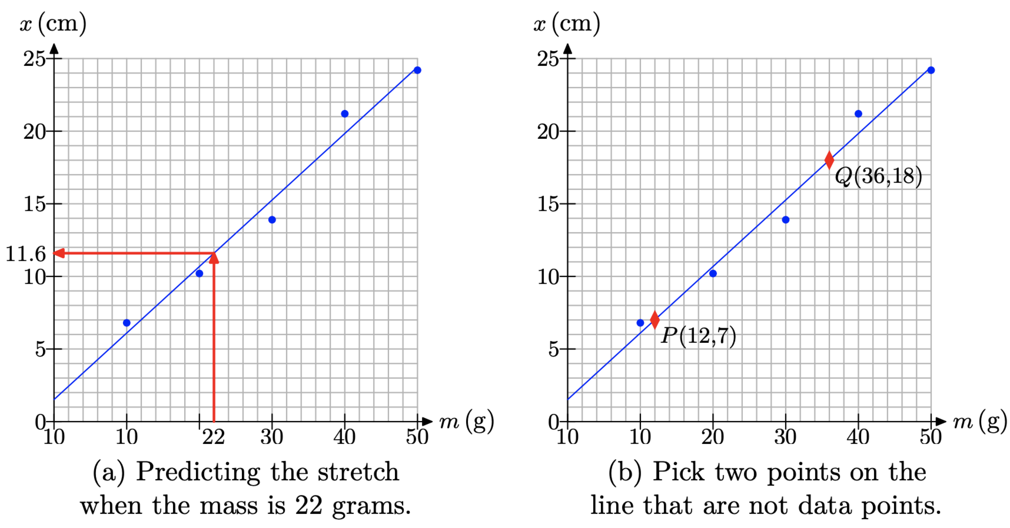
On the horizontal axis, we need to fit the masses 10, 20, 30, 40, and 50 grams. To avoid a smallish graph, we will let every 5 boxes represent 10 grams. On the vertical axis, we need to fit distances ranging from 6.8 centimeters up to and including 24.2 centimeters. Making each box represent 1 cm gives a nice sized graph and will allow for easy plotting of our data points, which we’ve done in Figure \(\PageIndex{1}\)(a).
Note the linear trend displayed by the data in Figure \(\PageIndex{1}\)(a). It’s not possible to draw a single line that will pass through every one of the data points, so a linear model will not exactly “fit” the data. However, the data are “approximately linear,” so let’s try to draw a line that “nearly fits” the data.
It is not our goal here to try to draw a line that passes through as many data points as possible. If we do, then we are essentially saying that the points through which the line does not pass have no influence on the overall model, nor do they have any influence on any predictions we might make with our model. This is not a reasonable assumption.
Indeed, the goal is to draw a line that comes as close to as many points as possible. Some points will lie above the line, some will lie below, and what we’ll try to do is “balance” the overestimates and the underestimates in an attempt to minimize the overall error. The best way to do this is to take a clear plastic ruler, something you can see through, and rotate and shift the ruler until you think you have a line that balances the overestimates and underestimates. We’ve done this for you in Figure \(\PageIndex{1}\)(b). The resulting line is called the “line of best fit.”

We can use the “line of best fit” in Figure \(\PageIndex{1}\)(b) to make predictions. For example, if we wanted to predict how much the spring will stretch when Aditya and Tami attach a 22 gram mass, then we would locate 22 grams on the horizontal axis, draw a vertical line upward to the “line of best fit,” followed by a horizontal line to the vertical axis, as shown in Figure \(\PageIndex{2}\)(a). Note that the x-value on the vertical axis appears to be approximately 11.6 centimeters.
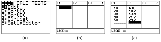
Alternatively, we will develop an equation model. First, select two points on the “line of best fit” using the following guidelines.
- Pick two points on the “line of best fit” that are not data points.
- Try to pick points passing through a lattice point of the grid. It makes interpreting the coordinates of the point a lot easier.
- The further apart the two selected points, the better the accuracy. Don’t pick points that are too close together.
In Figure \(\PageIndex{2}\)(b), we’ve selected points P(12, 7) and Q(36, 18). The first point indicates that a mass of 12 grams stretches the spring 7 centimeters. The interpretation for the second point is similar. We can find the slope of the line through the points P and Q with the slope formula.
\[m=\frac{\Delta x}{\Delta m}=\frac{18 \mathrm{cm}-7 \mathrm{cm}}{36 \mathrm{g}-12 \mathrm{g}}=\frac{11}{24} \frac{\mathrm{cm}}{\mathrm{g}} \nonumber \]
The slope of the line is the rate at which the distance stretched is changing with respect to how the mass is changing. In this case, for every additional 24 grams of mass that is hung, the spring stretches an additional 11 centimeters.
The next step is to use the point-slope formula to determine the equation of the line.
\[y-y_{0}=m\left(x-x_{0}\right) \nonumber \]
Let’s use point P(12, 7). That is, set \(\left(x_{0}, y_{0}\right)=(12,7)\). Substitute \(m=11 / 24, x_{0}=12\), and \(y_{0}=7\) into equation (1) to obtain
\[y-7=\frac{11}{24}(x-12) \nonumber \]
In the spring-mass application, the dependent variable is x, not y, and the independent variable is m, not x. Replace the y on the left-hand side of equation (2) with x, then replace x on the right-hand side of equation (2) with m to obtain
\[x-7=\frac{11}{24}(m-12) \nonumber \]
Solve equation (3) for x
\[\begin{aligned} x-7 &=\frac{11}{24} m-\frac{132}{24} \\ x &=\frac{11}{24} m-\frac{132}{24}+7 \\ x &=\frac{11}{24} m-\frac{132}{24}+\frac{168}{24} \\ x &=\frac{11}{24} m+\frac{36}{24} \end{aligned} \nonumber \]
Reduce 36/24 to 3/2 to obtain
\[x=\frac{11}{24} m+\frac{3}{2} \nonumber \]
Recall that x represents the distance stretched and m represents the amount of mass hung from the spring. That is, x is a function of m. We can use function notation to write the last equation as follows.
\[x(m)=\frac{11}{24} m+\frac{3}{2} \nonumber \]
We can use the model in equation (4) to determine the amount of stretch when a mass of 22 grams is attached to the spring. Substitute m = 22 in equation (4), then use a calculator to approximate the stretch in the spring.
\[x(22)=\frac{11}{24}(22)+\frac{3}{2} \approx 11.6 \mathrm{cm} \nonumber \]
Note the agreement with the graphical solution found in Figure \(\PageIndex{2}\)(a). Readers should understand that this kind of accuracy is not the usual norm. There are a number of factors that can introduce error.
- Aditya and Tami might not have taken accurate measurements in the lab, so the data could be flawed to begin with.
- There could be errors made when we scale the axes and plot the data.
- The “eyeball” line of best fit that we drew was very subjective. A slight rotation or translation of the ruler during the drawing of the supposed “line of best fit” can produce different results.
- Our calculations could contain mistakes and round-off error.
Using the Graphing Calculator to Find the Line of Best Fit
Statisticians have developed a particular method, called the “method of least squares,” which is used to find a “line of best fit” for a set of data that shows a linear trend. The algorithm seeks to find the line that minimizes the total error. These algorithms are programmed into the graphing calculator and are available for student use.
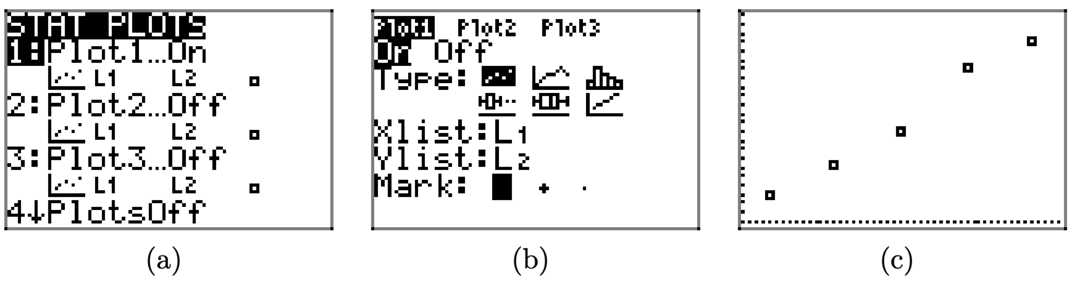
To use the graphing calculator to determine the line of best fit, the first thing you have to learn how to do is load the data from Table \(\PageIndex{1}\) into your calculator.
• Locate and push the STAT button on your keyboard, which will open the menu shown in Figure \(\PageIndex{3}\)(a).
• Select 1:Edit from this menu, which will open the edit window shown in Figure \(\PageIndex{3}\)(b).
• Enter the data from Table \(\PageIndex{1}\) into lists \(L_{1}\) and \(L_{2}\), as shown in Figure \(\PageIndex{3}\)(c)
The next step is to plot the data you’ve entered into lists \(L_{1}\) and \(L_{2}\).
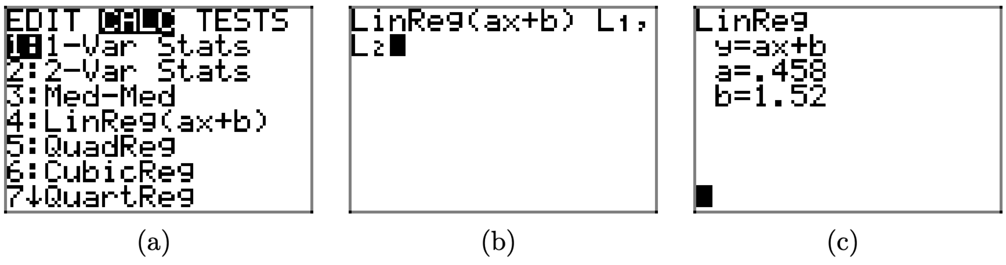
- Press the 2ND key, followed by STAT PLOT (located above the Y= menu). This opens the window shown in Figure \(\PageIndex{4}\)(a).
- Select 1:Plot1 to open the plot selection window shown in Figure \(\PageIndex{4}\)(b).
- In the plot selection window of Figure \(\PageIndex{4}\)(b), there are several things you need to check.
- Use the arrow keys to place the cursor over the word “On” and press the ENTER key to highlight this selection.
- There are six “Types” of plots: scatterplot, lineplot, histogram, modified box plot, box plot, and normal probability plot. These choices are arranged in two rows of three plots. Move your cursor to the first plot of the first row, the scatterplot, then press the ENTER key to highlight your selection.
- The next selection is the XList. This is the list that goes on the horizontal axis. In the case of Table 1, we want to place the mass data on the horizontal axis. We entered the mass data in list L1, so enter 2ND L1 (L1 is located above the 1 on the keyboard).
- The next selection is the Ylist. Enter 2ND L2 (L2 is located above the 2 on the keyboard). This lists the distance stretched and will be placed on the vertical axis.
- The last item is the marker. Choose the first one with the arrow keys (it’s the easiest to see) and press the ENTER key to highlight this choice.
- Push the ZOOM button on the first row of keys on your keyboard. Use the arrow keys to scroll the menu downward until you can select 9:ZoomStat. This will produce the image shown in Figure \(\PageIndex{4}\)(c).
The final step is to calculate and plot the line of best fit.
- Press the STAT button again, but then use the right-arrow to select the CALC submenu highlighted in Figure \(\PageIndex{5}\)(a).
- Select 4:LinReg(ax+b) from the CALC submenu. This places the command LinReg(ax+b) on your home screen, as shown in Figure \(\PageIndex{5}\)(b). You must then type 2ND \(L_{1}\), a comma (located on its own key just above the 7 key), then 2ND \(L_{2}\), as shown in Figure \(\PageIndex{5}\)(b).
- Press the ENTER key to execute the command LinReg \(L_{1}\), \(L_{2}\), which produces the equation of the line of best fit shown in Figure \(\PageIndex{5}\)(c).
The screen in Figure \(\PageIndex{5}\)(c) is quite informative. It tells us two things.
- The equation of the line of best fit is y = ax + b.
- The slope is a = .458 and the y-intercept is b = 1.52.
Substituting a = 0.458 and b = 1.52 into the equation y = ax + b gives us the equation of the line of best fit.
\[y=0.458 x+1.52 \nonumber \]
We can superimpose the plot of the line of best fit on our data set in two easy steps.
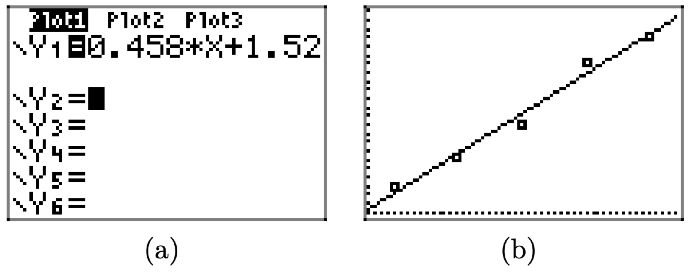
- Press the Y= key and enter the equation 0.458*X+1.52 in \(\boldsymbol{Y}_{1}\), as shown in Figure \(\PageIndex{6}\)(a).
- Press the GRAPH button on the top row of keys on your keyboard to produce the line of best fit in Figure \(\PageIndex{6}\)(b).
On the left-hand side of equation (5), replace y with x (the distance stretched); on the right-hand side, replace x with m (amount of mass). This leads to the result \[x=0.458 m+1.52 \nonumber \]
You might recall that our hand calculation produced equation (4), which we repeat here for convenience.
\[x=\frac{11}{24} x+\frac{3}{2} \nonumber \]
Note that 11\(/ 24 \approx 0.4583\) and 3/2 = 1.5, so equation (6) agrees closely with our hand-calculated equation of the line of best fit.
It is rather unusual to have a hand-calculated line of best fit agree so closely with the sophisticated and very accurate result produced by the graphing calculator. So, don’t be disappointed when your homework results don’t match as nicely as they have in this example. If you are in the ballpark with your hand-calculated equation for the line of best fit, that will usually be good enough. However, if your hand-calculated equation is not even close to what your calculator produces, it’s “back to the drawing board.” Recheck your plot and your calculations. Be stubborn! Don’t be satisfied with your results until you have reasonable agreement.