Mathematics LibreTexts

15.4: Visualizing Networks with NetworkX

  • Page ID
    7860
  • \( \newcommand{\vecs}[1]{\overset { \scriptstyle \rightharpoonup} {\mathbf{#1}} } \) \( \newcommand{\vecd}[1]{\overset{-\!-\!\rightharpoonup}{\vphantom{a}\smash {#1}}} \)\(\newcommand{\id}{\mathrm{id}}\) \( \newcommand{\Span}{\mathrm{span}}\) \( \newcommand{\kernel}{\mathrm{null}\,}\) \( \newcommand{\range}{\mathrm{range}\,}\) \( \newcommand{\RealPart}{\mathrm{Re}}\) \( \newcommand{\ImaginaryPart}{\mathrm{Im}}\) \( \newcommand{\Argument}{\mathrm{Arg}}\) \( \newcommand{\norm}[1]{\| #1 \|}\) \( \newcommand{\inner}[2]{\langle #1, #2 \rangle}\) \( \newcommand{\Span}{\mathrm{span}}\) \(\newcommand{\id}{\mathrm{id}}\) \( \newcommand{\Span}{\mathrm{span}}\) \( \newcommand{\kernel}{\mathrm{null}\,}\) \( \newcommand{\range}{\mathrm{range}\,}\) \( \newcommand{\RealPart}{\mathrm{Re}}\) \( \newcommand{\ImaginaryPart}{\mathrm{Im}}\) \( \newcommand{\Argument}{\mathrm{Arg}}\) \( \newcommand{\norm}[1]{\| #1 \|}\) \( \newcommand{\inner}[2]{\langle #1, #2 \rangle}\) \( \newcommand{\Span}{\mathrm{span}}\)\(\newcommand{\AA}{\unicode[.8,0]{x212B}}\)

    NetworkX also provides functions for visualizing networks. They are not as powerful as other more specialized software1, but still quite handy and useful, especially for small- to mid-sized network visualization. Those visualization functions depend on the functions defined in matplotlib (pylab), so we need to import it before visualizing networks.

    The simplest way is to use NetworkX’s draw function:

    Code 15.11.png

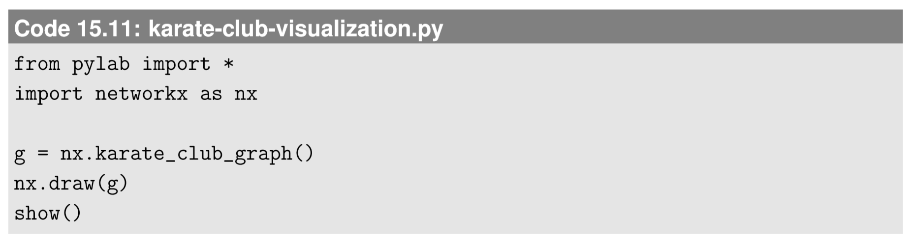
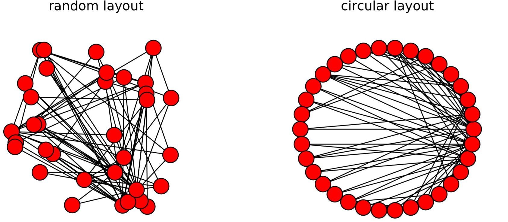
    The result is shown in Fig. 15.4.1. Red circles represent the nodes, and the black lines connecting them represent the edges. By default, the layout of the nodes and edges is automatically determined by the Fruchterman-Reingold force-directed algorithm [62] (called “spring layout” in NetworkX), which conducts a pseudo-physics simulation of the movements of the nodes, assuming that each edge is a spring with a fixed equilibrium distance. This heuristic algorithm tends to bring groups of well-connected nodes closer to each other, making the result of visualization more meaningful and aesthetically more pleasing.

    Fig 15.3.png
    Figure \(\PageIndex{1}\): Visual output of Code 15.11. Zachary’s Karate Club graph is visualized. Your result may not look like this because the spring layout algorithm uses random initial positions by default.

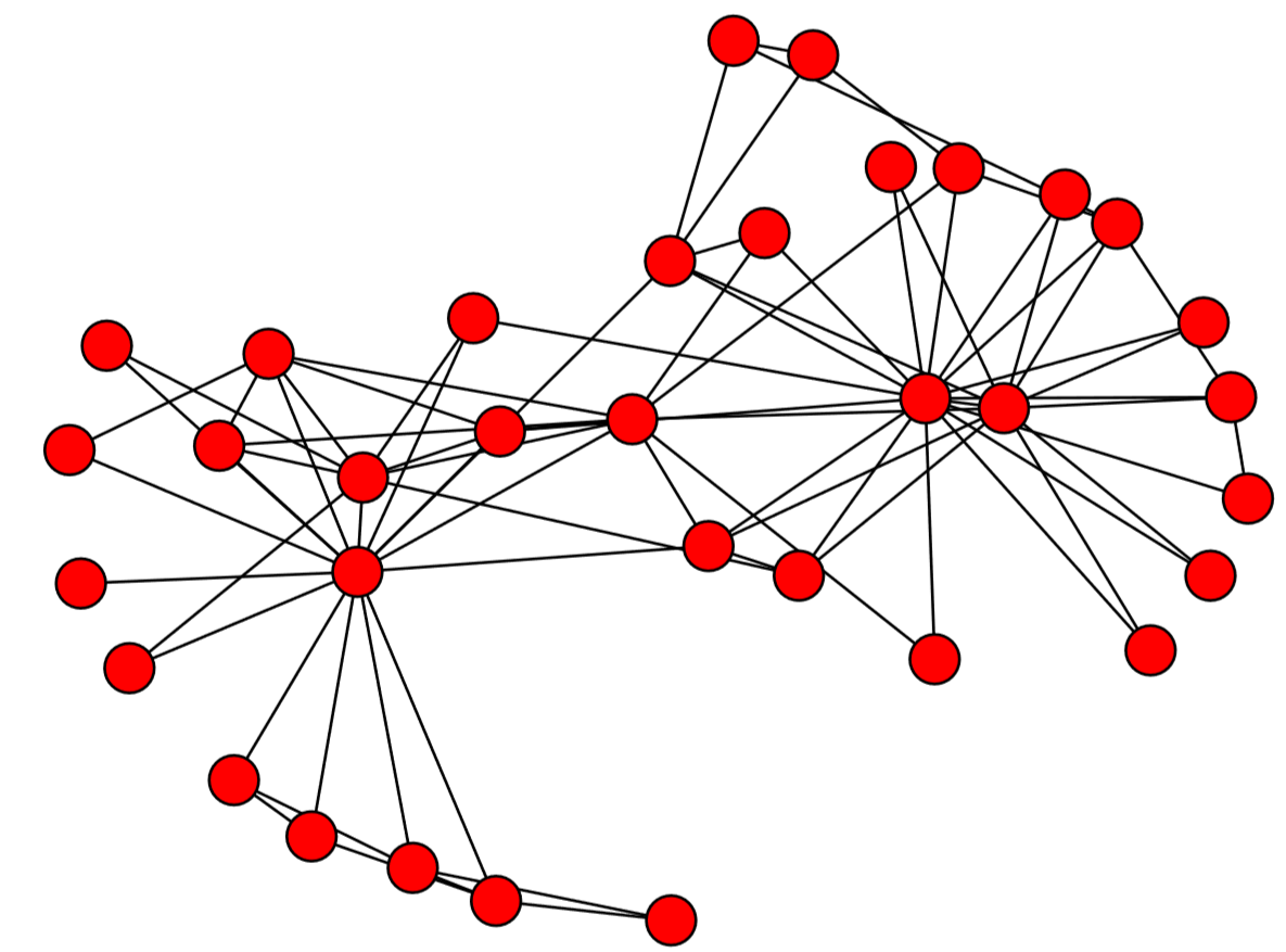
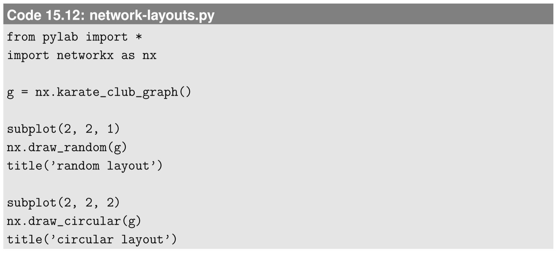
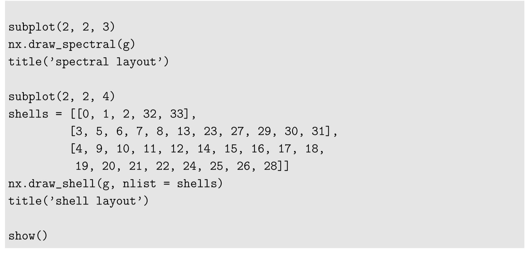
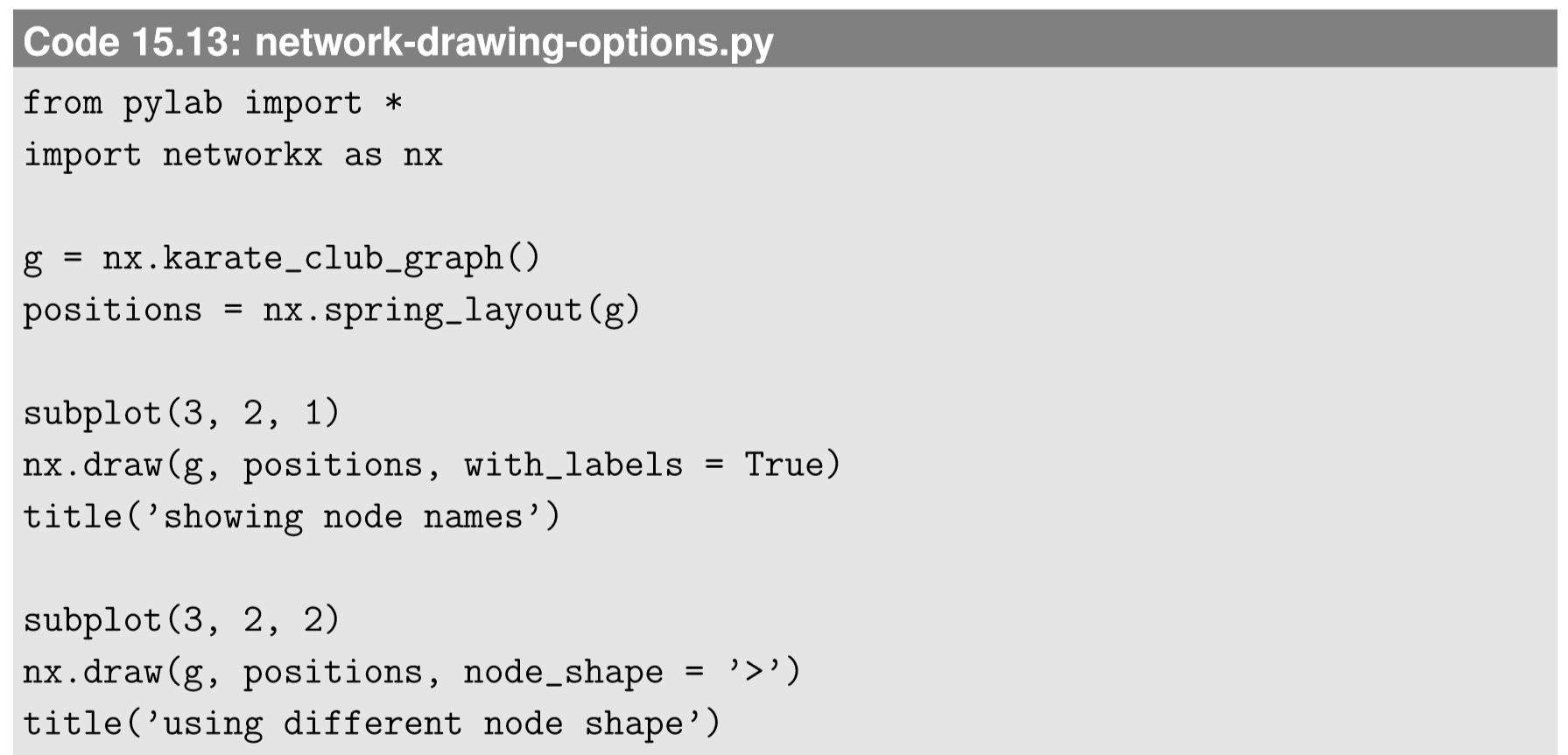
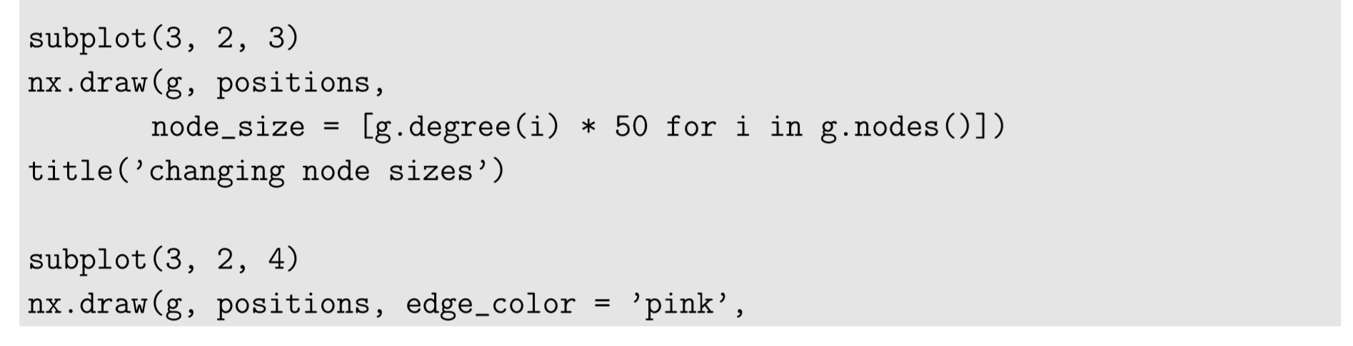
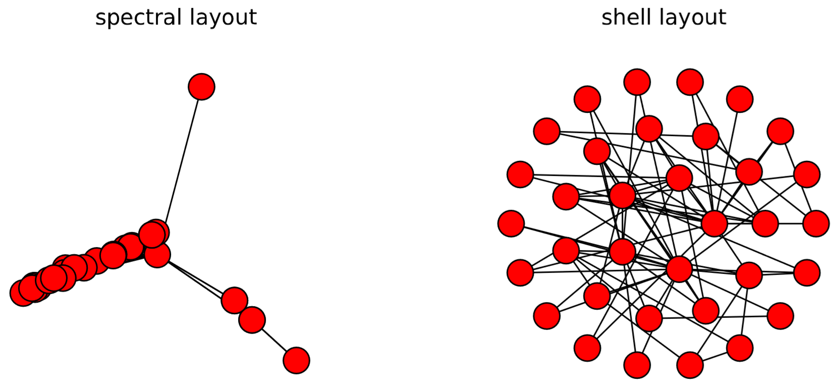
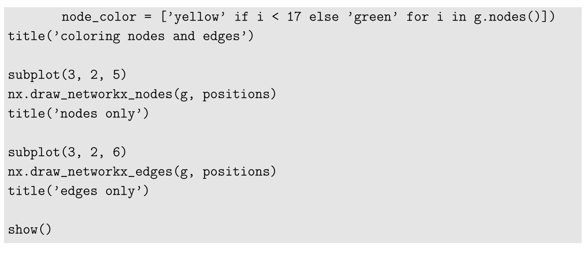
    There are several other layout algorithms, as shown in Code 15.12 and Fig.15.5.1. Also, there are many options you can use to customize visualization results (see Code 15.13 and Fig. 15.4.3). Check out NetworkX’s online documentation to learn more about what you can do.

    Code 15.12.png

    Code 15.12 pt2.png

    Code 15.13.png

    Code 15.13 pt2.png

    Fig 15.4 pt1.png

    Fig 15.4 pt2.png
    Figure \(\PageIndex{2}\): Visual output of Code 15.12, showing examples of network layouts available in NetworkX.

    Code 15.13 pt3.png

    Exercise \(\PageIndex{1}\)

    Visualize the following graphs. Look them up in NetworkX’s online documentation to learn how to generate them.

    • A “hypercube graph” of four dimensions.

    • A “ladder graph” of length 5.

    • A “barbell graph” made of two 20-node complete graphs that are connected by a single edge.

    • A “wheel graph” made of 100 nodes.

    Exercise \(\PageIndex{2}\)

    Visualize the social network you created in Exercise 15.3.2. Try several options to customize the result to your preference.

    1For example, Gephi (http://gephi.github.io/) can handle much larger networks, and it has many more node-embedding algorithms than NetworkX.


    This page titled 15.4: Visualizing Networks with NetworkX is shared under a CC BY-NC-SA 3.0 license and was authored, remixed, and/or curated by Hiroki Sayama (OpenSUNY) via source content that was edited to the style and standards of the LibreTexts platform; a detailed edit history is available upon request.