
44.4: Box Plots
- Page ID
- 40879
Lesson
Let's explore how box plots can help us summarize distributions.
Exercise \(\PageIndex{1}\): Notice and Wonder: Puppy Weights
Here are the birth weights, in ounces, of all the puppies born at a kennel in the past month.
\(13\qquad 14\qquad 15\qquad 15\qquad 16\qquad 16\qquad 16\qquad 16\qquad 17\qquad 17\qquad 17\qquad 17\qquad 17\qquad 17\qquad 17\qquad 18\qquad 18\qquad 18\qquad 18\qquad 18\qquad 18\qquad 18\qquad 18\qquad 19\qquad 20\)
What do you notice and wonder about the distribution of the puppy weights?
Exercise \(\PageIndex{2}\): Human Box Plot
Your teacher will give you the data on the lengths of names of students in your class. Write the five-number summary by finding the data set's minimum, Q1, Q2, Q3, and the maximum.
Pause for additional instructions from your teacher.
Exercise \(\PageIndex{3}\): Studying Blinks
Twenty people participated in a study about blinking. The number of times each person blinked while watching a video for one minute was recorded. The data values are shown here, in order from smallest to largest.
\(3\qquad 6\qquad 8\qquad 11\qquad 11\qquad 13\qquad 14\qquad 14\qquad 14\qquad 14\qquad 16\qquad 18\qquad 20\qquad 20\qquad 20\qquad 22\qquad 24\qquad 32\qquad 36\qquad 51\)
- Use the grid and axis to make a dot plot of this data set.
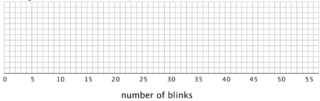
- Find the median (Q2) and mark its location on the dot plot.
- Find the first quartile (Q1) and the third quartile (Q3). Mark their locations on the dot plot.
- What are the minimum and maximum values?
- A box plot can be used to represent the five-number summary graphically. Let’s draw a box plot for the number-of-blinks data. On the grid, above the dot plot:
- Draw a box that extends from the first quartile (Q1) to the third quartile (Q3). Label the quartiles.
- At the median (Q2), draw a vertical line from the top of the box to the bottom of the box. Label the median.
- From the left side of the box (Q1), draw a horizontal line (a whisker) that extends to the minimum of the data set. On the right side of the box (Q3), draw a similar line that extends to the maximum of the data set.
- You have now created a box plot to represent the number of blinks data. What fraction of the data values are represented by each of these elements of the box plot?
- The left whisker
- The box
- The right whisker
Are you ready for more?
Suppose there were some errors in the data set: the smallest value should have been 6 instead of 3, and the largest value should have been 41 instead of 51. Determine if any part of the five-number summary would change. If you think so, describe how it would change. If not, explain how you know.
Summary
A box plot represents the five-number summary of a data set.
It shows the first quartile (Q1) and the third quartile (Q3) as the left and right sides of a rectangle or a box. The median (Q2) is shown as a vertical segment inside the box. On the left side, a horizontal line segment—a “whisker”—extends from Q1 to the minimum value. On the right, a whisker extends from Q3 to the maximum value.
The rectangle in the middle represents the middle half of the data. Its width is the IQR. The whiskers represent the bottom quarter and top quarter of the data set.
Earlier we saw dot plots representing the weights of pugs and beagles. The box plots for these data sets are shown above the corresponding dot plots.
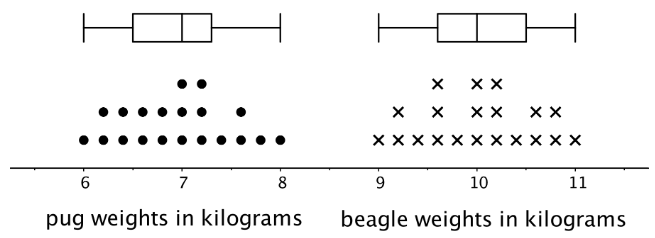
We can tell from the box plots that, in general, the pugs in the group are lighter than the beagles: the median weight of pugs is 7 kilograms and the median weight of beagles is 10 kilograms. Because the two box plots are on the same scale and the rectangles have similar widths, we can also tell that the IQRs for the two breeds are very similar. This suggests that the variability in the beagle weights is very similar to the variability in the pug weights.
Glossary Entries
Definition: Box Plot
A box plot is a way to represent data on a number line. The data is divided into four sections. The sides of the box represent the first and third quartiles. A line inside the box represents the median. Lines outside the box connect to the minimum and maximum values.
For example, this box plot shows a data set with a minimum of 2 and a maximum of 15. The median is 6, the first quartile is 5, and the third quartile is 10.
Definition: Interquartile Range (IQR)
The interquartile range is one way to measure how spread out a data set is. We sometimes call this the IQR. To find the interquartile range we subtract the first quartile from the third quartile.
For example, the IQR of this data set is 20 because \(50-30=20\).
| \(22\) | \(29\) | \(30\) | \(31\) | \(32\) | \(43\) | \(44\) | \(45\) | \(50\) | \(50\) | \(59\) |
| Q1 | Q2 | Q3 |
Definition: Median
The median is one way to measure the center of a data set. It is the middle number when the data set is listed in order.
For the data set 7, 9, 12, 13, 14, the median is 12.
For the data set 3, 5, 6, 8, 11, 12, there are two numbers in the middle. The median is the average of these two numbers. \(6+8=14\) and \(14\div 2=7\).
Definition: Quartile
Quartiles are the numbers that divide a data set into four sections that each have the same number of values.
For example, in this data set the first quartile is 30. The second quartile is the same thing as the median, which is 43. The third quartile is 50.
| \(22\) | \(29\) | \(30\) | \(31\) | \(32\) | \(43\) | \(44\) | \(45\) | \(50\) | \(50\) | \(59\) |
| Q1 | Q2 | Q3 |
Definition: Range
The range is the distance between the smallest and largest values in a data set. For example, for the data set 3, 5, 6, 8, 11, 12, the range is 9, because \(12-3=9\).
Practice
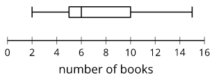
Exercise \(\PageIndex{4}\)
Each student in a class recorded how many books they read during the summer. Here is a box plot that summarizes their data.
- What is the greatest number of books read by a student in this group?
- What is the median number of books read by the students?
- What is the interquartile range (IQR)?
Exercise \(\PageIndex{5}\)
Use this five-number summary to draw a box plot. All values are in seconds.
- Minimum: 40
- First quartile (Q1): 45
- Median: 48
- Third quartile (Q3): 50
- Maximum: 60
Exercise \(\PageIndex{6}\)
The data shows the number of hours per week that each of 13 seventh-grade students spent doing homework. Create a box plot to summarize the data.
\(3\qquad 10\qquad 12\qquad 4\qquad 7\qquad 9\qquad 5\qquad 5\qquad 11\qquad 11\qquad 5\qquad 12\qquad 11\)
Exercise \(\PageIndex{7}\)
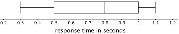
The box plot displays the data on the response times of 100 mice to seeing a flash of light. How many mice are represented by the rectangle between 0.5 and 1 second?
Exercise \(\PageIndex{8}\)
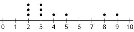
Here is a dot plot that represents a data set. Explain why the mean of the data set is greater than its median.
(From Unit 8.4.2)
Exercise \(\PageIndex{9}\)
Jada earns money from babysitting, walking her neighbor’s dogs, and running errands for her aunt. Every four weeks, she combines her earnings and divides them into three equal parts—one for spending, one for saving, and one for donating to a charity. Jada donated $26.00 of her earnings from the past four weeks to charity.
How much could she have earned from each job? Make two lists of how much she could have earned from the three jobs during the past four weeks.
(From Unit 8.3.1)