
44.4.1: Using Box Plots
- Page ID
- 40880
Lesson
Let's use box plots to make comparisons.
Exercise \(\PageIndex{1}\): Hours of Slumber
Ten sixth-grade students were asked how much sleep, in hours, they usually get on a school night. Here is the five-number summary of their responses.
- Minimum: 5 hours
- First quartile: 7 hours
- Median: 7.5 hours
- Third quartile: 8 hours
- Maximum: 9 hours
- On the grid, draw a box plot for this five-number summary.

- What questions could be answered by looking at this box plot?
Exercise \(\PageIndex{2}\): Info Gap: Sea Turtles
Your teacher will give you either a Problem Card or a Data Card about sea turtles that nest on the Outer Banks of North Carolina. Do not show or read your card to your partner.

If your teacher gives you the problem card:
- Silently read your card and think about what information you need to be able to answer the question.
- Ask your partner for the specific information that you need.
- Explain how you are using the information to solve the problem.
Continue to ask questions until you have enough information to solve the problem. - Share the problem card and solve the problem independently.
- Read the data card and discuss your reasoning.
If your teacher gives you the data card:
- Silently read your card.
- Ask your partner “What specific information do you need?” and wait for them to ask for information.
If your partner asks for information that is not on the card, do not do the calculations for them. Tell them you don’t have that information. - Before sharing the information, ask “Why do you need that information?” Listen to your partner’s reasoning and ask clarifying questions.
- Read the problem card and solve the problem independently.
- Share the data card and discuss your reasoning.
Pause here so your teacher can review your work. Ask your teacher for a new set of cards and repeat the activity, trading roles with your partner.
Exercise \(\PageIndex{3}\): Paper Planes
Andre, Lin, and Noah each designed and built a paper airplane. They launched each plane several times and recorded the distance of each flight in yards.
Andre
\(25\qquad 26\qquad 27\qquad 27\qquad 27\qquad 28\qquad 28\qquad 28\qquad 29\qquad 30\qquad 30\)
Lin
\(20\qquad 20\qquad 21\qquad 24\qquad 26\qquad 28\qquad 28\qquad 29\qquad 29\qquad 30\qquad 32\)
Noah
\(13\qquad 14\qquad 15\qquad 18\qquad 19\qquad 20\qquad 21\qquad 23\qquad 23\qquad 24\qquad 25\)
Work with your group to summarize the data sets with numbers and box plots.
- Write the five-number summary for the data for each airplane. Then, calculate the interquartile range for each data set.
min Q1 median Q3 max IQR Table \(\PageIndex{1}\) - Draw three box plots, one for each paper airplane. Label the box plots clearly.
- How are the results for Andre and Lin’s planes the same? How are they different?
- How are the results for Lin and Noah’s planes the same? How are they different?
Are you ready for more?
Priya joined in the paper-plane experiments. She launched her plane eleven times and recorded the lengths of each flight. She found that her maximum and minimum were equal to Lin’s. Her IQR was equal to Andre’s.
Draw a box plot that could represent Priya’s data.
With the information given, can you estimate the median for Priya’s data? Explain your reasoning.
Summary
Box plots are useful for comparing different groups. Here are two sets of plots that show the weights of some berries and some grapes.
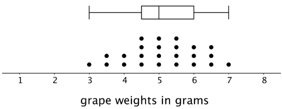
Notice that the median berry weight is 3.5 grams and the median grape weight is 5 grams. In both cases, the IQR is 1.5 grams. Because the grapes in this group have a higher median weight than the berries, we can say a grape in the group is typically heavier than a berry. Because both groups have the same IQR, we can say that they have a similar variability in their weights.
These box plots represent the length data for a collection ladybugs and a collection of beetles.

The medians of the two collections are the same, but the IQR of the ladybugs is much smaller. This tells us that a typical ladybug length is similar to a typical beetle length, but the ladybugs are more alike in their length than the beetles are in their length.
Glossary Entries
Definition: Box Plot
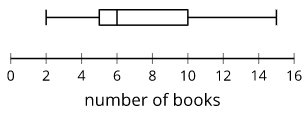
A box plot is a way to represent data on a number line. The data is divided into four sections. The sides of the box represent the first and third quartiles. A line inside the box represents the median. Lines outside the box connect to the minimum and maximum values.
For example, this box plot shows a data set with a minimum of 2 and a maximum of 15. The median is 6, the first quartile is 5, and the third quartile is 10.
Definition: Interquartile Range (IQR)
The interquartile range is one way to measure how spread out a data set is. We sometimes call this the IQR. To find the interquartile range we subtract the first quartile from the third quartile.
For example, the IQR of this data set is 20 because \(50-30=20\).
| \(22\) | \(29\) | \(30\) | \(31\) | \(32\) | \(43\) | \(44\) | \(45\) | \(50\) | \(50\) | \(59\) |
| Q1 | Q2 | Q3 |
Definition: Median
The median is one way to measure the center of a data set. It is the middle number when the data set is listed in order.
For the data set 7, 9, 12, 13, 14, the median is 12.
For the data set 3, 5, 6, 8, 11, 12, there are two numbers in the middle. The median is the average of these two numbers. \(6+8=14\) and \(14\div 2=7\).
Definition: Quartile
Quartiles are the numbers that divide a data set into four sections that each have the same number of values.
For example, in this data set the first quartile is 30. The second quartile is the same thing as the median, which is 43. The third quartile is 50.
| \(22\) | \(29\) | \(30\) | \(31\) | \(32\) | \(43\) | \(44\) | \(45\) | \(50\) | \(50\) | \(59\) |
| Q1 | Q2 | Q3 |
Definition: Range
The range is the distance between the smallest and largest values in a data set. For example, for the data set 3, 5, 6, 8, 11, 12, the range is 9, because \(12-3=9\).
Practice
Exercise \(\PageIndex{4}\)
Here are box plots that summarize the heights of 20 professional male athletes in basketball, football, hockey, and baseball.

- In which two sports are the players’ height distributions most alike? Explain your reasoning.
- Which sport shows the greatest variability in players’ heights? Which sport shows the least variability?
Exercise \(\PageIndex{5}\)
Here is a box plot that summarizes data for the time, in minutes, that a fire department took to respond to 100 emergency calls.
Select all the statements that are true, according to the dot plot.
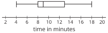
- Most of the response times were under 13 minutes.
- Fewer than 30 of the response times were over 13 minutes.
- More than half of the response times were 11 minutes or greater.
- There were more response times that were greater than 13 minutes than those that were less than 9 minutes.
- About 75% of the response times were 13 minutes or less.
Exercise \(\PageIndex{6}\)
Pineapples were packed in three large crates. For each crate, the weight of every pineapple in the crate was recorded. Here are three box plots that summarize the weights in each crate.

Select all of the statements that are true, according to the box plots.
- The weights of the pineapples in Crate 1 were the most variable.
- The heaviest pineapple was in Crate 1.
- The lightest pineapple was in Crate 1.
- Crate 3 had the greatest median weight and the greatest IQR.
- More than half the pineapples in Crate 1 and Crate 3 were heavier than the heaviest pineapple in Crate 2.
Exercise \(\PageIndex{7}\)
Two TV shows each asked 100 viewers for their ages. For one show, the mean age of the viewers was 35 years and the MAD was 20 years. For the other show, the mean age of the viewers was 30 years and the MAD was 5 years.
A sixth-grade student says he watches one of the shows. Which show do you think he watches? Explain your reasoning.
(From Unit 8.3.4)