
5.8: Reading Graphs in Media
- Page ID
- 74655

Don’t get fancy with graphs! People sometimes add features to graphs that don’t help to convey their information. For example, 3-dimensional bar charts are usually not as effective as their two-dimensional counterparts.
Another distortion in bar charts results from setting the baseline to a value other than zero. The baseline is the bottom of the vertical axis, representing the least number of cases that could have occurred in a category. Normally, this number should be zero.
Example 1
Compare the two graphs below showing support for same-sex marriage rights from a poll taken in December 2008[3]. The difference in the vertical scale on the first graph suggests a different story than the true differences in percentages; the second graph makes it look like twice as many people oppose marriage rights as support it.


Here is another way that fanciness can lead to trouble. Instead of plain bars, it is tempting to substitute meaningful images. This type of graph is called a pictogram.
Pictogram
A pictogram is a statistical graphic in which the size of the picture is intended to represent the frequencies or size of the values being represented.
Example
 A labor union might produce the graph to the right to show the difference between the average manager salary and the average worker salary.
Looking at the picture, it would be reasonable to guess that the manager salaries is 4 times as large as the worker salaries – the area of the bag looks about 4 times as large. However, the manager salaries are in fact only twice as large as worker salaries, which were reflected in the picture by making the manager bag twice as tall.
Try it Now 2
 A poll was taken asking people if they agreed with the positions of the 4 candidates for a county office. Does the pie chart present a good representation of this data? Explain.
- Answer
-
While the pie chart depicts the relative size of the people agreeing with each candidate as compared to the other candidates, the chart is confusing. Percents on a pie chart usually represent the percentage out of 100% that the slice represents.
There are many other types of graphs you will encounter in the media. The following example is a multiple line graph.
Example 3
The average score for SAT critical reading has been going down over the years. You can also see that the average score for male students is higher than the average score for female students for all of the years. Also, the average scores for male and female used to be closer to each other, then they separated fairly far, and look to be getting closer to each other again. What do you think could be a reason for this?
Multiple Line Graph for SAT Critical Reading Scores in AZ
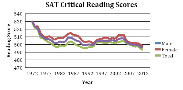
(College Board: Arizona, 2012)
Solution
In this case the vertical axis did not start at zero, because if it did start at zero, the different lines would be very close together and difficult to see. When at all possible, the scale on the vertical axis should start at zero. Always carefully consider that if a vertical scale of a graph does not start at zero, the researchers could be attempting to exaggerate insignificant differences in the data.
Multiple Bar Graphs:
Sometimes you have information for multiple variables and instead of putting the information on different bar graphs, you can put them all on one so that you can compare the variables. The following is an example of where you might use this. The data is the amount of nutrients used by crops with various fertilizers. By creating a graph that has all of the fertilizers and all of the crops, you can see that corn with nitrogen uses the most nutrients, and soybeans with nitrogen uses the least amount of nutrients. You can also see that phosphate seems to use low amounts of nutrients for all of its crops. So, a multiple bar graph is useful to make all of these observations.
Multiple Bar Graph for the Amount of Nutrients Used by Crops: 2010
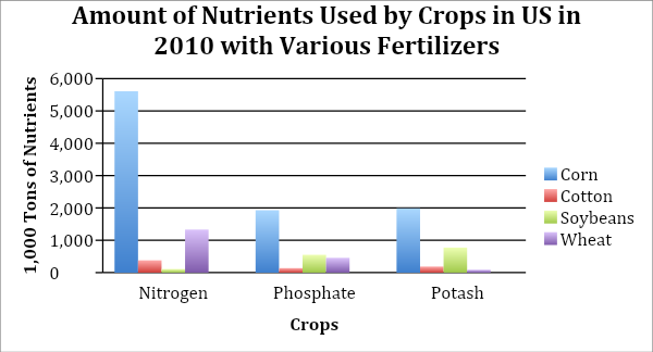
(United States Department of Agriculture [USDA], 2010)
Stack Plots:
A stack plot is basically a multiple bar graph, but with the bars separated (or stacked) on top of each other instead of next to each other. This can be useful when it is difficult to interpret a multiple bar graph since the bar heights are so close to one another. To read a given bar on a stack plot, you must subtract the height of the bar from the height of the bar below it. In the example of a stack plot below, you can see that the SAT Mathematics score for males in 1972 is about 530 while the SAT Mathematics score for females in 1972 is about 1010 – 530 = 480.
Stack Plot of SAT Mathematics Scores
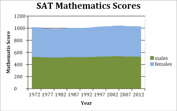
(College Board: Arizona, 2012)
Geographical Graphs:
Weather maps, topographic maps, population distribution maps, gravity maps, and vegetation maps are examples of geographical graphs. They allow you to see a trend of information over a geographic area. The following is an example of a weather map showing temperatures. As you can see, the different colors represent certain temperature ranges. From this graph, you can see that on this date, the red in the south means that the temperature was in the 80s and 90s there, and the blue in the Rockies area means that the temperature was in the 40s there.
Geographical Graph
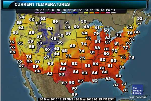
(Weather Channel, 2013)
Three-Dimensional Graphics
Some people like to show graphs in three-dimensions. This type of graph can be misleading when the media presents it this way. The following is misleading because the red party looks almost as equivalent to the teal party, which is not true.
Three-Dimensional Graph
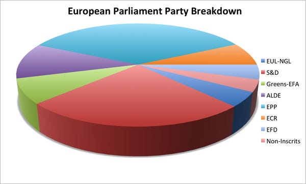
(Business Insider, 2013)
Combination Graphics
Some graphs are created so that they combine the data table and a graph or combine two types of graphs in one. The advantage is that you can see a graphical representation of the data, and still have the data to find exact values. The disadvantage is that they are busier, and usually people show graphical representation of data because people do not like looking at the data.
Combination Graph
These are just a few of the different types of graphs that exist in the world. There are many other ones. A quick Google search on statistical graphs will show you many more. Just open up a newspaper, magazine, or website and you are likely to see others. The most important thing to remember is that you need to look at the graph objectively, and interpret for yourself what it says. Also, do not read any cause and effect into what you see which will be discussed in more depth in the next section.