
44.3: Quartiles and Interquartile Range
- Page ID
- 40883
\( \newcommand{\vecs}[1]{\overset { \scriptstyle \rightharpoonup} {\mathbf{#1}} } \)
\( \newcommand{\vecd}[1]{\overset{-\!-\!\rightharpoonup}{\vphantom{a}\smash {#1}}} \)
\( \newcommand{\dsum}{\displaystyle\sum\limits} \)
\( \newcommand{\dint}{\displaystyle\int\limits} \)
\( \newcommand{\dlim}{\displaystyle\lim\limits} \)
\( \newcommand{\id}{\mathrm{id}}\) \( \newcommand{\Span}{\mathrm{span}}\)
( \newcommand{\kernel}{\mathrm{null}\,}\) \( \newcommand{\range}{\mathrm{range}\,}\)
\( \newcommand{\RealPart}{\mathrm{Re}}\) \( \newcommand{\ImaginaryPart}{\mathrm{Im}}\)
\( \newcommand{\Argument}{\mathrm{Arg}}\) \( \newcommand{\norm}[1]{\| #1 \|}\)
\( \newcommand{\inner}[2]{\langle #1, #2 \rangle}\)
\( \newcommand{\Span}{\mathrm{span}}\)
\( \newcommand{\id}{\mathrm{id}}\)
\( \newcommand{\Span}{\mathrm{span}}\)
\( \newcommand{\kernel}{\mathrm{null}\,}\)
\( \newcommand{\range}{\mathrm{range}\,}\)
\( \newcommand{\RealPart}{\mathrm{Re}}\)
\( \newcommand{\ImaginaryPart}{\mathrm{Im}}\)
\( \newcommand{\Argument}{\mathrm{Arg}}\)
\( \newcommand{\norm}[1]{\| #1 \|}\)
\( \newcommand{\inner}[2]{\langle #1, #2 \rangle}\)
\( \newcommand{\Span}{\mathrm{span}}\) \( \newcommand{\AA}{\unicode[.8,0]{x212B}}\)
\( \newcommand{\vectorA}[1]{\vec{#1}} % arrow\)
\( \newcommand{\vectorAt}[1]{\vec{\text{#1}}} % arrow\)
\( \newcommand{\vectorB}[1]{\overset { \scriptstyle \rightharpoonup} {\mathbf{#1}} } \)
\( \newcommand{\vectorC}[1]{\textbf{#1}} \)
\( \newcommand{\vectorD}[1]{\overrightarrow{#1}} \)
\( \newcommand{\vectorDt}[1]{\overrightarrow{\text{#1}}} \)
\( \newcommand{\vectE}[1]{\overset{-\!-\!\rightharpoonup}{\vphantom{a}\smash{\mathbf {#1}}}} \)
\( \newcommand{\vecs}[1]{\overset { \scriptstyle \rightharpoonup} {\mathbf{#1}} } \)
\(\newcommand{\longvect}{\overrightarrow}\)
\( \newcommand{\vecd}[1]{\overset{-\!-\!\rightharpoonup}{\vphantom{a}\smash {#1}}} \)
\(\newcommand{\avec}{\mathbf a}\) \(\newcommand{\bvec}{\mathbf b}\) \(\newcommand{\cvec}{\mathbf c}\) \(\newcommand{\dvec}{\mathbf d}\) \(\newcommand{\dtil}{\widetilde{\mathbf d}}\) \(\newcommand{\evec}{\mathbf e}\) \(\newcommand{\fvec}{\mathbf f}\) \(\newcommand{\nvec}{\mathbf n}\) \(\newcommand{\pvec}{\mathbf p}\) \(\newcommand{\qvec}{\mathbf q}\) \(\newcommand{\svec}{\mathbf s}\) \(\newcommand{\tvec}{\mathbf t}\) \(\newcommand{\uvec}{\mathbf u}\) \(\newcommand{\vvec}{\mathbf v}\) \(\newcommand{\wvec}{\mathbf w}\) \(\newcommand{\xvec}{\mathbf x}\) \(\newcommand{\yvec}{\mathbf y}\) \(\newcommand{\zvec}{\mathbf z}\) \(\newcommand{\rvec}{\mathbf r}\) \(\newcommand{\mvec}{\mathbf m}\) \(\newcommand{\zerovec}{\mathbf 0}\) \(\newcommand{\onevec}{\mathbf 1}\) \(\newcommand{\real}{\mathbb R}\) \(\newcommand{\twovec}[2]{\left[\begin{array}{r}#1 \\ #2 \end{array}\right]}\) \(\newcommand{\ctwovec}[2]{\left[\begin{array}{c}#1 \\ #2 \end{array}\right]}\) \(\newcommand{\threevec}[3]{\left[\begin{array}{r}#1 \\ #2 \\ #3 \end{array}\right]}\) \(\newcommand{\cthreevec}[3]{\left[\begin{array}{c}#1 \\ #2 \\ #3 \end{array}\right]}\) \(\newcommand{\fourvec}[4]{\left[\begin{array}{r}#1 \\ #2 \\ #3 \\ #4 \end{array}\right]}\) \(\newcommand{\cfourvec}[4]{\left[\begin{array}{c}#1 \\ #2 \\ #3 \\ #4 \end{array}\right]}\) \(\newcommand{\fivevec}[5]{\left[\begin{array}{r}#1 \\ #2 \\ #3 \\ #4 \\ #5 \\ \end{array}\right]}\) \(\newcommand{\cfivevec}[5]{\left[\begin{array}{c}#1 \\ #2 \\ #3 \\ #4 \\ #5 \\ \end{array}\right]}\) \(\newcommand{\mattwo}[4]{\left[\begin{array}{rr}#1 \amp #2 \\ #3 \amp #4 \\ \end{array}\right]}\) \(\newcommand{\laspan}[1]{\text{Span}\{#1\}}\) \(\newcommand{\bcal}{\cal B}\) \(\newcommand{\ccal}{\cal C}\) \(\newcommand{\scal}{\cal S}\) \(\newcommand{\wcal}{\cal W}\) \(\newcommand{\ecal}{\cal E}\) \(\newcommand{\coords}[2]{\left\{#1\right\}_{#2}}\) \(\newcommand{\gray}[1]{\color{gray}{#1}}\) \(\newcommand{\lgray}[1]{\color{lightgray}{#1}}\) \(\newcommand{\rank}{\operatorname{rank}}\) \(\newcommand{\row}{\text{Row}}\) \(\newcommand{\col}{\text{Col}}\) \(\renewcommand{\row}{\text{Row}}\) \(\newcommand{\nul}{\text{Nul}}\) \(\newcommand{\var}{\text{Var}}\) \(\newcommand{\corr}{\text{corr}}\) \(\newcommand{\len}[1]{\left|#1\right|}\) \(\newcommand{\bbar}{\overline{\bvec}}\) \(\newcommand{\bhat}{\widehat{\bvec}}\) \(\newcommand{\bperp}{\bvec^\perp}\) \(\newcommand{\xhat}{\widehat{\xvec}}\) \(\newcommand{\vhat}{\widehat{\vvec}}\) \(\newcommand{\uhat}{\widehat{\uvec}}\) \(\newcommand{\what}{\widehat{\wvec}}\) \(\newcommand{\Sighat}{\widehat{\Sigma}}\) \(\newcommand{\lt}{<}\) \(\newcommand{\gt}{>}\) \(\newcommand{\amp}{&}\) \(\definecolor{fillinmathshade}{gray}{0.9}\)Lesson
Let's look at other measures for describing distributions.
Exercise \(\PageIndex{1}\): Notice and Wonder: Two Parties
Here are dot plots that show the ages of people at two different parties. The mean of each distribution is marked with a triangle.
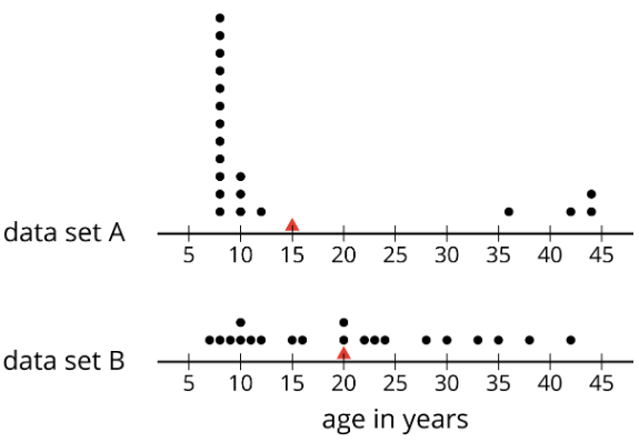
What do you notice and what do you wonder about the distributions in the two dot plots?
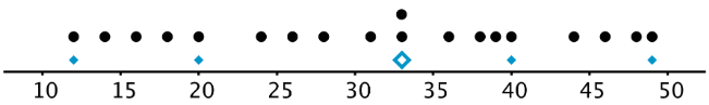
Exercise \(\PageIndex{2}\): The Five-Number Summary
Here are the ages of the people at one party, listed from least to greatest.
\(7\qquad 8\qquad 9\qquad 10\qquad 10\qquad 11\qquad 12\qquad 15\qquad 16\qquad 20\qquad 20\qquad 22\qquad 23\qquad 24\qquad 28\qquad 30\qquad 33\qquad 35\qquad 38\qquad 42\)
-
- Find the median of the data set and label it “50th percentile.” This splits the data into an upper half and a lower half.
- Find the middle value of the lower half of the data, without including the median. Label this value “25th percentile.”
- Find the middle value of the upper half of the data, without including the median. Label this value “75th percentile.”
- You have split the data set into four pieces. Each of the three values that split the data is called a quartile.
- We call the 25th percentile the first quartile. Write “Q1” next to that number.
- The median can be called the second quartile. Write “Q2” next to that number.
- We call the 75th percentile the third quartile. Write “Q3” next to that number.
- Label the lowest value in the set “minimum” and the greatest value “maximum.”
- The values you have identified make up the five-number summary for the data set. Record them here.
minimum: _____ Q1: _____ Q2: _____ Q3: _____ maximum: _____ - The median of this data set is 20. This tells us that half of the people at the party were 20 years old or younger, and the other half were 20 or older. What do each of these other values tell us about the ages of the people at the party?
- the third quartile
- the minimum
- the maximum
Are you ready for more?
There was another party where 21 people attended. Here is the five-number summary of their ages.
minimum: 5 Q1: 6 Q2: 27 Q3: 32 maximum: 60
- Do you think this party had more children or fewer children than the earlier one? Explain your reasoning.
- Were there more children or adults at this party? Explain your reasoning.
Exercise \(\PageIndex{3}\): Range and Interquartile Range
- Here is a dot plot that shows the lengths of Elena’s bus rides to school, over 12 days.
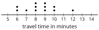
Write the five-number summary for this data set. Show your reasoning.
- The range is one way to describe the spread of values in a data set. It is the difference between the maximum and minimum. What is the range of Elena’s travel times?
- Another way to describe the spread of values in a data set is the interquartile range (IQR). It is the difference between the upper quartile and the lower quartile.
- What is the interquartile range (IQR) of Elena’s travel times?
- What fraction of the data values are between the lower and upper quartiles?
- Here are two more dot plots.
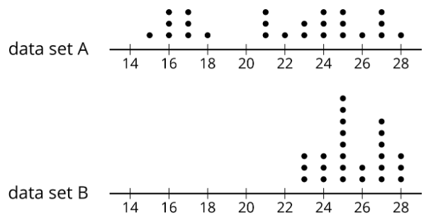
Without doing any calculations, predict:
- Which data set has the smaller range?
- Which data set has the smaller IQR?
- Check your predictions by calculating the range and IQR for the data in each dot plot.
Summary
Earlier we learned that the mean is a measure of the center of a distribution and the MAD is a measure of the variability (or spread) that goes with the mean. There is also a measure of spread that goes with the median. It is called the interquartile range (IQR).
Finding the IQR involves splitting a data set into fourths. Each of the three values that splits the data into fourths is called a quartile.
- The median, or second quartile (Q2), splits the data into two halves.
- The first quartile (Q1) is the middle value of the lower half of the data.
- The third quartile (Q3) is the middle value of the upper half of the data.
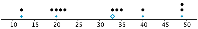
For example, here is a data set with 11 values.
| \(12\) | \(19\) | \(20\) | \(21\) | \(22\) | \(33\) | \(34\) | \(35\) | \(40\) | \(40\) | \(49\) |
| Q1 | Q2 | Q3 |
- The median is 33.
- The first quartile is 20. It is the median of the numbers less than 33.
- The third quartile 40. It is the median of the numbers greater than 33.
The difference between the maximum and minimum values of a data set is the range. The difference between Q3 and Q1 is the interquartile range (IQR). Because the distance between Q1 and Q3 includes the middle two-fourths of the distribution, the values between those two quartiles are sometimes called the middle half of the data.
The bigger the IQR, the more spread out the middle half of the data values are. The smaller the IQR, the closer together the middle half of the data values are. This is why we can use the IQR as a measure of spread.
A five-number summary can be used to summarize a distribution. It includes the minimum, first quartile, median, third quartile, and maximum of the data set. For the previous example, the five-number summary is 12, 20, 33, 40, and 49. These numbers are marked with diamonds on the dot plot.
Different data sets can have the same five-number summary. For instance, here is another data set with the same minimum, maximum, and quartiles as the previous example.
Glossary Entries
Definition: Interquartile Range (IQR)
The interquartile range is one way to measure how spread out a data set is. We sometimes call this the IQR. To find the interquartile range we subtract the first quartile from the third quartile.
For example, the IQR of this data set is 20 because \(50-30=20\).
| \(22\) | \(29\) | \(30\) | \(31\) | \(32\) | \(43\) | \(44\) | \(45\) | \(50\) | \(50\) | \(59\) |
| Q1 | Q2 | Q3 |
Definition: Median
The median is one way to measure the center of a data set. It is the middle number when the data set is listed in order.
For the data set 7, 9, 12, 13, 14, the median is 12.
For the data set 3, 5, 6, 8, 11, 12, there are two numbers in the middle. The median is the average of these two numbers. \(6+8=14\) and \(14\div 2=7\).
Definition: Quartile
Quartiles are the numbers that divide a data set into four sections that each have the same number of values.
For example, in this data set the first quartile is 30. The second quartile is the same thing as the median, which is 43. The third quartile is 50.
| \(22\) | \(29\) | \(30\) | \(31\) | \(32\) | \(43\) | \(44\) | \(45\) | \(50\) | \(50\) | \(59\) |
| Q1 | Q2 | Q3 |
Definition: Range
The range is the distance between the smallest and largest values in a data set. For example, for the data set 3, 5, 6, 8, 11, 12, the range is 9, because \(12-3=9\).
Practice
Exercise \(\PageIndex{4}\)
Suppose that there are 20 numbers in a data set and that they are all different.
- How many of the values in this data set are between the first quartile and the third quartile?
- How many of the values in this data set are between the first quartile and the median?
Exercise \(\PageIndex{5}\)
In a word game, 1 letter is worth 1 point. This dot plot shows the scores for 20 common words.
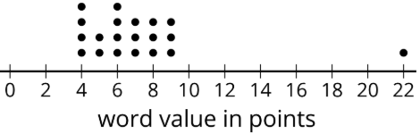
- What is the median score?
- What is the first quartile (Q1)?
- What is the third quartile (Q3)?
- What is the interquartile range (IQR)?
Exercise \(\PageIndex{6}\)
Mai and Priya each played 10 games of bowling and recorded the scores. Mai’s median score was 120, and her IQR was 5. Priya’s median score was 118, and her IQR was 15. Whose scores probably had less variability? Explain how you know.
Exercise \(\PageIndex{7}\)
Here are five dot plots that show the amounts of time that ten sixth-grade students in five countries took to get to school. Match each dot plot with the appropriate median and IQR.
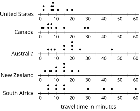
- Median: 17.5, IQR: 11
- Median: 15, IQR: 30
- Median: 8, IQR: 4
- Median: 7, IQR: 10
- Median: 12.5, IQR: 8
Exercise \(\PageIndex{8}\)
Draw and label an appropriate pair of axes and plot the points. \(A=(10,50), B=(30,25), C=(0,30), D=(20,35)\)
(From Unit 7.3.2)
Exercise \(\PageIndex{9}\)
There are 20 pennies in a jar. If 16% of the coins in the jar are pennies, how many coins are there in the jar?
(From Unit 6.2.2)