
4.6: Review Exercises
- Page ID
- 92990

\( \newcommand{\vecs}[1]{\overset { \scriptstyle \rightharpoonup} {\mathbf{#1}} } \)
\( \newcommand{\vecd}[1]{\overset{-\!-\!\rightharpoonup}{\vphantom{a}\smash {#1}}} \)
\( \newcommand{\id}{\mathrm{id}}\) \( \newcommand{\Span}{\mathrm{span}}\)
( \newcommand{\kernel}{\mathrm{null}\,}\) \( \newcommand{\range}{\mathrm{range}\,}\)
\( \newcommand{\RealPart}{\mathrm{Re}}\) \( \newcommand{\ImaginaryPart}{\mathrm{Im}}\)
\( \newcommand{\Argument}{\mathrm{Arg}}\) \( \newcommand{\norm}[1]{\| #1 \|}\)
\( \newcommand{\inner}[2]{\langle #1, #2 \rangle}\)
\( \newcommand{\Span}{\mathrm{span}}\)
\( \newcommand{\id}{\mathrm{id}}\)
\( \newcommand{\Span}{\mathrm{span}}\)
\( \newcommand{\kernel}{\mathrm{null}\,}\)
\( \newcommand{\range}{\mathrm{range}\,}\)
\( \newcommand{\RealPart}{\mathrm{Re}}\)
\( \newcommand{\ImaginaryPart}{\mathrm{Im}}\)
\( \newcommand{\Argument}{\mathrm{Arg}}\)
\( \newcommand{\norm}[1]{\| #1 \|}\)
\( \newcommand{\inner}[2]{\langle #1, #2 \rangle}\)
\( \newcommand{\Span}{\mathrm{span}}\) \( \newcommand{\AA}{\unicode[.8,0]{x212B}}\)
\( \newcommand{\vectorA}[1]{\vec{#1}} % arrow\)
\( \newcommand{\vectorAt}[1]{\vec{\text{#1}}} % arrow\)
\( \newcommand{\vectorB}[1]{\overset { \scriptstyle \rightharpoonup} {\mathbf{#1}} } \)
\( \newcommand{\vectorC}[1]{\textbf{#1}} \)
\( \newcommand{\vectorD}[1]{\overrightarrow{#1}} \)
\( \newcommand{\vectorDt}[1]{\overrightarrow{\text{#1}}} \)
\( \newcommand{\vectE}[1]{\overset{-\!-\!\rightharpoonup}{\vphantom{a}\smash{\mathbf {#1}}}} \)
\( \newcommand{\vecs}[1]{\overset { \scriptstyle \rightharpoonup} {\mathbf{#1}} } \)
\( \newcommand{\vecd}[1]{\overset{-\!-\!\rightharpoonup}{\vphantom{a}\smash {#1}}} \)
- For each scenario, state the population and the sample.
- A person collects the gas prices at 25 gas stations in Phoenix, AZ.
- A study was conducted of schools across the U.S. about whether they require school uniforms. Two hundred ninety-six schools gave their response to the question, “Does your school require school uniforms?”
- In each scenario, determine whether the data would best be described as quantitative data or qualitative data:
- heights of trees in a forest, in feet
- calories in various types of candy bars sold at a convenience store
- dominant hand of each of your classmates
- favorite sport
- A study to determine the opinion of Maryland voters about the use of marijuana for medical purposes is being conducted. Identify the sampling method described as simple random sample, stratified sample, cluster sample, systematic sample, convenience sample or voluntary response sample.
- The researchers attend a festival in a town in Maryland and ask all the voters they can what their opinions are.
- The researchers divide Maryland voters into groups based on the person’s race, and then take random samples from each group.
- The researchers get a list of all Maryland voters and call the 50th person on the list. Then they call every 1,000th person after the 50th person.
- The researchers call every voter in each of 10 Maryland zip codes that were randomly chosen.
- The researchers run an advertisement on Maryland television stations directing voters to give their opinion on a website.
- The researchers call only those with voter ID numbers generated randomly by a computer.
 The circle graph shows the results of a survey that asked 60 football fans their favorite snack while watching the game.
- How many of the fans chose wings?
- How many more fans chose nachos than chose popcorn?
- What is the measure of the central angle in the graph for the portion of the fans who chose chips? Round to the nearest whole degree as necessary.
- Tiffany has a game spinner with several colors. She spun the spinner several times and recorded the color she got after each spin. The data are shown.
\(\begin{array}{|c|c|c|c|c|} \hline \text{red} & \text{red} & \text{yellow} & \text{green} & \text{red} \\ \hline \text{blue} & \text{yellow} & \text{yellow} & \text{red} & \text{blue} \\ \hline \text{yellow} & \text{yellow} & \text{red} & \text{yellow} & \text{red} \\ \hline \text{green} & \text{yellow} & \text{yellow} & \text{red} & \text{yellow} \\ \hline \text{red} & \text{red} & \text{red} & \text{yellow} & \text{green} \\ \hline \end{array}\)
- Make a frequency table to summarize the colors that Tiffany spun on the spinner. Include a column for frequency and relative frequency in the table.
- Use the frequency table to draw a bar graph of the data.
- Use the frequency table to find the size of the angle you should draw for each color in a pie chart. Round to the nearest whole degree.

- Give the mode(s) of this data set.
- A group of adults were asked how many children they have in their families. The bar graph shows the responses.
- How many adults where questioned?
- What percent of the adults questioned had 0 children?
- What is the mode of this data set?
- A group of adults where asked how many cars they had in their household. The data are shown.
\(\begin{array}{|l|l|l|l|l|l|l|l|l|l|l|l|}
\hline 1 & 4 & 2 & 2 & 0 & 2 & 3 & 3 & 1 & 4 & 2 & 2 \\
\hline 1 & 2 & 1 & 3 & 2 & 2 & 1 & 2 & 1 & 1 & 1 & 2 \\
\hline
\end{array}\)
- Construct an ungrouped frequency table for data.
- Based on the frequency table, draw a histogram of the data.
- The SAT test scores for Michigan students in reading for several years are given in the table below (College Board: Michigan, 2012).
| 496 | 500 | 502 | 504 | 505 | 507 | 509 |
| 497 | 500 | 503 | 504 | 505 | 507 | 512 |
| 499 | 500 | 503 | 505 | 505 | 508 | 515 |
| 499 | 500 | 504 | 505 | 506 | 508 | 518 |
| 499 | 501 | 504 | 505 | 507 | 509 | 522 |
| 500 | 502 | 504 | 505 | 507 | 509 | 525 |
- Create a grouped frequency table using 495-499 as the first class. Show frequencies, relative frequencies, and class marks.
- Based on the frequency table, create a histogram of the data.
- The frequency table shows the ages of the passengers on a train. Use the frequency table to answer the questions.
\(\begin{array}{|c|c|}
\hline \text{Ages of Passengers} & \text{Frequency} \\
\hline 0-14 & 6 \\ \hline 15-29 & 11 \\ \hline 30-44 & 15 \\ \hline 45-59 & 8 \\ \hline 60-74 & 2 \\ \hline 75-89 & 1 \\ \hline \end{array}\)
- How many passengers were on the train?

- What class width was used to group the data?
- What is the modal class?
- What is the class mark of the last class?
- If an additional class were added to the end of the table, what would be its lower and upper limits?

- Monthly rainfall (in millimeters) for Beaver Creek, Oregon, was collected over several months. Use the histogram of the data to answer the questions.
- What class width was used to create the histogram?
- What is the modal class?
- In how many of these months was the total rainfall 150 mm or more?
- What is the relative frequency of the first class (0-49 mm)?
- A group of diners were asked how much they typically pay for lunch. Their responses were
$7 $10 $9 $8 $7 $6 $7 $5 $13
Find each of these descriptive measures (by hand) to the nearest cent.
- mean
- median
- 5-number summary
- range
- standard deviation
- midrange
- A math student took five tests and has a mean of 85 points. He took another test and scored 100 points. What is his mean score now?
- The frequency table shows the number of home runs for the past ten baseball games of the season. Find the mean and median number of home runs.
\(\begin{array}{|c|c|}
\hline \text{number of home runs} & \text{frequency} \\
\hline 4 & 1 \\ \hline 5 & 2 \\ \hline 6 & 0 \\ \hline 7 & 2 \\ \hline 8 & 4 \\ \hline 9 & 1 \\ \hline \end{array}\)
- The city gas mileage (in mpg) for small four-wheel-drive pick-up trucks are given in the table below.
| 17 | 18 | 17 | 14 | 18 | 16 |
| 14 | 14 | 15 | 17 | 18 | 18 |
| 14 | 16 | 16 | 14 | 14 | 16 |
Use a calculator (where possible) to find each statistic. Round to the nearest hundredth (two decimal places) where necessary.
- mean
- median
- standard deviation
- five-number summary
- IQR
- range
- midrange
- The following statistics represent scores on an exam.
Mode = 78 points Q1 = 67 points Mean = 82 points Q3 = 84 points Median = 80 points 90th percentile = 96 points
- What was the most common grade?
- Half of the students have grades higher than what score?
- About what percent of students have grades higher than 84 points?
- About what percent of students scored higher than 67 points?
- If there were 30 students who took the exam, how many scored higher than 96 points?
-
Professor Smith teaches two science classes, one in the morning and the other in the afternoon. After grading the unit test for the two classes, she calculated that the morning class scored a mean of 75 points and a standard deviation of 5.7 points. The afternoon class scored a mean of 75 points and a standard deviation of 12.5 points. Which of these conclusions is correct? Choose one:
- There were more students who took the test in the afternoon class than in the morning class.
- Typically, afternoon students did better than morning students on the test.
- There is more variation in the test scores in the afternoon class than in the morning class.
- The test scores in the afternoon class are more consistent to each other than those in the morning class.
- The box plot represents the number of guests each day at an island resort during the last tourist season. Use it to answer the questions.

- What is the median number of guests each day at this resort?
- On what percent of the days did the resort have 45 or more guests?
- On what percent of the days did the resort have 55 or fewer guests?
- What is the IQR for the number of guests at this resort?
- If this box-and-whisker plot shows data for the past 136 days, on how many of the days did the resort have 30 or fewer guests?
- The box plot below compares salaries of actuaries and CPAs.
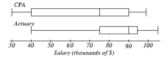
- What salary is at the 75th percentile for CPA's?
- Which profession has the higher median?
- Which profession has salaries that are more varied?
- Kendra makes the median salary for an actuary. Kelsey makes the first quartile salary for a CPA. Who makes more money? How much more?
- What percent of actuaries makes more than the median salary of a CPA?
- The mean systolic blood pressure of people in the U.S. is 124 with standard deviation of 16. Assume that systolic blood pressure follows a normal distribution. Draw a normal curve, label it, and use the Empirical Rule to answer the questions.
- What percent of the people in the U.S. have systolic blood pressure between 92 and 156?
- What percent of the people in the U.S. have systolic blood pressure between 108 and 124?
- What percent of the people in the U.S. have systolic blood pressure below 108?
- What percent of the people in the U.S. have systolic blood pressure above 156?
- The mean height of men in the U.S. is 69.1 inches with a standard deviation of 2.9 inches. Assume that height follows a normal distribution. Use a TI calculator to answer the questions. Round parts a-c to the nearest whole percent. Round parts d and e to the nearest tenth of an inch.
- What percent of men in the U.S. are shorter than 68 inches?
- What percent of men in the U.S. are taller than 75 inches?
- What percent of men in the U.S. are between 66 and 72 inches tall?
- How tall are the shortest 20% of U.S. men in the U.S.?
- How tall is a man if he is one of the tallest 5% men in the U.S?