
42.6: Describing Distributions on Histograms


- Last updated
- Mar 27, 2022
- Save as PDF
( \newcommand{\kernel}{\mathrm{null}\,}\)
Lesson
Let's describe distributions displayed in histograms.
Exercise 42.6.1: Which One Doesn't Belong: Histograms
Which histogram does not belong? Be prepared to explain your reasoning.
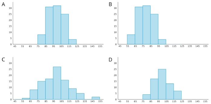
Exercise 42.6.2: Sorting Histograms
- Your teacher will give your group a set of histogram cards. Sort them into two piles—one for histograms that are approximately symmetrical, and another for those that are not.
- Discuss your sorting decisions with another group. Do both groups agree which cards should go in each pile? If not, discuss the reasons behind the differences and see if you can reach agreement. Record your final decisions.
- Histograms that are approximately symmetrical:
- Histograms that are not approximately symmetrical:
- Histograms are also described by how many major peaks they have. Histogram A is an example of a distribution with a single peak that is not symmetrical.
Which other histograms have this feature? - Some histograms have a gap, a space between two bars where there are no data points. For example, if some students in a class have 7 or more siblings, but the rest of the students have 0, 1, or 2 siblings, the histogram for this data set would show gaps between the bars because no students have 3, 4, 5, or 6 siblings.
Which histograms do you think show one or more gaps? - Sometimes there are a few data points in a data set that are far from the center. Histogram A is an example of a distribution with this feature.
Which other histograms have this feature?
Exercise 42.6.3: Getting to School
Your teacher will provide you with some data that your class collected the other day.
- Use the data to draw a histogram that shows your class’s travel times.
- Describe the distribution of travel times. Comment on the center and spread of the data, as well as the shape and features.
- Use the data on methods of travel to draw a bar graph. Include labels for the horizontal axis.
- Describe what you learned about your class’s methods of transportation to school. Comment on any patterns you noticed.
- Compare the histogram and the bar graph that you drew. How are they the same? How are they different?
Are you ready for more?
Use one of these suggestions (or make up your own). Research data to create a histogram. Then, describe the distribution.
- Heights of 30 athletes from multiple sports
- Heights of 30 athletes from the same sport
- High temperatures for each day of the last month in a city you would like to visit
- Prices for all the menu items at a local restaurant
Summary
We can describe the shape and features of the distribution shown on a histogram. Here are two distributions with very different shapes and features.
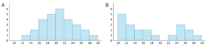
- Histogram A is very symmetrical and has a peak near 21. Histogram B is not symmetrical and has two peaks, one near 11 and one near 25.
- Histogram B has two clusters. A cluster forms when many data points are near a particular value (or a neighborhood of values) on a number line.
- Histogram B also has a gap between 20 and 22. A gap shows a location with no data values.
Here is a bar graph showing the breeds of 30 dogs and a histogram for their weights.
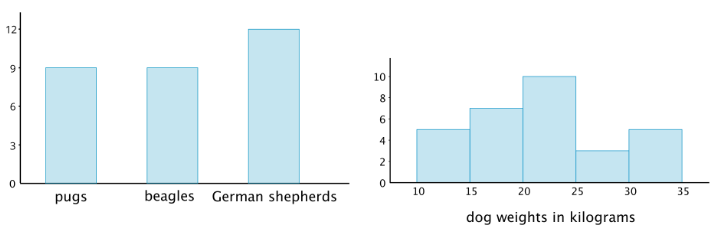
Bar graphs and histograms may seem alike, but they are very different.
- Bar graphs represent categorical data. Histograms represent numerical data.
- Bar graphs have spaces between the bars. Histograms show a space between bars only when no data values fall between the bars.
- Bars in a bar graph can be in any order. Histograms must be in numerical order.
- In a bar graph, the number of bars depends on the number of categories. In a histogram, we choose how many bars to use.
Glossary Entries
Definition: Center
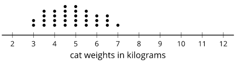
The center of a set of numerical data is a value in the middle of the distribution. It represents a typical value for the data set.
For example, the center of this distribution of cat weights is between 4.5 and 5 kilograms.
Definition: Distribution
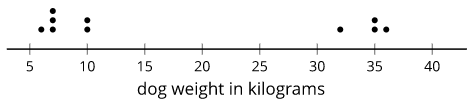
The distribution tells how many times each value occurs in a data set. For example, in the data set blue, blue, green, blue, orange, the distribution is 3 blues, 1 green, and 1 orange.
Here is a dot plot that shows the distribution for the data set 6, 10, 7, 35, 7, 36, 32, 10, 7, 35.
Definition: Frequency
The frequency of a data value is how many times it occurs in the data set.
For example, there were 20 dogs in a park. The table shows the frequency of each color.
| color | frequency |
|---|---|
| white | 4 |
| brown | 7 |
| black | 3 |
| multi-color | 6 |
Definition: Histogram
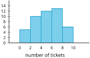
A histogram is a way to represent data on a number line. Data values are grouped by ranges. The height of the bar shows how many data values are in that group.
This histogram shows there were 10 people who earned 2 or 3 tickets. We can't tell how many of them earned 2 tickets or how many earned 3. Each bar includes the left-end value but not the right-end value. (There were 5 people who earned 0 or 1 tickets and 13 people who earned 6 or 7 tickets.)
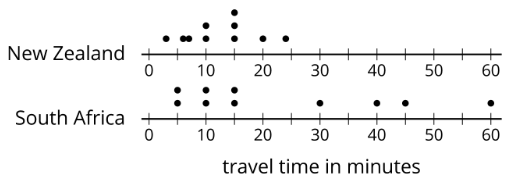
Definition: Spread
The spread of a set of numerical data tells how far apart the values are.
For example, the dot plots show that the travel times for students in South Africa are more spread out than for New Zealand.
Practice
Exercise 42.6.4
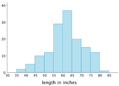
The histogram summarizes the data on the body lengths of 143 wild bears. Describe the distribution of body lengths. Be sure to comment on shape, center, and spread.
Exercise 42.6.5
Which data set is more likely to produce a histogram with a symmetric distribution? Explain your reasoning.
- Data on the number of seconds on a track of music in a pop album.
- Data on the number of seconds spent talking on the phone yesterday by everyone in the school.
Exercise 42.6.6
Evaluate the expression 4x3 for each value of x.
- 1
- 2
- 12
(From Unit 6.3.4)
Exercise 42.6.7
Decide if each data set might produce one or more gaps when represented by a histogram. For each data set that you think might produce gaps, briefly describe or give an example of how the values in the data set might do so.
- The ages of students in a sixth-grade class.
- The ages of people in an elementary school.
- The ages of people eating in a family restaurant.
- The ages of people who watch football.
- The ages of runners in a marathon.
Exercise 42.6.8
Jada drank 12 ounces of water from her bottle. This is 60% of the water the bottle holds.
- Write an equation to represent this situation. Explain the meaning of any variables you use.
- How much water does the bottle hold?
(From Unit 6.2.2)