
42.2: Dot Plots


- Last updated
- Mar 27, 2022
- Save as PDF
( \newcommand{\kernel}{\mathrm{null}\,}\)
Lesson
Let's investigate what dot plots and bar graphs can tell us.
Exercise 42.2.1: Pizza Toppings (Part 1)
Fifteen customers in a pizza shop were asked, “How many toppings did you add to your cheese pizza?” Here are their responses:
121301120300122
- Could you use a dot plot to represent the data? Explain your reasoning.
- Complete the table.
| number of toppings | frequency (number) |
|---|---|
| 0 | |
| 1 | |
| 2 | |
| 3 |
Exercise 42.2.2: Pizza Toppings (Part 2)
- Use the tables from the warm-up to display the number of toppings as a dot plot. Label your drawing clearly.

- Use your dot plot to study the distribution for number of toppings. What do you notice about the number of toppings that this group of customers ordered? Write 2–3 sentences summarizing your observations.
Are you ready for more?
Think of a statistical question that can be answered with the data about the number of toppings ordered, as displayed on the dot plot. Then answer this question.
Exercise 42.2.3: Homework Time
Twenty-five sixth-grade students answered the question: “How many hours do you generally spend on homework each week?”
This dot plot shows the number of hours per week that these 25 students reported spending on homework.

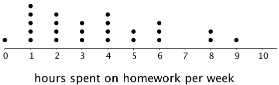
Use the dot plot to answer the following questions. For each, show or explain your reasoning.
- What percentage of the students reported spending 1 hour on homework each week?
- What percentage of the students reported spending 4 or fewer hours on homework each week?
- Would 6 hours per week be a good description of the number of hours this group of students spends on homework per week? What about 1 hour per week? Explain your reasoning.
- What value do you think would be a good description of the homework time of the students in this group? Explain your reasoning.
- Someone said, “In general, these students spend roughly the same number of hours doing homework.” Do you agree? Explain your reasoning.
Summary
We often collect and analyze data because we are interested in learning what is “typical,” or what is common and can be expected in a group.
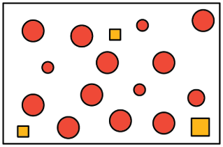
Sometimes it is easy to tell what a typical member of the group is. For example, we can say that a typical shape in this set is a large circle.
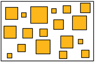
Just looking at the members of a group doesn’t always tell us what is typical, however. For example, if we are interested in the side length typical of squares in this set, it isn’t easy to do so just by studying the set visually.
In a situation like this, it is helpful to gather the side lengths of the squares in the set and look at their distribution, as shown in this dot plot.
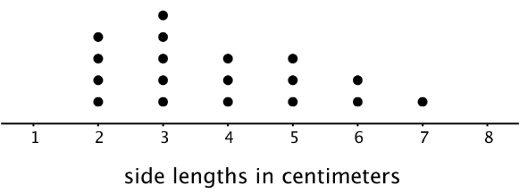
We can see that many of the data points are between 2 and 4, so we could say that side lengths between 2 and 4 centimeters or close to these lengths are typical of squares in this set.
Glossary Entries
Definition: Distribution
The distribution tells how many times each value occurs in a data set. For example, in the data set blue, blue, green, blue, orange, the distribution is 3 blues, 1 green, and 1 orange.
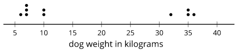
Here is a dot plot that shows the distribution for the data set 6, 10, 7, 35, 7, 36, 32, 10, 7, 35.
Definition: Frequency
The frequency of a data value is how many times it occurs in the data set.
For example, there were 20 dogs in a park. The table shows the frequency of each color.
| color | frequency |
|---|---|
| white | 4 |
| brown | 7 |
| black | 3 |
| multi-color | 6 |
Practice
Exercise 42.2.4
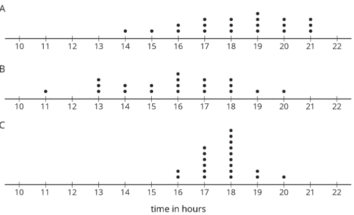
Clare recorded the amounts of time spent doing homework, in hours per week, by students in sixth, eighth, and tenth grades. She made a dot plot of the data for each grade and provided the following summary.
- Students in sixth grade tend to spend less time on homework than students in eighth and tenth grades.
- The homework times for the tenth-grade students are more alike than the homework times for the eighth-grade students.
Use Clare's summary to match each dot plot to the correct grade (sixth, eighth, or tenth).
Exercise 42.2.5
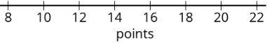
Mai played 10 basketball games. She recorded the number of points she scored and made a dot plot. Mai said that she scored between 8 and 14 points in most of the 10 games, but one game was exceptional. During that game she scored more than double her typical score of 9 points. Use the number line to make a dot plot that fits the description Mai gave.
Exercise 42.2.6
A movie theater is showing three different movies. The dot plots represent the ages of the people who were at the Saturday afternoon showing of each of these movies.
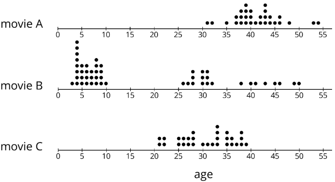
- One of these movies was an animated movie rated G for general audiences. Do you think it was movie A, B, or C? Explain your reasoning.
- Which movie has a dot plot with ages that that center at about 30 years?
- What is a typical age for the people who were at Movie A?
Exercise 42.2.7
Find the value of each expression.
- 3.727+1.384
- 3.727−1.384
- 5.01⋅4.8
- 5.01÷4.8
(From Unit 5.4.5)