
42.4: Interpreting Histograms


( \newcommand{\kernel}{\mathrm{null}\,}\)
Lesson
Let's explore how histograms represent data sets.
Exercise 42.4.1: Dog Show (Part 1)
Here is a dot plot showing the weights, in pounds, of 40 dogs at a dog show.
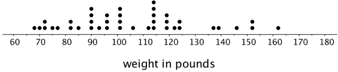
- Write two statistical questions that can be answered using the dot plot.
- What would you consider a typical weight for a dog at this dog show? Explain your reasoning.
Exercise 42.4.2: Dog Show (Part 2)
Here is a histogram that shows some dog weights in pounds.
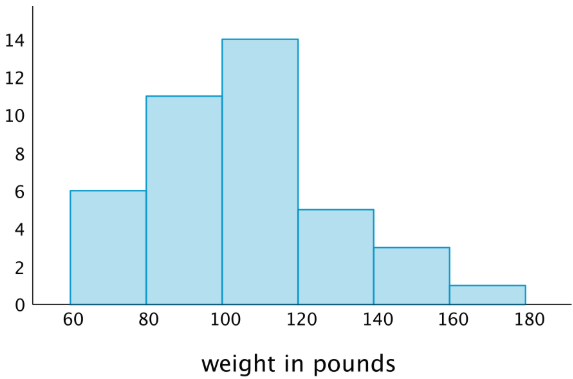
Each bar includes the left-end value but not the right-end value. For example, the first bar includes dogs that weigh 60 pounds and 68 pounds but not 80 pounds.
- Use the histogram to answer the following questions.
- How many dogs weigh at least 100 pounds?
- How many dogs weigh exactly 70 pounds?
- How many dogs weigh at least 120 and less than 160 pounds?
- How much does the heaviest dog at the show weigh?
- What would you consider a typical weight for a dog at this dog show? Explain your reasoning.
- Discuss with a partner:
- If you used the dot plot to answer the same five questions you just answered, how would your answers be different?
- How are the histogram and the dot plot alike? How are they different?
Exercise 42.4.3: Population of States
Every ten years, the United States conducts a census, which is an effort to count the entire population. The dot plot shows the population data from the 2010 census for each of the fifty states and the District of Columbia (DC).
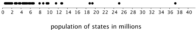
- Here are some statistical questions about the population of the fifty states and DC. How difficult would it be to answer the questions using the dot plot?
In the middle column, rate each question with an E (easy to answer), H (hard to answer), or I (impossible to answer). Be prepared to explain your reasoning.statistical question using the dot plot using the histogram a. How many states have populations greater than 15 million? b. Which states have populations greater than 15 million? c. How many states have populations less than 5 million? d. What is a typical state population? e. Are there more states with fewer than 5 million people or more states with between 5 and 10 million people? f. How would you describe the distribution of state populations? Table 42.4.1 - Here are the population data for all states and the District of Columbia from the 2010 census. Use the information to complete the table.
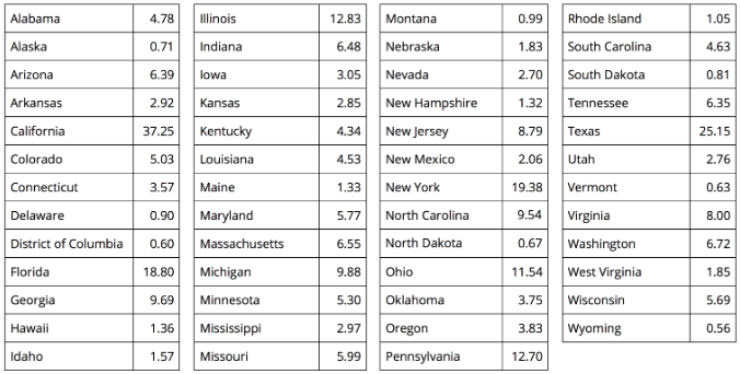
| population (millions) | frequency |
|---|---|
| 0-5 | |
| 5-10 | |
| 10-15 | |
| 15-20 | |
| 20-25 | |
| 25-30 | |
| 30-35 | |
| 35-40 |
- Use the grid and the information in your table to create a histogram.
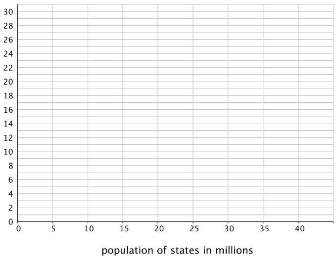
- Return to the statistical questions at the beginning of the activity. Which ones are now easier to answer?
In the last column of the table, rate each question with an E (easy), H (hard), and I (impossible) based on how difficult it is to answer them. Be prepared to explain your reasoning.
Are you ready for more?
Think of two more statistical questions that can be answered using the data about populations of states. Then, decide whether each question can be answered using the dot plot, the histogram, or both.
Summary
In addition to using dot plots, we can also represent distributions of numerical data using histograms.
Here is a dot plot that shows the weights, in kilograms, of 30 dogs, followed by a histogram that shows the same distribution.
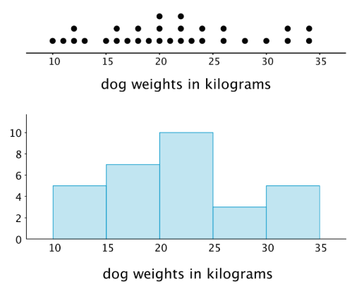
In a histogram, data values are placed in groups or “bins” of a certain size, and each group is represented with a bar. The height of the bar tells us the frequency for that group.
For example, the height of the tallest bar is 10, and the bar represents weights from 20 to less than 25 kilograms, so there are 10 dogs whose weights fall in that group. Similarly, there are 3 dogs that weigh anywhere from 25 to less than 30 kilograms.
Notice that the histogram and the dot plot have a similar shape. The dot plot has the advantage of showing all of the data values, but the histogram is easier to draw and to interpret when there are a lot of values or when the values are all different.
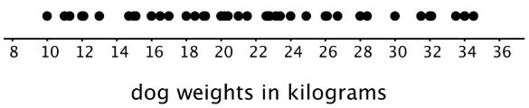
Here is a dot plot showing the weight distribution of 40 dogs. The weights were measured to the nearest 0.1 kilogram instead of the nearest kilogram.
Here is a histogram showing the same distribution.
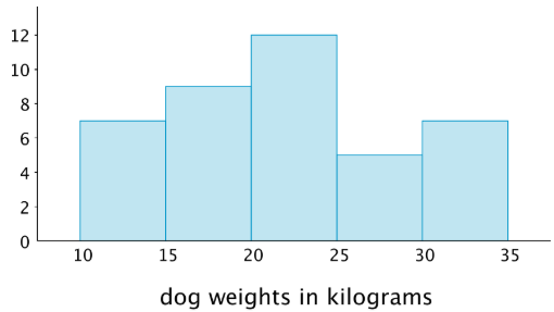
In this case, it is difficult to make sense of the distribution from the dot plot because the dots are so close together and all in one line. The histogram of the same data set does a much better job showing the distribution of weights, even though we can’t see the individual data values.
Glossary Entries
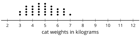
Definition: Center
The center of a set of numerical data is a value in the middle of the distribution. It represents a typical value for the data set.
For example, the center of this distribution of cat weights is between 4.5 and 5 kilograms.
Definition: Distribution
The distribution tells how many times each value occurs in a data set. For example, in the data set blue, blue, green, blue, orange, the distribution is 3 blues, 1 green, and 1 orange.
Here is a dot plot that shows the distribution for the data set 6, 10, 7, 35, 7, 36, 32, 10, 7, 35.
Definition: Frequency
The frequency of a data value is how many times it occurs in the data set.
For example, there were 20 dogs in a park. The table shows the frequency of each color.
| color | frequency |
|---|---|
| white | 4 |
| brown | 7 |
| black | 3 |
| multi-color | 6 |
Definition: Histogram
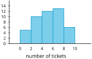
A histogram is a way to represent data on a number line. Data values are grouped by ranges. The height of the bar shows how many data values are in that group.
This histogram shows there were 10 people who earned 2 or 3 tickets. We can't tell how many of them earned 2 tickets or how many earned 3. Each bar includes the left-end value but not the right-end value. (There were 5 people who earned 0 or 1 tickets and 13 people who earned 6 or 7 tickets.)
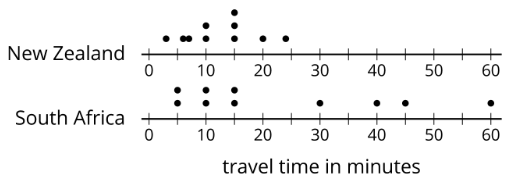
Definition: Spread
The spread of a set of numerical data tells how far apart the values are.
For example, the dot plots show that the travel times for students in South Africa are more spread out than for New Zealand.
Practice
Exercise 42.4.4
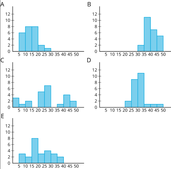
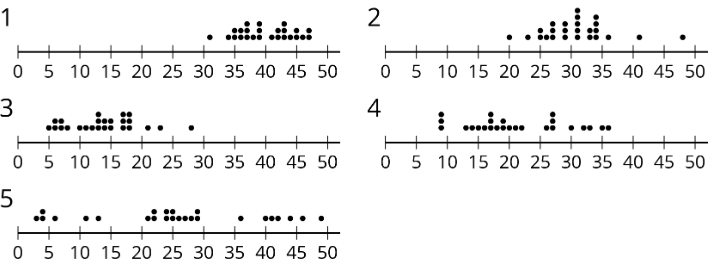
Match histograms A through E to dot plots 1 through 5 so that each match represents the same data set.
Exercise 42.4.5
(−2,3) is one vertex of a square on a coordinate plane. Name three points that could be the other vertices.
(From Unit 7.3.2)
Exercise 42.4.6
Here is a histogram that summarizes the lengths, in feet, of a group of adult female sharks. Select all the statements that are true, according to the histogram.
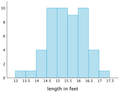
- A total of 9 sharks were measured.
- A total of 50 sharks were measured.
- The longest shark that was measured was 10 feet long.
- Most of the sharks that were measured were over 16 feet long.
- Two of the sharks that were measured were less than 14 feet long.
Exercise 42.4.7
This table shows the times, in minutes, it took 40 sixth-grade students to run 1 mile.
| time (minutes) | frequency |
|---|---|
| 4 to less than 6 | 1 |
| 6 to less than 8 | 5 |
| 8 to less than 10 | 13 |
| 10 to less than 12 | 12 |
| 12 to less than 14 | 7 |
| 14 to less than 16 | 2 |
Draw a histogram for the information in the table.