
42.5: Using Histograms to Answer Statistical Questions


- Last updated
- Mar 27, 2022
- Save as PDF
( \newcommand{\kernel}{\mathrm{null}\,}\)
Lesson
Let's draw histograms and use them to answer questions.
Exercise 42.5.1: Which One Doesn't Belong: Questions
Here are four questions about the population of Alaska. Which question does not belong? Be prepared to explain your reasoning.
- In general, at what age do Alaska residents retire?
- At what age can Alaskans vote?
- What is the age difference between the youngest and oldest Alaska residents with a full-time job?
- Which age group is the largest part of the population: 18 years or younger, 19–25 years, 25–34 years, 35–44 years, 45–54 years, 55–64 years, or 65 years or older?
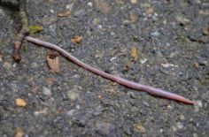
Exercise 42.5.2: Measuring Earthworms
An earthworm farmer set up several containers of a certain species of earthworms so that he could learn about their lengths. The lengths of the earthworms provide information about their ages. The farmer measured the lengths of 25 earthworms in one of the containers. Each length was measured in millimeters.
- Using a ruler, draw a line segment for each length:
- 20 millimeters
- 40 millimeters
- 60 millimeters
- 80 millimeters
- 100 millimeters
- Here are the lengths, in millimeters, of the 25 earthworms.
6111819202323252526272728293233414248525459607793
Complete the table for the lengths of the 25 earthworms.
| length | frequency |
|---|---|
| 0 millimeters to less than 20 millimeters | |
| 20 millimeters to less than 40 millimeters | |
| 40 millimeters to less than 60 millimeters | |
| 60 millimeters to less than 80 millimeters | |
| 80 millimeters to less than 100 millimeters |
- Use the grid and the information in the table to draw a histogram for the worm length data. Be sure to label the axes of your histogram.
- Based on the histogram, what is a typical length for these 25 earthworms? Explain how you know.
- Write 1–2 sentences to describe the spread of the data. Do most of the worms have a length that is close to your estimate of a typical length, or are they very different in length?
Are you ready for more?
Here is another histogram for the earthworm measurement data. In this histogram, the measurements are in different groupings.
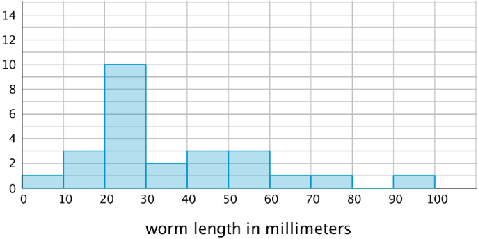
- Based on this histogram, what is your estimate of a typical length for the 25 earthworms?
- Compare this histogram with the one you drew. How are the distributions of data summarized in the two histograms the same? How are they different?
- Compare your estimates of a typical earthworm length for the two histograms. Did you reach different conclusions about a typical earthworm length from the two histograms?
Exercise 42.5.3: Tall and Taller Players
Professional basketball players tend to be taller than professional baseball players.
Here are two histograms that show height distributions of 50 male professional baseball players and 50 male professional basketball players.
- Decide which histogram shows the heights of baseball players and which shows the heights of basketball players. Be prepared to explain your reasoning.
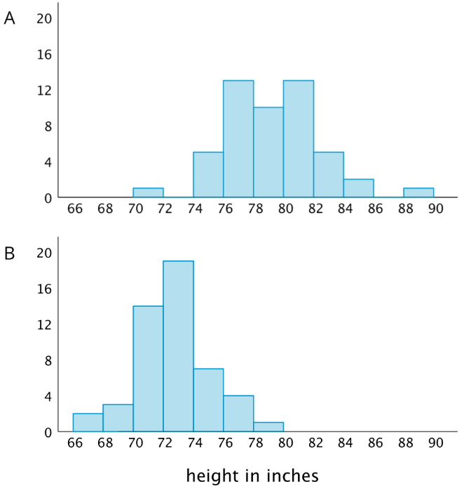
- Write 2–3 sentences that describe the distribution of the heights of the basketball players. Comment on the center and spread of the data.
- Write 2–3 sentences that describe the distribution of the heights of the baseball players. Comment on the center and spread of the data.
Summary
Here are the weights, in kilograms, of 30 dogs.
101112121315161617181819202020212222222324242626283032323434
Before we draw a histogram, let’s consider a couple of questions.
- What are the smallest and largest values in our data set? This gives us an idea of the distance on the number line that our histogram will cover. In this case, the minimum is 10 and the maximum is 34, so our number line needs to extend from 10 to 35 at the very least.
(Remember the convention we use to mark off the number line for a histogram: we include the left boundary of a bar but exclude the right boundary. If 34 is the right boundary of the last bar, it won't be included in that bar, so the number line needs to go a little greater than the maximum value.)
- What group size or bin size seems reasonable here? We could organize the weights into bins of 2 kilograms (10, 12, 14, . . .), 5 kilograms, (10, 15, 20, 25, . . .), 10 kilograms (10, 20, 30, . . .), or any other size. The smaller the bins, the more bars we will have, and vice versa.
Let’s use bins of 5 kilograms for the dog weights. The boundaries of our bins will be: 10, 15, 20, 25, 30, 35. We stop at 35 because it is greater than the maximum.
Next, we find the frequency for the values in each group. It is helpful to organize the values in a table.
| weights in kilograms | frequency |
|---|---|
| 10 to less than 15 | 5 |
| 15 to less than 20 | 7 |
| 20 to less than 25 | 10 |
| 25 to less than 30 | 3 |
| 30 to less than 35 | 5 |
Now we can draw the histogram.
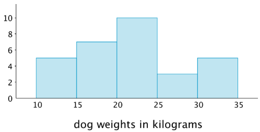
The histogram allows us to learn more about the dog weight distribution and describe its center and spread.
Glossary Entries
Definition: Center
The center of a set of numerical data is a value in the middle of the distribution. It represents a typical value for the data set.
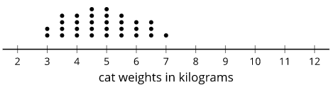
For example, the center of this distribution of cat weights is between 4.5 and 5 kilograms.
Definition: Distribution
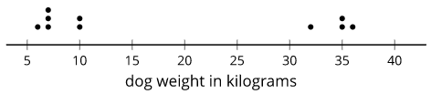
The distribution tells how many times each value occurs in a data set. For example, in the data set blue, blue, green, blue, orange, the distribution is 3 blues, 1 green, and 1 orange.
Here is a dot plot that shows the distribution for the data set 6, 10, 7, 35, 7, 36, 32, 10, 7, 35.
Definition: Frequency
The frequency of a data value is how many times it occurs in the data set.
For example, there were 20 dogs in a park. The table shows the frequency of each color.
| color | frequency |
|---|---|
| white | 4 |
| brown | 7 |
| black | 3 |
| multi-color | 6 |
Definition: Histogram
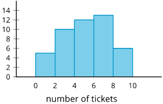
A histogram is a way to represent data on a number line. Data values are grouped by ranges. The height of the bar shows how many data values are in that group.
This histogram shows there were 10 people who earned 2 or 3 tickets. We can't tell how many of them earned 2 tickets or how many earned 3. Each bar includes the left-end value but not the right-end value. (There were 5 people who earned 0 or 1 tickets and 13 people who earned 6 or 7 tickets.)
Definition: Spread
The spread of a set of numerical data tells how far apart the values are.
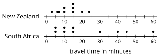
For example, the dot plots show that the travel times for students in South Africa are more spread out than for New Zealand.
Practice
Exercise 42.5.4
These two histograms show the number of text messages sent in one week by two groups of 100 students. The first histogram summarizes data from sixth-grade students. The second histogram summarizes data from seventh-grade students.
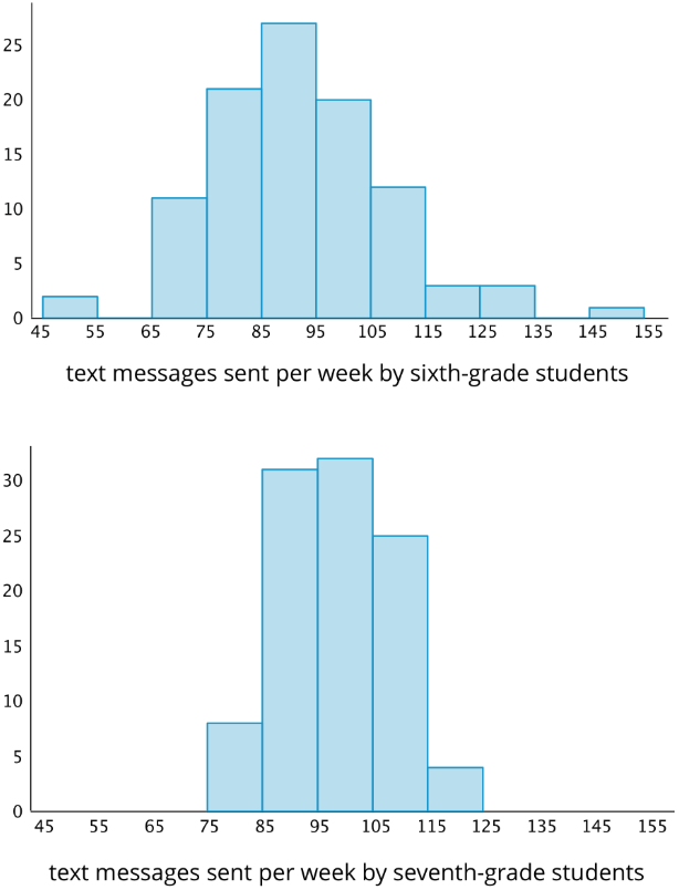
- Do the two data sets have approximately the same center? If so, explain where the center is located. If not, which one has the greater center?
- Which data set has greater spread? Explain your reasoning.
- Overall, which group of students—sixth- or seventh-grade—sent more text messages?
Exercise 42.5.5
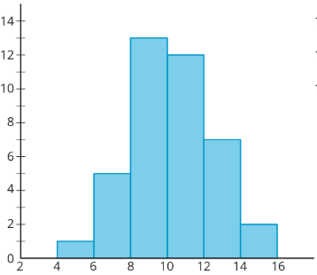
Forty sixth-grade students ran 1 mile. Here is a histogram that summarizes their times, in minutes. The center of the distribution is approximately 10 minutes.
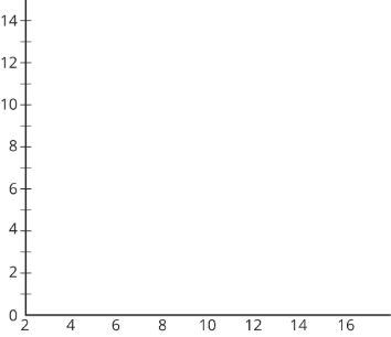
On the blank axes, draw a second histogram that has:
- a distribution of times for a different group of 40 sixth-grade students.
- a center at 10 minutes.
- less variability than the distribution shown in the first histogram.
Exercise 42.5.6
Jada has d dimes. She has more than 30 cents but less than a dollar.
- Write two inequalities that represent how many dimes Jada has.
- Can d be 10?
- How many possible solutions make both inequalities true? If possible, describe or list the solutions.
(From Unit 7.2.2)
Exercise 42.5.7
Order these numbers from greatest to least: −4,14,0,4,−312,74,−54
(From Unit 7.1.4)