
2.1: Time-dependent data and rates of change
- Page ID
- 121086

\( \newcommand{\vecs}[1]{\overset { \scriptstyle \rightharpoonup} {\mathbf{#1}} } \)
\( \newcommand{\vecd}[1]{\overset{-\!-\!\rightharpoonup}{\vphantom{a}\smash {#1}}} \)
\( \newcommand{\id}{\mathrm{id}}\) \( \newcommand{\Span}{\mathrm{span}}\)
( \newcommand{\kernel}{\mathrm{null}\,}\) \( \newcommand{\range}{\mathrm{range}\,}\)
\( \newcommand{\RealPart}{\mathrm{Re}}\) \( \newcommand{\ImaginaryPart}{\mathrm{Im}}\)
\( \newcommand{\Argument}{\mathrm{Arg}}\) \( \newcommand{\norm}[1]{\| #1 \|}\)
\( \newcommand{\inner}[2]{\langle #1, #2 \rangle}\)
\( \newcommand{\Span}{\mathrm{span}}\)
\( \newcommand{\id}{\mathrm{id}}\)
\( \newcommand{\Span}{\mathrm{span}}\)
\( \newcommand{\kernel}{\mathrm{null}\,}\)
\( \newcommand{\range}{\mathrm{range}\,}\)
\( \newcommand{\RealPart}{\mathrm{Re}}\)
\( \newcommand{\ImaginaryPart}{\mathrm{Im}}\)
\( \newcommand{\Argument}{\mathrm{Arg}}\)
\( \newcommand{\norm}[1]{\| #1 \|}\)
\( \newcommand{\inner}[2]{\langle #1, #2 \rangle}\)
\( \newcommand{\Span}{\mathrm{span}}\) \( \newcommand{\AA}{\unicode[.8,0]{x212B}}\)
\( \newcommand{\vectorA}[1]{\vec{#1}} % arrow\)
\( \newcommand{\vectorAt}[1]{\vec{\text{#1}}} % arrow\)
\( \newcommand{\vectorB}[1]{\overset { \scriptstyle \rightharpoonup} {\mathbf{#1}} } \)
\( \newcommand{\vectorC}[1]{\textbf{#1}} \)
\( \newcommand{\vectorD}[1]{\overrightarrow{#1}} \)
\( \newcommand{\vectorDt}[1]{\overrightarrow{\text{#1}}} \)
\( \newcommand{\vectE}[1]{\overset{-\!-\!\rightharpoonup}{\vphantom{a}\smash{\mathbf {#1}}}} \)
\( \newcommand{\vecs}[1]{\overset { \scriptstyle \rightharpoonup} {\mathbf{#1}} } \)
\( \newcommand{\vecd}[1]{\overset{-\!-\!\rightharpoonup}{\vphantom{a}\smash {#1}}} \)
- Use (your favorite) graphical software package (spreadsheet, graphics calculator, online tools, etc.) to plot data points such as those in Table 2.1.
- Describe the trends seen in such data using words such as ’increasing’, ’decreasing’, ’linear’, ’nonlinear’, ’shallow’, ’steep’, ’changes’, etc.
In this section we consider time dependent processes and develop the idea of rates of change. We also use graphical software to represent the data.
Milk temperature and a recipe for yoghurt
To make yoghurt, heat milk to \(190^{\circ} \mathrm{F}\) to kill off bacteria, then cool to \(110^{\circ} \mathrm{F}\). Add a spoonful of "live" pre-made yoghurt and keep the mixture at \(110^{\circ} \mathrm{F}\) for 7-8 hours. This promotes growth of the microorganism Lactobacillus, that turns milk into yoghurt.
Shown in Tables \(2.1\) and \(2.2\) are sets of temperature measurements over time. Use your favorite software to plot the data and describe the trends you see in each graph.

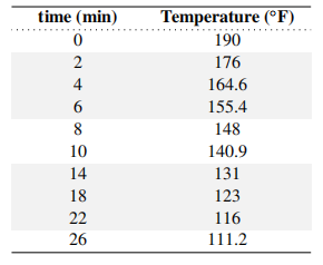
Solution
The data is plotted in Figure 2.2, and points are connected with line segments. The heating phase is shown on the left. (Temperature increases at a nearly linear rate.) On the right, the milk is cooling and the temperature decreases, but the slope of the graph becomes shallower with time.
In this chapter, we will be concerned with describing the rates of change of similar processes, that is in quantifying what we mean by "how fast is the temperature changing" in examples of this sort. Before answering, we introduce two other examples of time dependent data.
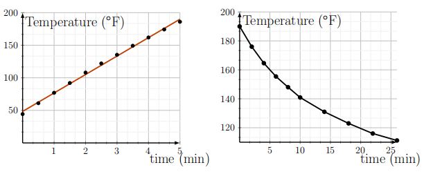
- Reproduce one of the graphs in Figure 2.2 using Celsius.
Data for swimming tuna
The tuna fishing industry is of great economic value, but the danger of overfishing is recognized. Prof Molly Lutcavage \({ }^{2}\) studied the swimming behavior of Atlantic bluefin tuna (Thunnus thynnus L.) in the Gulf of Maine. She recorded their position over a period of 1-2 days. Some of her approximate data is given in Table 2.3. Plot the data points and describe the trends these display.
\({ }^{2}\) ME Lutcavage, RW Brill, GB Skomal, BC Chase, JL Goldstein, and J Tutein. Tracking adult north atlantic bluefin tuna (thunnus thynnus) in the northwestern atlantic using ultrasonic telemetry. Marine Biology, 137(2):347-358, 2000

Table 2.3: Data for tuna swimming distance collected by Prof. Molly Lutcavage in the Gulf of Maine.
Solution
As shown in Figure 2.3, distance traveled by Tuna 1 is roughly proportional to time spent, since its graph is roughly linear (almost a straight line). This linear relationship between distance travelled and time spent is called uniform motion.
Tuna 2 started with similar uniform motion, but later sped up. During \(15 \leq t \leq 20 \mathrm{~h}\), it was swimming much faster.

- Use Figure 2.3 to approximate how far each tuna travelled after 18 hours.
- Does an object dropped from a height of \(15 \mathrm{~m}\) hit the ground in 2 seconds? 1 second?
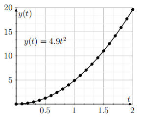
Distance of a falling object
Long ago, Galileo devised some ingenious experiments to track the position of a falling object. He used his measurements to quantify the relationship between the total distance fallen over a given time. Although Galileo did not have formulae nor graph-paper in his day - and was thus forced to express this relationship in a cumbersome verbal way - what he had discovered was quite remarkable.
Galileo discovered that the distance fallen, \(y(t)\), is proportional to the square of the time \(t\), that is
where \(c\) is a constant. When distance is measured in meters \((m)\) and time in seconds (s) the constant is found to be \(c=4.9 \mathrm{~m} / \mathrm{s}^{2}\). Using Equation (2.1), plot a graph of the distance fallen \(y(t)\) versus time \(t\) for \(0 \leq t \leq 2\) seconds at intervals of 0.1s. Connect the data points and comment on the shape of the graph.
Solution
The graph is shown in Figure 2.4. We recognize this as a parabola, resulting from the quadratic relationship of \(y\) and \(t\). (In fact, the relationship is that of a simple power function with a constant coefficient.)
Having looked at three examples of data for time-dependent processes, we now turn to quantifying the rate at which change occurs in each process. We start with the notion of average rate of change, and eventually refine and idealize this idea it to develop rates of change at an instant in time.