
6.2.2: Fitting a Line to Data
- Page ID
- 36718

\( \newcommand{\vecs}[1]{\overset { \scriptstyle \rightharpoonup} {\mathbf{#1}} } \)
\( \newcommand{\vecd}[1]{\overset{-\!-\!\rightharpoonup}{\vphantom{a}\smash {#1}}} \)
\( \newcommand{\id}{\mathrm{id}}\) \( \newcommand{\Span}{\mathrm{span}}\)
( \newcommand{\kernel}{\mathrm{null}\,}\) \( \newcommand{\range}{\mathrm{range}\,}\)
\( \newcommand{\RealPart}{\mathrm{Re}}\) \( \newcommand{\ImaginaryPart}{\mathrm{Im}}\)
\( \newcommand{\Argument}{\mathrm{Arg}}\) \( \newcommand{\norm}[1]{\| #1 \|}\)
\( \newcommand{\inner}[2]{\langle #1, #2 \rangle}\)
\( \newcommand{\Span}{\mathrm{span}}\)
\( \newcommand{\id}{\mathrm{id}}\)
\( \newcommand{\Span}{\mathrm{span}}\)
\( \newcommand{\kernel}{\mathrm{null}\,}\)
\( \newcommand{\range}{\mathrm{range}\,}\)
\( \newcommand{\RealPart}{\mathrm{Re}}\)
\( \newcommand{\ImaginaryPart}{\mathrm{Im}}\)
\( \newcommand{\Argument}{\mathrm{Arg}}\)
\( \newcommand{\norm}[1]{\| #1 \|}\)
\( \newcommand{\inner}[2]{\langle #1, #2 \rangle}\)
\( \newcommand{\Span}{\mathrm{span}}\) \( \newcommand{\AA}{\unicode[.8,0]{x212B}}\)
\( \newcommand{\vectorA}[1]{\vec{#1}} % arrow\)
\( \newcommand{\vectorAt}[1]{\vec{\text{#1}}} % arrow\)
\( \newcommand{\vectorB}[1]{\overset { \scriptstyle \rightharpoonup} {\mathbf{#1}} } \)
\( \newcommand{\vectorC}[1]{\textbf{#1}} \)
\( \newcommand{\vectorD}[1]{\overrightarrow{#1}} \)
\( \newcommand{\vectorDt}[1]{\overrightarrow{\text{#1}}} \)
\( \newcommand{\vectE}[1]{\overset{-\!-\!\rightharpoonup}{\vphantom{a}\smash{\mathbf {#1}}}} \)
\( \newcommand{\vecs}[1]{\overset { \scriptstyle \rightharpoonup} {\mathbf{#1}} } \)
\( \newcommand{\vecd}[1]{\overset{-\!-\!\rightharpoonup}{\vphantom{a}\smash {#1}}} \)
Lesson
Let's look at the scatter plots as a whole.
Exercise \(\PageIndex{1}\): Predict This
Here is a scatter plot that shows weights and fuel efficiencies of 20 different types of cars.
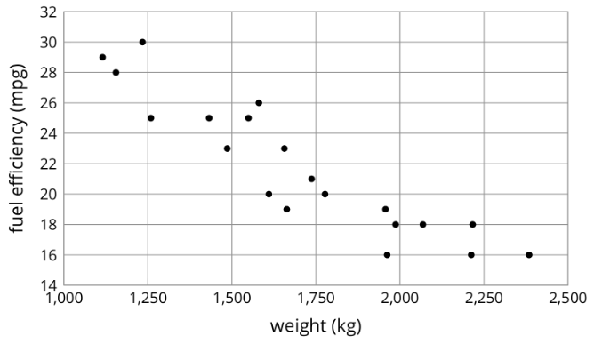
If a car weighs 1,750 kg, would you expect its fuel efficiency to be closer to 22 mpg or to 28 mpg? Explain your reasoning.
Exercise \(\PageIndex{2}\): Shine Bright
Here is a table that shows weights and prices of 20 different diamonds.
| weight (carats) | actual price (dollars) | predicted price (dollars) |
|---|---|---|
| 1 | 3,772 | 4,429 |
| 1 | 4,221 | 4,429 |
| 1 | 4,032 | 4,429 |
| 1 | 5,385 | 4,429 |
| 1.05 | 3,942 | 4,705 |
| 1.05 | 4,480 | 4,705 |
| 1.06 | 4,511 | 4,760 |
| 1.2 | 5,544 | 5533 |
| 1.3 | 6,131 | 6,085 |
| 1.32 | 5,872 | 6,195 |
| 1.41 | 7,122 | 6,692 |
| 1.5 | 7,474 | 7,189 |
| 1.5 | 5,904 | 7,189 |
| 1.59 | 8,706 | 7,686 |
| 1.61 | 8,252 | 7,796 |
| 1.73 | 9,530 | 8,459 |
| 1.77 | 9,374 | 8,679 |
| 1.85 | 8,169 | 9,121 |
| 1.9 | 9,541 | 9,397 |
| 2.04 | 9,125 | 10,170 |
The scatter plot shows the prices and weights of the 20 diamonds together with the graph of \(y=5,520x-1,091\).
The function described by the equation \(y=5,520x-1,091\) is a model of the relationship between a diamond’s weight and its price.
This model predicts the price of a diamond from its weight. These predicted prices are shown in the third column of the table.
- Two diamonds that both weigh 1.5 carats have different prices. What are their prices? How can you see this in the table? How can you see this in the graph?
- The model predicts that when the weight is 1.5 carats, the price will be $7,189. How can you see this in the graph? How can you see this using the equation?
- One of the diamonds weighs 1.9 carats. What does the model predict for its price? How does that compare to the actual price?
- Find a diamond for which the model makes a very good prediction of the actual price. How can you see this in the table? In the graph?
- Find a diamond for which the model’s prediction is not very close to the actual price. How can you see this in the table? In the graph?
Exercise \(\PageIndex{3}\): The Agony of the Feet
Here is a scatter plot that shows lengths and widths of 20 different left feet. Use the double arrows to show or hide the expressions list.
- Estimate the widths of the longest foot and the shortest foot.
- Estimate the lengths of the widest foot and the narrowest foot.
- Click on the gray circle next to the words “The Line” in the expressions list. The graph of a linear model should appear. Find the data point that seems weird when compared to the model. What length and width does that point represent?
Summary
Sometimes, we can use a linear function as a model of the relationship between two variables. For example, here is a scatter plot that shows heights and weights of 25 dogs together with the graph of a linear function which is a model for the relationship between a dog’s height and its weight.

We can see that the model does a good job of predicting the weight given the height for some dogs. These correspond to points on or near the line. The model doesn’t do a very good job of predicting the weight given the height for the dogs whose points are far from the line.
For example, there is a dog that is about 20 inches tall and weighs a little more than 16 pounds. The model predicts that the weight would be about 48 pounds. We say that the model overpredicts the weight of this dog. There is also a dog that is 27 inches tall and weighs about 110 pounds. The model predicts that its weight will be a little less than 80 pounds. We say the model underpredicts the weight of this dog.
Sometimes a data point is far away from the other points or doesn’t fit a trend that all the other points fit. We call these outliers.
Glossary Entries
Definition: Outlier
An outlier is a data value that is far from the other values in the data set.
Here is a scatter plot that shows lengths and widths of 20 different left feet. The foot whose length is 24.5 cm and width is 7.8 cm is an outlier.

Practice
Exercise \(\PageIndex{4}\)
The scatter plot shows the number of hits and home runs for 20 baseball players who had at least 10 hits last season. The table shows the values for 15 of those players.
The model, represented by \(y=0.15x-1.5\), is graphed with a scatter plot.

| hits | home runs | predicted home runs |
|---|---|---|
| 12 | 2 | 0.3 |
| 22 | 1 | 1.8 |
| 154 | 26 | 21.6 |
| 145 | 11 | 20.3 |
| 110 | 16 | 15 |
| 57 | 3 | 7.1 |
| 149 | 17 | 20.9 |
| 29 | 2 | 2.9 |
| 13 | 1 | 0.5 |
| 18 | 1 | 1.2 |
| 86 | 15 | 11.4 |
| 163 | 31 | 23 |
| 115 | 13 | 15.8 |
| 57 | 16 | 7.1 |
| 96 | 10 | 12.9 |
Table\(\PageIndex{2}\)
Use the graph and the table to answer the questions.
- Player A had 154 hits in 2015. How many home runs did he have? How many was he predicted to have?
- Player B was the player who most outperformed the prediction. How many hits did Player B have last season?
- What would you expect to see in the graph for a player who hit many fewer home runs than the model predicted?
Exercise \(\PageIndex{5}\)
Here is a scatter plot that compares points per game to free throw attempts per game for basketball players in a tournament. The model, represented by \(y=4.413x+0.377\), is graphed with the scatter plot. Here, \(x\) represents free throw attempts per game, and \(y\) represents points per game.

- Circle any data points that appear to be outliers.
- What does it mean for a point to be far above the line in this situation?
- Based on the model, how many points per game would you expect a player who attempts 4.5 free throws per game to have? Round your answer to the nearest tenth of a point per game.
- One of the players scored 13.7 points per game with 4.1 free throw attempts per game. How does this compare to what the model predicts for this player?