
8.2: Presenting Quantitative Data Graphically
- Page ID
- 113184

- Summarize quantitative data using a frequency distribution
- Construct a histogram, frequency polygon and stem plot
Frequency Distributions
Quantitative, or numerical, data can also be summarized into frequency tables, also known as frequency distributions.
A teacher records scores on a 20-point quiz for the 30 students in his class. The scores are:
19 20 18 18 17 18 19 17 20 18 20 16 20 15 17 12 18 19 18 19 17 20 18 16 15 18 20 5 0 0
Construct a frequency table for the data.
Solution
These scores could be summarized into a frequency table by grouping like values:
\(\begin{array}{|c|c|}
\hline \textbf { Score } & \textbf { Frequency } \\
\hline 0 & 2 \\
\hline 5 & 1 \\
\hline 12 & 1 \\
\hline 15 & 2 \\
\hline 16 & 2 \\
\hline 17 & 4 \\
\hline 18 & 8 \\
\hline 19 & 4 \\
\hline 20 & 6 \\
\hline
\end{array}\)
Histograms
Using the table above, it would be possible to create a standard bar chart from this summary, like we did for categorical data:
Class Quiz Scores
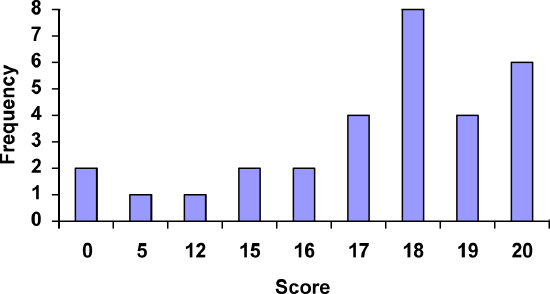
However, since the scores are numerical values, this chart doesn’t really make sense; the first and second bars are five values apart, while the later bars are only one value apart. It would be more correct to treat the horizontal axis as a number line. This type of graph is called a histogram.
A histogram is a graphical representation of quantitative data, similar to a bar graph. The horizontal axis is a number line and the bars are touching.
For the values above, a histogram would look like:
Class Quiz Scores

Notice that in the histogram, a bar represents values on the horizontal axis from that on the left hand-side of the bar up to, but not including, the value on the right hand side of the bar. Some people choose to have bars start at \(\frac{1}{2}\) values to avoid this ambiguity.
Class Quiz Scores
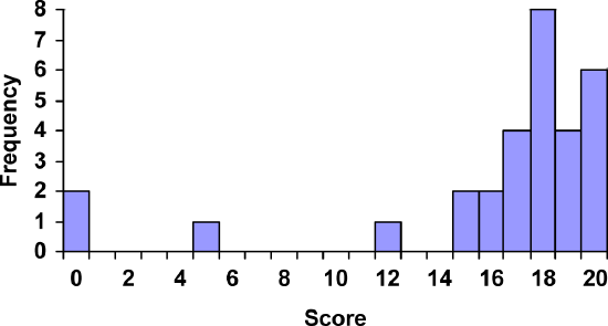
Unfortunately, not a lot of common software packages can correctly graph a histogram. About the best you can do in Excel or Word is a bar graph with no gap between the bars and spacing added to simulate a numerical horizontal axis.
If we have a large number of widely varying data values, creating a frequency table that lists every possible value as a category would lead to an exceptionally long frequency table, and probably would not reveal any patterns. For this reason, it is common with quantitative data to group data into class intervals.
Class intervals are groupings of the data. In general, we define class intervals so that:
- Each interval is equal in size. For example, if the first class contains values from 120-129, the second class should include values from 130-139.
- Each interval has a lower limit and an upper limit. For example, for the class interval of 120-129, the lower limit is 120 and the upper limit is 129.
- The size of the interval is called the class width. It is the difference between 2 consecutive lower limits. For example, the class width for a class interval of 120-129 is 10 since the next class interval starts at 130 (and 130 - 120 = 10).
- We have between 5 and 20 classes, typically, depending upon the number of data we’re working with.
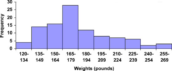
Suppose that we have collected weights from 100 male subjects as part of a nutrition study. For our weight data, we have values ranging from a low of 121 pounds to a high of 263 pounds, giving a total range of \(263 - 121 = 142\). Construct a frequency distribution for the data and a histogram.
Solution
We could create 7 intervals with a width of around 20, 14 intervals with a width of around 10, or somewhere in between. Often times we have to experiment with a few possibilities to find something that represents the data well. Let us try using a class width of 15. We could start at 121, or at 120 since it is a nice round number. The second class interval will start at 120 + 15 = 135.
| Interval | Frequency |
|---|---|
| 120-134 | 4 |
| 135-149 | 14 |
| 150-164 | 16 |
| 165-179 | 28 |
| 180-194 | 12 |
| 195-209 | 8 |
| 210-224 | 7 |
| 225-239 | 6 |
| 240-254 | 2 |
| 255-269 | 3 |
A histogram of this data would look like:
Weights of Subjects in Nutrition Study

In many software packages, you can create a graph similar to a histogram by putting the class intervals as the labels on a bar chart.
Weights of Subjects in Nutrition Study
Other graph types such as pie charts are possible for quantitative data. The usefulness of different graph types will vary depending upon the number of intervals and the type of data being represented. For example, a pie chart of our weight data is difficult to read because of the quantity of intervals we used.

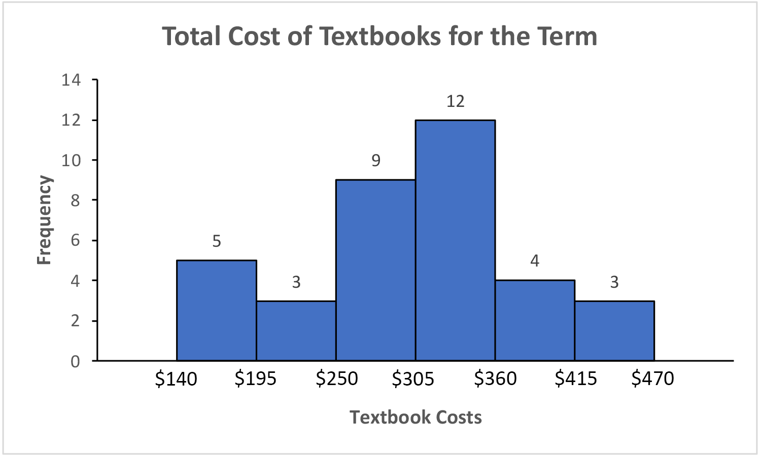
The total cost of textbooks for the term was collected from 36 students. Create a histogram for this data.
$140 $160 $160 $165 $180 $220 $235 $240 $250 $260 $280 $285
$285 $285 $290 $300 $300 $305 $310 $310 $315 $315 $320 $320
$330 $340 $345 $350 $355 $360 $360 $380 $395 $420 $460 $460
- Answer
-
Using a class intervals of size 55, we can group our data into 6 intervals:
\(\begin{array}{|l|r|}
\hline \textbf { cost interval } & \textbf { Frequency } \\
\hline \$ 140-194 & 5 \\
\hline \$ 195-249 & 3 \\
\hline \$ 250-304 & 9 \\
\hline \$ 305-359 & 12 \\
\hline \$ 360-414 & 4 \\
\hline \$ 415-469 & 3 \\
\hline
\end{array}\)We can use the frequency distribution to generate the histogram.
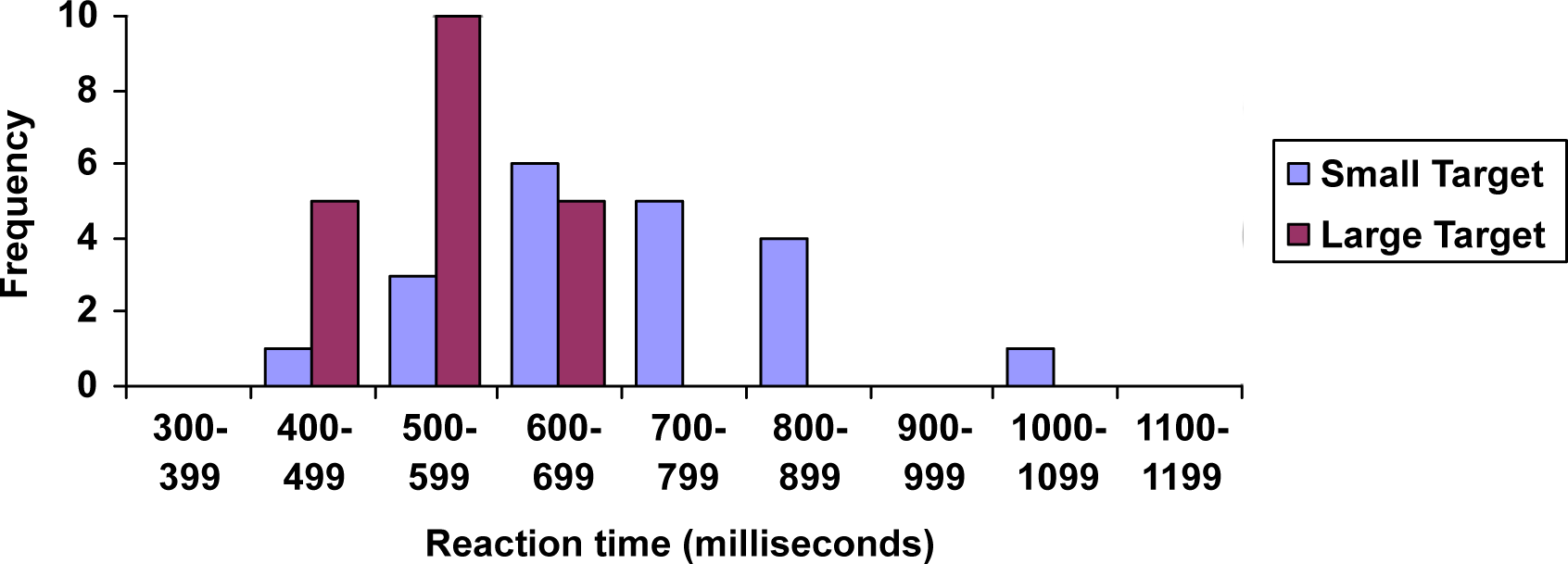
When collecting data to compare two groups, it is desirable to create a graph that compares quantities.
The data below came from a task in which the goal is to move a computer mouse to a target on the screen as fast as possible. On 20 of the trials, the target was a small rectangle; on the other 20, the target was a large rectangle. Time to reach the target was recorded on each trial.
\(\begin{array}{|c|c|c|}
\hline \begin{array}{c}
\textbf { Interval } \\
\textbf { (milliseconds) }
\end{array} & \begin{array}{c}
\textbf { Frequency } \\
\textbf { small target }
\end{array} & \begin{array}{c}
\textbf { Frequency } \\
\textbf { large target }
\end{array} \\
\hline 300-399 & 0 & 0 \\
\hline 400-499 & 1 & 5 \\
\hline 500-599 & 3 & 10 \\
\hline 600-699 & 6 & 5 \\
\hline 700-799 & 5 & 0 \\
\hline 800-899 & 4 & 0 \\
\hline 900-999 & 0 & 0 \\
\hline 1000-1099 & 1 & 0 \\
\hline 1100-1199 & 0 & 0 \\
\hline
\end{array}\)
One option to represent this data would be a comparative histogram or side-by-side bar chart, in which bars for the small target group and large target group are placed next to each other.
Reaction Time for Small and Large Targets
Frequency Polygons
An alternative representation is a frequency polygon.
A frequency polygon is a line graph of a frequency distribution.
It starts out like a histogram, but instead of drawing a bar, a point is placed in the midpoint of each interval with height equal to the frequency. The midpoint of a class interval is
\[\text{class midpoint} = \dfrac{\text{lower limit}_{1} + \text{lower limit}_{2}}{2} \nonumber\]
The points are connected with straight lines to emphasize the distribution of the data. By definition, a polygon is a closed figure, so the graph is "closed" on both ends by connecting the first and last points back to 0 (the x-axis) at the appropriate interval midpoint before the first and last class intervals.
Construct a frequency polygon for both small and large targets on the same graph using the data on reaction time from the previous example.
Solution
Find the midpoint of the first class interval: \(\text{class midpoint} = \dfrac{400+500}{2} = \dfrac{900}{2} = 450\). Since the class width is \(500 - 400 = 100\), add 100 to find the second midpoint: 450 + 100 = 550. Find the rest of the midpoints, including the midpoint of the class before the first class interval (\(450 - 100 = 350)\) and the midpoint of the class after the last class interval (\(1050 + 100 = 1150)\) where the polygons will connect back to the \(x\)-axis. Plot the midpoints as \(x\)-coordinates and frequencies as \(y\)-coordinates and connect the points with straight lines. The table below shows the midpoints and frequencies.
\(\begin{array}{|c|c|c|}
\hline \begin{array}{c}
\textbf { Midpoint } \\
\textbf { (milliseconds) }
\end{array} & \begin{array}{c}
\textbf { Frequency } \\
\textbf { small target }
\end{array} & \begin{array}{c}
\textbf { Frequency } \\
\textbf { large target }
\end{array} \\
\hline 350 & 0 & 0 \\
\hline 450 & 1 & 5 \\
\hline 550 & 3 & 10 \\
\hline 650 & 6 & 5 \\
\hline 750 & 5 & 0 \\
\hline 850 & 4 & 0 \\
\hline 950 & 0 & 0 \\
\hline 1050 & 1 & 0 \\
\hline 1150 & 0 & 0 \\
\hline
\end{array}\)
The completed graph is shown below.
Reaction Time for Small and Large Targets
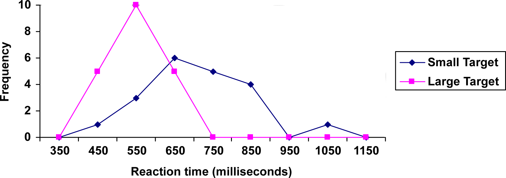
This graph makes it easier to see that reaction times were generally shorter for the larger target, and that the reaction times for the smaller target were more spread out.
Stem Plots
Stem-and-leaf plots, or stem plots, are a quick and easy way to look at small samples of numerical data. You can look for any patterns or any strange data values. It is easy to compare two samples using stem plots.
The first step is to divide each number into 2 parts, the stem (such as the leftmost digit) and the leaf (such as the rightmost digit). There are no set rules, you just have to look at the data and see what makes sense.
The following are the percentage grades of 25 students from a statistics course. Draw a stem plot of the data.
| 62 | 87 | 81 | 69 | 87 | 62 | 45 | 95 | 76 | 76 |
| 62 | 71 | 65 | 67 | 72 | 80 | 40 | 77 | 87 | 58 |
| 84 | 73 | 93 | 64 | 89 |
Solution
Divide each number so that the tens digit is the stem and the ones digit is the leaf. 62 becomes 6|2.
Make a vertical chart with the stems on the left of a vertical bar. Be sure to fill in any missing stems. In other words, the stems should have equal spacing (for example, count by ones or count by tens). Here is what the stems for our data look like:
\[\begin{array}{c| c}
4 & \\
5 & \\
6 & \\
7 & \\
8 & \\
9 & \\
\end{array}\nonumber \]
Now go through the list of data and add the leaves. Put each leaf next to its corresponding stem. Don’t worry about order yet, just get all the leaves down.
When the data value 62 is placed on the plot it looks like the plot below.
\[\begin{array}{c| c}
4 & \\
5 & \\
6 & 2 \\
7 & \\
8 & \\
9 & \\
\end{array}\nonumber \]
When the data value 87 is placed on the plot it looks like the plot below.
\[\begin{array}{c| c}
4 & \\
5 & \\
6 & 2 \\
7 & \\
8 & 7 \\
9 & \\
\end{array}\nonumber \]
Filling in the rest of the leaves to obtain the plot below.
\[\begin{array}{c| c c c c c c c }
4 & 5 & 0 & & & & & \\
5 & 8 & & & & & & \\
6 & 2 & 9 & 2 & 2 &5 &7 & 4 \\
7 & 6 & 6 & 1 & 2 & 7 & 3 & \\
8 & 7 & 1 & 7 & 0 & 7 & 4 & 9 \\
9 & 5 & 3 & & & & & \\
\end{array}\nonumber \]
Now you have to add labels and make the graph look pretty. You need to add a title and sort the leaves into increasing order. You also need to tell people what the stems and leaves mean by inserting a key. Be careful to line the leaves up in columns. You need to be able to compare the lengths of the rows when you interpret the graph. The final stem plot for the test grade data is shown below.
Test Grades
\[\begin{array}{c| c c c c c c c }
4 & 0 & 5 & & & & & \\
5 & 8 & & & & & & \\
6 & 2 & 2 &2 &4 &5 &7 &9 \\
7 & 1 & 2 & 3& 6 &6 & 7& \\
8 & 0 & 1 & 4& 7&7 & 7& 9 \\
9 & 3 & 5 & & & & & \\
\end{array}\nonumber \]
key: 4|0 = 40%