
24.6: E1.05- Graphs Part 1
- Page ID
- 51748
Section 3. Graphs
First we’ll investigate how to use a spreadsheet to graph one formula onto a rectangular coordinate system, just like the graphs you have done by hand in algebra classes. You MUST put the values for the input variable and the output variable in two columns, with the input variable on the left. Some of the details of exactly what menus to use after that may vary from one spreadsheet program to another. The description here is for Excel. Ask for help about the exact sequence to use if you have a different spreadsheet program, such as Open Office. (The Microsoft Works spreadsheet program will not graph.)
Then, in Excel, choose the Insert > Chart
Example 7. Graph on the values using a rectangular coordinate system and connecting the points with a line/curve.
Solution:
- First enter the x-values in the first column, including the label at the top of the column. There is no clear answer about exactly how many values to enter here, but be sure they include some at each end of the range of x-values.
- Second, enter the formula as described in Section 2, Example 4, including the label at the top of the column. (Look back at that example to see the values.)
- Select the cells that contain the labels and the data to graph.
- In the menus at the top of the page, choose Insert>Chart to begin a graph.
- Choose X-Y Scatter for the type. (Gives the rectangular coordinate system that we want.)
- You’ll have a choice of connected or unconnected lines. In this case, choose the connected lines. Sometimes in this course we’ll choose unconnected lines.
- Go through the rest of the choices quickly, not changing anything, and click Finish.
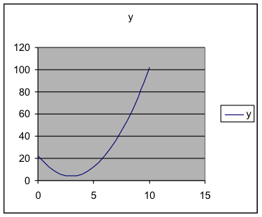
Check: In this course, you will graph many formulas that you haven’t seen before, so you won’t know what they are supposed to look like. The best way to check this is to evaluate at least one of the values by hand (using a calculator) as we did when entering the formula, just to be sure you have done what you intended when you put the formula in. But, if you have entered the formula correctly, then those values will be correct and this will be the correct graph.
Example 8. Graph on the values
and, on the same axes, graph
. Determine what range of x-values has the first formula value smaller than the second formula value. (Where is the curved graph below the straight line?)
Solution:
- Repeat the first few steps in the previous example to obtain the first formula values. This time extend the x-values to 12.
- In the third column of the spreadsheet, put the values for the formula
.
- Select all three columns of numbers, as far down as you have values.
- Use Insert>Chart and choose X-Y Scatter. Choose the connected lines. I encourage you to experiment a bit.
| 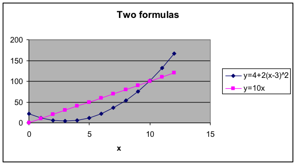 The range of values is about
|
- Mathematics for Modeling. Authored by: Mary Parker and Hunter Ellinger. License: CC BY: Attribution