Section 6.5: Bar Graphs
- Page ID
- 216505

\( \newcommand{\vecs}[1]{\overset { \scriptstyle \rightharpoonup} {\mathbf{#1}} } \)
\( \newcommand{\vecd}[1]{\overset{-\!-\!\rightharpoonup}{\vphantom{a}\smash {#1}}} \)
\( \newcommand{\dsum}{\displaystyle\sum\limits} \)
\( \newcommand{\dint}{\displaystyle\int\limits} \)
\( \newcommand{\dlim}{\displaystyle\lim\limits} \)
\( \newcommand{\id}{\mathrm{id}}\) \( \newcommand{\Span}{\mathrm{span}}\)
( \newcommand{\kernel}{\mathrm{null}\,}\) \( \newcommand{\range}{\mathrm{range}\,}\)
\( \newcommand{\RealPart}{\mathrm{Re}}\) \( \newcommand{\ImaginaryPart}{\mathrm{Im}}\)
\( \newcommand{\Argument}{\mathrm{Arg}}\) \( \newcommand{\norm}[1]{\| #1 \|}\)
\( \newcommand{\inner}[2]{\langle #1, #2 \rangle}\)
\( \newcommand{\Span}{\mathrm{span}}\)
\( \newcommand{\id}{\mathrm{id}}\)
\( \newcommand{\Span}{\mathrm{span}}\)
\( \newcommand{\kernel}{\mathrm{null}\,}\)
\( \newcommand{\range}{\mathrm{range}\,}\)
\( \newcommand{\RealPart}{\mathrm{Re}}\)
\( \newcommand{\ImaginaryPart}{\mathrm{Im}}\)
\( \newcommand{\Argument}{\mathrm{Arg}}\)
\( \newcommand{\norm}[1]{\| #1 \|}\)
\( \newcommand{\inner}[2]{\langle #1, #2 \rangle}\)
\( \newcommand{\Span}{\mathrm{span}}\) \( \newcommand{\AA}{\unicode[.8,0]{x212B}}\)
\( \newcommand{\vectorA}[1]{\vec{#1}} % arrow\)
\( \newcommand{\vectorAt}[1]{\vec{\text{#1}}} % arrow\)
\( \newcommand{\vectorB}[1]{\overset { \scriptstyle \rightharpoonup} {\mathbf{#1}} } \)
\( \newcommand{\vectorC}[1]{\textbf{#1}} \)
\( \newcommand{\vectorD}[1]{\overrightarrow{#1}} \)
\( \newcommand{\vectorDt}[1]{\overrightarrow{\text{#1}}} \)
\( \newcommand{\vectE}[1]{\overset{-\!-\!\rightharpoonup}{\vphantom{a}\smash{\mathbf {#1}}}} \)
\( \newcommand{\vecs}[1]{\overset { \scriptstyle \rightharpoonup} {\mathbf{#1}} } \)
\(\newcommand{\longvect}{\overrightarrow}\)
\( \newcommand{\vecd}[1]{\overset{-\!-\!\rightharpoonup}{\vphantom{a}\smash {#1}}} \)
\(\newcommand{\avec}{\mathbf a}\) \(\newcommand{\bvec}{\mathbf b}\) \(\newcommand{\cvec}{\mathbf c}\) \(\newcommand{\dvec}{\mathbf d}\) \(\newcommand{\dtil}{\widetilde{\mathbf d}}\) \(\newcommand{\evec}{\mathbf e}\) \(\newcommand{\fvec}{\mathbf f}\) \(\newcommand{\nvec}{\mathbf n}\) \(\newcommand{\pvec}{\mathbf p}\) \(\newcommand{\qvec}{\mathbf q}\) \(\newcommand{\svec}{\mathbf s}\) \(\newcommand{\tvec}{\mathbf t}\) \(\newcommand{\uvec}{\mathbf u}\) \(\newcommand{\vvec}{\mathbf v}\) \(\newcommand{\wvec}{\mathbf w}\) \(\newcommand{\xvec}{\mathbf x}\) \(\newcommand{\yvec}{\mathbf y}\) \(\newcommand{\zvec}{\mathbf z}\) \(\newcommand{\rvec}{\mathbf r}\) \(\newcommand{\mvec}{\mathbf m}\) \(\newcommand{\zerovec}{\mathbf 0}\) \(\newcommand{\onevec}{\mathbf 1}\) \(\newcommand{\real}{\mathbb R}\) \(\newcommand{\twovec}[2]{\left[\begin{array}{r}#1 \\ #2 \end{array}\right]}\) \(\newcommand{\ctwovec}[2]{\left[\begin{array}{c}#1 \\ #2 \end{array}\right]}\) \(\newcommand{\threevec}[3]{\left[\begin{array}{r}#1 \\ #2 \\ #3 \end{array}\right]}\) \(\newcommand{\cthreevec}[3]{\left[\begin{array}{c}#1 \\ #2 \\ #3 \end{array}\right]}\) \(\newcommand{\fourvec}[4]{\left[\begin{array}{r}#1 \\ #2 \\ #3 \\ #4 \end{array}\right]}\) \(\newcommand{\cfourvec}[4]{\left[\begin{array}{c}#1 \\ #2 \\ #3 \\ #4 \end{array}\right]}\) \(\newcommand{\fivevec}[5]{\left[\begin{array}{r}#1 \\ #2 \\ #3 \\ #4 \\ #5 \\ \end{array}\right]}\) \(\newcommand{\cfivevec}[5]{\left[\begin{array}{c}#1 \\ #2 \\ #3 \\ #4 \\ #5 \\ \end{array}\right]}\) \(\newcommand{\mattwo}[4]{\left[\begin{array}{rr}#1 \amp #2 \\ #3 \amp #4 \\ \end{array}\right]}\) \(\newcommand{\laspan}[1]{\text{Span}\{#1\}}\) \(\newcommand{\bcal}{\cal B}\) \(\newcommand{\ccal}{\cal C}\) \(\newcommand{\scal}{\cal S}\) \(\newcommand{\wcal}{\cal W}\) \(\newcommand{\ecal}{\cal E}\) \(\newcommand{\coords}[2]{\left\{#1\right\}_{#2}}\) \(\newcommand{\gray}[1]{\color{gray}{#1}}\) \(\newcommand{\lgray}[1]{\color{lightgray}{#1}}\) \(\newcommand{\rank}{\operatorname{rank}}\) \(\newcommand{\row}{\text{Row}}\) \(\newcommand{\col}{\text{Col}}\) \(\renewcommand{\row}{\text{Row}}\) \(\newcommand{\nul}{\text{Nul}}\) \(\newcommand{\var}{\text{Var}}\) \(\newcommand{\corr}{\text{corr}}\) \(\newcommand{\len}[1]{\left|#1\right|}\) \(\newcommand{\bbar}{\overline{\bvec}}\) \(\newcommand{\bhat}{\widehat{\bvec}}\) \(\newcommand{\bperp}{\bvec^\perp}\) \(\newcommand{\xhat}{\widehat{\xvec}}\) \(\newcommand{\vhat}{\widehat{\vvec}}\) \(\newcommand{\uhat}{\widehat{\uvec}}\) \(\newcommand{\what}{\widehat{\wvec}}\) \(\newcommand{\Sighat}{\widehat{\Sigma}}\) \(\newcommand{\lt}{<}\) \(\newcommand{\gt}{>}\) \(\newcommand{\amp}{&}\) \(\definecolor{fillinmathshade}{gray}{0.9}\)
- Draw bar graphs
A bar graph (also called a bar chart) is a graphical display that uses rectangular bars to represent data. Each bar corresponds to a category or group, and the length or height of the bar is proportional to the value or frequency it represents. Bar graphs are one of the most versatile and widely used methods for displaying categorical data, making comparisons between groups clear and straightforward.
When to Use Bar Graphs
Bar graphs are most effective when you want to:
- Compare values across different categories or groups
- Display categorical or discrete data
- Show frequencies, counts, or measurements for distinct groups
- Make it easy to compare the sizes of different categories
- Present data where categories have no natural order or connection
Key Components of a Bar Graph
- Horizontal Axis (x-axis): Typically shows the categories or groups being compared
- Vertical Axis (y-axis): Represents the scale of measurement (frequency, count, percentage, amount, etc.)
- Bars: Rectangular shapes whose heights (or lengths) represent the data values
- Bars are separated by spaces to emphasize that categories are distinct
- All bars should have the same width
- Labels: Clear identification of categories and the measurement scale
- Title: Describes what the bar graph represents
- Scale: Consistent intervals on the measurement axis, typically starting at zero
Each category is assigned a position along one axis (usually horizontal), and a bar is drawn to a height (or length) that corresponds to its value on the other axis. The bars are separated by spaces to show that the categories are distinct and unrelated. By comparing the heights of the bars, viewers can quickly see which categories have larger or smaller values.
Types of Bar Graphs
- Vertical Bar Graph: Bars extend upward from the horizontal axis
- Most common type
- Categories on x-axis, values on y-axis
- Also called a column chart

The bar graph displays values for four categories labeled Item 1 through Item 4. Item 1 has a value of 8, Item 2 has a value of 12, Item 3 has a value of 16, and Item 4 has the highest value at 29. The bar heights increase steadily from left to right, with Item 4 showing a noticeably larger value than the other categories.
- Horizontal Bar Graph: Bars extend horizontally from the vertical axis
- Categories on y-axis, values on x-axis
- Useful when category names are long
- Easier to read with many categories

The horizontal bar graph displays values for four categories labeled Item 1 through Item 4. Item 1 has a value of 8, Item 2 has a value of 12, Item 3 has a value of 16, and Item 4 has the highest value at 29. The bar lengths increase steadily from top to bottom, with Item 4 noticeably larger than the other categories.
- Side-by-Side Bar Graph: Multiple bars for each category, placed side-by-side
- Compares subcategories within each main category
- Example: Comparing male and female enrollment across different majors
- Emphasizes comparison, not trends over time

The double bar graph compares two sets of values for Items 1 through 4. For Item 1, the first data set has a value of 8 and the second has 11. For Item 2, the first value is 12 and the second is 9. For Item 3, the values are 16 and 19. For Item 4, the values are 29 and 35. Both data sets generally increase from Item 1 to Item 4, with the second data set larger in every category except Item 2.
Although bar graphs come in many forms, this section focuses only on these three most commonly used types. These examples provide the foundation students need to recognize how categorical data can be compared, grouped, or displayed over time. While other variations of bar graphs exist, such as segmented bars, paired bars, and population bars, they tend to be used in more specialized contexts or rely on the same underlying principles already demonstrated. By concentrating on the most widely used forms, this keeps the explanations clear and accessible without overwhelming learners with unnecessary variations. Students will still be well‑prepared to interpret other bar graph formats they may encounter, since the core ideas remain the same.
Advantages of Bar Graphs
- Easy to read and understand: Simple, intuitive format that most people recognize
- Excellent for comparisons: Bar heights make it obvious which values are larger or smaller
- Works with many categories: Can display numerous categories without becoming cluttered
- Precise values: Bar heights allow for accurate reading of exact values
- Flexible: Can be vertical or horizontal, grouped or stacked
- Shows individual values clearly: Each category stands alone
- No misleading connections: Spaces between bars prevent implying relationships that don't exist
Limitations of Bar Graphs
- Not ideal for trends over time: Line graphs are better for showing continuous change
- Can become cluttered: Too many categories or groups can make the graph hard to read
- Limited in showing relationships: Shows comparisons but not correlations between variables
- Scale manipulation: Starting the y-axis above zero can exaggerate differences
When NOT to use Bar Graphs
Avoid bar graphs when:
- You want to show trends or changes over continuous time (use line graphs)
- You need to display parts of a whole (use pie graphs for small numbers of categories)
- You're showing the relationship between two quantitative variables (use scatter plots)
- Data is continuous rather than categorical
- Step 1 — Organize your data in a table with categories and their corresponding values
- Step 2 —Draw and label the axes
- Horizontal axis (x-axis): List the categories with equal spacing
- Vertical axis (y-axis): Show the measurement scale (frequency, count, percentage, etc.)
- Include units where appropriate
- Step 3 — Determine the scale for the vertical axis (y-axis):
- Find the maximum value in your data
- Choose an upper limit that accommodates all values
- Use consistent intervals (e.g., 0, 10, 20, 30, 40...)
- Generally start at zero to avoid distorting comparisons
- Step 4 — Draw the bars
- For each category, draw a rectangular bar
- Height (or length) should accurately represent the value
- Keep all bars the same width
- Leave spaces between bars to show distinct categories
- Step 5 — Label Clearly
- Mark categories on the horizontal axis (x-axis)
- Ensure vertical axis (y-axis) scale is clear
- Consider adding value labels on top of bars for precision
- Step 6 — Add a descriptive title, if necessary
- Example: "Favorite Sports Among 100 High School Students"
A college surveyed 200 students about their class standing:
| Classes | Frequency |
|---|---|
| Freshman | 60 |
| Sophomore | 50 |
| Junior | 45 |
| Senior | 45 |
Create a bar graph to display this data.
✅ Solution:
- Step 1 — Organize your data in a table with categories and their corresponding values. This step is done, since data was given in a frequency distribution.
- Step 2 — Draw and label the axes. The horizontal axis is labeled "Classes" and the vertical axis is labeled "Frequency".
- Step 3 — Determine the scale for the vertical axis (y-axis). Since the maximum frequency is 60, then increments of 10 can be used for the tick marks on the axis.
- Step 4 — Draw the bars. Draw rectangular bars of equal width up to the frequency of each class.
- Step 5 — Label clearly. Label each of the rectangular bars: Freshman, Sophomore, Junior, and Senior.
- Step 6 — Add a descriptive title, if necessary. Add the title, "Class Standings" or some other similar title.
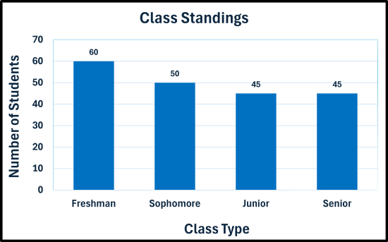
The bar graph compares the number of students in four class levels. Freshmen have the highest total with 60 students. Sophomores have 50 students. Juniors and seniors each have 45 students, tying for the lowest total. The graph shows a gradual decrease in the number of students from freshman through junior level, with no change between juniors and seniors.
A teacher recorded final grades for 40 students:
A, B, F, C, B, D, B, C, B, C, A, C, B, C, B, C, A, D, C, B, B, C, C, A, C, C, B, A, A, B, A, D, B, D, F, B, B, A, B, C
Create a bar graph to display this data.
✅ Solution:
- Step 1 — Organize your data in a table with categories and their corresponding values. Create a frequency distribution for the data.
| Grades | Frequency |
|---|---|
| A | 8 |
| B | 14 |
| C | 12 |
| D | 4 |
| F | 2 |
- Step 2 — Draw and label the axes. The horizontal axis is labeled "Grades" and the vertical axis is labeled "Frequency".
- Step 3 — Determine the scale for the vertical axis (y-axis). Since the maximum frequency is 12, then increments of 2 can be used for the tick marks on the axis.
- Step 4 — Draw the bars. Draw rectangular bars of equal width up to the frequency of each letter grade.
- Step 5 — Label clearly. Label each of the rectangular bars: A, B, C, D, and F.
- Step 6 — Add a descriptive title, if necessary. Add the title, "Final Grades" or some other similar title.
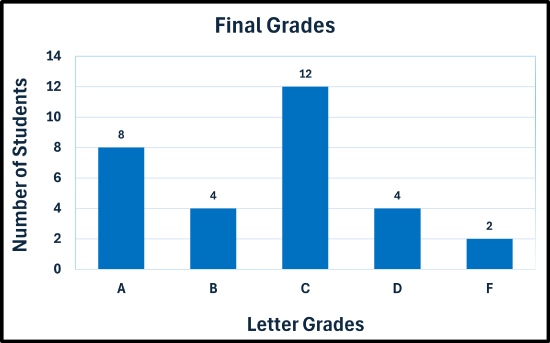
The bar graph compares the number of students receiving each final letter grade. Grade C is the most common with 12 students. Grade A has 8 students. Grades B and D each have 4 students, while grade F has the fewest students with 2. The graph peaks at grade C and decreases toward both the higher and lower grade categories.
A survey was conducted and asked adults their primary source of news:
| News Source | Respondents |
|---|---|
| Television | 57 |
| Internet/Social Media | 149 |
| Newspapers | 6 |
| Radio | 38 |
Create a bar graph to display this data.
✅ Solution:
- Step 1 — Organize your data in a table with categories and their corresponding values. This step is done, since data was given in a frequency distribution.
- Step 2 — Draw and label the axes. The horizontal axis is labeled "Grades" and the vertical axis is labeled "Frequency".
- Step 3 — Determine the scale for the vertical axis (y-axis). Since the maximum frequency is 149, then increments of 20 can be used for the tick marks on the axis.
- Step 4 — Draw the bars. Draw rectangular bars of equal width up to the frequency of each letter grade.
- Step 5 — Label clearly. Label each of the rectangular bars: Television, Internet/Social Media, Newspapers, and Radio.
- Step 6 — Add a descriptive title, if necessary. Add the title, "Primary Source of News" or some other similar title.

The bar graph compares the number of adults using different primary news sources. Internet and social media is the most common source with 149 adults. Television is used by 57 adults, followed by radio with 38 adults. Newspapers are the least common source with only 6 adults. The graph shows a large gap between Internet/Social Media and the other categories.
A survey of 500 smartphone users were asked which type of phone that they own/prefer is given below:
| Type of Phone | Users |
|---|---|
| iOS (iPhone) | 214 |
| Android | 258 |
| Other | 28 |
Create a bar graph to display this data.
✅ Solution:
- Step 1 — Organize your data in a table with categories and their corresponding values. This step is done, since data was given in a frequency distribution.
- Step 2 — Draw and label the axes. The horizontal axis is labeled "Grades" and the vertical axis is labeled "Frequency".
- Step 3 — Determine the scale for the vertical axis (y-axis). Since the maximum frequency is 258, then increments of 50 can be used for the tick marks on the axis.
- Step 4 — Draw the bars. Draw rectangular bars of equal width up to the frequency of each letter grade.
- Step 5 — Label clearly. Label each of the rectangular bars: iOS (iPhone), Android, and Other.
- Step 6 — Add a descriptive title, if necessary. Add the title, "Phone Device Preference" or some other similar title.

The bar graph compares the number of users preferring different phone types. Android is the most popular with 258 users, followed by iOS (iPhone) with 214 users. The “Other” category has 28 users, far fewer than the other two categories. The graph shows that Android and iPhone devices are much more commonly preferred than other phone types.
A travel agency surveyed their clients about preferred vacation types:
| Vacation Type | Clients |
|---|---|
| Beach | 95 |
| Mountains | 64 |
| City/Urban | 48 |
| Adventure/Safari | 44 |
| Cruise | 28 |
| National Park/Wildlife | 40 |
| Lake/Countryside | 30 |
Create a bar graph to display this data.
✅ Solution:
- Step 1 — Organize your data in a table with categories and their corresponding values. This step is done, since data was given in a frequency distribution.
- Step 2 — Draw and label the axes. The horizontal axis is labeled "Grades" and the vertical axis is labeled "Frequency".
- Step 3 — Determine the scale for the vertical axis (y-axis). Since the maximum frequency is 95, then increments of 10 can be used for the tick marks on the axis.
- Step 4 — Draw the bars. Draw rectangular bars of equal width up to the frequency of each letter grade.
- Step 5 — Label clearly. Label each of the rectangular bars: Beach, Mountains, City/Urnam, Adventure/Safari, Cruise, National Park/Wildfire, and Lake/Countryside.
- Step 6 — Add a descriptive title, if necessary. Add the title, "Vacation Destinations" or some other similar title.

he bar graph compares the number of clients selecting different vacation types. Beach vacations are the most popular with 95 clients, followed by Mountains with 64 clients. City/Urban vacations have 48 clients, Adventure/Safari has 44 clients, National Park/Wildlife has 40 clients, Lake/Countryside has 30 clients, and Cruise vacations have 28 clients, the fewest among the categories.
- A bag of peanut M&M’s were opened and the following colors with their respective quantities were present: 6 Blue, 4 Brown, 1 Green, 5 Orange, 3 Red, 2 Yellow. Construct a bar graph for the data.
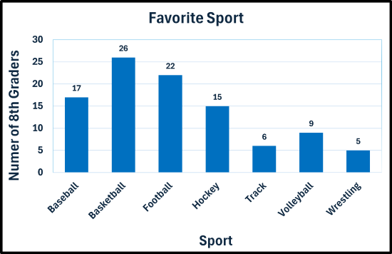
- A survey of 100 8th-graders was conducted. They were asked what their favorite sport is. The results are given in the frequency table.
Favorite sports of 8th graders Sport Number of 8th Graders Baseball 17 Basketball 26 Football 22 Hockey 15 Track 6 Volleyball 9 Wrestling 5 Create a bar graph to display this data.
- The table below provides the total electoral votes for the last eight U.S. Presidential elections.
U.S. electoral vote totals 1996-2024 Year Democrat Republican 1996 379 159 2000 266 271 2004 251 286 2008 365 173 2012 332 206 2016 227 304 2020 306 232 2024 226 312 Construct a side-by-side bar graph to display this data.
- Answers
-