
9.1: Describing a Distribution
- Page ID
- 139298
\( \newcommand{\vecs}[1]{\overset { \scriptstyle \rightharpoonup} {\mathbf{#1}} } \)
\( \newcommand{\vecd}[1]{\overset{-\!-\!\rightharpoonup}{\vphantom{a}\smash {#1}}} \)
\( \newcommand{\id}{\mathrm{id}}\) \( \newcommand{\Span}{\mathrm{span}}\)
( \newcommand{\kernel}{\mathrm{null}\,}\) \( \newcommand{\range}{\mathrm{range}\,}\)
\( \newcommand{\RealPart}{\mathrm{Re}}\) \( \newcommand{\ImaginaryPart}{\mathrm{Im}}\)
\( \newcommand{\Argument}{\mathrm{Arg}}\) \( \newcommand{\norm}[1]{\| #1 \|}\)
\( \newcommand{\inner}[2]{\langle #1, #2 \rangle}\)
\( \newcommand{\Span}{\mathrm{span}}\)
\( \newcommand{\id}{\mathrm{id}}\)
\( \newcommand{\Span}{\mathrm{span}}\)
\( \newcommand{\kernel}{\mathrm{null}\,}\)
\( \newcommand{\range}{\mathrm{range}\,}\)
\( \newcommand{\RealPart}{\mathrm{Re}}\)
\( \newcommand{\ImaginaryPart}{\mathrm{Im}}\)
\( \newcommand{\Argument}{\mathrm{Arg}}\)
\( \newcommand{\norm}[1]{\| #1 \|}\)
\( \newcommand{\inner}[2]{\langle #1, #2 \rangle}\)
\( \newcommand{\Span}{\mathrm{span}}\) \( \newcommand{\AA}{\unicode[.8,0]{x212B}}\)
\( \newcommand{\vectorA}[1]{\vec{#1}} % arrow\)
\( \newcommand{\vectorAt}[1]{\vec{\text{#1}}} % arrow\)
\( \newcommand{\vectorB}[1]{\overset { \scriptstyle \rightharpoonup} {\mathbf{#1}} } \)
\( \newcommand{\vectorC}[1]{\textbf{#1}} \)
\( \newcommand{\vectorD}[1]{\overrightarrow{#1}} \)
\( \newcommand{\vectorDt}[1]{\overrightarrow{\text{#1}}} \)
\( \newcommand{\vectE}[1]{\overset{-\!-\!\rightharpoonup}{\vphantom{a}\smash{\mathbf {#1}}}} \)
\( \newcommand{\vecs}[1]{\overset { \scriptstyle \rightharpoonup} {\mathbf{#1}} } \)
\( \newcommand{\vecd}[1]{\overset{-\!-\!\rightharpoonup}{\vphantom{a}\smash {#1}}} \)
We will now begin to discuss how to describe a particular variable of interest. Of particular importance is the variable’s distribution.
The distribution of a variable tells you all possible values the variable can take on, and the frequency that each of the possible values occurs.
In the last chapter, we looked at frequency tables and histograms, which are two ways of showing a variable’s distribution. Distributions can also be shown by fitting smooth curves to a graphical display of a data set, or using a formula.
In statistics, when we consider differences between distributions, we usually look at several characteristics of the distribution:
| Shape Outliers Center Spread |
Together we refer to these as the “SOCS” of the distribution |
The shape of a distribution is frequently estimated by drawing a smooth curve to a histogram, as shown in the following diagram:

In the histogram above, a smooth curve has been drawn to roughly approximate the shape of the distribution for the variable “Weights”. This particular distribution is right-skewed.
The previous example showed just one of the many possible distribution shapes that can be observed. There are several common distribution shapes, each with unique
combinations of number of peaks, symmetry, center, and spread. The most commonly used distribution curve in elementary statistics is a bell-shaped distribution curve, but it is important to realize that there are many possible distribution shapes. Some are symmetric, some are right-skewed, left-skewed, unimodal (one peak), or bimodal (two peaks). A few of the most common shapes are shown below.
A symmetric distribution is a distribution shape in which the left and right sides of the distribution are roughly mirror images of one another.
Symmetric Distribution Shapes:
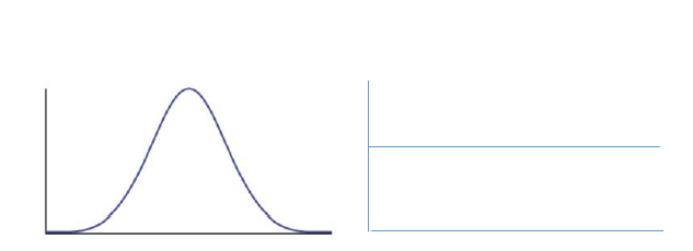
Bell Shaped Uniform
Definition text
Skewed Distribution Shapes:

Right-skewed Left-skewed
(tail extends to right) (tail extends to left)
In practice, there will be variables whose distribution shapes do not exactly fit any of the shapes described above.
Example
The histogram below shows the “Model Year” for a sample of 40 vehicles.
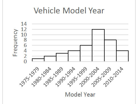
a) Is the distribution symmetric or skewed?
b) Classify the shape of the distribution as bell shaped, uniform, right-skewed, or left-skewed.
Solution
a) The distribution is a skewed distribution, as the data clusters on the right side and has a longer tail on the left side.
b) This distribution is left-skewed, as the longer tail extends to the left.
Given the histogram below:

a) Is the distribution symmetric or skewed?
b) Classify the shape of the distribution as bell shaped, uniform, right-skewed, or left-skewed.
Solution
a) The distribution is a symmetric distribution, as the data clusters fairly evenly on both the left and right sides.
b) This distribution is bell-shaped.
An outlier is a data value that is “extreme” when compared to the rest of the values in the data set. It may be extreme in either direction, meaning it may be very small when compared to the rest of the values in the data set, or it may be very large when compared to the rest of the values in the data set.
While there are several formal methods for determining if a data value is an outlier (or a potential outlier), the determination of outliers can be somewhat subjective. This means that it can be left up to the researcher to determine which observations are “extreme”.
Consider the data set below which consists of “Exam Scores” for a sample of 20 Statistics students:
|
89 |
73 |
76 |
95 |
72 |
61 |
70 |
18 |
65 |
57 |
|
77 |
93 |
85 |
81 |
72 |
48 |
69 |
75 |
83 |
70 |
Do there appear to be any outliers in the data set? Why or why not?
Solution
It can be difficult to look at a list of data and try to identify any “extreme” or unusual values. These outliers are easier to identify by looking at a graph of the data.
Create a histogram, and look for any outliers. They will be values that appear to fall far outside the normal values.

Notice the graph shows one bar that is “far” below the other bars in the graph. When looking more closely, we see that this bar represents 1 test score. If we look back at the data set, we can see this bar represents 1 student who scored an 18 on the Exam.
The value 18 appears to be an outlier, because it is “far” outside the original group of data values. It is important to recognize that there is an outlier in the data set, as the outlier may affect the descriptive measures of the mean and standard deviation (coming up in the next sections).
Since outliers can affect the descriptive measures we use to describe a data set (specifically the mean as a measure of center and the standard deviation as a measure of spread), it is important to visually inspect a data set to see if there appear to be any outliers. We will come back to this idea in the next several sections.
Recall, we started this chapter by defining a distribution, and describing the “SOCS” (Shape, Outliers, Center, and Spread) of a distribution. Now that we have spent time introducing the “Shape” of a distribution, and briefly discussing “Outliers”, we will move on to measuring the “Center”. We will discuss “Spread” later on in Sections 8.3 and
8.4.