
4.3: Regression
- Page ID
- 83705

\( \newcommand{\vecs}[1]{\overset { \scriptstyle \rightharpoonup} {\mathbf{#1}} } \)
\( \newcommand{\vecd}[1]{\overset{-\!-\!\rightharpoonup}{\vphantom{a}\smash {#1}}} \)
\( \newcommand{\dsum}{\displaystyle\sum\limits} \)
\( \newcommand{\dint}{\displaystyle\int\limits} \)
\( \newcommand{\dlim}{\displaystyle\lim\limits} \)
\( \newcommand{\id}{\mathrm{id}}\) \( \newcommand{\Span}{\mathrm{span}}\)
( \newcommand{\kernel}{\mathrm{null}\,}\) \( \newcommand{\range}{\mathrm{range}\,}\)
\( \newcommand{\RealPart}{\mathrm{Re}}\) \( \newcommand{\ImaginaryPart}{\mathrm{Im}}\)
\( \newcommand{\Argument}{\mathrm{Arg}}\) \( \newcommand{\norm}[1]{\| #1 \|}\)
\( \newcommand{\inner}[2]{\langle #1, #2 \rangle}\)
\( \newcommand{\Span}{\mathrm{span}}\)
\( \newcommand{\id}{\mathrm{id}}\)
\( \newcommand{\Span}{\mathrm{span}}\)
\( \newcommand{\kernel}{\mathrm{null}\,}\)
\( \newcommand{\range}{\mathrm{range}\,}\)
\( \newcommand{\RealPart}{\mathrm{Re}}\)
\( \newcommand{\ImaginaryPart}{\mathrm{Im}}\)
\( \newcommand{\Argument}{\mathrm{Arg}}\)
\( \newcommand{\norm}[1]{\| #1 \|}\)
\( \newcommand{\inner}[2]{\langle #1, #2 \rangle}\)
\( \newcommand{\Span}{\mathrm{span}}\) \( \newcommand{\AA}{\unicode[.8,0]{x212B}}\)
\( \newcommand{\vectorA}[1]{\vec{#1}} % arrow\)
\( \newcommand{\vectorAt}[1]{\vec{\text{#1}}} % arrow\)
\( \newcommand{\vectorB}[1]{\overset { \scriptstyle \rightharpoonup} {\mathbf{#1}} } \)
\( \newcommand{\vectorC}[1]{\textbf{#1}} \)
\( \newcommand{\vectorD}[1]{\overrightarrow{#1}} \)
\( \newcommand{\vectorDt}[1]{\overrightarrow{\text{#1}}} \)
\( \newcommand{\vectE}[1]{\overset{-\!-\!\rightharpoonup}{\vphantom{a}\smash{\mathbf {#1}}}} \)
\( \newcommand{\vecs}[1]{\overset { \scriptstyle \rightharpoonup} {\mathbf{#1}} } \)
\(\newcommand{\longvect}{\overrightarrow}\)
\( \newcommand{\vecd}[1]{\overset{-\!-\!\rightharpoonup}{\vphantom{a}\smash {#1}}} \)
\(\newcommand{\avec}{\mathbf a}\) \(\newcommand{\bvec}{\mathbf b}\) \(\newcommand{\cvec}{\mathbf c}\) \(\newcommand{\dvec}{\mathbf d}\) \(\newcommand{\dtil}{\widetilde{\mathbf d}}\) \(\newcommand{\evec}{\mathbf e}\) \(\newcommand{\fvec}{\mathbf f}\) \(\newcommand{\nvec}{\mathbf n}\) \(\newcommand{\pvec}{\mathbf p}\) \(\newcommand{\qvec}{\mathbf q}\) \(\newcommand{\svec}{\mathbf s}\) \(\newcommand{\tvec}{\mathbf t}\) \(\newcommand{\uvec}{\mathbf u}\) \(\newcommand{\vvec}{\mathbf v}\) \(\newcommand{\wvec}{\mathbf w}\) \(\newcommand{\xvec}{\mathbf x}\) \(\newcommand{\yvec}{\mathbf y}\) \(\newcommand{\zvec}{\mathbf z}\) \(\newcommand{\rvec}{\mathbf r}\) \(\newcommand{\mvec}{\mathbf m}\) \(\newcommand{\zerovec}{\mathbf 0}\) \(\newcommand{\onevec}{\mathbf 1}\) \(\newcommand{\real}{\mathbb R}\) \(\newcommand{\twovec}[2]{\left[\begin{array}{r}#1 \\ #2 \end{array}\right]}\) \(\newcommand{\ctwovec}[2]{\left[\begin{array}{c}#1 \\ #2 \end{array}\right]}\) \(\newcommand{\threevec}[3]{\left[\begin{array}{r}#1 \\ #2 \\ #3 \end{array}\right]}\) \(\newcommand{\cthreevec}[3]{\left[\begin{array}{c}#1 \\ #2 \\ #3 \end{array}\right]}\) \(\newcommand{\fourvec}[4]{\left[\begin{array}{r}#1 \\ #2 \\ #3 \\ #4 \end{array}\right]}\) \(\newcommand{\cfourvec}[4]{\left[\begin{array}{c}#1 \\ #2 \\ #3 \\ #4 \end{array}\right]}\) \(\newcommand{\fivevec}[5]{\left[\begin{array}{r}#1 \\ #2 \\ #3 \\ #4 \\ #5 \\ \end{array}\right]}\) \(\newcommand{\cfivevec}[5]{\left[\begin{array}{c}#1 \\ #2 \\ #3 \\ #4 \\ #5 \\ \end{array}\right]}\) \(\newcommand{\mattwo}[4]{\left[\begin{array}{rr}#1 \amp #2 \\ #3 \amp #4 \\ \end{array}\right]}\) \(\newcommand{\laspan}[1]{\text{Span}\{#1\}}\) \(\newcommand{\bcal}{\cal B}\) \(\newcommand{\ccal}{\cal C}\) \(\newcommand{\scal}{\cal S}\) \(\newcommand{\wcal}{\cal W}\) \(\newcommand{\ecal}{\cal E}\) \(\newcommand{\coords}[2]{\left\{#1\right\}_{#2}}\) \(\newcommand{\gray}[1]{\color{gray}{#1}}\) \(\newcommand{\lgray}[1]{\color{lightgray}{#1}}\) \(\newcommand{\rank}{\operatorname{rank}}\) \(\newcommand{\row}{\text{Row}}\) \(\newcommand{\col}{\text{Col}}\) \(\renewcommand{\row}{\text{Row}}\) \(\newcommand{\nul}{\text{Nul}}\) \(\newcommand{\var}{\text{Var}}\) \(\newcommand{\corr}{\text{corr}}\) \(\newcommand{\len}[1]{\left|#1\right|}\) \(\newcommand{\bbar}{\overline{\bvec}}\) \(\newcommand{\bhat}{\widehat{\bvec}}\) \(\newcommand{\bperp}{\bvec^\perp}\) \(\newcommand{\xhat}{\widehat{\xvec}}\) \(\newcommand{\vhat}{\widehat{\vvec}}\) \(\newcommand{\uhat}{\widehat{\uvec}}\) \(\newcommand{\what}{\widehat{\wvec}}\) \(\newcommand{\Sighat}{\widehat{\Sigma}}\) \(\newcommand{\lt}{<}\) \(\newcommand{\gt}{>}\) \(\newcommand{\amp}{&}\) \(\definecolor{fillinmathshade}{gray}{0.9}\)We have seen examples already in the text where linear and quadratic functions are used to model a wide variety of real world phenomena ranging from production costs to the height of a projectile above the ground. In this section, we use some basic tools from statistical analysis to quantify linear and quadratic trends that we may see in real world data in order to generate linear and quadratic models. Our goal is to give the reader an understanding of the basic processes involved, but we are quick to refer the reader to a more advanced course for a complete exposition of this material. Suppose we collected three data points: \(\{(1,2), (3,1), (4,3)\}\). By plotting these points, we can clearly see that they do not lie along the same line. If we pick any two of the points, we can find a line containing both which completely misses the third, but our aim is to find a line which is in some sense 'close' to all the points, even though it may go through none of them. The way we measure 'closeness' in this case is to find the total squared error between the data points and the line. Consider our three data points and the line \(y=\frac{1}{2}x + \frac{1}{2}\). For each of our data points, we find the vertical distance between the point and the line. To accomplish this, we need to find a point on the line directly above or below each data point - in other words, a point on the line with the same \(x\)-coordinate as our data point. For example, to find the point on the line directly below \((1,2)\), we plug \(x=1\) into \(y=\frac{1}{2}x + \frac{1}{2}\) and we get the point \((1,1)\). Similarly, we get \((3,1)\) to correspond to \((3,2)\) and \(\left(4,\frac{5}{2} \right)\) for \((4,3)\).
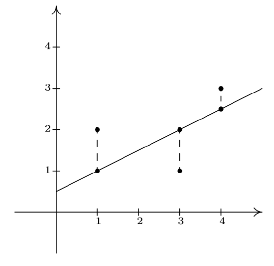
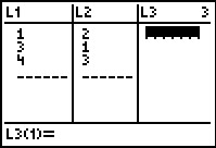
We find the total squared error \(E\) by taking the sum of the squares of the differences of the \(y\)-coordinates of each data point and its corresponding point on the line. For the data and line above \(E = (2-1)^2+(1-2)^2+\left(3-\frac{5}{2}\right)^2 = \frac{9}{4}\). Using advanced mathematical machinery, (specifically Calculus and Linear Algebra) it is possible to find the line which results in the lowest value of \(E\). This line is called the least squares regression line, or sometimes the 'line of best fit'. The formula for the line of best fit requires notation we won't present until Chapter 9, so we will revisit it then. The graphing calculator can come to our assistance here, since it has a built-in feature to compute the regression line. We enter the data and perform the Linear Regression feature and we get
The calculator tells us that the line of best fit is \(y=ax+b\) where the slope is \(a \approx 0.214\) and the \(y\)-coordinate of the \(y\)-intercept is \(b \approx 1.428\). (We will stick to using three decimal places for our approximations.) Using this line, we compute the total squared error for our data to be \(E \approx 1.786\). The value \(r\) is the correlation coefficient and is a measure of how close the data is to being on the same line. The closer \(|r|\) is to \(1\), the better the linear fit. Since \(r \approx 0.327\), this tells us that the line of best fit doesn't fit all that well - in other words, our data points aren't close to being linear. The value \(r^2\) is called the coefficient of determination and is also a measure of the goodness of fit.\footnote{We refer the interested reader to a course in Statistics to explore the significance of \(r\) and \(r^2\).} Plotting the data with its regression line results in the picture below.
Our first example looks at energy consumption in the US over the past 50 years.
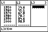
\[\begin{array}{|c|c|} \hline \mbox{Year} & \mbox{Energy Usage,} \\ & \mbox{ in Quads} \\ \hline 1950 & 34.6 \\ \hline 1960 & 45.1 \\ \hline 1970 & 67.8 \\ \hline 1980 & 78.3 \\ \hline 1990 & 84.6 \\ \hline 2000 & 98.9 \\ \hline \end{array}\]
The unit 1 Quad is 1 Quadrillion = \(10^{15}\) BTUs, which is enough heat to raise Lake Erie roughly \(1^{\circ}\)F}
Example \(\PageIndex{1}\): Energy Consumption
Using the energy consumption data given above,
- Plot the data using a graphing calculator.
- Find the least squares regression line and comment on the goodness of fit.
- Interpret the slope of the line of best fit.
- Use the regression line to predict the annual US energy consumption in the year \(2013\).
- Use the regression line to predict when the annual consumption will reach \(120\) Quads.
Solution
- Entering the data into the calculator gives
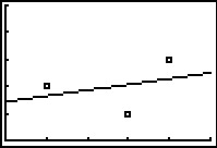
- Performing a linear regression produces
We can tell both from the correlation coefficient as well as the graph that the regression line is a good fit to the data.
- The slope of the regression line is \(a \approx 1.287\). To interpret this, recall that the slope is the rate of change of the \(y\)-coordinates with respect to the \(x\)-coordinates. Since the \(y\)-coordinates represent the energy usage in Quads, and the \(x\)-coordinates represent years, a slope of positive \(1.287\) indicates an increase in annual energy usage at the rate of \(1.287\) Quads per year.
- To predict the energy needs in \(2013\), we substitute \(x=2013\) into the equation of the line of best fit to get \[y = 1.287(2013)-2473.890 \approx 116.841.\] The predicted annual energy usage of the US in \(2013\) is approximately \(116.841\) Quads.
- To predict when the annual US energy usage will reach \(120\) Quads, we substitute \(y=120\) into the equation of the line of best fit to get \[120 = 1.287x - 2473.908.\] Solving for \(x\) yields \(x \approx 2015.454\). Since the regression line is increasing, we interpret this result as saying the annual usage in \(2015\) won't yet be \(120\) Quads, but that in \(2016\), the demand will be more than \(120\) Quads.
Our next example gives us an opportunity to find a nonlinear model to fit the data. According to the National Weather Service, the predicted hourly temperatures for Painesville on March 3, 2009 were given as summarized below.
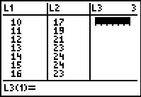
\[\begin{array}{|c|c|} \hline \mbox{Time} & \mbox{Temperature, \(^{\circ}\)F} \\ \hline 10 \mbox{AM} & 17 \\ \hline 11 \mbox{AM} & 19 \\ \hline 12 \mbox{PM} & 21 \\ \hline 1 \mbox{PM} & 23 \\ \hline 2 \mbox{PM} & 24 \\ \hline 3 \mbox{PM} & 24 \\ \hline 4 \mbox{PM} & 23 \\ \hline \end{array}\]
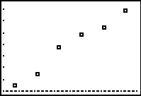
To enter this data into the calculator, we need to adjust the \(x\) values, since just entering the numbers could cause confusion. (Do you see why?) We have a few options available to us. Perhaps the easiest is to convert the times into the 24 hour clock time so that \(1\) PM is \(13\), \(2\) PM is \(14\), etc.. If we enter these data into the graphing calculator and plot the points we get
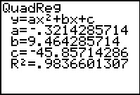
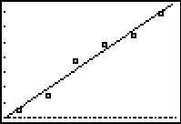
While the beginning of the data looks linear, the temperature begins to fall in the afternoon hours. This sort of behavior reminds us of parabolas, and, sure enough, it is possible to find a parabola of best fit in the same way we found a line of best fit. The process is called quadratic regression and its goal is to minimize the least square error of the data with their corresponding points on the parabola. The calculator has a built in feature for this as well which yields
The coefficient of determination \(R^2\) seems reasonably close to \(1\), and the graph visually seems to be a decent fit. We use this model in our next example.
Example \(\PageIndex{2}\): Quadratic Regression
Using the quadratic model for the temperature data above, predict the warmest temperature of the day. When will this occur?
Solution
The maximum temperature will occur at the vertex of the parabola. Recalling the Vertex Formula, Equation 2.4, \[x = -\frac{b}{2a} \approx - \frac{9.464}{2(-0.321)} \approx 14.741.\] This corresponds to roughly \(2\!:\!45\) PM. To find the temperature, we substitute \(x = 14.741\) into \[y = -0.321 x^2+9.464x - 45.857\] to get \(y \approx 23.899\), or \(23.899^{\circ}\)F.
The results of the last example should remind you that regression models are just that, models. Our predicted warmest temperature was found to be \(23.899^{\circ}\)F, but our data says it will warm to \(24^{\circ}\)F. It's all well and good to observe trends and guess at a model, but a more thorough investigation into why certain data should be linear or quadratic in nature is usually in order - and that, most often, is the business of scientists.