Section 6.4: Pie Graphs
- Page ID
- 216504

\( \newcommand{\vecs}[1]{\overset { \scriptstyle \rightharpoonup} {\mathbf{#1}} } \)
\( \newcommand{\vecd}[1]{\overset{-\!-\!\rightharpoonup}{\vphantom{a}\smash {#1}}} \)
\( \newcommand{\dsum}{\displaystyle\sum\limits} \)
\( \newcommand{\dint}{\displaystyle\int\limits} \)
\( \newcommand{\dlim}{\displaystyle\lim\limits} \)
\( \newcommand{\id}{\mathrm{id}}\) \( \newcommand{\Span}{\mathrm{span}}\)
( \newcommand{\kernel}{\mathrm{null}\,}\) \( \newcommand{\range}{\mathrm{range}\,}\)
\( \newcommand{\RealPart}{\mathrm{Re}}\) \( \newcommand{\ImaginaryPart}{\mathrm{Im}}\)
\( \newcommand{\Argument}{\mathrm{Arg}}\) \( \newcommand{\norm}[1]{\| #1 \|}\)
\( \newcommand{\inner}[2]{\langle #1, #2 \rangle}\)
\( \newcommand{\Span}{\mathrm{span}}\)
\( \newcommand{\id}{\mathrm{id}}\)
\( \newcommand{\Span}{\mathrm{span}}\)
\( \newcommand{\kernel}{\mathrm{null}\,}\)
\( \newcommand{\range}{\mathrm{range}\,}\)
\( \newcommand{\RealPart}{\mathrm{Re}}\)
\( \newcommand{\ImaginaryPart}{\mathrm{Im}}\)
\( \newcommand{\Argument}{\mathrm{Arg}}\)
\( \newcommand{\norm}[1]{\| #1 \|}\)
\( \newcommand{\inner}[2]{\langle #1, #2 \rangle}\)
\( \newcommand{\Span}{\mathrm{span}}\) \( \newcommand{\AA}{\unicode[.8,0]{x212B}}\)
\( \newcommand{\vectorA}[1]{\vec{#1}} % arrow\)
\( \newcommand{\vectorAt}[1]{\vec{\text{#1}}} % arrow\)
\( \newcommand{\vectorB}[1]{\overset { \scriptstyle \rightharpoonup} {\mathbf{#1}} } \)
\( \newcommand{\vectorC}[1]{\textbf{#1}} \)
\( \newcommand{\vectorD}[1]{\overrightarrow{#1}} \)
\( \newcommand{\vectorDt}[1]{\overrightarrow{\text{#1}}} \)
\( \newcommand{\vectE}[1]{\overset{-\!-\!\rightharpoonup}{\vphantom{a}\smash{\mathbf {#1}}}} \)
\( \newcommand{\vecs}[1]{\overset { \scriptstyle \rightharpoonup} {\mathbf{#1}} } \)
\(\newcommand{\longvect}{\overrightarrow}\)
\( \newcommand{\vecd}[1]{\overset{-\!-\!\rightharpoonup}{\vphantom{a}\smash {#1}}} \)
\(\newcommand{\avec}{\mathbf a}\) \(\newcommand{\bvec}{\mathbf b}\) \(\newcommand{\cvec}{\mathbf c}\) \(\newcommand{\dvec}{\mathbf d}\) \(\newcommand{\dtil}{\widetilde{\mathbf d}}\) \(\newcommand{\evec}{\mathbf e}\) \(\newcommand{\fvec}{\mathbf f}\) \(\newcommand{\nvec}{\mathbf n}\) \(\newcommand{\pvec}{\mathbf p}\) \(\newcommand{\qvec}{\mathbf q}\) \(\newcommand{\svec}{\mathbf s}\) \(\newcommand{\tvec}{\mathbf t}\) \(\newcommand{\uvec}{\mathbf u}\) \(\newcommand{\vvec}{\mathbf v}\) \(\newcommand{\wvec}{\mathbf w}\) \(\newcommand{\xvec}{\mathbf x}\) \(\newcommand{\yvec}{\mathbf y}\) \(\newcommand{\zvec}{\mathbf z}\) \(\newcommand{\rvec}{\mathbf r}\) \(\newcommand{\mvec}{\mathbf m}\) \(\newcommand{\zerovec}{\mathbf 0}\) \(\newcommand{\onevec}{\mathbf 1}\) \(\newcommand{\real}{\mathbb R}\) \(\newcommand{\twovec}[2]{\left[\begin{array}{r}#1 \\ #2 \end{array}\right]}\) \(\newcommand{\ctwovec}[2]{\left[\begin{array}{c}#1 \\ #2 \end{array}\right]}\) \(\newcommand{\threevec}[3]{\left[\begin{array}{r}#1 \\ #2 \\ #3 \end{array}\right]}\) \(\newcommand{\cthreevec}[3]{\left[\begin{array}{c}#1 \\ #2 \\ #3 \end{array}\right]}\) \(\newcommand{\fourvec}[4]{\left[\begin{array}{r}#1 \\ #2 \\ #3 \\ #4 \end{array}\right]}\) \(\newcommand{\cfourvec}[4]{\left[\begin{array}{c}#1 \\ #2 \\ #3 \\ #4 \end{array}\right]}\) \(\newcommand{\fivevec}[5]{\left[\begin{array}{r}#1 \\ #2 \\ #3 \\ #4 \\ #5 \\ \end{array}\right]}\) \(\newcommand{\cfivevec}[5]{\left[\begin{array}{c}#1 \\ #2 \\ #3 \\ #4 \\ #5 \\ \end{array}\right]}\) \(\newcommand{\mattwo}[4]{\left[\begin{array}{rr}#1 \amp #2 \\ #3 \amp #4 \\ \end{array}\right]}\) \(\newcommand{\laspan}[1]{\text{Span}\{#1\}}\) \(\newcommand{\bcal}{\cal B}\) \(\newcommand{\ccal}{\cal C}\) \(\newcommand{\scal}{\cal S}\) \(\newcommand{\wcal}{\cal W}\) \(\newcommand{\ecal}{\cal E}\) \(\newcommand{\coords}[2]{\left\{#1\right\}_{#2}}\) \(\newcommand{\gray}[1]{\color{gray}{#1}}\) \(\newcommand{\lgray}[1]{\color{lightgray}{#1}}\) \(\newcommand{\rank}{\operatorname{rank}}\) \(\newcommand{\row}{\text{Row}}\) \(\newcommand{\col}{\text{Col}}\) \(\renewcommand{\row}{\text{Row}}\) \(\newcommand{\nul}{\text{Nul}}\) \(\newcommand{\var}{\text{Var}}\) \(\newcommand{\corr}{\text{corr}}\) \(\newcommand{\len}[1]{\left|#1\right|}\) \(\newcommand{\bbar}{\overline{\bvec}}\) \(\newcommand{\bhat}{\widehat{\bvec}}\) \(\newcommand{\bperp}{\bvec^\perp}\) \(\newcommand{\xhat}{\widehat{\xvec}}\) \(\newcommand{\vhat}{\widehat{\vvec}}\) \(\newcommand{\uhat}{\widehat{\uvec}}\) \(\newcommand{\what}{\widehat{\wvec}}\) \(\newcommand{\Sighat}{\widehat{\Sigma}}\) \(\newcommand{\lt}{<}\) \(\newcommand{\gt}{>}\) \(\newcommand{\amp}{&}\) \(\definecolor{fillinmathshade}{gray}{0.9}\)- Draw pie graphs
A pie graph (also called a pie chart) is a circular graph divided into slices, where each slice represents a category or part of the whole. The size of each slice is proportional to the percentage or frequency of that category relative to the total. Pie graphs are particularly useful for displaying how a whole is divided into parts, making it easy to see the relative proportions at a glance.
When to Use Pie Graphs
Pie graphs are most effective when you want to:
- Show how parts make up a whole (100%)
- Display categorical data with relatively few categories (typically 2-6)
- Emphasize proportions or percentages rather than exact values
- Make quick visual comparisons of relative sizes
Key Components of a Pie Graph
- The Circle (Pie): Represents the whole data set or 100%
- Slices (Sectors): Each slice represents one category, with its size proportional to its percentage of the total
- Labels: Identify what each slice represents, often including the category name and percentage or frequency
- Title: Describes what the pie graph represents
Advantages of Pie Graphs
- Intuitive: Easy to understand—everyone recognizes the concept of "pieces of a pie"
- Shows proportions clearly: Visual impact makes it obvious which categories are larger or smaller
- Emphasizes the whole: Reinforces that all categories together equal 100%
- Aesthetically appealing: Colorful and engaging for presentations and reports
Limitations of Pie Graphs
- Difficult to compare similar-sized slices: When percentages are close, it's hard to tell which is larger
- Not suitable for many categories: More than 5-6 slices become cluttered and hard to read
- Poor for precise comparisons: Bar graphs are better when exact values matter
- Can't show trends over time: Only displays data for one time point
- Requires percentages or proportions: Doesn't work well with raw counts unless converted
When NOT to use Pie Graphs
Avoid pie graphs when:
- You have more than 6-7 categories (especially if some slices are too small)
- Categories have very similar percentages (hard to distinguish)
- You need to compare multiple data sets
- Exact values are more important than proportions
- You're showing change over time
In these cases, bar graphs, line graphs, or other displays are more appropriate.
- Step 1 — Obtain the sum of your categorical data.
- Step 2 — Calculate the frequency and percentage for each category.
- Step 3 — Verify that percentages sum to 100%.
- Step 4 — Sketch the circle and mark the slices based off the percentages (or use software).
- Step 5 — Label each slice with the category name and percentage.
- Step 6 — Add a title and legend, if necessary.
A college surveyed 200 students about their class standing:
| Classes | Frequency |
|---|---|
| Freshman | 60 |
| Sophomore | 50 |
| Junior | 45 |
| Senior | 45 |
Create a pie graph to display this data.
✅ Solution:
- Step 1 — Obtain the sum of your categorical data: Here the sum was given. We will still verify to be sure. 60 + 50 + 45 + 45 = 200.
- Step 2 — Calculate the frequency and percentage for each category:
- Freshman: \(\frac{60}{200}=30\%\)
- Sophomore: \(\frac{50}{200}=25\%\)
- Junior: \(\frac{45}{200}=22.5\%\)
- Senior: \(\frac{45}{200}=22.5\%\)
- Step 3 — Verify that percentages sum to 100%: 30% + 25% + 22.5% + 22.5% = 100%.
- Step 4 — Sketch the circle and mark the slices based off the percentages (or use software): Here we used Excel software.
- Step 5 — Label each slice with the category name and percentage: Label each of the slices along with the percentages: Freshman at 30%, Sophomore at 25%, Junior at 22%, and Senior at 23%.
- Step 6 — Add a title and legend, if necessary: Add the title, "Class Standings" or some other similar title.

A teacher recorded final grades for 40 students:
| Classes | Frequency |
|---|---|
| A | 8 |
| B | 14 |
| C | 12 |
| D | 4 |
| F | 2 |
Create a pie graph to display this data.
✅ Solution:
- Step 1 — Obtain the sum of your categorical data: Here the sum was given. We will still verify to be sure. 8 + 14 + 12 + 4 + 2 = 40.
- Step 2 — Calculate the frequency and percentage for each category:
- A: \(\frac{8}{40}=20\%\)
- B: \(\frac{14}{40}=35\%\)
- C: \(\frac{12}{40}=30\%\)
- D: \(\frac{4}{40}=10\%\)
- F: \(\frac{2}{40}=5\%\)
- Step 3 — Verify that percentages sum to 100%: 20% + 35% + 30% + 10% + 5% = 100%.
- Step 4 — Sketch the circle and mark the slices based off the percentages (or use software): Here we used Excel software.
- Step 5 — Label each slice with the category name and percentage: Label each of the slices along with the percentages: A at 20%, B at 35%, C at 30%, D at 10%, and F at 5%.
- Step 6 — Add a title and legend, if necessary: Add the title, "Final Grades" or some other similar title.

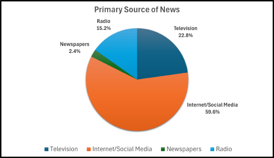
A survey was conducted and asked adults their primary source of news:
| News Source | Respondents |
|---|---|
| Television | 57 |
| Internet/Social Media | 149 |
| Newspapers | 6 |
| Radio | 38 |
Create a bar graph to display this data.
✅ Solution:
- Step 1 — Obtain the sum of your categorical data: The sum is 57 + 149 + 6 + 38 = 250.
- Step 2 — Calculate the frequency and percentage for each category:
- Television: \(\frac{57}{250}=22.8\%\)
- Internet/Social Media: \(\frac{149}{250}=59.6\%\)
- Newspapers: \(\frac{6}{250}=2.4\%\)
- Radio: \(\frac{38}{250}=15.2\%\)
- Step 3 — Verify that percentages sum to 100%: 22.8% + 59.6% + 2.4% + 15.2% = 100%.
- Step 4 — Sketch the circle and mark the slices based off the percentages (or use software): Here we used Excel software.
- Step 5 — Label each slice with the category name and percentage: Label each of the slices along with the percentages: Television at 22.8%, Internet/Social Media at 59.6%, Newspapers at 2.4%, and Radio at 15.2%
- Step 6 — Add a title and legend, if necessary: Add the title, "Primary Source of News" or some other similar title.
A survey of 500 smartphone users were asked which type of phone that they own/prefer. The results are in the pie graph below:
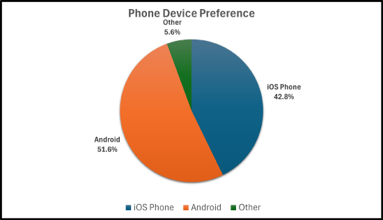
- How many smartphone users own an iPhone?
- How many smartphone users do not own an Android?
- Based off these results, how many Android users would we expect there to be in a town of 1,200 people.
✅ Solution:
- How many smartphone users own an iPhone?
- Change \(42.8\%\) to a decimal, which is \(0.428\). Then, \((0.428)\cdot(500)=214\). So, \(214\) smartphone users own an iPhone.
- How many smartphone users do not own an Android?
- \(5.6\% + 42.8\% = 48.4\%\). Change \(48.4\%\) to a decimal, which is \(0.484\). Then, \((0.484)\cdot(500)=242\). So, \(242\) smartphone users do not own an Android.
- Based off these results, how many Android users would we expect there to be in a town of \(\text{1,200}\) people.
- Change \(51.6\%\) to a decimal, which is \(0.516\). Then, \((0.516)\cdot(\text{1,200})=619.2\). So, about \(619\) smartphone users own an Android.
A travel agency surveyed 349 clients about preferred vacation types. The results are in the pie graph below:

- How many clients preferred the mountains?
- How many clients preferred lake/countryside or national parks/wildlife?
- Which vacation type is the most popular? How many clients preferred that vacation type?
- Which vacation type is the least popular? How many clients preferred that vacation type?
✅ Solution:
- How many clients preferred the mountains?
- Change \(18.3\%\) to a decimal, which is \(0.183\). Then, \((0.183)\cdot(349)=63.867\). So, 64 clients preferred the mountains.
- How many clients preferred lake/countryside or national parks/wildlife?
- \(8.6\% + 11.5\% = 20.1\%\). Change \(20.1\%\) to a decimal, which is \(0.201\). Then, \((0.201)\cdot(349)=70.1492\). So, 70 clients preferred the lake/countryside or national parks/wildlife.
- Which vacation type is the most popular? How many clients preferred that vacation type?
- Change \(27.2\%\) to a decimal, which is \(0.272\). Then, \((0.272)\cdot(349)=94.928\). So, about \(95\) clients preferred the beach.
- Which vacation type is the least popular? How many clients preferred that vacation type?
- Change \(8\%\) to a decimal, which is \(0.08\). Then, \((0.08)\cdot(349)=27.92\). So, about \(28\) clients preferred a cruise.
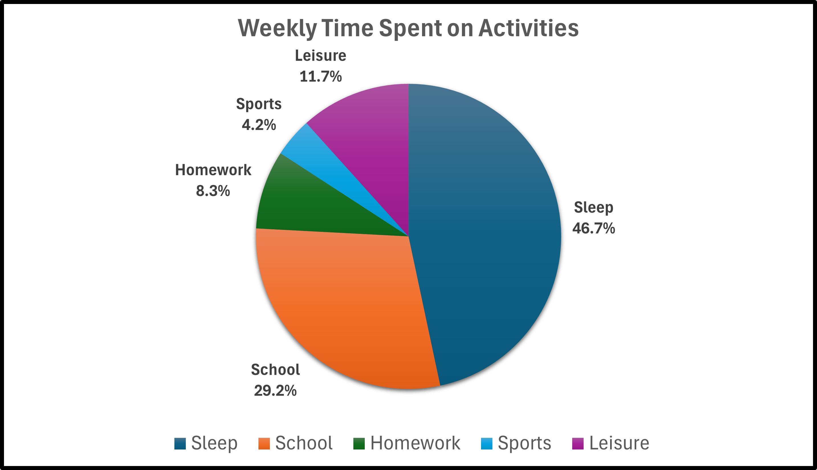
- A student recorded how many hours they spent on weekly activities:
| Activity | Hours |
|---|---|
| Sleep | 56 |
| School | 35 |
| Homework | 10 |
| Sports | 5 |
| Leisure | 14 |
Construct a pie graph for the data.
- A survey of 100 8th-graders was conducted. They were asked what their favorite sport is.The results are given in the frequency table.
| Sport | No. of 8th Graders |
|---|---|
| Baseball | 17 |
| Basketball | 26 |
| Football | 22 |
| Hockey | 15 |
| Track | 6 |
| Volleyball | 9 |
| Wrestling | 5 |
Construct a pie graph for the data.
- Four states have no official minimum age, but still require either parental consent, court approval or both. Those states are California, Mississippi, New Mexico, and Oklahoma. According to city-data.com, the following pie graph shows the marital status of the population for ages 15 years and over in Anaheim, CA.

- If the population of Anaheim is 344,000, how many people are divorced?
- If the population of Anaheim is 344,000, how many people are divorced or separated?
- If the population of Anaheim is 344,000, how many people were ever married?
- Answers
-


- a) 26,488; b) 33,024; c) 209,152.