
Section 6.6: Line Graphs
- Page ID
- 216506

\( \newcommand{\vecs}[1]{\overset { \scriptstyle \rightharpoonup} {\mathbf{#1}} } \)
\( \newcommand{\vecd}[1]{\overset{-\!-\!\rightharpoonup}{\vphantom{a}\smash {#1}}} \)
\( \newcommand{\dsum}{\displaystyle\sum\limits} \)
\( \newcommand{\dint}{\displaystyle\int\limits} \)
\( \newcommand{\dlim}{\displaystyle\lim\limits} \)
\( \newcommand{\id}{\mathrm{id}}\) \( \newcommand{\Span}{\mathrm{span}}\)
( \newcommand{\kernel}{\mathrm{null}\,}\) \( \newcommand{\range}{\mathrm{range}\,}\)
\( \newcommand{\RealPart}{\mathrm{Re}}\) \( \newcommand{\ImaginaryPart}{\mathrm{Im}}\)
\( \newcommand{\Argument}{\mathrm{Arg}}\) \( \newcommand{\norm}[1]{\| #1 \|}\)
\( \newcommand{\inner}[2]{\langle #1, #2 \rangle}\)
\( \newcommand{\Span}{\mathrm{span}}\)
\( \newcommand{\id}{\mathrm{id}}\)
\( \newcommand{\Span}{\mathrm{span}}\)
\( \newcommand{\kernel}{\mathrm{null}\,}\)
\( \newcommand{\range}{\mathrm{range}\,}\)
\( \newcommand{\RealPart}{\mathrm{Re}}\)
\( \newcommand{\ImaginaryPart}{\mathrm{Im}}\)
\( \newcommand{\Argument}{\mathrm{Arg}}\)
\( \newcommand{\norm}[1]{\| #1 \|}\)
\( \newcommand{\inner}[2]{\langle #1, #2 \rangle}\)
\( \newcommand{\Span}{\mathrm{span}}\) \( \newcommand{\AA}{\unicode[.8,0]{x212B}}\)
\( \newcommand{\vectorA}[1]{\vec{#1}} % arrow\)
\( \newcommand{\vectorAt}[1]{\vec{\text{#1}}} % arrow\)
\( \newcommand{\vectorB}[1]{\overset { \scriptstyle \rightharpoonup} {\mathbf{#1}} } \)
\( \newcommand{\vectorC}[1]{\textbf{#1}} \)
\( \newcommand{\vectorD}[1]{\overrightarrow{#1}} \)
\( \newcommand{\vectorDt}[1]{\overrightarrow{\text{#1}}} \)
\( \newcommand{\vectE}[1]{\overset{-\!-\!\rightharpoonup}{\vphantom{a}\smash{\mathbf {#1}}}} \)
\( \newcommand{\vecs}[1]{\overset { \scriptstyle \rightharpoonup} {\mathbf{#1}} } \)
\(\newcommand{\longvect}{\overrightarrow}\)
\( \newcommand{\vecd}[1]{\overset{-\!-\!\rightharpoonup}{\vphantom{a}\smash {#1}}} \)
\(\newcommand{\avec}{\mathbf a}\) \(\newcommand{\bvec}{\mathbf b}\) \(\newcommand{\cvec}{\mathbf c}\) \(\newcommand{\dvec}{\mathbf d}\) \(\newcommand{\dtil}{\widetilde{\mathbf d}}\) \(\newcommand{\evec}{\mathbf e}\) \(\newcommand{\fvec}{\mathbf f}\) \(\newcommand{\nvec}{\mathbf n}\) \(\newcommand{\pvec}{\mathbf p}\) \(\newcommand{\qvec}{\mathbf q}\) \(\newcommand{\svec}{\mathbf s}\) \(\newcommand{\tvec}{\mathbf t}\) \(\newcommand{\uvec}{\mathbf u}\) \(\newcommand{\vvec}{\mathbf v}\) \(\newcommand{\wvec}{\mathbf w}\) \(\newcommand{\xvec}{\mathbf x}\) \(\newcommand{\yvec}{\mathbf y}\) \(\newcommand{\zvec}{\mathbf z}\) \(\newcommand{\rvec}{\mathbf r}\) \(\newcommand{\mvec}{\mathbf m}\) \(\newcommand{\zerovec}{\mathbf 0}\) \(\newcommand{\onevec}{\mathbf 1}\) \(\newcommand{\real}{\mathbb R}\) \(\newcommand{\twovec}[2]{\left[\begin{array}{r}#1 \\ #2 \end{array}\right]}\) \(\newcommand{\ctwovec}[2]{\left[\begin{array}{c}#1 \\ #2 \end{array}\right]}\) \(\newcommand{\threevec}[3]{\left[\begin{array}{r}#1 \\ #2 \\ #3 \end{array}\right]}\) \(\newcommand{\cthreevec}[3]{\left[\begin{array}{c}#1 \\ #2 \\ #3 \end{array}\right]}\) \(\newcommand{\fourvec}[4]{\left[\begin{array}{r}#1 \\ #2 \\ #3 \\ #4 \end{array}\right]}\) \(\newcommand{\cfourvec}[4]{\left[\begin{array}{c}#1 \\ #2 \\ #3 \\ #4 \end{array}\right]}\) \(\newcommand{\fivevec}[5]{\left[\begin{array}{r}#1 \\ #2 \\ #3 \\ #4 \\ #5 \\ \end{array}\right]}\) \(\newcommand{\cfivevec}[5]{\left[\begin{array}{c}#1 \\ #2 \\ #3 \\ #4 \\ #5 \\ \end{array}\right]}\) \(\newcommand{\mattwo}[4]{\left[\begin{array}{rr}#1 \amp #2 \\ #3 \amp #4 \\ \end{array}\right]}\) \(\newcommand{\laspan}[1]{\text{Span}\{#1\}}\) \(\newcommand{\bcal}{\cal B}\) \(\newcommand{\ccal}{\cal C}\) \(\newcommand{\scal}{\cal S}\) \(\newcommand{\wcal}{\cal W}\) \(\newcommand{\ecal}{\cal E}\) \(\newcommand{\coords}[2]{\left\{#1\right\}_{#2}}\) \(\newcommand{\gray}[1]{\color{gray}{#1}}\) \(\newcommand{\lgray}[1]{\color{lightgray}{#1}}\) \(\newcommand{\rank}{\operatorname{rank}}\) \(\newcommand{\row}{\text{Row}}\) \(\newcommand{\col}{\text{Col}}\) \(\renewcommand{\row}{\text{Row}}\) \(\newcommand{\nul}{\text{Nul}}\) \(\newcommand{\var}{\text{Var}}\) \(\newcommand{\corr}{\text{corr}}\) \(\newcommand{\len}[1]{\left|#1\right|}\) \(\newcommand{\bbar}{\overline{\bvec}}\) \(\newcommand{\bhat}{\widehat{\bvec}}\) \(\newcommand{\bperp}{\bvec^\perp}\) \(\newcommand{\xhat}{\widehat{\xvec}}\) \(\newcommand{\vhat}{\widehat{\vvec}}\) \(\newcommand{\uhat}{\widehat{\uvec}}\) \(\newcommand{\what}{\widehat{\wvec}}\) \(\newcommand{\Sighat}{\widehat{\Sigma}}\) \(\newcommand{\lt}{<}\) \(\newcommand{\gt}{>}\) \(\newcommand{\amp}{&}\) \(\definecolor{fillinmathshade}{gray}{0.9}\)- Draw line graphs
A line graph (also called a line chart or line plot) is a type of graph that displays data as points connected by straight line segments. Line graphs are particularly effective for showing trends, patterns, and changes in data over time or across ordered categories. The connected points create a visual flow that makes it easy to see how values increase, decrease, or remain constant.
When to Use Line Graphs
Line graphs are most effective when you want to:
- Show change or trends over time (days, months, years, etc.)
- Display continuous data or data measured at regular intervals
- Compare trends between two or more groups
- Emphasize the rate of change rather than individual values
- Track progress or performance over time
- Identify patterns such as seasonal variations or cycles
Key Components of a Line Graph
- Horizontal Axis (x-axis): Typically represents time or an ordered sequence (years, months, days, measurement intervals)
- Vertical Axis (y-axis): Represents the variable being measured (temperature, price, test scores, population, etc.)
- Data Points: Individual values plotted at their corresponding coordinates
- Line Segments: Straight lines connecting consecutive data points, showing the progression from one value to the next
- Labels and Titles: Clear axis labels with units, and a descriptive title for the entire graph
- Scale: Consistent intervals on both axes, with the y-axis starting typically (but not always) at zero
- Legend (for multiple lines): Identifies what each line represents when comparing multiple data sets
Types of Line Graphs
- Simple Line Graph: Shows one variable over time
- Example: Daily temperature for one week
- One line tracking a single data series

- Multiple Line Graph: Shows two or more variables on the same graph for comparison
- Example: Comparing sales for Product A and Product B over the same time period
- Different lines are usually distinguished by color or line style (solid, dashed, dotted)
- Requires a legend to identify each line
How Line Graphs Work
Each data point is plotted at the intersection of its x-coordinate (often time) and y-coordinate (measured value). Once all points are plotted, they are connected in order with straight lines. The resulting graph creates a visual representation of how the variable changes, with:
- Upward slopes indicating increases
- Downward slopes showing decreases
- Horizontal sections representing no change
- Steep slopes showing rapid change
- Gradual slopes indicating slow, steady change
Advantages of Line Graphs
- Excellent for showing trends: The connected lines make patterns immediately visible
- Easy to see changes over time: Increases and decreases are obvious from the line's direction
- Multiple data sets: Can display several lines on one graph for comparison
- Shows rate of change: Steep lines indicate rapid change; flat lines show stability
- Continuous flow: Creates a sense of progression and continuity
- Predictions: Trends can suggest future values (though caution is needed)
- Identifies patterns: Cycles, peaks, and valleys become apparent
Limitations of Line Graphs
- Can be misleading with non-continuous data: Connecting discrete, unrelated categories may imply relationships that don't exist
- Cluttered with too many lines: More than 3-4 lines become difficult to read and compare
- Scale manipulation: Changing the y-axis scale can exaggerate or minimize trends
- Assumes linear change between points: The straight lines suggest constant rate of change between measurements, which may not be accurate
- Requires ordered data: The x-axis must represent a logical sequence
- Can hide individual data points: Focus on trend may obscure specific values
When NOT to use Line Graphs
Avoid line graphs when:
- Data is not ordered or sequential (use bar graphs instead for unrelated categories)
- You're comparing unrelated categories where connections would be meaningless
- You want to emphasize individual values rather than trends
- Data points are too sparse to show meaningful trends
- The independent variable is categorical with no natural order
- You need to show parts of a whole (use pie charts)
- You're showing the relationship between two quantitative variables (use scatter plots)
- Step 1 — Obtain the the data in a table.
- Step 2 — Set up the axes and label.
- Step 3 — Plot the data points.
- Step 4 — Connect the points.
- Step 5 — Add a title and legend, if necessary.
A small business tracked its monthly revenue (in thousands of dollars) for the first six months:
| Month | Revenue |
|---|---|
| January | 45 |
| February | 52 |
| March | 45 |
| April | 55 |
| May | 63 |
| June | 34 |
Create a line graph to display this data.
✅ Solution:
- Step 1 — Obtain the data in a table: This step is done, since the data was given in a frequency distribution.
- Step 2 — Set up the axes and label:
- Label the main axes: "Months", for the horizontal axis & "Revenue ($1,000)", for the vertical axis.
- On the horizontal axis, "Months", label the following: January, February, March, April, May, and June.
- On the vertical axis, "Revenue ($1,000)", since the minimum frequency is 34 and the maximum frequency is 63, then increments of 5 can be used for the tick marks on the vertical axis, starting from 0 (or 30) to 65 (or 70).
- Step 3 — Plot the data points: On January at 45, February at 52, March at 45, April at 55, May at 63, and June at 34.
- Step 4 — Connect the points: Connect the points from left to right using one straight line between each set of points.
- Step 5 — Add a title and legend, if necessary: Add the title, "Monthly Revenue" or some other similar title.

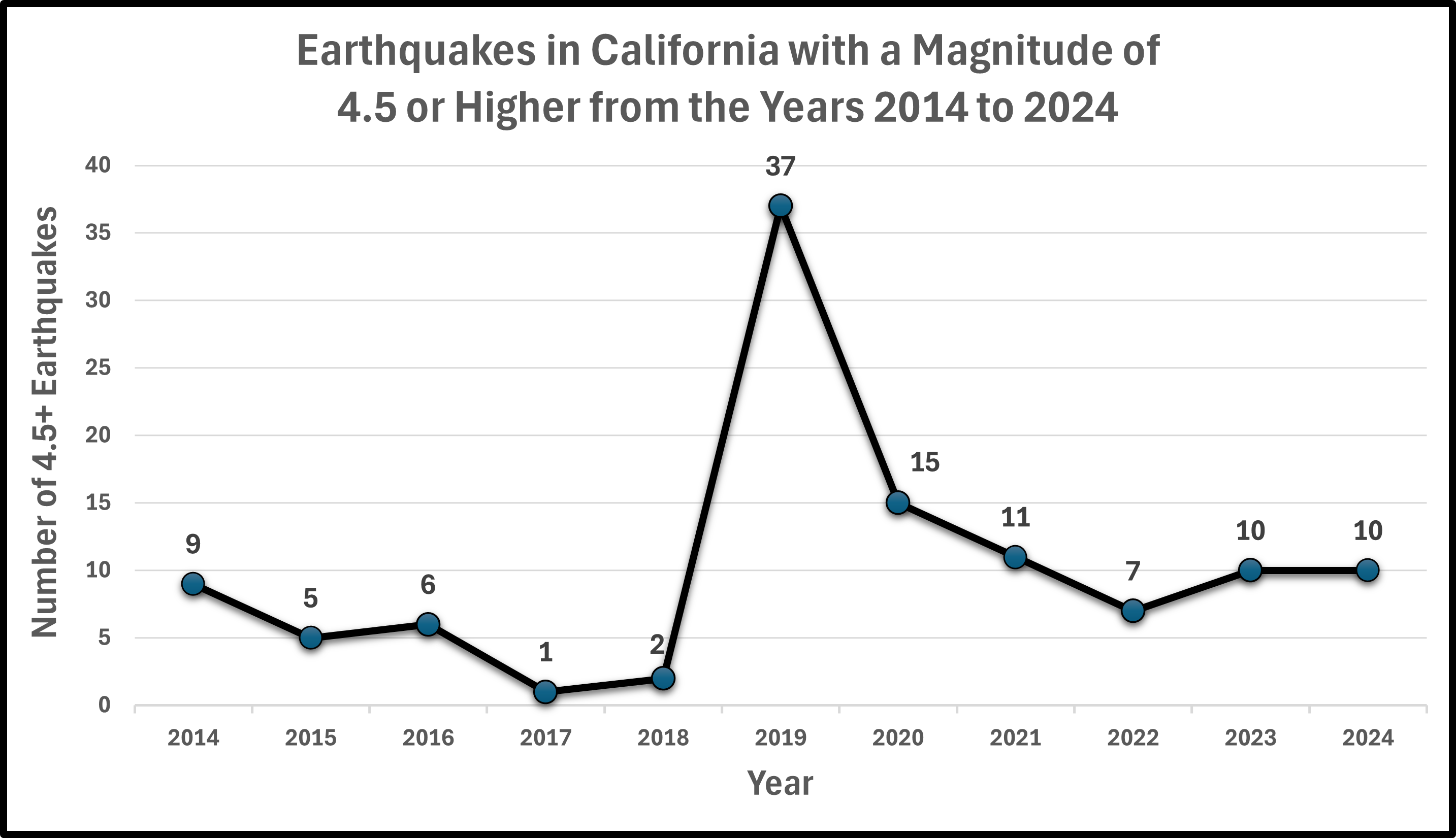
According to the United States Geological Survey (USGS), there were 112 earthquakes in California with a magnitude of 4.5 or higher, from the years 2014 to 2024. The following number of earthquakes with a magnitude of 4.5 or more is given in the table below.
| Year | Number of 4.5+ Earthquakes |
|---|---|
| 2014 | 9 |
| 2015 | 5 |
| 2016 | 6 |
| 2017 | 1 |
| 2018 | 2 |
| 2019 | 37 |
| 2020 | 15 |
| 2021 | 11 |
| 2022 | 7 |
| 2023 | 10 |
| 2024 | 10 |
Create a line graph to display this data.
✅ Solution:
- Step 1 — Obtain the data in a table: This step is done, since the data was given in a frequency distribution.
- Step 2 — Set up the axes and label:
- Label the main axes: "Year", for the horizontal axis & "Number of 4.5+ Earthquakes", for the vertical axis.
- On the horizontal axis, "Months", label the following: 2014, 2015, 2016, 2017, 2018, 2019, 2020, 2021, 2022, 2023, and 2024.
- On the vertical axis, "Number of 4.5+ Earthquakes", since the minimum frequency is 1 and the maximum frequency is 37, then increments of 5 can be used for the tick marks on the vertical axis, starting from 0 to 40.
- Step 3 — Plot the data points: On 2014 at 9, 2015 at 5, 2016 at 6, 2017 at 1, 2018 at 2, 2019 at 37, 2020 at 15, 2021 at 11, 2022 at 7, 2023 at 10, and 2024 at 10.
- Step 4 — Connect the points: Connect the points from left to right using one straight line between each set of points.
- Step 5 — Add a title and legend, if necessary: Add the title, "Earthquakes in California with a Magnitude of 4.5 or Higher from the Years 2014 to 2024" or some other similar title.
According to the U.S. Energy Information Administration (EIA), the average monthly retail price per gallon for regular gasoline in California during 2024 is given below:
| Month | Price per Gallon (in dollars) |
|---|---|
| Jan | $4.482 |
| Feb | $4.535 |
| Mar | $4.831 |
| Apr | $5.255 |
| May | $5.518 |
| Jun | $4.777 |
| Jul | $4.590 |
| Aug | $4.451 |
| Sep | $4.574 |
| Oct | $4.513 |
| Nov | $4.355 |
| Dec | $4.243 |
Create a line graph to display this data.
✅ Solution:
- Step 1 — Obtain the data in a table: This step is done, since the data was given in a frequency distribution.
- Step 2 — Set up the axes and label:
- Label the main axes: "Month", for the horizontal axis & "Price per Gallon (in dollars)", for the vertical axis.
- On the horizontal axis, "Months", label the following: Jan, Feb, Mar, Apr, May, Jun, Jul, Aug, Sep, Oct, Nov, Dec.
- On the vertical axis, "Price per Gallon (in dollars)", since the minimum frequency is $4.243 and the maximum frequency is $5.518, then increments of $.20 can be used for the tick marks on the vertical axis, starting from $4 to $6.
- Step 3 — Plot the data points: On Jan at $4.482, Feb at $4.535, Mar at $4.831, Apr at $5.255, May at $5.518, Jun at $4.777, Jul at $4.590, Aug at $4.451, Sep at $4.574, Oct at $4.513, Nov at $4,355, and Dec at $4.243.
- Step 4 — Connect the points: Connect the points from left to right using one straight line between each set of points.
- Step 5 — Add a title and legend, if necessary: Add the title, "Average Monthly Retail Price for Regular Gasoline in California during 2024" or some other similar title.

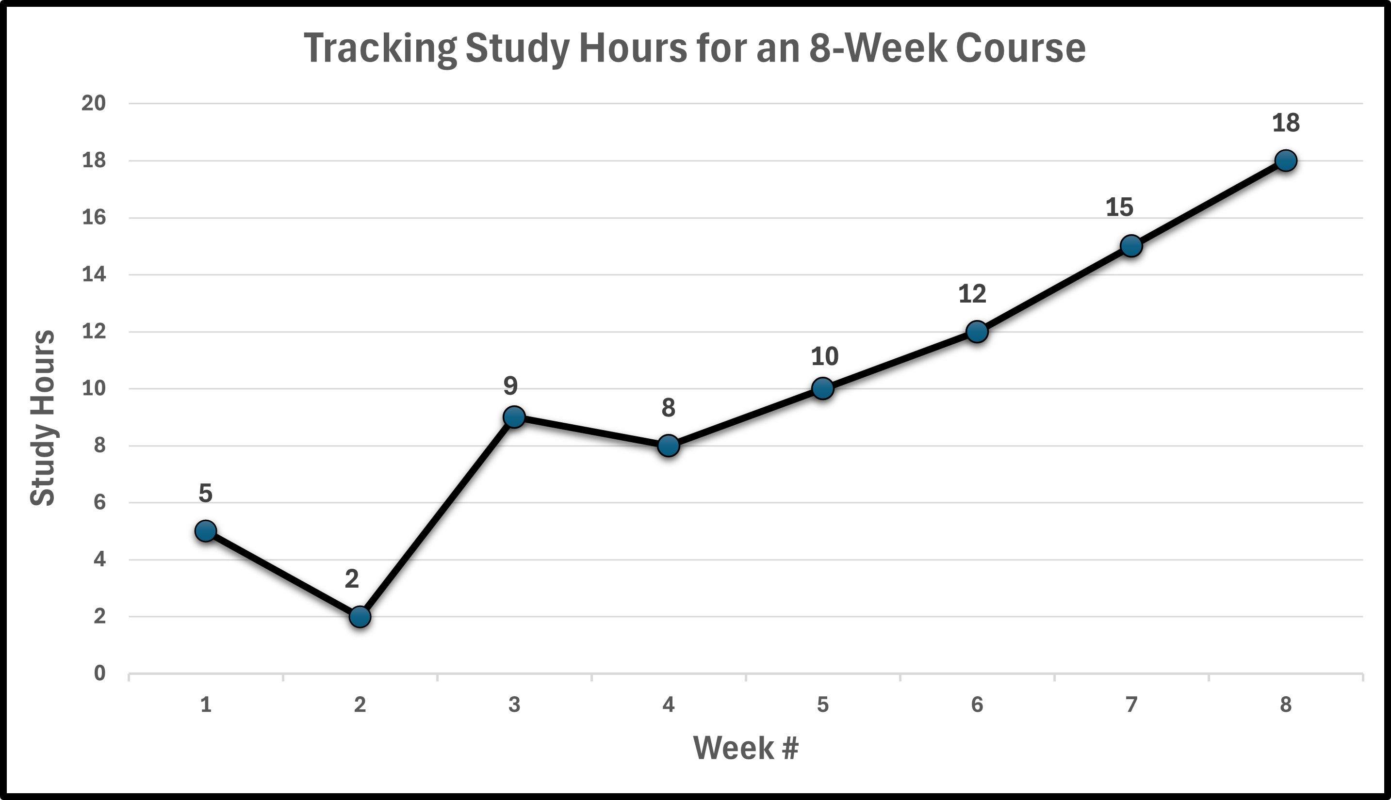
A student tracked the number of hours spent studying each week during an 8-week semester:
| Week # | Study Hours |
|---|---|
| 1 | 5 |
| 2 | 2 |
| 3 | 9 |
| 4 | 8 |
| 5 | 10 |
| 6 | 12 |
| 7 | 15 |
| 8 | 18 |
Create a line graph to display this data.
✅ Solution:
- Step 1 — Obtain the data in a table: This step is done, since the data was given in a frequency distribution.
- Step 2 — Set up the axes and label:
- Label the main axes: "Week #", for the horizontal axis & "Study Hours", for the vertical axis.
- On the horizontal axis, "Week #", label the following: 1, 2, 3, 4, 5, 6, 7, and 8.
- On the vertical axis, "Study Hours", since the minimum frequency is 2 and the maximum frequency is 18, then increments of 2 can be used for the tick marks on the vertical axis, starting from 0 to 20.
- Step 3 — Plot the data points: On 1 at 5, 2 at 2, 3 at 9, 4 at 8, 5 at 10, 6 at 12, 7 at 15, and 8 at 18.
- Step 4 — Connect the points: Connect the points from left to right using one straight line between each set of points.
- Step 5 — Add a title and legend, if necessary: Add the title, "Tracking Study Hours for an 8-Week Course" or some other similar title.
- The Los Angeles Rams during the 2025 regular season, scored the most points in the NFL with 518. The following total points scored by quarter (overtime excluded) for the Los Angeles Rams is given in the table below:
| Quarter | Points Scored |
|---|---|
| First Quarter | 113 |
| Second Quarter | 144 |
| Third Quarter | 124 |
| Forth Quarter | 130 |
Construct a line graph for the data.
- A survey of 100 8th-graders was conducted. They were asked what their favorite sport is.The results are given in the frequency table.
| Sport | No. of 8th Graders |
|---|---|
| Baseball | 17 |
| Basketball | 26 |
| Football | 22 |
| Hockey | 15 |
| Track | 6 |
| Volleyball | 9 |
| Wrestling | 5 |
Construct a line graph for the data.
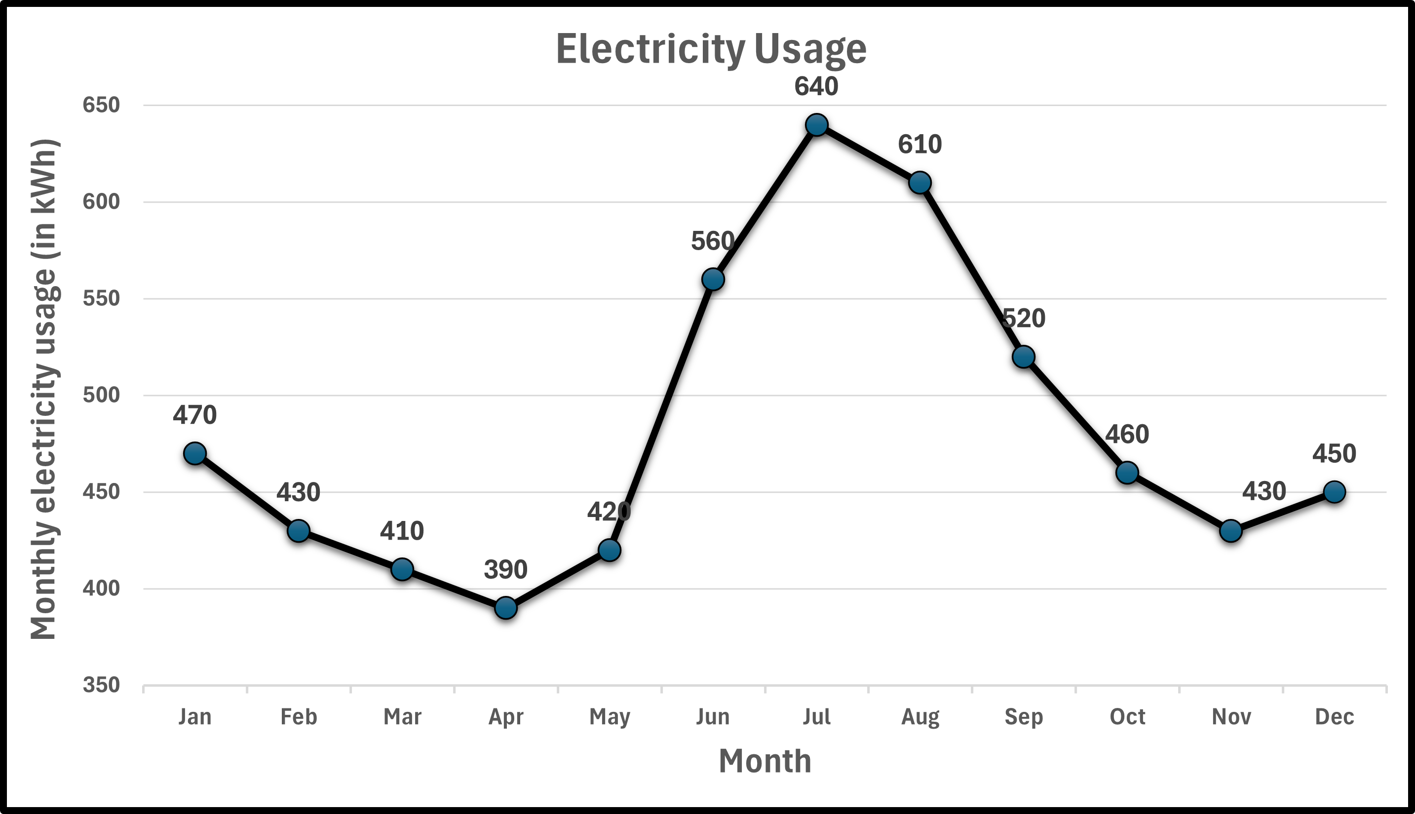
- The typical monthly electricity usage (in kilowatts per hour, kWh) for a U.S. household based on publicly available summaries from the U.S. Energy Information Administration (EIA) in a city for an entire year is given in the frequency table below.
| Date | kWh |
|---|---|
| Jan | 470 |
| Feb | 430 |
| Mar | 410 |
| Apr | 390 |
| May | 420 |
| Jun | 560 |
| Jul | 640 |
| Aug | 610 |
| Sep | 520 |
| Oct | 460 |
| Nov | 430 |
| Dec | 450 |
Construct a line graph for the data.
- Answers
-


- Difficult to compare similar-sized slices: When percentages are close, it's hard to tell which is larger
- Not suitable for many categories: More than 5-6 slices become cluttered and hard to read
- Poor for precise comparisons: Bar graphs are better when exact values matter
- Can't show trends over time: Only displays data for one time point
- Requires percentages or proportions: Doesn't work well with raw counts unless converted
- You have more than 6-7 categories (especially if some slices are too small)
- Categories have very similar percentages (hard to distinguish)
- You need to compare multiple data sets
- Exact values are more important than proportions
- You're showing change over time