
Section 6.12: The Normal Distribution
- Page ID
- 216512

\( \newcommand{\vecs}[1]{\overset { \scriptstyle \rightharpoonup} {\mathbf{#1}} } \)
\( \newcommand{\vecd}[1]{\overset{-\!-\!\rightharpoonup}{\vphantom{a}\smash {#1}}} \)
\( \newcommand{\dsum}{\displaystyle\sum\limits} \)
\( \newcommand{\dint}{\displaystyle\int\limits} \)
\( \newcommand{\dlim}{\displaystyle\lim\limits} \)
\( \newcommand{\id}{\mathrm{id}}\) \( \newcommand{\Span}{\mathrm{span}}\)
( \newcommand{\kernel}{\mathrm{null}\,}\) \( \newcommand{\range}{\mathrm{range}\,}\)
\( \newcommand{\RealPart}{\mathrm{Re}}\) \( \newcommand{\ImaginaryPart}{\mathrm{Im}}\)
\( \newcommand{\Argument}{\mathrm{Arg}}\) \( \newcommand{\norm}[1]{\| #1 \|}\)
\( \newcommand{\inner}[2]{\langle #1, #2 \rangle}\)
\( \newcommand{\Span}{\mathrm{span}}\)
\( \newcommand{\id}{\mathrm{id}}\)
\( \newcommand{\Span}{\mathrm{span}}\)
\( \newcommand{\kernel}{\mathrm{null}\,}\)
\( \newcommand{\range}{\mathrm{range}\,}\)
\( \newcommand{\RealPart}{\mathrm{Re}}\)
\( \newcommand{\ImaginaryPart}{\mathrm{Im}}\)
\( \newcommand{\Argument}{\mathrm{Arg}}\)
\( \newcommand{\norm}[1]{\| #1 \|}\)
\( \newcommand{\inner}[2]{\langle #1, #2 \rangle}\)
\( \newcommand{\Span}{\mathrm{span}}\) \( \newcommand{\AA}{\unicode[.8,0]{x212B}}\)
\( \newcommand{\vectorA}[1]{\vec{#1}} % arrow\)
\( \newcommand{\vectorAt}[1]{\vec{\text{#1}}} % arrow\)
\( \newcommand{\vectorB}[1]{\overset { \scriptstyle \rightharpoonup} {\mathbf{#1}} } \)
\( \newcommand{\vectorC}[1]{\textbf{#1}} \)
\( \newcommand{\vectorD}[1]{\overrightarrow{#1}} \)
\( \newcommand{\vectorDt}[1]{\overrightarrow{\text{#1}}} \)
\( \newcommand{\vectE}[1]{\overset{-\!-\!\rightharpoonup}{\vphantom{a}\smash{\mathbf {#1}}}} \)
\( \newcommand{\vecs}[1]{\overset { \scriptstyle \rightharpoonup} {\mathbf{#1}} } \)
\(\newcommand{\longvect}{\overrightarrow}\)
\( \newcommand{\vecd}[1]{\overset{-\!-\!\rightharpoonup}{\vphantom{a}\smash {#1}}} \)
\(\newcommand{\avec}{\mathbf a}\) \(\newcommand{\bvec}{\mathbf b}\) \(\newcommand{\cvec}{\mathbf c}\) \(\newcommand{\dvec}{\mathbf d}\) \(\newcommand{\dtil}{\widetilde{\mathbf d}}\) \(\newcommand{\evec}{\mathbf e}\) \(\newcommand{\fvec}{\mathbf f}\) \(\newcommand{\nvec}{\mathbf n}\) \(\newcommand{\pvec}{\mathbf p}\) \(\newcommand{\qvec}{\mathbf q}\) \(\newcommand{\svec}{\mathbf s}\) \(\newcommand{\tvec}{\mathbf t}\) \(\newcommand{\uvec}{\mathbf u}\) \(\newcommand{\vvec}{\mathbf v}\) \(\newcommand{\wvec}{\mathbf w}\) \(\newcommand{\xvec}{\mathbf x}\) \(\newcommand{\yvec}{\mathbf y}\) \(\newcommand{\zvec}{\mathbf z}\) \(\newcommand{\rvec}{\mathbf r}\) \(\newcommand{\mvec}{\mathbf m}\) \(\newcommand{\zerovec}{\mathbf 0}\) \(\newcommand{\onevec}{\mathbf 1}\) \(\newcommand{\real}{\mathbb R}\) \(\newcommand{\twovec}[2]{\left[\begin{array}{r}#1 \\ #2 \end{array}\right]}\) \(\newcommand{\ctwovec}[2]{\left[\begin{array}{c}#1 \\ #2 \end{array}\right]}\) \(\newcommand{\threevec}[3]{\left[\begin{array}{r}#1 \\ #2 \\ #3 \end{array}\right]}\) \(\newcommand{\cthreevec}[3]{\left[\begin{array}{c}#1 \\ #2 \\ #3 \end{array}\right]}\) \(\newcommand{\fourvec}[4]{\left[\begin{array}{r}#1 \\ #2 \\ #3 \\ #4 \end{array}\right]}\) \(\newcommand{\cfourvec}[4]{\left[\begin{array}{c}#1 \\ #2 \\ #3 \\ #4 \end{array}\right]}\) \(\newcommand{\fivevec}[5]{\left[\begin{array}{r}#1 \\ #2 \\ #3 \\ #4 \\ #5 \\ \end{array}\right]}\) \(\newcommand{\cfivevec}[5]{\left[\begin{array}{c}#1 \\ #2 \\ #3 \\ #4 \\ #5 \\ \end{array}\right]}\) \(\newcommand{\mattwo}[4]{\left[\begin{array}{rr}#1 \amp #2 \\ #3 \amp #4 \\ \end{array}\right]}\) \(\newcommand{\laspan}[1]{\text{Span}\{#1\}}\) \(\newcommand{\bcal}{\cal B}\) \(\newcommand{\ccal}{\cal C}\) \(\newcommand{\scal}{\cal S}\) \(\newcommand{\wcal}{\cal W}\) \(\newcommand{\ecal}{\cal E}\) \(\newcommand{\coords}[2]{\left\{#1\right\}_{#2}}\) \(\newcommand{\gray}[1]{\color{gray}{#1}}\) \(\newcommand{\lgray}[1]{\color{lightgray}{#1}}\) \(\newcommand{\rank}{\operatorname{rank}}\) \(\newcommand{\row}{\text{Row}}\) \(\newcommand{\col}{\text{Col}}\) \(\renewcommand{\row}{\text{Row}}\) \(\newcommand{\nul}{\text{Nul}}\) \(\newcommand{\var}{\text{Var}}\) \(\newcommand{\corr}{\text{corr}}\) \(\newcommand{\len}[1]{\left|#1\right|}\) \(\newcommand{\bbar}{\overline{\bvec}}\) \(\newcommand{\bhat}{\widehat{\bvec}}\) \(\newcommand{\bperp}{\bvec^\perp}\) \(\newcommand{\xhat}{\widehat{\xvec}}\) \(\newcommand{\vhat}{\widehat{\vvec}}\) \(\newcommand{\uhat}{\widehat{\uvec}}\) \(\newcommand{\what}{\widehat{\wvec}}\) \(\newcommand{\Sighat}{\widehat{\Sigma}}\) \(\newcommand{\lt}{<}\) \(\newcommand{\gt}{>}\) \(\newcommand{\amp}{&}\) \(\definecolor{fillinmathshade}{gray}{0.9}\)- Identify characteristics of a data set that is normally distributed.
- Apply the empirical rule.
- Compute z scores and use them to compare values from different data sets.
- Use a table and z scores as well as technology to find areas under the standard normal distribution.
In Section 6.7, histograms were introduced. When we look at a histogram, the first thing we notice is its shape, whether the bars pile up in the middle, stretch out to one side, or rise into a clear peak. This visible shape is the key to understanding what kind of distribution the data might follow. Let's look at a few scenarios:
Suppose we have the following data sets
A histogram’s shape helps us see where the data cluster, how spread out they are, whether they are symmetric or skewed, and whether extreme values (outliers) appear. As we increase the amount of data or choose smaller bins, the bars begin to trace out a smoother pattern. That smooth pattern is what we call a distribution. In other words, the distribution is the idealized curve that the histogram is trying to approximate.
If the histogram forms a single mound with symmetry on both sides, the underlying distribution is likely normal. If the bars stretch farther to the right than the left, the distribution is right‑skewed, meaning most observations are low with some high outliers. If the bars are flat and spread out, the distribution is wide and variable; if they are narrow and tall, the distribution is tight and consistent. So the shape of the histogram is our visual clue, and the distribution is the mathematical model that generalizes that visual shape into a smooth curve we can use to make predictions, calculate probabilities, and analyze how typical or unusual specific values are.
The histogram is the first tool used to visualize the “shape” of the data. The shape A histogram shows how many observations fall in each interval or “bin,” how the data are distributed across the range, whether the values pile up around certain points, and whether the overall shape reveals symmetry, skewness, or outliers. Histograms matter because they transform messy, unorganized data into a visible pattern: a tightly clustered histogram suggests consistency, a wide and flat one indicates high variation, a right‑skewed histogram shows that most values are low with a few unusually high ones, and a symmetric, bell‑shaped hump suggests the data may follow a normal distribution.
Let's take a look at two different data sets:
Class A Exam Scores: 53, 55, 59, 61, 61, 63, 64, 65, 66, 66, 67, 68, 68, 70, 71, 72, 72, 72, 73, 74, 75, 75, 77, 78, 78, 79, 79, 81, 81, 83, 83, 85, 85, 88, 88, 88, 90, 92, 96, 99
A normal distribution is a smooth, continuous, bell‑shaped curve defined by two numbers:
Mean \(\overline{x}\) — the center
Standard deviation s — how spread out the values are
When to Use Histograms
Histograms are most effective when you want to:
- Display the distribution of continuous numerical data
- Show the shape of a data distribution
- Identify patterns such as symmetry, skewness, or uniformity
- See where data values are concentrated
- Identify gaps, clusters, or outliers in the data
- Understand the spread or variability of data
- Compare frequency distributions visually
Key Components of a Histogram
- Horizontal Axis (x-axis): Shows the numerical scale divided into class intervals (bins)
- Represents the variable being measured (height, test scores, age, temperature, etc.)
- Divided into equal-width intervals
- Vertical Axis (y-axis): Shows the frequency (count) or relative frequency (percentage) of observations in each interval
- Bars (Rectangles): Each bar represents one class interval
- Height shows the frequency for that interval
- Width represents the class interval
- Bars touch each other (no spaces) to show continuous data
- Class Intervals (Bins): The ranges into which data is divided
- Should have equal width
- Should cover all data values
- Typically use 5-20 intervals depending on data size
- Labels and Title: Clear axis labels and descriptive title
Advantages of Histograms
- Shows distribution shape: Immediately reveals if data is symmetric, skewed, uniform, or bimodal
- Identifies patterns: Clusters, gaps, and outliers become visible
- Easy to construct and interpret: Simple visual representation
- Shows central tendency: Where data concentrates
- Reveals spread: Shows how variable or consistent the data is
- Handles large datasets: Can summarize hundreds or thousands of observations
- Foundation for statistical analysis: Helps check assumptions for further analysis
Limitations of Histograms
- Loses individual data values: Grouping obscures specific observations
- Sensitive to bin width: Different bin widths can create different impressions
- Sensitive to bin boundaries: Starting/ending points affect appearance
- Less precise than raw data: Can't calculate exact statistics from histogram alone
- Requires numerical data: Won't work with categorical data
- Can be misleading: Poor choices in bins or scale can distort interpretation
- Step 1 — Obtain the data in a frequency distribution table.
- Step 2 — Draw the histogram.
- Draw the axes: Draw a horizontal line for the x-axis and a vertical line for the y-axis.
- Label the axes: Label the horizontal axis with your chosen class width or bin intervals and the vertical axis with a frequency scale that accommodates your highest count.
- Draw the bars: For each class/bin, draw a vertical bar with a height corresponding to its frequency. The bars should have the exact same width and should touch each other to show the continuous nature of the data.
- Step 3 — Add a title, if necessary.
Two Types of Frequency Histograms
- Ungrouped frequency histograms - Used for either qualitative data (categorical data) or single value data
- Grouped frequency histograms - Used for quantitative data (numerical data) where the data needs to be grouped into class intervals.
Let's see several examples for both types of frequency histograms.
Standard Normal Distribution — Left Tail (P(Z < z))
| z | 0.00 | 0.01 | 0.02 | 0.03 | 0.04 | 0.05 | 0.06 | 0.07 | 0.08 | 0.09 |
|---|---|---|---|---|---|---|---|---|---|---|
| −3.4 | 0.0003 | 0.0003 | 0.0003 | 0.0003 | 0.0003 | 0.0003 | 0.0003 | 0.0003 | 0.0003 | 0.0003 |
| −3.3 | 0.0005 | 0.0005 | 0.0005 | 0.0004 | 0.0004 | 0.0004 | 0.0004 | 0.0004 | 0.0004 | 0.0003 |
| −3.2 | 0.0007 | 0.0007 | 0.0006 | 0.0006 | 0.0006 | 0.0006 | 0.0006 | 0.0005 | 0.0005 | 0.0005 |
| −3.1 | 0.0010 | 0.0009 | 0.0009 | 0.0009 | 0.0008 | 0.0008 | 0.0008 | 0.0008 | 0.0007 | 0.0007 |
| −3.0 | 0.0013 | 0.0013 | 0.0013 | 0.0012 | 0.0012 | 0.0011 | 0.0011 | 0.0011 | 0.0010 | 0.0010 |
| −2.9 | 0.0019 | 0.0018 | 0.0018 | 0.0017 | 0.0016 | 0.0016 | 0.0015 | 0.0015 | 0.0014 | 0.0014 |
| −2.8 | 0.0026 | 0.0025 | 0.0024 | 0.0023 | 0.0023 | 0.0022 | 0.0021 | 0.0021 | 0.0020 | 0.0019 |
| −2.7 | 0.0035 | 0.0034 | 0.0033 | 0.0032 | 0.0031 | 0.0030 | 0.0029 | 0.0028 | 0.0027 | 0.0026 |
| −2.6 | 0.0047 | 0.0045 | 0.0044 | 0.0043 | 0.0041 | 0.0040 | 0.0039 | 0.0038 | 0.0037 | 0.0036 |
| −2.5 | 0.0062 | 0.0060 | 0.0059 | 0.0057 | 0.0055 | 0.0054 | 0.0052 | 0.0051 | 0.0049 | 0.0048 |
| −2.4 | 0.0082 | 0.0080 | 0.0078 | 0.0075 | 0.0073 | 0.0071 | 0.0069 | 0.0068 | 0.0066 | 0.0064 |
| −2.3 | 0.0107 | 0.0104 | 0.0102 | 0.0099 | 0.0096 | 0.0094 | 0.0091 | 0.0089 | 0.0087 | 0.0084 |
| −2.2 | 0.0139 | 0.0136 | 0.0132 | 0.0129 | 0.0125 | 0.0122 | 0.0119 | 0.0116 | 0.0113 | 0.0110 |
| −2.1 | 0.0179 | 0.0174 | 0.0170 | 0.0166 | 0.0162 | 0.0158 | 0.0154 | 0.0150 | 0.0146 | 0.0143 |
| −2.0 | 0.0228 | 0.0222 | 0.0217 | 0.0212 | 0.0207 | 0.0202 | 0.0197 | 0.0192 | 0.0188 | 0.0183 |
| −1.9 | 0.0287 | 0.0281 | 0.0274 | 0.0268 | 0.0262 | 0.0256 | 0.0250 | 0.0244 | 0.0239 | 0.0233 |
| −1.8 | 0.0359 | 0.0351 | 0.0344 | 0.0336 | 0.0329 | 0.0322 | 0.0314 | 0.0307 | 0.0301 | 0.0294 |
| −1.7 | 0.0446 | 0.0436 | 0.0427 | 0.0418 | 0.0409 | 0.0401 | 0.0392 | 0.0384 | 0.0375 | 0.0367 |
| −1.6 | 0.0548 | 0.0537 | 0.0526 | 0.0516 | 0.0505 | 0.0495 | 0.0485 | 0.0475 | 0.0465 | 0.0455 |
| −1.5 | 0.0668 | 0.0655 | 0.0643 | 0.0630 | 0.0618 | 0.0606 | 0.0594 | 0.0582 | 0.0571 | 0.0559 |
| −1.4 | 0.0808 | 0.0793 | 0.0778 | 0.0764 | 0.0749 | 0.0735 | 0.0721 | 0.0708 | 0.0694 | 0.0681 |
| −1.3 | 0.0968 | 0.0951 | 0.0934 | 0.0918 | 0.0901 | 0.0885 | 0.0869 | 0.0853 | 0.0838 | 0.0823 |
| −1.2 | 0.1151 | 0.1131 | 0.1112 | 0.1093 | 0.1075 | 0.1056 | 0.1038 | 0.1020 | 0.1003 | 0.0985 |
| −1.1 | 0.1357 | 0.1335 | 0.1314 | 0.1292 | 0.1271 | 0.1251 | 0.1230 | 0.1210 | 0.1190 | 0.1170 |
| −1.0 | 0.1587 | 0.1562 | 0.1539 | 0.1515 | 0.1492 | 0.1469 | 0.1446 | 0.1423 | 0.1401 | 0.1379 |
| −0.9 | 0.1841 | 0.1814 | 0.1788 | 0.1762 | 0.1736 | 0.1711 | 0.1685 | 0.1660 | 0.1635 | 0.1611 |
| −0.8 | 0.2119 | 0.2090 | 0.2061 | 0.2033 | 0.2005 | 0.1977 | 0.1949 | 0.1922 | 0.1894 | 0.1867 |
| −0.7 | 0.2420 | 0.2389 | 0.2358 | 0.2327 | 0.2296 | 0.2266 | 0.2236 | 0.2206 | 0.2177 | 0.2148 |
| −0.6 | 0.2743 | 0.2709 | 0.2676 | 0.2643 | 0.2611 | 0.2578 | 0.2546 | 0.2514 | 0.2483 | 0.2451 |
| −0.5 | 0.3085 | 0.3050 | 0.3015 | 0.2981 | 0.2946 | 0.2912 | 0.2877 | 0.2843 | 0.2810 | 0.2776 |
| −0.4 | 0.3446 | 0.3409 | 0.3372 | 0.3336 | 0.3300 | 0.3264 | 0.3228 | 0.3192 | 0.3156 | 0.3121 |
| −0.3 | 0.3821 | 0.3783 | 0.3745 | 0.3707 | 0.3669 | 0.3632 | 0.3594 | 0.3557 | 0.3520 | 0.3483 |
| −0.2 | 0.4207 | 0.4168 | 0.4129 | 0.4090 | 0.4052 | 0.4013 | 0.3974 | 0.3936 | 0.3897 | 0.3859 |
| −0.1 | 0.4602 | 0.4562 | 0.4522 | 0.4483 | 0.4443 | 0.4404 | 0.4364 | 0.4325 | 0.4286 | 0.4247 |
| −0.0 | 0.5000 | 0.4960 | 0.4920 | 0.4880 | 0.4840 | 0.4801 | 0.4761 | 0.4721 | 0.4681 | 0.4641 |
| 0.0 | 0.5000 | 0.5040 | 0.5080 | 0.5120 | 0.5160 | 0.5199 | 0.5239 | 0.5279 | 0.5319 | 0.5359 |
| 0.1 | 0.5398 | 0.5438 | 0.5478 | 0.5517 | 0.5557 | 0.5596 | 0.5636 | 0.5675 | 0.5714 | 0.5753 |
| 0.2 | 0.5793 | 0.5832 | 0.5871 | 0.5910 | 0.5948 | 0.5987 | 0.6026 | 0.6064 | 0.6103 | 0.6141 |
| 0.3 | 0.6179 | 0.6217 | 0.6255 | 0.6293 | 0.6331 | 0.6368 | 0.6406 | 0.6443 | 0.6480 | 0.6517 |
| 0.4 | 0.6554 | 0.6591 | 0.6628 | 0.6664 | 0.6700 | 0.6736 | 0.6772 | 0.6808 | 0.6844 | 0.6879 |
| 0.5 | 0.6915 | 0.6950 | 0.6985 | 0.7019 | 0.7054 | 0.7088 | 0.7123 | 0.7157 | 0.7190 | 0.7224 |
| 0.6 | 0.7257 | 0.7291 | 0.7324 | 0.7357 | 0.7389 | 0.7422 | 0.7454 | 0.7486 | 0.7517 | 0.7549 |
| 0.7 | 0.7580 | 0.7611 | 0.7642 | 0.7673 | 0.7704 | 0.7734 | 0.7764 | 0.7794 | 0.7823 | 0.7852 |
| 0.8 | 0.7881 | 0.7910 | 0.7939 | 0.7967 | 0.7995 | 0.8023 | 0.8051 | 0.8078 | 0.8106 | 0.8133 |
| 0.9 | 0.8159 | 0.8186 | 0.8212 | 0.8238 | 0.8264 | 0.8289 | 0.8315 | 0.8340 | 0.8365 | 0.8389 |
| 1.0 | 0.8413 | 0.8438 | 0.8461 | 0.8485 | 0.8508 | 0.8531 | 0.8554 | 0.8577 | 0.8599 | 0.8621 |
| 1.1 | 0.8643 | 0.8665 | 0.8686 | 0.8708 | 0.8729 | 0.8749 | 0.8770 | 0.8790 | 0.8810 | 0.8830 |
| 1.2 | 0.8849 | 0.8869 | 0.8888 | 0.8907 | 0.8925 | 0.8944 | 0.8962 | 0.8980 | 0.8997 | 0.9015 |
| 1.3 | 0.9032 | 0.9049 | 0.9066 | 0.9082 | 0.9099 | 0.9115 | 0.9131 | 0.9147 | 0.9162 | 0.9177 |
| 1.4 | 0.9192 | 0.9207 | 0.9222 | 0.9236 | 0.9251 | 0.9265 | 0.9279 | 0.9292 | 0.9306 | 0.9319 |
| 1.5 | 0.9332 | 0.9345 | 0.9357 | 0.9370 | 0.9382 | 0.9394 | 0.9406 | 0.9418 | 0.9429 | 0.9441 |
| 1.6 | 0.9452 | 0.9463 | 0.9474 | 0.9484 | 0.9495 | 0.9505 | 0.9515 | 0.9525 | 0.9535 | 0.9545 |
| 1.7 | 0.9554 | 0.9564 | 0.9573 | 0.9582 | 0.9591 | 0.9599 | 0.9608 | 0.9616 | 0.9625 | 0.9633 |
| 1.8 | 0.9641 | 0.9649 | 0.9656 | 0.9664 | 0.9671 | 0.9678 | 0.9686 | 0.9693 | 0.9699 | 0.9706 |
| 1.9 | 0.9713 | 0.9719 | 0.9726 | 0.9732 | 0.9738 | 0.9744 | 0.9750 | 0.9756 | 0.9761 | 0.9767 |
| 2.0 | 0.9772 | 0.9778 | 0.9783 | 0.9788 | 0.9793 | 0.9798 | 0.9803 | 0.9808 | 0.9812 | 0.9817 |
| 2.1 | 0.9821 | 0.9826 | 0.9830 | 0.9834 | 0.9838 | 0.9842 | 0.9846 | 0.9850 | 0.9854 | 0.9857 |
| 2.2 | 0.9861 | 0.9864 | 0.9868 | 0.9871 | 0.9875 | 0.9878 | 0.9881 | 0.9884 | 0.9887 | 0.9890 |
| 2.3 | 0.9893 | 0.9896 | 0.9898 | 0.9901 | 0.9904 | 0.9906 | 0.9909 | 0.9911 | 0.9913 | 0.9916 |
| 2.4 | 0.9918 | 0.9920 | 0.9922 | 0.9925 | 0.9927 | 0.9929 | 0.9931 | 0.9932 | 0.9934 | 0.9936 |
| 2.5 | 0.9938 | 0.9940 | 0.9941 | 0.9943 | 0.9945 | 0.9946 | 0.9948 | 0.9949 | 0.9951 | 0.9952 |
| 2.6 | 0.9953 | 0.9955 | 0.9956 | 0.9957 | 0.9959 | 0.9960 | 0.9961 | 0.9962 | 0.9963 | 0.9964 |
| 2.7 | 0.9965 | 0.9966 | 0.9967 | 0.9968 | 0.9969 | 0.9970 | 0.9971 | 0.9972 | 0.9973 | 0.9974 |
| 2.8 | 0.9974 | 0.9975 | 0.9976 | 0.9977 | 0.9977 | 0.9978 | 0.9979 | 0.9979 | 0.9980 | 0.9981 |
| 2.9 | 0.9981 | 0.9982 | 0.9982 | 0.9983 | 0.9984 | 0.9984 | 0.9985 | 0.9985 | 0.9986 | 0.9986 |
| 3.0 | 0.9987 | 0.9987 | 0.9987 | 0.9988 | 0.9988 | 0.9989 | 0.9989 | 0.9989 | 0.9990 | 0.9990 |
| 3.1 | 0.9990 | 0.9991 | 0.9991 | 0.9991 | 0.9992 | 0.9992 | 0.9992 | 0.9992 | 0.9993 | 0.9993 |
| 3.2 | 0.9993 | 0.9993 | 0.9994 | 0.9994 | 0.9994 | 0.9994 | 0.9994 | 0.9995 | 0.9995 | 0.9995 |
| 3.3 | 0.9995 | 0.9995 | 0.9995 | 0.9996 | 0.9996 | 0.9996 | 0.9996 | 0.9996 | 0.9996 | 0.9997 |
| 3.4 | 0.9997 | 0.9997 | 0.9997 | 0.9997 | 0.9997 | 0.9997 | 0.9997 | 0.9997 | 0.9997 | 0.9998 |
The number of text messages sent in one hour by 20 teenagers is given below in a frequency distribution table:
| Number of Texts | Frequency |
|---|---|
| 1 | 3 |
| 2 | 1 |
| 3 | 0 |
| 4 | 3 |
| 5 | 2 |
| 6 | 5 |
| 7 | 1 |
| 8 | 2 |
| 9 | 3 |
Draw an ungrouped frequency histogram for the data set.
✅ Solution:
- Step 1 — Obtain the data in a frequency distribution table: Here, the frequency distribution was given.
- Step 2 — Draw the histogram:
- Draw the axes: Draw a horizontal line for the x-axis and a vertical line for the y-axis.
- Label the axes: Label the horizontal axis with your chosen class width or bin intervals and the vertical axis with a frequency scale that accommodates your highest count. So, since the data is ungrouped, the first bin is labeled 1 and represents all data values that are equal to 1. The second bin is labeled 2 and represents all data values that are equal to 2. And so on, and so on.
- Draw the bars: For each class/bin, draw a vertical bar with a height corresponding to its frequency. The bars should have the exact same width and should touch each other to show the continuous nature of the data.
- Step 3 — Add a title, if necessary: Add the title, "Text Messaging by Students" or some other similar title.

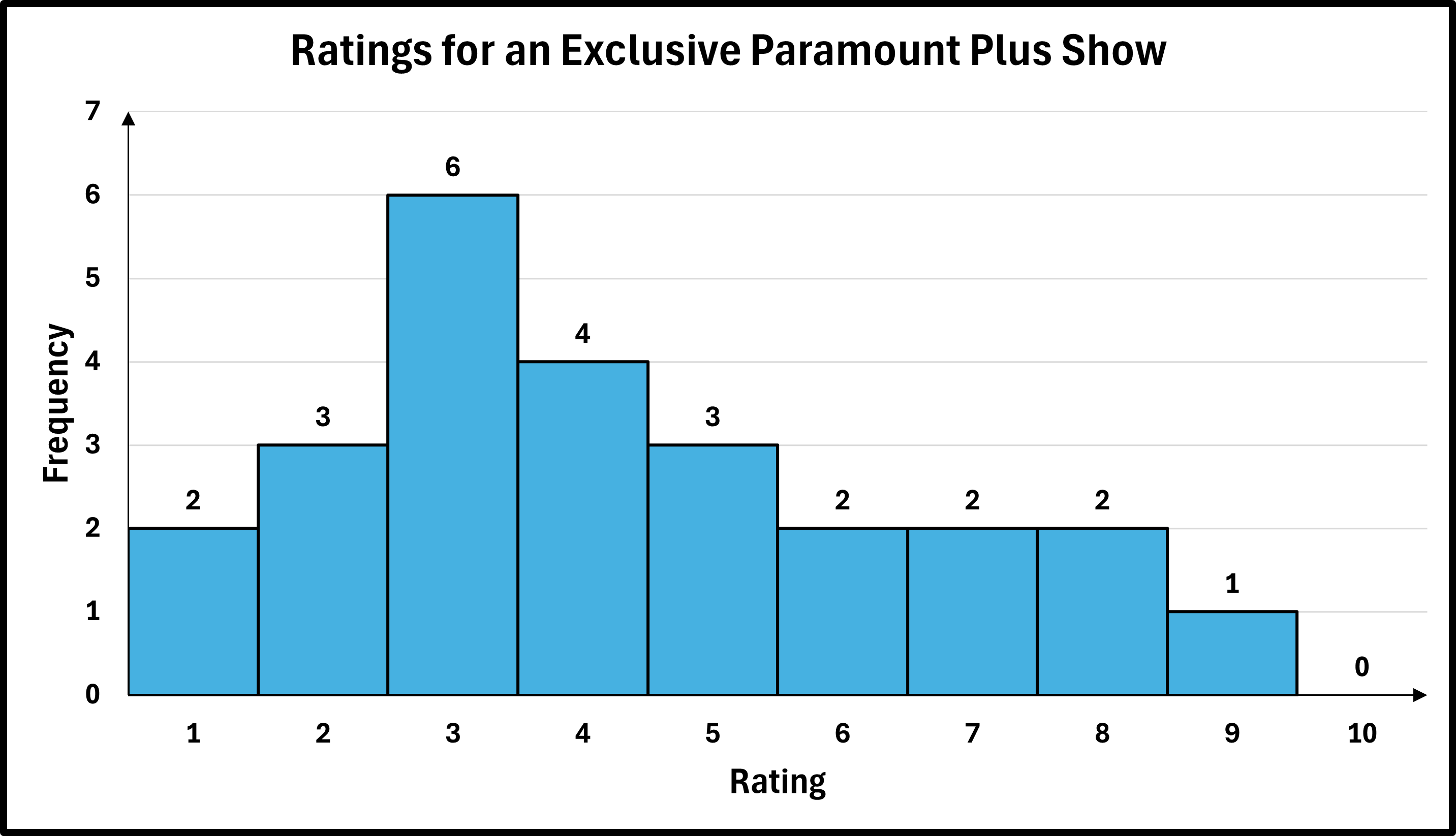
The frequency distribution for twenty-five overall ratings from 1 through 10 of an exclusive Paramount Plus show is given below:
| Ratings | Frequency |
|---|---|
| 1 | 2 |
| 2 | 3 |
| 3 | 6 |
| 4 | 4 |
| 5 | 3 |
| 6 | 2 |
| 7 | 2 |
| 8 | 2 |
| 9 | 1 |
| 10 | 0 |
Draw an ungrouped frequency histogram for the data set.
✅ Solution:
- Step 1 — Obtain the data in a frequency distribution table: Here, the frequency distribution was given.
- Step 2 — Draw the histogram:
- Draw the axes: Draw a horizontal line for the x-axis and a vertical line for the y-axis.
- Label the axes: Label the horizontal axis with your chosen class width or bin intervals and the vertical axis with a frequency scale that accommodates your highest count. So, since the data is ungrouped, the first bin is labeled 1 and represents all data values that are equal to 1. The second bin is labeled 2 and represents all data values that are equal to 2. And so on, and so on.
- Draw the bars: For each class/bin, draw a vertical bar with a height corresponding to its frequency. The bars should have the exact same width and should touch each other to show the continuous nature of the data.
- Step 3 — Add a title, if necessary: Add the title, "Ratings for an Exclusive Paramount Plus Show" or some other similar title.
The heights (in inches) of 28 adult males is recorded.
64, 65, 66, 66, 67, 67, 68, 68, 68, 69, 69, 69, 70, 70,
70, 71, 71, 71, 72, 72, 72, 73, 73, 73, 74, 74, 75, 76
Draw an ungrouped frequency histogram for the data set.
✅ Solution:
- Step 1 — Obtain the data in a frequency distribution table: A frequency distribution for the data set is given below.
| Heights | Frequency |
|---|---|
| 64 | 1 |
| 65 | 1 |
| 66 | 2 |
| 67 | 2 |
| 68 | 3 |
| 69 | 3 |
| 70 | 3 |
| 71 | 3 |
| 72 | 3 |
| 73 | 3 |
| 74 | 2 |
| 75 | 1 |
| 76 | 1 |
- Step 2 — Draw the histogram:
- Draw the axes: Draw a horizontal line for the x-axis and a vertical line for the y-axis.
- Label the axes: Label the horizontal axis with your chosen class width or bin intervals and the vertical axis with a frequency scale that accommodates your highest count. So, since the data is ungrouped, the first bin is labeled 64 and represents all data values that are equal to 64. The second bin is labeled 65 and represents all data values that are equal to 65. And so on, and so on.
- Draw the bars: For each class/bin, draw a vertical bar with a height corresponding to its frequency. The bars should have the exact same width and should touch each other to show the continuous nature of the data.
- Step 3 — Add a title, if necessary: Add the title, "Text Messaging by Students" or some other similar title.

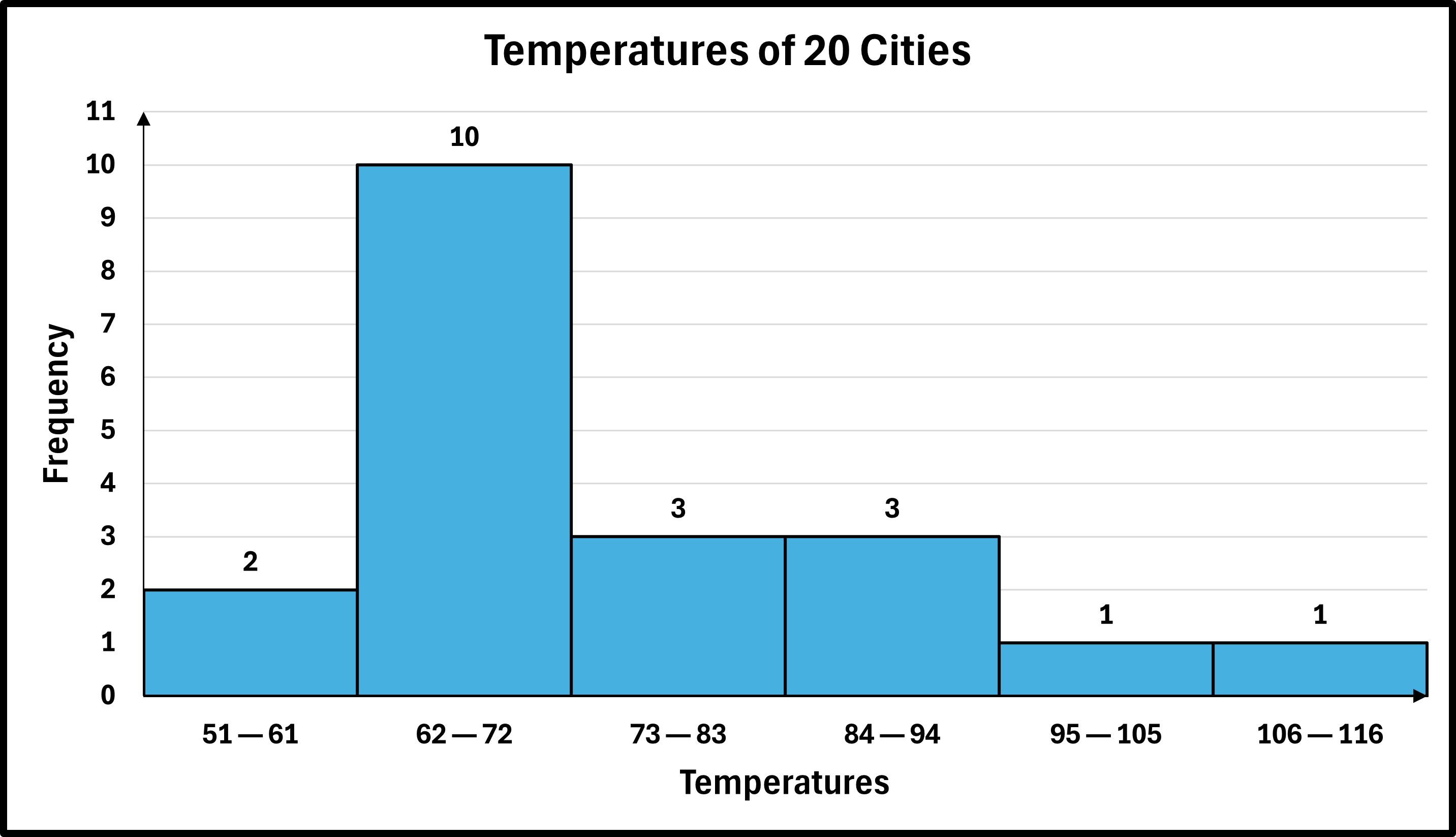
The temperatures (in degrees Fahrenheit) recorded in 20 cities on a particular day, rounded to the nearest degree are listed below:
58, 68, 65, 79, 51, 94, 64, 80, 69, 113, 63, 70, 102, 70, 92, 87, 77, 64, 64, 72
Here is the grouped frequency distribution for the above data using a class width of 11 and a starting point of 51.
| Temperature | Frequency |
|---|---|
| 51—61 | 2 |
| 62—72 | 10 |
| 73—83 | 3 |
| 84—94 | 3 |
| 95—105 | 1 |
| 106—116 | 1 |
Draw an grouped frequency histogram for the data set.
✅ Solution:
- Step 1 — Obtain the data in a frequency distribution table: Here, the frequency distribution was given.
- Step 2 — Draw the histogram:
- Draw the axes: Draw a horizontal line for the x-axis and a vertical line for the y-axis.
- Label the axes: Label the horizontal axis with your chosen class width or bin intervals and the vertical axis with a frequency scale that accommodates your highest count. So, since the data is grouped, the first bin is labeled 51—61 and represents all data values that are between 51 and 61 inclusive. The second bin is labeled 62—72 and represents all data values that are between 62 and 72 inclusive. The third bin is labeled 73—83 and represents all data values that are between 73 and 83 inclusive. And so on, and so on.
- Draw the bars: For each class/bin, draw a vertical bar with a height corresponding to its frequency. The bars should have the exact same width and should touch each other to show the continuous nature of the data.
- Step 3 — Add a title, if necessary: Add the title, "Temperatures of 20 Cities" or some other similar title.
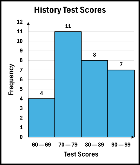
In a history class, the test scores (out of 100) for 30 students was recorded below in a grouped frequency distribution for the above data using a class width of 10 and a starting point of 60.
| Ratings | Frequency |
|---|---|
| 60—69 | 4 |
| 70—79 | 11 |
| 80—89 | 8 |
| 90—99 | 7 |
Draw a grouped frequency histogram for the data set.
✅ Solution:
- Step 1 — Obtain the data in a frequency distribution table: Here, the frequency distribution was given.
- Step 2 — Draw the histogram:
- Draw the axes: Draw a horizontal line for the x-axis and a vertical line for the y-axis.
- Label the axes: Label the horizontal axis with your chosen class width or bin intervals and the vertical axis with a frequency scale that accommodates your highest count. So, since the data is grouped, the first bin is labeled 60—69 and represents all data values that are between 60 and 69 inclusive. The second bin is labeled 70—79 and represents all data values that are between 70 and 79 inclusive. And so on, and so on.
- Draw the bars: For each class/bin, draw a vertical bar with a height corresponding to its frequency. The bars should have the exact same width and should touch each other to show the continuous nature of the data.
- Step 3 — Add a title, if necessary: Add the title, "History Test Scores" or some other similar title.
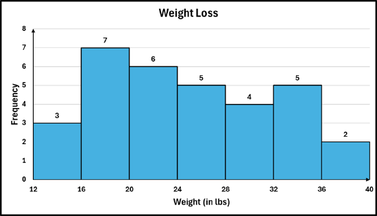
The weight loss (in pounds) over 6 months for 32 program participants were recorded:
19, 18, 25, 15, 32, 20, 28, 14, 35, 22, 16, 30, 19, 38, 24, 17,
31, 21, 36, 23, 18, 29, 20, 34, 25, 16, 33, 22, 27, 12, 35, 26
Draw a grouped frequency histogram for the above data using a class width of 4 and a starting point of the lowest observation in the data set.
✅ Solution:
- Step 1 — Obtain the data in a grouped frequency distribution table: A grouped frequency distribution for the data set is given below. (See Section 6.2 for reference).
| Heights | Frequency |
|---|---|
| 12—15 | 3 |
| 16—19 | 7 |
| 20—23 | 6 |
| 24—27 | 5 |
| 28—31 | 4 |
| 32—35 | 5 |
| 36—39 | 2 |
- Step 2 — Draw the histogram:
- Draw the axes: Draw a horizontal line for the x-axis and a vertical line for the y-axis.
- Label the axes: Label the horizontal axis with your chosen class width or bin intervals and the vertical axis with a frequency scale that accommodates your highest count. So, since the data is grouped, the first bin is labeled 12—15 and represents all data values that are between 12 and 15 inclusive. The second bin is labeled 16—19 and represents all data values that are between 16 and 19 inclusive. And so on, and so on.
- Draw the bars: For each class/bin, draw a vertical bar with a height corresponding to its frequency. The bars should have the exact same width and should touch each other to show the continuous nature of the data.
- Step 3 — Add a title, if necessary: Add the title, "Weight Loss" or some other similar title.

In statistics, there is an alternative way to draw a histogram that changes only how the x‑axis is labeled. Instead of placing a class label under each bar, the axis is marked with the class boundaries. This means each bar spans from the lower limit of a class up to, but not including, the upper limit. In this format, the sides of each bar line up exactly with the lower class limits, and every value falls into the interval that includes its lower boundary but excludes its upper boundary. Here is what the alternate histogram would look like for Example #6.7.6:
So, the bin/bar between 12 and 16, represents the first class of 12—15, the second bin/bar between 16 and 20, represents the second class of 16—19, and so on. In the data set, there are two observations of 16, both of which would be counted in the second bin, not the first bin.
-
Draw an ungrouped frequency histogram for the following data set: 1, 1, 2, 3, 4, 4, 4, 4, 5, 6, 6, 7, 7, 7, 7, 7, 7, 7, 9, 9
-
Twenty AA batteries were tested to determine how long they would last. The results, to the nearest minute, were recorded as follows:
423, 369, 387, 411, 393, 399, 371, 377, 409, 392,
417, 431, 401, 363, 391, 405, 425, 400, 381, 399
The above data is in a grouped frequency distribution below using a class width of 9 and a starting point of 363.
| Minutes | Frequency |
|---|---|
| 363—371 | 3 |
| 372—380 | 1 |
| 381—389 | 2 |
| 390—398 | 3 |
| 399—407 | 5 |
| 408—416 | 2 |
| 417—425 | 3 |
| 426—434 | 1 |
Draw a grouped frequency histogram for the above data in the frequency distribution.
-
The following data represent sales (in dollars) at a café during their slowest hour:
145, 152, 138, 160, 149, 176, 155, 142, 158, 151, 147, 181, 132, 154, 152, 168, 118, 175
Draw a grouped frequency histogram for the above data using a class width of 7 and a starting point of the lowest observation in the data set.
- Answers
-


