
6.2.5: Observing More Patterns in Scatter Plots
- Page ID
- 36715

\( \newcommand{\vecs}[1]{\overset { \scriptstyle \rightharpoonup} {\mathbf{#1}} } \)
\( \newcommand{\vecd}[1]{\overset{-\!-\!\rightharpoonup}{\vphantom{a}\smash {#1}}} \)
\( \newcommand{\id}{\mathrm{id}}\) \( \newcommand{\Span}{\mathrm{span}}\)
( \newcommand{\kernel}{\mathrm{null}\,}\) \( \newcommand{\range}{\mathrm{range}\,}\)
\( \newcommand{\RealPart}{\mathrm{Re}}\) \( \newcommand{\ImaginaryPart}{\mathrm{Im}}\)
\( \newcommand{\Argument}{\mathrm{Arg}}\) \( \newcommand{\norm}[1]{\| #1 \|}\)
\( \newcommand{\inner}[2]{\langle #1, #2 \rangle}\)
\( \newcommand{\Span}{\mathrm{span}}\)
\( \newcommand{\id}{\mathrm{id}}\)
\( \newcommand{\Span}{\mathrm{span}}\)
\( \newcommand{\kernel}{\mathrm{null}\,}\)
\( \newcommand{\range}{\mathrm{range}\,}\)
\( \newcommand{\RealPart}{\mathrm{Re}}\)
\( \newcommand{\ImaginaryPart}{\mathrm{Im}}\)
\( \newcommand{\Argument}{\mathrm{Arg}}\)
\( \newcommand{\norm}[1]{\| #1 \|}\)
\( \newcommand{\inner}[2]{\langle #1, #2 \rangle}\)
\( \newcommand{\Span}{\mathrm{span}}\) \( \newcommand{\AA}{\unicode[.8,0]{x212B}}\)
\( \newcommand{\vectorA}[1]{\vec{#1}} % arrow\)
\( \newcommand{\vectorAt}[1]{\vec{\text{#1}}} % arrow\)
\( \newcommand{\vectorB}[1]{\overset { \scriptstyle \rightharpoonup} {\mathbf{#1}} } \)
\( \newcommand{\vectorC}[1]{\textbf{#1}} \)
\( \newcommand{\vectorD}[1]{\overrightarrow{#1}} \)
\( \newcommand{\vectorDt}[1]{\overrightarrow{\text{#1}}} \)
\( \newcommand{\vectE}[1]{\overset{-\!-\!\rightharpoonup}{\vphantom{a}\smash{\mathbf {#1}}}} \)
\( \newcommand{\vecs}[1]{\overset { \scriptstyle \rightharpoonup} {\mathbf{#1}} } \)
\( \newcommand{\vecd}[1]{\overset{-\!-\!\rightharpoonup}{\vphantom{a}\smash {#1}}} \)
Lesson
Let's look for other patterns in data.
Exercise \(\PageIndex{1}\): Notice and Wonder: Nonlinear Scatter Plot
What do you notice? What do you wonder?

Exercise \(\PageIndex{2}\): Scatter Plot City
Your teacher will give you a set of cards. Each card shows a scatter plot.
- Sort the cards into categories and describe each category.
- Explain the reasoning behind your categories to your partner. Listen to your partner’s reasoning for their categories.
- Sort the cards into two categories: positive associations and negative associations. Compare your sorting with your partner’s and discuss any disagreements.
- Sort the cards into two categories: linear associations and non-linear associations. Compare your sorting with your partner’s and discuss any disagreements.
Exercise \(\PageIndex{3}\): Clustering
How are these scatter plots alike? How are they different?

Summary
Sometimes a scatter plot shows an association that is not linear:

We call such an association a non-linear association. In later grades, you will study functions that can be models for non-linear associations.
Sometimes in a scatter plot we can see separate groups of points.

We call these groups clusters.
Glossary Entries
Definition: Negative Association
A negative association is a relationship between two quantities where one tends to decrease as the other increases. In a scatter plot, the data points tend to cluster around a line with negative slope.
Different stores across the country sell a book for different prices.
The scatter plot shows that there is a negative association between the the price of the book in dollars and the number of books sold at that price.

Definition: Outlier
An outlier is a data value that is far from the other values in the data set.
Here is a scatter plot that shows lengths and widths of 20 different left feet. The foot whose length is 24.5 cm and width is 7.8 cm is an outlier.

Definition: Positive Association
A positive association is a relationship between two quantities where one tends to increase as the other increases. In a scatter plot, the data points tend to cluster around a line with positive slope.
The relationship between height and weight for 25 dogs is shown in the scatter plot. There is a positive association between dog height and dog weight.

Practice
Exercise \(\PageIndex{4}\)
Literacy rate and population for the 12 countries with more than 100 million people are shown in the scatter plot. Circle any clusters in the data.

Exercise \(\PageIndex{5}\)
Here is a scatter plot:

Select all the following that describe the association in the scatter plot:
- Linear association
- Non-linear association
- Positive association
- Negative association
- No association
Exercise \(\PageIndex{6}\)
For the same data, two different models are graphed. Which model more closely matches the data? Explain your reasoning.


(From Unit 6.2.3)
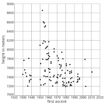
Exercise \(\PageIndex{7}\)
Here is a scatter plot of data for some of the tallest mountains on Earth.
The heights in meters and year of first recorded ascent is shown. Mount Everest is the tallest mountain in this set of data.
- Estimate the height of Mount Everest.
- Estimate the year of the first recorded ascent of Mount Everest.
(From Unit 6.2.1)
Exercise \(\PageIndex{8}\)
A cone has a volume \(V\), radius \(r\), and a height of 12 cm.
- A cone has the same height and \(\frac{1}{3}\) of the radius of the original cone. Write an expression for its volume.
- A cone has the same height and 3 times the radius of the original cone. Write an expression for its volume.
(From Unit 5.5.2)