
6.2.6: Analyzing Bivariate Data
- Page ID
- 36714

\( \newcommand{\vecs}[1]{\overset { \scriptstyle \rightharpoonup} {\mathbf{#1}} } \)
\( \newcommand{\vecd}[1]{\overset{-\!-\!\rightharpoonup}{\vphantom{a}\smash {#1}}} \)
\( \newcommand{\id}{\mathrm{id}}\) \( \newcommand{\Span}{\mathrm{span}}\)
( \newcommand{\kernel}{\mathrm{null}\,}\) \( \newcommand{\range}{\mathrm{range}\,}\)
\( \newcommand{\RealPart}{\mathrm{Re}}\) \( \newcommand{\ImaginaryPart}{\mathrm{Im}}\)
\( \newcommand{\Argument}{\mathrm{Arg}}\) \( \newcommand{\norm}[1]{\| #1 \|}\)
\( \newcommand{\inner}[2]{\langle #1, #2 \rangle}\)
\( \newcommand{\Span}{\mathrm{span}}\)
\( \newcommand{\id}{\mathrm{id}}\)
\( \newcommand{\Span}{\mathrm{span}}\)
\( \newcommand{\kernel}{\mathrm{null}\,}\)
\( \newcommand{\range}{\mathrm{range}\,}\)
\( \newcommand{\RealPart}{\mathrm{Re}}\)
\( \newcommand{\ImaginaryPart}{\mathrm{Im}}\)
\( \newcommand{\Argument}{\mathrm{Arg}}\)
\( \newcommand{\norm}[1]{\| #1 \|}\)
\( \newcommand{\inner}[2]{\langle #1, #2 \rangle}\)
\( \newcommand{\Span}{\mathrm{span}}\) \( \newcommand{\AA}{\unicode[.8,0]{x212B}}\)
\( \newcommand{\vectorA}[1]{\vec{#1}} % arrow\)
\( \newcommand{\vectorAt}[1]{\vec{\text{#1}}} % arrow\)
\( \newcommand{\vectorB}[1]{\overset { \scriptstyle \rightharpoonup} {\mathbf{#1}} } \)
\( \newcommand{\vectorC}[1]{\textbf{#1}} \)
\( \newcommand{\vectorD}[1]{\overrightarrow{#1}} \)
\( \newcommand{\vectorDt}[1]{\overrightarrow{\text{#1}}} \)
\( \newcommand{\vectE}[1]{\overset{-\!-\!\rightharpoonup}{\vphantom{a}\smash{\mathbf {#1}}}} \)
\( \newcommand{\vecs}[1]{\overset { \scriptstyle \rightharpoonup} {\mathbf{#1}} } \)
\( \newcommand{\vecd}[1]{\overset{-\!-\!\rightharpoonup}{\vphantom{a}\smash {#1}}} \)
Lesson
Let's analyze data like a pro.
Exercise \(\PageIndex{1}\): Speed vs Step Length
A researcher found an association between a dog’s stride length and its speed: the longer a dog’s steps, the faster it goes. The predicted speed in meters per second, \(s\), as a function of step length in meters, \(l\), is
\(s=4l-1.6\)
What does the rate of change of the function tell you about the association between stride length and speed?
Exercise \(\PageIndex{2}\): Animal Brains
Is there an association between the weight of an animal’s body and the weight of the animal’s brain?
| animal | body weight (kg) | brain weight (kg) |
|---|---|---|
| cow | 465 | 423 |
| grey wolf | 36 | 120 |
| goat | 28 | 115 |
| donkey | 187 | 419 |
| horse | 521 | 655 |
| potar monkey | 10 | 115 |
| cat | 3 | 26 |
| giraffe | 529 | 680 |
| gorilla | 207 | 406 |
| human | 62 | 1320 |
| rhesus monkey | 7 | 179 |
| kangaroo | 35 | 56 |
| sheep | 56 | 175 |
| jaguar | 100 | 157 |
| chimpanzee | 52 | 440 |
| pig | 192 | 180 |
Use the data to make a scatter plot. Are there any outliers?
Experiment with the line to fit the data. Drag the points to move the line. You can close the expressions list by clicking on the double arrow.
- Without including any outliers, does there appear to be an association between body weight and brain weight? Describe the association in a sentence.
- Adjust the line by moving the green points, fitting the line to your scatter plot, and estimate its slope. What does this slope mean in the context of brain and body weight?
- Does the fitted line help you identify any other outliers?
Are you ready for more?
Use one of the suggestions or find another set of data that interested you to look for associations between the variables.
- Number of wins vs number of points per game for your favorite sports team in different seasons
- Amount of money grossed vs critic rating for your favorite movies
- Price of a ticket vs stadium capacity for popular bands on tour
After you have collected the data,
- Create a scatter plot for the data.
- Are any of the points very far away from the rest of the data?
- Would a linear model fit the data in your scatter plot? If so, draw it. If not, explain why a line would be a bad fit.
- Is there an association between the two variables? Explain your reasoning.
Exercise \(\PageIndex{3}\): Equal Body Dimensions
- Sometimes a person’s arm span is the same as their height. Is this true for anyone in the class?
- Make a scatter plot for the arm span and height data, and describe any association. Click on the plus sign to get a menu and add a table, if you choose.
- Is the line \(y=x\) a good fit for the data? If so, explain why. If not, find the equation of a line that fits the data better.
- Examine the scatter plot. Which person in your class has the largest ratio between their arm span and their height? Explain or show your reasoning.
Summary
People often collect data in two variables to investigate possible associations between two numerical variables and use the connections that they find to predict more values of the variables. Data analysis usually follows these steps:
- Collect data.
- Organize and represent the data, and look for an association.
- Identify any outliers and try to explain why these data points are exceptions to the trend that describes the association.
- Find a function that fits the data well.
Although computational systems can help with data analysis by graphing the data, finding a function that might fit the data, and using that function to make predictions, it is important to understand the process and think about what is happening. A computational system may find a function that does not make sense or use a line when the situation suggests that a different model would be more appropriate.
Glossary Entries
Definition: Negative Association
A negative association is a relationship between two quantities where one tends to decrease as the other increases. In a scatter plot, the data points tend to cluster around a line with negative slope.
Different stores across the country sell a book for different prices.
The scatter plot shows that there is a negative association between the the price of the book in dollars and the number of books sold at that price.

Definition: Outlier
An outlier is a data value that is far from the other values in the data set.
Here is a scatter plot that shows lengths and widths of 20 different left feet. The foot whose length is 24.5 cm and width is 7.8 cm is an outlier.

Definition: Positive Association
A positive association is a relationship between two quantities where one tends to increase as the other increases. In a scatter plot, the data points tend to cluster around a line with positive slope.
The relationship between height and weight for 25 dogs is shown in the scatter plot. There is a positive association between dog height and dog weight.

Practice
Exercise \(\PageIndex{4}\)
Different stores across the country sell a book for different prices. The table shows the price of the book in dollars and the number of books sold at that price.
| price in dollars | number sold |
|---|---|
| 11.25 | 53 |
| 10.50 | 60 |
| 12.10 | 30 |
| 8.45 | 81 |
| 9.25 | 70 |
| 9.75 | 80 |
| 7.25 | 120 |
| 12 | 37 |
| 9.99 | 130 |
| 7.99 | 100 |
| 8.75 | 90 |
- Draw a scatter plot of this data. Label the axes.
- Are there any outliers? Explain your reasoning.
- If there is a relationship between the variables, explain what it is.
- Remove any outliers, and draw a line that you think is a good fit for the data.

Exercise \(\PageIndex{5}\)
Here is a scatter plot:

Select all the following that describe the association in the scatter plot:
- Linear association
- Non-linear association
- Positive association
- Negative association
- No association
(From Unit 6.2.5)
Exercise \(\PageIndex{6}\)
Using the data in the scatter plot, what can you tell about the slope of a good model?
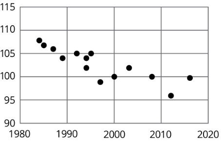
- The slope is positive.
- The slope is zero.
- The slope is negative.
- There is no association.
(From Unit 6.2.4)