
6.3.1: Looking for Associations
- Page ID
- 36720

\( \newcommand{\vecs}[1]{\overset { \scriptstyle \rightharpoonup} {\mathbf{#1}} } \)
\( \newcommand{\vecd}[1]{\overset{-\!-\!\rightharpoonup}{\vphantom{a}\smash {#1}}} \)
\( \newcommand{\dsum}{\displaystyle\sum\limits} \)
\( \newcommand{\dint}{\displaystyle\int\limits} \)
\( \newcommand{\dlim}{\displaystyle\lim\limits} \)
\( \newcommand{\id}{\mathrm{id}}\) \( \newcommand{\Span}{\mathrm{span}}\)
( \newcommand{\kernel}{\mathrm{null}\,}\) \( \newcommand{\range}{\mathrm{range}\,}\)
\( \newcommand{\RealPart}{\mathrm{Re}}\) \( \newcommand{\ImaginaryPart}{\mathrm{Im}}\)
\( \newcommand{\Argument}{\mathrm{Arg}}\) \( \newcommand{\norm}[1]{\| #1 \|}\)
\( \newcommand{\inner}[2]{\langle #1, #2 \rangle}\)
\( \newcommand{\Span}{\mathrm{span}}\)
\( \newcommand{\id}{\mathrm{id}}\)
\( \newcommand{\Span}{\mathrm{span}}\)
\( \newcommand{\kernel}{\mathrm{null}\,}\)
\( \newcommand{\range}{\mathrm{range}\,}\)
\( \newcommand{\RealPart}{\mathrm{Re}}\)
\( \newcommand{\ImaginaryPart}{\mathrm{Im}}\)
\( \newcommand{\Argument}{\mathrm{Arg}}\)
\( \newcommand{\norm}[1]{\| #1 \|}\)
\( \newcommand{\inner}[2]{\langle #1, #2 \rangle}\)
\( \newcommand{\Span}{\mathrm{span}}\) \( \newcommand{\AA}{\unicode[.8,0]{x212B}}\)
\( \newcommand{\vectorA}[1]{\vec{#1}} % arrow\)
\( \newcommand{\vectorAt}[1]{\vec{\text{#1}}} % arrow\)
\( \newcommand{\vectorB}[1]{\overset { \scriptstyle \rightharpoonup} {\mathbf{#1}} } \)
\( \newcommand{\vectorC}[1]{\textbf{#1}} \)
\( \newcommand{\vectorD}[1]{\overrightarrow{#1}} \)
\( \newcommand{\vectorDt}[1]{\overrightarrow{\text{#1}}} \)
\( \newcommand{\vectE}[1]{\overset{-\!-\!\rightharpoonup}{\vphantom{a}\smash{\mathbf {#1}}}} \)
\( \newcommand{\vecs}[1]{\overset { \scriptstyle \rightharpoonup} {\mathbf{#1}} } \)
\(\newcommand{\longvect}{\overrightarrow}\)
\( \newcommand{\vecd}[1]{\overset{-\!-\!\rightharpoonup}{\vphantom{a}\smash {#1}}} \)
\(\newcommand{\avec}{\mathbf a}\) \(\newcommand{\bvec}{\mathbf b}\) \(\newcommand{\cvec}{\mathbf c}\) \(\newcommand{\dvec}{\mathbf d}\) \(\newcommand{\dtil}{\widetilde{\mathbf d}}\) \(\newcommand{\evec}{\mathbf e}\) \(\newcommand{\fvec}{\mathbf f}\) \(\newcommand{\nvec}{\mathbf n}\) \(\newcommand{\pvec}{\mathbf p}\) \(\newcommand{\qvec}{\mathbf q}\) \(\newcommand{\svec}{\mathbf s}\) \(\newcommand{\tvec}{\mathbf t}\) \(\newcommand{\uvec}{\mathbf u}\) \(\newcommand{\vvec}{\mathbf v}\) \(\newcommand{\wvec}{\mathbf w}\) \(\newcommand{\xvec}{\mathbf x}\) \(\newcommand{\yvec}{\mathbf y}\) \(\newcommand{\zvec}{\mathbf z}\) \(\newcommand{\rvec}{\mathbf r}\) \(\newcommand{\mvec}{\mathbf m}\) \(\newcommand{\zerovec}{\mathbf 0}\) \(\newcommand{\onevec}{\mathbf 1}\) \(\newcommand{\real}{\mathbb R}\) \(\newcommand{\twovec}[2]{\left[\begin{array}{r}#1 \\ #2 \end{array}\right]}\) \(\newcommand{\ctwovec}[2]{\left[\begin{array}{c}#1 \\ #2 \end{array}\right]}\) \(\newcommand{\threevec}[3]{\left[\begin{array}{r}#1 \\ #2 \\ #3 \end{array}\right]}\) \(\newcommand{\cthreevec}[3]{\left[\begin{array}{c}#1 \\ #2 \\ #3 \end{array}\right]}\) \(\newcommand{\fourvec}[4]{\left[\begin{array}{r}#1 \\ #2 \\ #3 \\ #4 \end{array}\right]}\) \(\newcommand{\cfourvec}[4]{\left[\begin{array}{c}#1 \\ #2 \\ #3 \\ #4 \end{array}\right]}\) \(\newcommand{\fivevec}[5]{\left[\begin{array}{r}#1 \\ #2 \\ #3 \\ #4 \\ #5 \\ \end{array}\right]}\) \(\newcommand{\cfivevec}[5]{\left[\begin{array}{c}#1 \\ #2 \\ #3 \\ #4 \\ #5 \\ \end{array}\right]}\) \(\newcommand{\mattwo}[4]{\left[\begin{array}{rr}#1 \amp #2 \\ #3 \amp #4 \\ \end{array}\right]}\) \(\newcommand{\laspan}[1]{\text{Span}\{#1\}}\) \(\newcommand{\bcal}{\cal B}\) \(\newcommand{\ccal}{\cal C}\) \(\newcommand{\scal}{\cal S}\) \(\newcommand{\wcal}{\cal W}\) \(\newcommand{\ecal}{\cal E}\) \(\newcommand{\coords}[2]{\left\{#1\right\}_{#2}}\) \(\newcommand{\gray}[1]{\color{gray}{#1}}\) \(\newcommand{\lgray}[1]{\color{lightgray}{#1}}\) \(\newcommand{\rank}{\operatorname{rank}}\) \(\newcommand{\row}{\text{Row}}\) \(\newcommand{\col}{\text{Col}}\) \(\renewcommand{\row}{\text{Row}}\) \(\newcommand{\nul}{\text{Nul}}\) \(\newcommand{\var}{\text{Var}}\) \(\newcommand{\corr}{\text{corr}}\) \(\newcommand{\len}[1]{\left|#1\right|}\) \(\newcommand{\bbar}{\overline{\bvec}}\) \(\newcommand{\bhat}{\widehat{\bvec}}\) \(\newcommand{\bperp}{\bvec^\perp}\) \(\newcommand{\xhat}{\widehat{\xvec}}\) \(\newcommand{\vhat}{\widehat{\vvec}}\) \(\newcommand{\uhat}{\widehat{\uvec}}\) \(\newcommand{\what}{\widehat{\wvec}}\) \(\newcommand{\Sighat}{\widehat{\Sigma}}\) \(\newcommand{\lt}{<}\) \(\newcommand{\gt}{>}\) \(\newcommand{\amp}{&}\) \(\definecolor{fillinmathshade}{gray}{0.9}\)Lesson
Let's look for associations in data.
Exercise \(\PageIndex{1}\): Notice and Wonder: Bar Association
What do you notice? What do you wonder?
Exercise \(\PageIndex{2}\): Card Sort: Matching Representations
Your teacher will hand out some cards.
Some cards show two-way tables like this:
| has cell phone | does not have cell phone | total | |
|---|---|---|---|
| 10 to 12 years old | 25 | 35 | 60 |
| 13 to 15 years old | 40 | 10 | 50 |
| 16 to 18 years old | 50 | 10 | 60 |
| total | 115 | 55 | 170 |
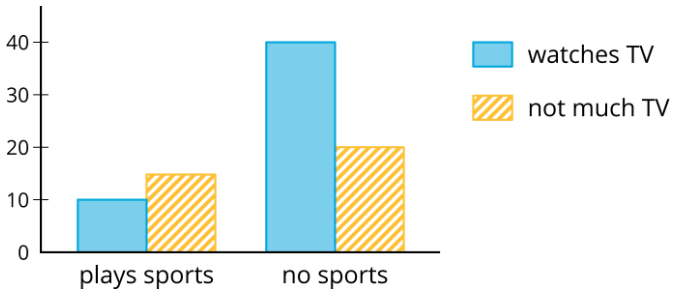
Some cards show bar graphs like this:

Some cards show segmented bar graphs like this:

The bar graphs and segmented bar graphs have their labels removed.
- Put all the cards that describe the same situation in the same group.
- One of the groups does not have a two-way table. Make a two-way table for the situation described by the graphs in the group.
- Label the bar graphs and segmented bar graphs so that the categories represented by each bar are indicated.
- Describe in your own words the kind of information shown by a segmented bar graph.
Are you ready for more?
One of the segmented bar graphs is missing. Construct a segmented bar graph that matches the other representations.
Exercise \(\PageIndex{3}\): Building Another Type of Two-Way Table
Here is a two-way table that shows data about cell phone usage among children aged 10 to 18.
| has cell phone | does not have cell phone | total | |
|---|---|---|---|
| 10 to 12 years old | 25 | 35 | 60 |
| 13 to 15 years old | 40 | 10 | 50 |
| 16 to 18 years old | 50 | 10 | 60 |
| total | 115 | 55 | 170 |
1. Complete the table. In each row, the entries for “has cell phone” and “does not have cell phone” should have the total 100%. Round entries to the nearest percentage point.
| has cell phone | does not have cell phone | total | |
|---|---|---|---|
| 10 to 12 years old | 42% | ||
| 13 to 15 years old | 100% | ||
| 16 to 18 years old | 17% |
This is still a two-way table. Instead of showing frequency, this table shows relative frequency.
2. Two-way tables that show relative frequencies often don’t include a “total” row at the bottom. Why?
3. Is there an association between age and cell phone use? How does the two-way table of relative frequencies help to illustrate this?
Are you ready for more?
A pollster attends a rally and surveys many of the participants about whether they associate with political Party A or political Party B and whether they are for or against Proposition 3.14 going up for vote soon. The results are sorted into the table shown.
| for | against | |
|---|---|---|
| party A | 832 | 165 |
| party B | 80 | 160 |
- A news station reports these results by saying, “A poll shows that about the same number of people from both parties are voting against Proposition 3.14.”
- A second news station shows this graphic.

- Are any of the news reports misleading? Explain your reasoning.
- Create a headline, graphic, and short description that more accurately represents the data in the table.
Summary
When we collect data by counting things in various categories, like red, blue, or yellow, we call the data categorical data, and we say that color is a categorical variable.
We can use two-way tables to investigate possible connections between two categorical variables. For example, this two-way table of frequencies shows the results of a study of meditation and state of mind of athletes before a track meet.
| meditated | did not meditate | total | |
|---|---|---|---|
| calm | 45 | 8 | 53 |
| agitated | 23 | 21 | 44 |
| total | 68 | 29 | 97 |
If we are interested in the question of whether there is an association between meditating and being calm, we might present the frequencies in a bar graph, grouping data about meditators and grouping data about non-meditators, so we can compare the numbers of calm and agitated athletes in each group.

Notice that the number of athletes who did not meditate is small compared to the number who meditated (29 as compared to 68, as shown in the table).
If we want to know the proportions of calm meditators and calm non-meditators, we can make a two-way table of relative frequencies and present the relative frequencies in a segmented bar graph.
| meditated | did not meditate | |
|---|---|---|
| calm | 66% | 28% |
| agitated | 34% | 72% |
| total | 100% | 100% |

Glossary Entries
Definition: Relative Frequency
The relative frequency of a category tells us the proportion at which the category occurs in the data set. It is expressed as a fraction, a decimal, or a percentage of the total number.
For example, suppose there were 21 dogs in the park, some white, some brown, some black, and some multi-color. The table shows the frequency and the relative frequency of each color.
| color | frequency | relative frequency |
|---|---|---|
| white | \(5\) | \(\frac{5}{21}\) |
| brown | \(7\) | \(\frac{7}{21}\) |
| black | \(3\) | \(\frac{3}{21}\) |
| multi-color | \(6\) | \(\frac{6}{21}\) |
Definition: Segmented Bar Graph
A segmented bar graph compares two categories within a data set. The whole bar represents all the data within one category. Then, each bar is separated into parts (segments) that show the percentage of each part in the second category.
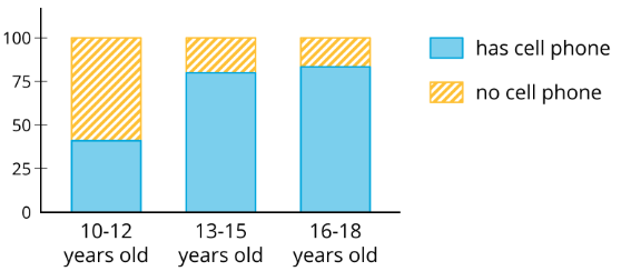
This segmented bar graph shows the percentage of people in different age groups that do and do not have a cell phone. For example, among people ages 10 to 12, about 40% have a cell phone and 60% do not have a cell phone.
Definition: Two-Way Table
A two-way table provides a way to compare two categorical variables.
It shows one of the variables across the top and the other down one side. Each entry in the table is the frequency or relative frequency of the category shown by the column and row headings.
A study investigates the connection between meditation and the state of mind of athletes before a track meet. This two-way table shows the results of the study.
| meditated | did not meditate | total | |
|---|---|---|---|
| calm | 45 | 8 | 53 |
| agitated | 23 | 21 | 44 |
| total | 68 | 29 | 97 |
Practice
Exercise \(\PageIndex{4}\)
A scientist wants to know if the color of the water affects how much animals drink. The average amount of water each animal drinks was recorded in milliliters for a week and then graphed. Is there evidence to suggest an association between water color and animal?
| cat intake (mL) | dog intake (mL) | total (mL) | |
|---|---|---|---|
| blue water | 210 | 1200 | 1410 |
| green water | 200 | 1100 | 1300 |
| total | 410 | 2300 | 2710 |

Exercise \(\PageIndex{5}\)
A farmer brings his produce to the farmer’s market and records whether people buy lettuce, apples, both, or something else.
| bought apples | did not buy apples | |
|---|---|---|
| bought lettuce | 14 | 58 |
| did not buy lettuce | 8 | 29 |
Make a table that shows the relative frequencies for each row. Use this table to decide if there is an association between buying lettuce and buying apples.
Exercise \(\PageIndex{6}\)
Researchers at a media company want to study news-reading habits among different age groups. They tracked print and online subscription data and made a 2-way table.
| internet media | print media | |
|---|---|---|
| 18-25 year olds | 151 | 28 |
| 26-45 year olds | 132 | 72 |
| 46-65 year olds | 48 | 165 |
- Create a segmented bar graph using one bar for each row of the table.
- Is there an association between age groups and the method they use to read articles? Explain your reasoning.
Exercise \(\PageIndex{7}\)
Using the data in the scatter plot, what is a reasonable slope of a model that fits this data?

- \(-2.5\)
- \(-1\)
- \(1\)
- \(2.5\)
(From Unit 6.2.4)