
6.3.2: Using Data Displays to Find Associations
- Page ID
- 36721

\( \newcommand{\vecs}[1]{\overset { \scriptstyle \rightharpoonup} {\mathbf{#1}} } \)
\( \newcommand{\vecd}[1]{\overset{-\!-\!\rightharpoonup}{\vphantom{a}\smash {#1}}} \)
\( \newcommand{\id}{\mathrm{id}}\) \( \newcommand{\Span}{\mathrm{span}}\)
( \newcommand{\kernel}{\mathrm{null}\,}\) \( \newcommand{\range}{\mathrm{range}\,}\)
\( \newcommand{\RealPart}{\mathrm{Re}}\) \( \newcommand{\ImaginaryPart}{\mathrm{Im}}\)
\( \newcommand{\Argument}{\mathrm{Arg}}\) \( \newcommand{\norm}[1]{\| #1 \|}\)
\( \newcommand{\inner}[2]{\langle #1, #2 \rangle}\)
\( \newcommand{\Span}{\mathrm{span}}\)
\( \newcommand{\id}{\mathrm{id}}\)
\( \newcommand{\Span}{\mathrm{span}}\)
\( \newcommand{\kernel}{\mathrm{null}\,}\)
\( \newcommand{\range}{\mathrm{range}\,}\)
\( \newcommand{\RealPart}{\mathrm{Re}}\)
\( \newcommand{\ImaginaryPart}{\mathrm{Im}}\)
\( \newcommand{\Argument}{\mathrm{Arg}}\)
\( \newcommand{\norm}[1]{\| #1 \|}\)
\( \newcommand{\inner}[2]{\langle #1, #2 \rangle}\)
\( \newcommand{\Span}{\mathrm{span}}\) \( \newcommand{\AA}{\unicode[.8,0]{x212B}}\)
\( \newcommand{\vectorA}[1]{\vec{#1}} % arrow\)
\( \newcommand{\vectorAt}[1]{\vec{\text{#1}}} % arrow\)
\( \newcommand{\vectorB}[1]{\overset { \scriptstyle \rightharpoonup} {\mathbf{#1}} } \)
\( \newcommand{\vectorC}[1]{\textbf{#1}} \)
\( \newcommand{\vectorD}[1]{\overrightarrow{#1}} \)
\( \newcommand{\vectorDt}[1]{\overrightarrow{\text{#1}}} \)
\( \newcommand{\vectE}[1]{\overset{-\!-\!\rightharpoonup}{\vphantom{a}\smash{\mathbf {#1}}}} \)
\( \newcommand{\vecs}[1]{\overset { \scriptstyle \rightharpoonup} {\mathbf{#1}} } \)
\( \newcommand{\vecd}[1]{\overset{-\!-\!\rightharpoonup}{\vphantom{a}\smash {#1}}} \)
Lesson
Let's use data displays to find associations.
Exercise \(\PageIndex{1}\): Sports and Musical Instruments
For a survey, students in a class answered these questions:
- Do you play a sport?
- Do you play a musical instrument?
1. Here is a two-way table that gives some results from the survey. Complete the table, assuming that all students answered both questions.
| plays instrument | does not play instrument | total | |
|---|---|---|---|
| plays sport | 5 | 16 | |
| does not play sport | |||
| total | 15 | 25 |
2. To the nearest percentage point, what percentage of students who play a sport don’t play a musical instrument?
3. To the nearest percentage point, what percentage of students who don’t play a sport also don’t play a musical instrument?
Exercise \(\PageIndex{2}\): Sports and Music Association
Your teacher will give you a two-way table with information about the number of people in your class who play sports or musical instruments.
1. Complete this table to make a two-way table for the data from earlier. The table will show relative frequencies by row.
| plays instrument | does not play instrument | row total | |
|---|---|---|---|
| plays sport | 100% | ||
| does not play sport | 100% |
2. Make a segmented bar graph for the table. Use one bar of the graph for each row of the table.
3. Complete the table to make a two-way table for the data from earlier. The table will show relative frequencies by column.
| plays instrument | does not play instrument | |
|---|---|---|
| plays sport | ||
| does not play sport | ||
| column total | 100% | 100% |
4. Using the values in the table, make a segmented bar graph. Use one bar of the graph for each column of the table.

5. Based on the two-way tables and segmented bar graphs, do you think there is an association between playing a sport and playing a musical instrument? Explain how you know.
Exercise \(\PageIndex{3}\): Colored Erasers
An eraser factory has five machines. One machine makes the eraser shapes. Then each shape goes through the red machine, blue machine, yellow machine, or green machine to have a side colored.
The manager notices that an uncolored side of some erasers is flawed at the end of the process and wants to know which machine needs to be fixed: the shape machine or some of the color machines. The manager collected data on the number of flawed and unflawed erasers of each color.
| unflawed | flawed | total | |
|---|---|---|---|
| red | 285 | 15 | 300 |
| blue | 223 | 17 | 240 |
| yellow | 120 | 80 | 200 |
| green | 195 | 65 | 260 |
| total | 823 | 177 | 1000 |
- Work with a partner. Each of you should make one segmented bar graph for the data in the table. One segmented bar graph should have a bar for each row of the table. The other segmented bar graph should have one bar for each column of the table.
- Are the flawed erasers associated with certain colors? If so, which colors? Explain your reasoning.
Are you ready for more?
Based on the federal budgets for 2009, the table shows where some of the federal money was expected to go. The values are in billions of U.S. Dollars.
| United States | Japan | United Kingdom | |
|---|---|---|---|
| defense | 718.4 | 42.8 | 49.2 |
| education | 44.9 | 47.5 | 113.9 |
- Why would a segmented bar graph be more useful than the table of data to see any associations between the country and where the money is spent?
- Create a segmented bar graph that represents the data from the table.
- Is there an association between the country’s budget and their spending in these areas? Explain your reasoning.
Summary
In an earlier lesson, we looked at data on meditation and state of mind in athletes.

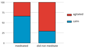
Is there an association between meditation and state of mind?
The bar graph shows that more athletes were calm than agitated among the group that meditated, and more athletes were agitated than calm among the group that did not. We can see the proportions of calm meditators and calm non-meditators from the segmented bar graph, which shows that about 66% of athletes who meditated were calm, whereas only about 27% of those who did not meditate were calm.
This does not necessarily mean that meditation causes calm; it could be the other way around, that calm athletes are more inclined to meditate. But it does suggest that there is an association between meditating and calmness.
Glossary Entries
Definition: Relative Frequency
The relative frequency of a category tells us the proportion at which the category occurs in the data set. It is expressed as a fraction, a decimal, or a percentage of the total number.
For example, suppose there were 21 dogs in the park, some white, some brown, some black, and some multi-color. The table shows the frequency and the relative frequency of each color.
| color | frequency | relative frequency |
|---|---|---|
| white | \(5\) | \(\frac{5}{21}\) |
| brown | \(7\) | \(\frac{7}{21}\) |
| black | \(3\) | \(\frac{3}{21}\) |
| multi-color | \(6\) | \(\frac{6}{21}\) |
Definition: Segmented Bar Graph
A segmented bar graph compares two categories within a data set. The whole bar represents all the data within one category. Then, each bar is separated into parts (segments) that show the percentage of each part in the second category.
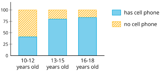
This segmented bar graph shows the percentage of people in different age groups that do and do not have a cell phone. For example, among people ages 10 to 12, about 40% have a cell phone and 60% do not have a cell phone.
Definition: Two-Way Table
A two-way table provides a way to compare two categorical variables.
It shows one of the variables across the top and the other down one side. Each entry in the table is the frequency or relative frequency of the category shown by the column and row headings.
A study investigates the connection between meditation and the state of mind of athletes before a track meet. This two-way table shows the results of the study.
| meditated | did not meditate | total | |
|---|---|---|---|
| calm | 45 | 8 | 53 |
| agitated | 23 | 21 | 44 |
| total | 68 | 29 | 97 |
Practice
Exercise \(\PageIndex{4}\)
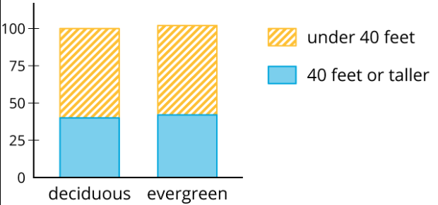
An ecologist is studying a forest with a mixture of tree types. Since the average tree height in the area is 40 feet, he measures the height of the tree against that. He also records the type of tree. The results are shown in the table and segmented bar graph. Is there evidence of an association between tree height and tree type? Explain your reasoning.
| under 40 ft | 40 feet or taller | total | |
|---|---|---|---|
| deciduous | 45 | 30 | 75 |
| evergreen | 14 | 10 | 24 |
| total | 59 | 40 | 99 |
Exercise \(\PageIndex{5}\)
Workers at an advertising agency are interested in people’s TV viewing habits. They take a survey of people in two cities to try to find patterns in the types of shows they watch. The results are recorded in a table and shown in a segmented bar graph. Is there evidence of different viewing habits? If so, explain.
| reality | news | comedy | drama | |
|---|---|---|---|---|
| Chicago | 50 | 40 | 90 | 20 |
| Topeka | 45 | 70 | 40 | 45 |

Exercise \(\PageIndex{6}\)
A scientist is interested in whether certain species of butterflies like certain types of local flowers. The scientist captures butterflies in two zones with different flower types and records the number caught. Do these data show an association between butterfly type and zone? Explain your reasoning.
| zone 1 | zone 2 | |
|---|---|---|
| eastern tiger swallowtail | 16 | 34 |
| monarch | 24 | 46 |