
1.5: Fitting Linear Models to Data
- Page ID
- 40115

\( \newcommand{\vecs}[1]{\overset { \scriptstyle \rightharpoonup} {\mathbf{#1}} } \)
\( \newcommand{\vecd}[1]{\overset{-\!-\!\rightharpoonup}{\vphantom{a}\smash {#1}}} \)
\( \newcommand{\id}{\mathrm{id}}\) \( \newcommand{\Span}{\mathrm{span}}\)
( \newcommand{\kernel}{\mathrm{null}\,}\) \( \newcommand{\range}{\mathrm{range}\,}\)
\( \newcommand{\RealPart}{\mathrm{Re}}\) \( \newcommand{\ImaginaryPart}{\mathrm{Im}}\)
\( \newcommand{\Argument}{\mathrm{Arg}}\) \( \newcommand{\norm}[1]{\| #1 \|}\)
\( \newcommand{\inner}[2]{\langle #1, #2 \rangle}\)
\( \newcommand{\Span}{\mathrm{span}}\)
\( \newcommand{\id}{\mathrm{id}}\)
\( \newcommand{\Span}{\mathrm{span}}\)
\( \newcommand{\kernel}{\mathrm{null}\,}\)
\( \newcommand{\range}{\mathrm{range}\,}\)
\( \newcommand{\RealPart}{\mathrm{Re}}\)
\( \newcommand{\ImaginaryPart}{\mathrm{Im}}\)
\( \newcommand{\Argument}{\mathrm{Arg}}\)
\( \newcommand{\norm}[1]{\| #1 \|}\)
\( \newcommand{\inner}[2]{\langle #1, #2 \rangle}\)
\( \newcommand{\Span}{\mathrm{span}}\) \( \newcommand{\AA}{\unicode[.8,0]{x212B}}\)
\( \newcommand{\vectorA}[1]{\vec{#1}} % arrow\)
\( \newcommand{\vectorAt}[1]{\vec{\text{#1}}} % arrow\)
\( \newcommand{\vectorB}[1]{\overset { \scriptstyle \rightharpoonup} {\mathbf{#1}} } \)
\( \newcommand{\vectorC}[1]{\textbf{#1}} \)
\( \newcommand{\vectorD}[1]{\overrightarrow{#1}} \)
\( \newcommand{\vectorDt}[1]{\overrightarrow{\text{#1}}} \)
\( \newcommand{\vectE}[1]{\overset{-\!-\!\rightharpoonup}{\vphantom{a}\smash{\mathbf {#1}}}} \)
\( \newcommand{\vecs}[1]{\overset { \scriptstyle \rightharpoonup} {\mathbf{#1}} } \)
\( \newcommand{\vecd}[1]{\overset{-\!-\!\rightharpoonup}{\vphantom{a}\smash {#1}}} \)
Learning Objectives
- Draw and interpret scatter plots.
- Use a graphing utility to find the line of best fit.
- Fit a regression line to a set of data and use the linear model to make predictions.
Prerequisite Skills
Before you get started, take this prerequisite quiz.
1. On a piece of graph paper, plot and label these points: A(1, 4), B(-3, 2), C(2, -5), D(0, -3), E(4, 0).
- Click here to check your answer
-
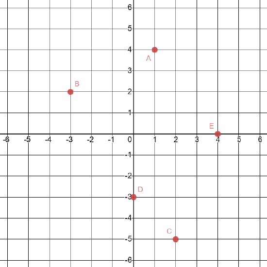
If you missed any part of this problem, review here. (Note that this will open a different textbook in a new window.)
2. Write the coordinates of each of the points shown in this graph.
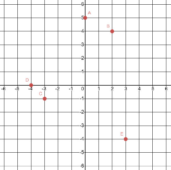
- Click here to check your answer
-
A(0, 5)
B(2, 4)
C(-3, -1)
D(-4, 0)
E(3, -4)
If you missed any part of this problem, review here. (Note that this will open a different textbook in a new window.)
3. If \(y=-3.215x-78.2\), solve for \(y\) when \(x=-21\).
- Click here to check your answer
-
\(y=-10.685\)
If you missed this problem, review here. (Note that this will open a different textbook in a new window.)
4. If \(y=-3.215x-78.2\), solve for \(x\) when \(y=-46.05\).
- Click here to check your answer
-
\(x=-10\)
If you missed this problem, review Section 1.1. (Note that this will open in a new window.)
A professor is attempting to identify trends among final exam scores. His class has a mixture of students, so he wonders if there is any relationship between age and final exam scores. One way for him to analyze the scores is by creating a diagram that relates the age of each student to the exam score received. In this section, we will examine one such diagram known as a scatter plot.
Drawing and Interpreting Scatter Plots
A scatter plot is a graph of plotted points that may show a relationship between two sets of data. If the relationship is from a linear model, or a model that is nearly linear, the professor can draw conclusions using his knowledge of linear functions. Figure \(\PageIndex{1}\) shows a sample scatter plot.
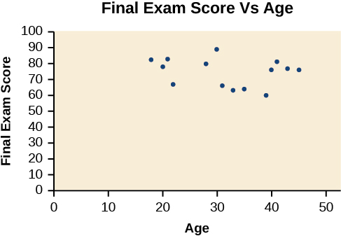
Notice this scatter plot does not indicate a linear relationship. The points do not appear to follow a trend. In other words, there does not appear to be a relationship between the age of the student and the score on the final exam.
To create a scatter plot on a calculator
- Press STAT ENTER to enter your data; enter your \(X\) data into list L1 and your \(Y\) data into list L2.
- Press 2nd STATPLOT ENTER to use Plot 1. On the input screen for PLOT 1, highlight On and press ENTER. (Make sure the other plots are OFF.)
- For TYPE: highlight the very first icon, which is the scatter plot, and press ENTER.
- For Xlist:, enter L1 ENTER and for Ylist: L2 ENTER.
- For Mark: it does not matter which symbol you highlight, but the square is often the easiest to see. Press ENTER.
- Make sure there are no other equations that could be plotted. Press Y = and clear any equations out.
- Press the ZOOM key and then the number 9 (for menu item "ZoomStat"); the calculator will fit the window to the data. You can press WINDOW to see the scaling of the axes.
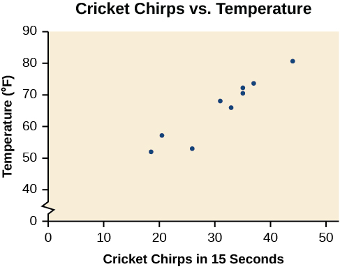
Example \(\PageIndex{1}\): Using a Scatter Plot to Investigate Cricket Chirps
The table below shows the number of cricket chirps in 15 seconds, for several different air temperatures, in degrees Fahrenheit. Plot this data in your calculator, and determine whether the data appears to be linearly related.
| Chirps | 44 | 35 | 20.4 | 33 | 31 | 35 | 18.5 | 37 | 26 |
| Temperature | 80.5 | 70.5 | 57 | 66 | 68 | 72 | 52 | 73.5 | 53 |
Solution
Plotting this data, as depicted in Figure \(\PageIndex{2}\) suggests that there may be a trend. We can see from the trend in the data that the number of chirps increases as the temperature increases. The trend appears to be roughly linear, though certainly not perfectly so.
Finding the Line of Best Fit
Once we recognize a need for a linear function to model that data, the natural follow-up question is “what is that linear function?” One way to approximate our linear function is to sketch the line that seems to best fit the data. Then we can extend the line until we can verify the y-intercept. We can approximate the slope of the line by extending it until we can estimate the \(\frac{\text{rise}}{\text{run}}\).
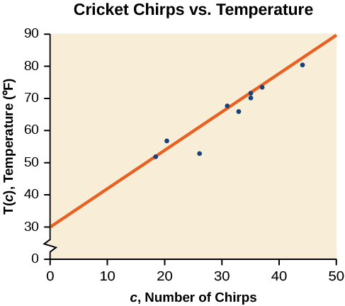
Example \(\PageIndex{2}\): "Eyeballing" a Line of Best Fit
Find a linear function that fits the data in Table \(\PageIndex{1}\) by “eyeballing” a line that seems to fit.
Solution
On a graph, we could try sketching a line.
Using the starting and ending points of our hand drawn line, points \((0, 30)\) and \((50, 90)\), this graph has a slope of
\[m=\dfrac{60}{50}=1.2\nonumber\]
and a y-intercept at 30. This gives an equation of
\[T(c)=1.2c+30\nonumber\]
where \(c\) is the number of chirps in 15 seconds, and \(T(c)\) is the temperature in degrees Fahrenheit. The resulting equation is represented in Figure \(\PageIndex{3}\).
Analysis
This linear equation can then be used to approximate answers to various questions we might ask about the trend.
Exercise \(\PageIndex{1}\)
According to the data from Table \(\PageIndex{1}\), what temperature can we predict it is if we counted 20 chirps in 15 seconds?
Solution
54°F
Finding the Line of Best Fit Using a Graphing Utility
While eyeballing a line works reasonably well, some statistical techniques exist for fitting a line to data that minimize the differences between the line and data values[2]. One such technique is called least squares regression and can be computed by many graphing calculators, spreadsheet software, statistical software, and many web-based calculators[3]. Least squares regression is one means to determine the line that best fits the data, and here we will refer to this method as linear regression.
![]() Given data of input and corresponding outputs from a linear function, find the best fit line using linear regression.
Given data of input and corresponding outputs from a linear function, find the best fit line using linear regression.
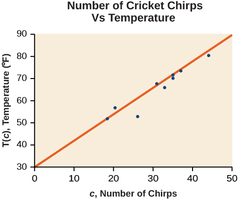
Example \(\PageIndex{3}\): Finding a Linear Regression Equation
Find the line of best fit using the cricket-chirp data in Table \(\PageIndex{1}\).
Solution
Enter the input (chirps) in List 1 (L1).
Enter the output (temperature) in List 2 (L2). See Table \(\PageIndex{2}\).
| L1 | 44 | 35 | 20.4 | 33 | 31 | 35 | 18.5 | 37 | 26 |
| L2 | 80.5 | 70.5 | 57 | 66 | 68 | 72 | 52 | 73.5 | 53 |
To use a calculator to find the equation of this line:
- In the STAT list editor, enter the \(X\) data in list L1 and the Y data in list L2, paired so that the corresponding (\(x,y\)) values are next to each other in the lists. (If a particular pair of values is repeated, enter it as many times as it appears in the data.)
- On the STAT TESTS menu, scroll down with the cursor to select the LinRegTTest. (Be careful to select LinRegTTest, as some calculators may also have a different item called LinRegTInt.)
- On the LinRegTTest input screen enter: Xlist: L1 ; Ylist: L2 ; Freq: 1
- On the next line, at the prompt \(\beta\) or \(\rho\), highlight "\(\neq 0\)" and press ENTER
- Leave the line for "RegEq:" blank
- Highlight Calculate and press ENTER.
The output screen contains a lot of information. For now we will focus on a few items from the output, and will return later to the other items.
The second line says \(y = a + bx\). Scroll down to find the values for a and b for the equation of the line of best fit.
Therefore we obtain the equation:
\[y=30.281+1.143x \nonumber \]
or
\[T=30.281+1.143c \nonumber \]
Analysis
To graph the best-fit line, press the "\(Y =\)" key and type the equation \(30.281 + 1.143X\) into equation Y1. (The \(X\) key is immediately left of the STAT key). Press ZOOM 9 again to graph it.
Notice that this line is quite similar to the equation we “eyeballed” but should fit the data better. Notice also that using this equation would change our prediction for the temperature when hearing 30 chirps in 15 seconds from 66 degrees to:
\[\begin{align*} T(30)&=30.281+1.143(30) \\ &=64.571 \\ &\approx 64.6 \text{ degrees} \end{align*} \]
The graph of the scatter plot with the line of best fit is shown in Figure \(\PageIndex{4}\).
![]() Will there ever be a case where two different lines will serve as the best fit for the data?
Will there ever be a case where two different lines will serve as the best fit for the data?
No. There is only one best fit line.
Predicting with a Regression Line
Once we determine that a set of data is linear, we can use the regression line to make predictions. As we learned above, a regression line is a line that is closest to the data in the scatter plot, which means that only one such line is a best fit for the data.
Example \(\PageIndex{4}\): Using a Regression Line to Make Predictions
Gasoline consumption in the United States has been steadily increasing. Consumption data from 1994 to 2004 is shown in Table \(\PageIndex{3}\). Graph the data and determine whether the trend is linear. If so, find a model for the data and use the model to predict the consumption in 2008.
| Year | '94 | '95 | '96 | '97 | '98 | '99 | '00 | '01 | '02 | '03 | '04 |
| Consumption (billions of gallons) | 113 | 116 | 118 | 119 | 123 | 125 | 126 | 128 | 131 | 133 | 136 |
The scatter plot of the data, including the least squares regression line, is shown in Figure \(\PageIndex{5}\).
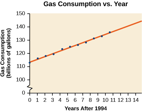
We can introduce new input variable, \(t\),representing years since 1994.
The linear regression equation is:
\[C(t)=113.318+2.209t \nonumber \]
Using this to predict consumption in 2008 \((t=14)\),
\[\begin{align*} C(14)&=113.318+2.209(14) \\ &=144.244 \end{align*} \]
The model predicts 144.244 billion gallons of gasoline consumption in 2008.
Exercise \(\PageIndex{2}\)
Use the model we created using technology in Example \(\PageIndex{4}\) to predict the gas consumption in 2011.
- Answer
-
150.871 billion gallons
Key Concepts
- Scatter plots show the relationship between two sets of data.
- Scatter plots may represent linear or non-linear models.
- The line of best fit may be estimated or calculated, using a calculator or statistical software.
- The correlation coefficient, \(r\), indicates the degree of linear relationship between data.
- A regression line best fits the data.
- The least squares regression line is found by minimizing the squares of the distances of points from a line passing through the data and may be used to make predictions regarding either of the variables.
Contributors and Attributions
Jay Abramson (Arizona State University) with contributing authors. Textbook content produced by OpenStax College is licensed under a Creative Commons Attribution License 4.0 license. Download for free at https://openstax.org/details/books/precalculus.