4.3: Visual Summaries of Data
- Page ID
- 91558

- Create and interpret frequency tables.
- Create and interpret bar plots and histograms.
Organizing Data
Once you have collected data, what will you do with it? Data can be described and presented in many different formats. For example, suppose you are interested in buying a house in a particular area. You may have no clue about the house prices, so you might ask your real estate agent to give you a sample data set of prices. Looking at all the prices in the sample often is overwhelming. A better way might be to look at the median price and the variation of prices. The median and variation are just two ways that you will learn to describe data. Your agent might also provide you with a graph of the data.
Next, you will study numerical and graphical ways to describe and display your data. This area of statistics is called "Descriptive Statistics." You will learn how to calculate, and even more importantly, how to interpret these measurements and graphs.
A statistical graph is a tool that helps you learn about the shape or distribution of a sample or a population. A graph can be a more effective way of presenting data than a mass of numbers because we can see where data clusters and where there are only a few data values. Graphs can be used to show trends and to enable readers to compare facts and figures quickly. Statisticians often graph data first to get a picture of the data. Then, more formal tools may be applied.
Some of the types of graphs that are used to summarize and organize data are the dot plot, the bar graph, the histogram, the stem-and-leaf plot, the frequency polygon (a type of broken line graph), the pie chart, and the box plot. In this chapter, we will briefly look at stem-and-leaf plots, line graphs, and bar graphs, as well as frequency polygons, and time series graphs. Our emphasis will be on histograms and box plots.
Frequency Tables
Twenty students were asked how many hours they worked per day. Their responses, in hours, are as follows:
5; 6; 3; 3; 2; 4; 7; 5; 2; 3; 5; 6; 5; 4; 4; 3; 5; 2; 5; 3.
Table lists the different data values in ascending order and their frequencies.
| DATA VALUE | FREQUENCY |
|---|---|
| 2 | 3 |
| 3 | 5 |
| 4 | 3 |
| 5 | 6 |
| 6 | 2 |
| 7 | 1 |
A frequency is the number of times a value of the data occurs. According to Table Table \(\PageIndex{A}\), there are three students who work two hours, five students who work three hours, and so on. The sum of the values in the frequency column, 20, represents the total number of students included in the sample.
A relative frequency is the ratio (fraction or proportion) of the number of times a value of the data occurs in the set of all outcomes to the total number of outcomes. To find the relative frequencies, divide each frequency by the total number of students in the sample–in this case, 20. Relative frequencies can be written as fractions, percents, or decimals.
| DATA VALUE | FREQUENCY | RELATIVE FREQUENCY |
|---|---|---|
| 2 | 3 | \(\frac{3}{20}\) or 0.15 or 15% |
| 3 | 5 | \(\frac{5}{20}\) or 0.25 or 25% |
| 4 | 3 | \(\frac{3}{20}\) or 0.15 or 15% |
| 5 | 6 | \(\frac{6}{20}\) or 0.30 or 30% |
| 6 | 2 | \(\frac{2}{20}\) or 0.10 or 10% |
| 7 | 1 | \(\frac{1}{20}\) or 0.05 or 5% |
The sum of the values in the relative frequency column of Table \(\PageIndex{B}\) is \(\frac{20}{20}\), or 1, or 100%.
Because of rounding, the relative frequency column may not always sum to one, and the last entry in the cumulative relative frequency column may not be one. However, they should be close to one.
Table \(\PageIndex{C}\) represents the heights, in inches, of a sample of 100 male semiprofessional soccer players.
| HEIGHTS (INCHES) | FREQUENCY | RELATIVE FREQUENCY |
|---|---|---|
| 60–62 | 5 | \(\frac{5}{100} = 0.05 = 5%\) |
| 62-64 | 3 | \(\frac{3}{100} = 0.03 = 3%\) |
| 64–66 | 15 | \(\frac{15}{100} = 0.15 = 15%\) |
| 66–68 | 40 | \(\frac{40}{100} = 0.40 = 40%\) |
| 68–70 | 17 | \(\frac{17}{100} = 0.17 = 17%\) |
| 70–72 | 12 | \(\frac{12}{100} = 0.12 = 12%\) |
| 72–74 | 7 | \(\frac{7}{100} = 0.07 = 7%\) |
| 74–76 | 1 | \(\frac{1}{100} = 0.01 = 1%\) |
| Total = 100 | Total = 1.00 |
In this sample, there are five players whose heights fall within the interval 60–62 inches, three players whose heights fall within the interval 62–64 inches, 15 players whose heights fall within the interval 64–66 inches, 40 players whose heights fall within the interval 66–68 inches, 17 players whose heights fall within the interval 68–70 inches, 12 players whose heights fall within the interval 70–72, seven players whose heights fall within the interval 72–74, and one player whose heights fall within the interval 74–76. All heights fall between the endpoints of an interval and not at the endpoints.
- From the Table \(\PageIndex{C}\), find the percentage of heights that are less than 66 inches.
- Find the percentage of heights that fall between 62 and 66 inches.
Answer
- If you look at the first, second, and third rows, the heights are all less than 66 inches. There are \(5 + 3 + 15 = 23\) players whose heights are less than 66 inches. The percentage of heights less than 66 inches is then \(\frac{23}{100}\) or 23%. This percentage is an example of the cumulative relative frequency.
- Add the relative frequencies in the second and third rows: \(0.03 + 0.15 = 0.18\) or 18%.
Table \(\PageIndex{D}\) shows the amount, in inches, of annual rainfall in a sample of towns.
- Find the percentage of rainfall that is less than 9.01 inches.
- Find the percentage of rainfall that is between 6.99 and 13.05 inches.
| Rainfall (Inches) | Frequency | Relative Frequency |
|---|---|---|
| 2.95–4.97 | 6 | \(\frac{6}{50} = 0.12\) |
| 4.97–6.99 | 7 | \(\frac{7}{50} = 0.14\) |
| 6.99–9.01 | 15 | \(\frac{15}{50} = 0.30\) |
| 9.01–11.03 | 8 | \(\frac{8}{50} = 0.16\) |
| 11.03–13.05 | 9 | \(\frac{9}{50} = 0.18\) |
| 13.05–15.07 | 5 | \(\frac{5}{50} = 0.10\) |
| Total = 50 | Total = 1.00 |
- Answer
-
- \(0.56\) or \(56%\)
- \(0.30 + 0.16 + 0.18 = 0.64\) or \(64%\)
Use the heights of the 100 male semiprofessional soccer players in Table \(\PageIndex{C}\). Fill in the blanks and check your answers.
- The percentage of heights that are from 68 to 72 inches is: ____.
- The percentage of heights that are from 68 to 74 inches is: ____.
- The percentage of heights that are more than 66 inches is: ____.
- The number of players in the sample who are between 62 and 72 inches tall is: ____.
- What kind of data are the heights?
- Describe how you could gather this data (the heights) so that the data are characteristic of all male semiprofessional soccer players.
Remember, you count frequencies. To find the relative frequency, divide the frequency by the total number of data values. To find the cumulative relative frequency, add all of the previous relative frequencies to the relative frequency for the current row.
Answer
- 29%
- 36%
- 77%
- 87
- quantitative continuous
- get rosters from each team and choose a simple random sample from each
From Table \(\PageIndex{D}\), find the number of towns that have rainfall between 2.95 and 9.01 inches.
- Answer
-
\(6 + 7 + 15 = 28\) towns
Nineteen people were asked how many miles, to the nearest mile, they commute to work each day. The data are as follows: 2; 5; 7; 3; 2; 10; 18; 15; 20; 7; 10; 18; 5; 12; 13; 12; 4; 5; 10. Table \(\PageIndex{E}\) was produced:
| DATA | FREQUENCY | RELATIVE FREQUENCY |
|---|---|---|
| 3 | 3 | \(\frac{3}{19}\) |
| 4 | 1 | \(\frac{1}{19}\) |
| 5 | 3 | \(\frac{3}{19}\) |
| 7 | 2 | \(\frac{2}{19}\) |
| 10 | 3 | \(\frac{3}{19}\) |
| 12 | 2 | \(\frac{2}{19}\) |
| 13 | 1 | \(\frac{1}{19}\) |
| 15 | 1 | \(\frac{1}{19}\) |
| 18 | 1 | \(\frac{1}{19}\) |
| 20 | 1 | \(\frac{1}{19}\) |
- Is the table correct? If it is not correct, what is wrong?
- True or False: Three percent of the people surveyed commute three miles. If the statement is not correct, what should it be? If the table is incorrect, make the corrections.
- What fraction of the people surveyed commute five or seven miles?
- What fraction of the people surveyed commute 12 miles or more? Less than 12 miles? Between five and 13 miles (not including five and 13 miles)?
Answer
- No. The frequency column sums to 18, not 19.
- False. The frequency for three miles should be one; for two miles (left out), two.
- \(\frac{5}{19}\)
- \(\frac{7}{19}\), \(\frac{12}{19}\), \(\frac{7}{19}\)
Table \(\PageIndex{D}\) represents the amount, in inches, of annual rainfall in a sample of towns. What fraction of towns surveyed get between 11.03 and 13.05 inches of rainfall each year?
- Answer
-
\(\frac{9}{50}\)
Table \(\PageIndex{F}\) contains the total number of deaths worldwide as a result of earthquakes for the period from 2000 to 2012.
| Year | Total Number of Deaths |
|---|---|
| 2000 | 231 |
| 2001 | 21,357 |
| 2002 | 11,685 |
| 2003 | 33,819 |
| 2004 | 228,802 |
| 2005 | 88,003 |
| 2006 | 6,605 |
| 2007 | 712 |
| 2008 | 88,011 |
| 2009 | 1,790 |
| 2010 | 320,120 |
| 2011 | 21,953 |
| 2012 | 768 |
| Total | 823,356 |
Answer the following questions.
- What is the frequency of deaths measured from 2006 through 2009?
- What percentage of deaths occurred after 2009?
- What is the relative frequency of deaths that occurred in 2003 or earlier?
- What is the percentage of deaths that occurred in 2004?
- What kind of data are the numbers of deaths?
- The Richter scale is used to quantify the energy produced by an earthquake. Examples of Richter scale numbers are 2.3, 4.0, 6.1, and 7.0. What kind of data are these numbers?
Answer
- 97,118 (11.8%)
- 41.6%
- 67,092/823,356 or 0.081 or 8.1 %
- 27.8%
- Quantitative discrete
- Quantitative continuous
Table \(\PageIndex{G}\) contains the total number of fatal motor vehicle traffic crashes in the United States for the period from 1994 to 2011.
| Year | Total Number of Crashes | Year | Total Number of Crashes |
|---|---|---|---|
| 1994 | 36,254 | 2004 | 38,444 |
| 1995 | 37,241 | 2005 | 39,252 |
| 1996 | 37,494 | 2006 | 38,648 |
| 1997 | 37,324 | 2007 | 37,435 |
| 1998 | 37,107 | 2008 | 34,172 |
| 1999 | 37,140 | 2009 | 30,862 |
| 2000 | 37,526 | 2010 | 30,296 |
| 2001 | 37,862 | 2011 | 29,757 |
| 2002 | 38,491 | Total | 653,782 |
| 2003 | 38,477 |
Answer the following questions.
- What is the frequency of deaths measured from 2000 through 2004?
- What percentage of deaths occurred after 2006?
- What is the relative frequency of deaths that occurred in 2000 or before?
- What is the percentage of deaths that occurred in 2011?
- What is the percentage of deaths that occurred between 1994 and 2006? Explain what this number tells you about the data.
Answer
- 190,800 (29.2%)
- 24.9%
- 260,086/653,782 or 39.8%
- 4.6%
- 75.1% of all fatal traffic crashes for the period from 1994 to 2011 happened from 1994 to 2006.
Visualizing Data
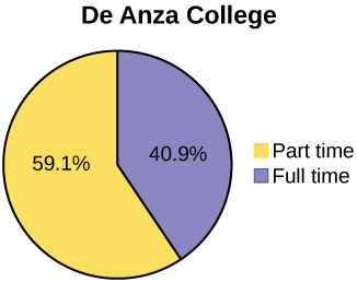
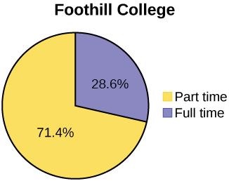
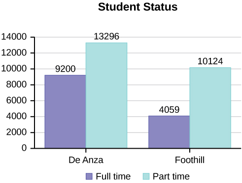
Below are tables comparing the number of part-time and full-time students at De Anza College and Foothill College enrolled for the spring 2010 quarter. The tables display counts (frequencies) and percentages or proportions (relative frequencies). The percent columns make comparing the same categories in the colleges easier. Displaying percentages along with the numbers is often helpful, but it is particularly important when comparing sets of data that do not have the same totals, such as the total enrollments for both colleges in this example. Notice how much larger the percentage for part-time students at Foothill College is compared to De Anza College.
| De Anza College | Foothill College | |||||
|---|---|---|---|---|---|---|
| Number | Percent | Number | Percent | |||
| Full-time | 9,200 | 40.9% | Full-time | 4,059 | 28.6% | |
| Part-time | 13,296 | 59.1% | Part-time | 10,124 | 71.4% | |
| Total | 22,496 | 100% | Total | 14,183 | 100% | |
Tables are a good way of organizing and displaying data. But graphs can be even more helpful in understanding the data. There are no strict rules concerning which graphs to use. Two graphs that are used to display qualitative data are pie charts and bar graphs.
- In a pie chart, categories of data are represented by wedges in a circle and are proportional in size to the percent of individuals in each category.
- In a bar graph, the length of the bar for each category is proportional to the number or percent of individuals in each category. Bars may be vertical or horizontal.
- A Pareto chart consists of bars that are sorted into order by category size (largest to smallest).
Look at Figures \(\PageIndex{I}\) and \(\PageIndex{J}\) and determine which graph (pie or bar) you think displays the comparisons better.
It is a good idea to look at a variety of graphs to see which is the most helpful in displaying the data. We might make different choices of what we think is the “best” graph depending on the data and the context. Our choice also depends on what we are using the data for.
Bar Graphs
Bar graphs consist of bars that are separated from each other. The bars can be rectangles, or they can be rectangular boxes (used in three-dimensional plots), and they can be vertical or horizontal. The bar graphs have the possible values represented on the x-axis and proportions on the y-axis.
By the end of 2011, Facebook had over 146 million users in the United States. Table shows three age groups, the number of users in each age group, and the proportion (%) of users in each age group. Construct a bar graph using this data.
| Age groups | Number of Facebook users | Proportion (%) of Facebook users |
|---|---|---|
| 13–25 | 65,082,280 | 45% |
| 26–44 | 53,300,200 | 36% |
| 45–64 | 27,885,100 | 19% |
Answer

The population in Park City is made up of children, working-age adults, and retirees. Table shows the three age groups, the number of people in the town from each age group, and the proportion (%) of people in each age group. Construct a bar graph showing the proportions.
| Age groups | Number of people | Proportion of population |
|---|---|---|
| Children | 67,059 | 19% |
| Working-age adults | 152,198 | 43% |
| Retirees | 131,662 | 38% |
Answer

The columns in the following table contain: the race or ethnicity of students in U.S. Public Schools for the class of 2011, percentages for the Advanced Placement examine population for that class, and percentages for the overall student population. Create a bar graph with the student race or ethnicity (qualitative data) on the x-axis, and the Advanced Placement examinee population percentages on the y-axis.
| Race/Ethnicity | AP Examinee Population | Overall Student Population |
|---|---|---|
| 1 = Asian, Asian American or Pacific Islander | 10.3% | 5.7% |
| 2 = Black or African American | 9.0% | 14.7% |
| 3 = Hispanic or Latino | 17.0% | 17.6% |
| 4 = American Indian or Alaska Native | 0.6% | 1.1% |
| 5 = White | 57.1% | 59.2% |
| 6 = Not reported/other | 6.0% | 1.7% |
Solution

Park city is broken down into six voting districts. The table shows the percent of the total registered voter population that lives in each district as well as the percent total of the entire population that lives in each district. Construct a bar graph that shows the registered voter population by district.
| District | Registered voter population | Overall city population |
|---|---|---|
| 1 | 15.5% | 19.4% |
| 2 | 12.2% | 15.6% |
| 3 | 9.8% | 9.0% |
| 4 | 17.4% | 18.5% |
| 5 | 22.8% | 20.7% |
| 6 | 22.3% | 16.8% |
Answer

Histograms
For quantitative data, we frequently use histograms to display the data. A histogram consists of contiguous (adjoining) boxes. It has both a horizontal axis and a vertical axis. The horizontal axis is labeled with what the data represents (for instance, distance from your home to school). The vertical axis is labeled either frequency or relative frequency (or percent frequency or probability). The graph will have the same shape with either label. The histogram (like the stemplot) can give you the shape of the data, the center, and the spread of the data.
To construct a histogram, first decide how many bars or intervals, also called classes, represent the data. Many histograms consist of five to 15 bars or classes for clarity. The number of bars needs to be chosen. Choose a starting point for the first interval to be less than the smallest data value. A convenient starting point is a lower value carried out to one more decimal place than the value with the most decimal places. For example, if the value with the most decimal places is 6.1 and this is the smallest value, a convenient starting point is \(6.05 (6.1 – 0.05 = 6.05)\). We say that 6.05 has more precision. If the value with the most decimal places is 2.23 and the lowest value is 1.5, a convenient starting point is \(1.495 (1.5 – 0.005 = 1.495)\). If the value with the most decimal places is 3.234 and the lowest value is 1.0, a convenient starting point is \(0.9995 (1.0 – 0.0005 = 0.9995)\). If all the data happen to be integers and the smallest value is two, then a convenient starting point is \(1.5 (2 - 0.5 = 1.5)\). Also, when the starting point and other boundaries are carried to one additional decimal place, no data value will fall on a boundary. The next two examples go into detail about how to construct a histogram using continuous data and how to create a histogram using discrete data.
The following data are the heights (in inches to the nearest half-inch) of 100 male semiprofessional soccer players. The heights are continuous data, since height is measured.
60; 60.5; 61; 61; 61.5
63.5; 63.5; 63.5
64; 64; 64; 64; 64; 64; 64; 64.5; 64.5; 64.5; 64.5; 64.5; 64.5; 64.5; 64.5
66; 66; 66; 66; 66; 66; 66; 66; 66; 66; 66.5; 66.5; 66.5; 66.5; 66.5; 66.5; 66.5; 66.5; 66.5; 66.5; 66.5; 67; 67; 67; 67; 67; 67; 67; 67; 67; 67; 67; 67; 67.5; 67.5; 67.5; 67.5; 67.5; 67.5; 67.5
68; 68; 69; 69; 69; 69; 69; 69; 69; 69; 69; 69; 69.5; 69.5; 69.5; 69.5; 69.5
70; 70; 70; 70; 70; 70; 70.5; 70.5; 70.5; 71; 71; 71
72; 72; 72; 72.5; 72.5; 73; 73.5
74
The smallest data value is 60. Since the data with the most decimal places has one decimal (for instance, 61.5), we want our starting point to have two decimal places. Since the numbers 0.5, 0.05, 0.005, etc. are convenient numbers, use 0.05 and subtract it from 60, the smallest value, for the convenient starting point.
60 – 0.05 = 59.95 which is more precise than, say, 61.5 by one decimal place. The starting point is, then, 59.95.
The largest value is 74, so 74 + 0.05 = 74.05 is the ending value.
Next, calculate the width of each bar or class interval. To calculate this width, subtract the starting point from the ending value and divide by the number of bars (you must choose the number of bars you desire). Suppose you choose eight bars.
\[\dfrac{74.05−59.95}{8}=1.76\]We will round up to two and make each bar or class interval two units wide. Rounding up to two is one way to prevent a value from falling on a boundary. Rounding to the next number is often necessary even if it goes against the standard rules of rounding. For this example, using 1.76 as the width would also work. A guideline that is followed by some for the width of a bar or class interval is to take the square root of the number of data values and then round to the nearest whole number, if necessary. For example, if there are 150 values of data, take the square root of 150 and round to 12 bars or intervals.
The boundaries are:
- 59.95
- 59.95 + 2 = 61.95
- 61.95 + 2 = 63.95
- 63.95 + 2 = 65.95
- 65.95 + 2 = 67.95
- 67.95 + 2 = 69.95
- 69.95 + 2 = 71.95
- 71.95 + 2 = 73.95
- 73.95 + 2 = 75.95
The heights 60 through 61.5 inches are in the interval 59.95–61.95. The heights that are 63.5 are in the interval 61.95–63.95. The heights that are 64 through 64.5 are in the interval 63.95–65.95. The heights 66 through 67.5 are in the interval 65.95–67.95. The heights 68 through 69.5 are in the interval 67.95–69.95. The heights 70 through 71 are in the interval 69.95–71.95. The heights 72 through 73.5 are in the interval 71.95–73.95. The height 74 is in the interval 73.95–75.95.
The following histogram displays the heights on the x-axis and relative frequency on the y-axis.

The following data are the shoe sizes of 50 male students. The sizes are discrete data since shoe size is measured in whole and half units only. Construct a histogram and calculate the width of each bar or class interval. Suppose you choose six bars.
9; 9; 9.5; 9.5; 10; 10; 10; 10; 10; 10; 10.5; 10.5; 10.5; 10.5; 10.5; 10.5; 10.5; 10.5
11; 11; 11; 11; 11; 11; 11; 11; 11; 11; 11; 11; 11; 11.5; 11.5; 11.5; 11.5; 11.5; 11.5; 11.5
12; 12; 12; 12; 12; 12; 12; 12.5; 12.5; 12.5; 12.5; 14
Answer
Smallest value: 9
Largest value: 14
Convenient starting value: 9 – 0.05 = 8.95
Convenient ending value: 14 + 0.05 = 14.05
\(\frac{14.05-8.95}{6}\) = 0.85
The calculations suggest using 0.85 as the width of each bar or class interval. You can also use an interval with a width equal to one.
The following data are the number of books bought by 50 part-time college students at ABC College. The number of books is discrete data, since books are counted.
1; 1; 1; 1; 1; 1; 1; 1; 1; 1; 1
2; 2; 2; 2; 2; 2; 2; 2; 2; 2
3; 3; 3; 3; 3; 3; 3; 3; 3; 3; 3; 3; 3; 3; 3; 3
4; 4; 4; 4; 4; 4
5; 5; 5; 5; 5
6; 6
Eleven students buy one book. Ten students buy two books. Sixteen students buy three books. Six students buy four books. Five students buy five books. Two students buy six books.
Because the data are integers, subtract 0.5 from 1, the smallest data value and add 0.5 to 6, the largest data value. Then the starting point is 0.5 and the ending value is 6.5.
Next, calculate the width of each bar or class interval. If the data are discrete and there are not too many different values, a width that places the data values in the middle of the bar or class interval is the most convenient. Since the data consist of the numbers 1, 2, 3, 4, 5, 6, and the starting point is 0.5, a width of one places the 1 in the middle of the interval from 0.5 to 1.5, the 2 in the middle of the interval from 1.5 to 2.5, the 3 in the middle of the interval from 2.5 to 3.5, the 4 in the middle of the interval from _______ to _______, the 5 in the middle of the interval from _______ to _______, and the _______ in the middle of the interval from _______ to _______ .
Answer
Calculate the number of bars as follows:
\(\frac{6.5 - 0.5}{\text{number of bars}}\) = 1
where 1 is the width of a bar. Therefore, bars = 6.
The following histogram displays the number of books on the x-axis and the frequency on the y-axis.

The following data are the number of sports played by 50 student athletes. The number of sports is discrete data since sports are counted.
1; 1; 1; 1; 1; 1; 1; 1; 1; 1; 1; 1; 1; 1; 1; 1; 1; 1; 1; 1
2; 2; 2; 2; 2; 2; 2; 2; 2; 2; 2; 2; 2; 2; 2; 2; 2; 2; 2; 2; 2; 2
3; 3; 3; 3; 3; 3; 3; 3
20 student athletes play one sport. 22 student athletes play two sports. Eight student athletes play three sports.
Fill in the blanks for the following sentence. Since the data consist of the numbers 1, 2, 3, and the starting point is 0.5, a width of one places the 1 in the middle of the interval 0.5 to _____, the 2 in the middle of the interval from _____ to _____, and the 3 in the middle of the interval from _____ to _____.
Answer
1.5
1.5 to 2.5
2.5 to 3.5
Using this data set, construct a histogram.
| 9.95 | 10 | 2.25 | 16.75 | 0 |
| 19.5 | 22.5 | 7.5 | 15 | 12.75 |
| 5.5 | 11 | 10 | 20.75 | 17.5 |
| 23 | 21.9 | 24 | 23.75 | 18 |
| 20 | 15 | 22.9 | 18.8 | 20.5 |
Answer

Some values in this data set fall on boundaries for the class intervals. A value is counted in a class interval if it falls on the left boundary, but not if it falls on the right boundary. Different researchers may set up histograms for the same data in different ways. There is more than one correct way to set up a histogram.
The following data represent the number of employees at various restaurants in New York City. Using this data, create a histogram.
22; 35; 15; 26; 40; 28; 18; 20; 25; 34; 39; 42; 24; 22; 19; 27; 22; 34; 40; 20; 38 and 28
Use 10–19 as the first interval.
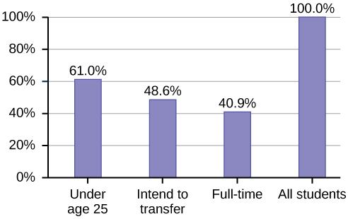
Percentages That Add to More (or Less) Than 100%
Sometimes percentages add up to be more than 100% (or less than 100%). In the graph, the percentages add to more than 100% because students can be in more than one category. A bar graph is appropriate to compare the relative size of the categories. A pie chart cannot be used. It also could not be used if the percentages added to less than 100%.
| Characteristic/Category | Percent |
|---|---|
| Full-Time Students | 40.9% |
| Students who intend to transfer to a 4-year educational institution | 48.6% |
| Students under age 25 | 61.0% |
| TOTAL | 150.5% |
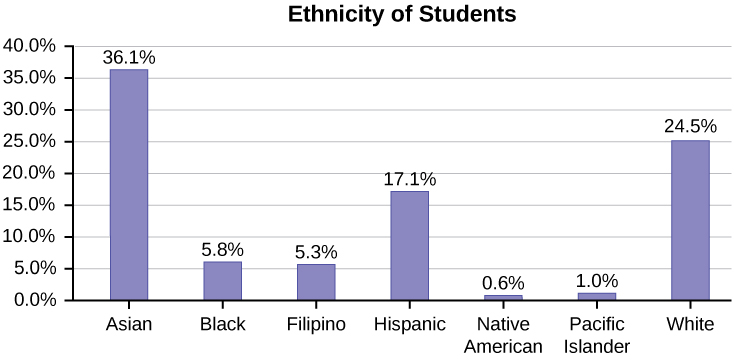
Omitting Categories/Missing Data
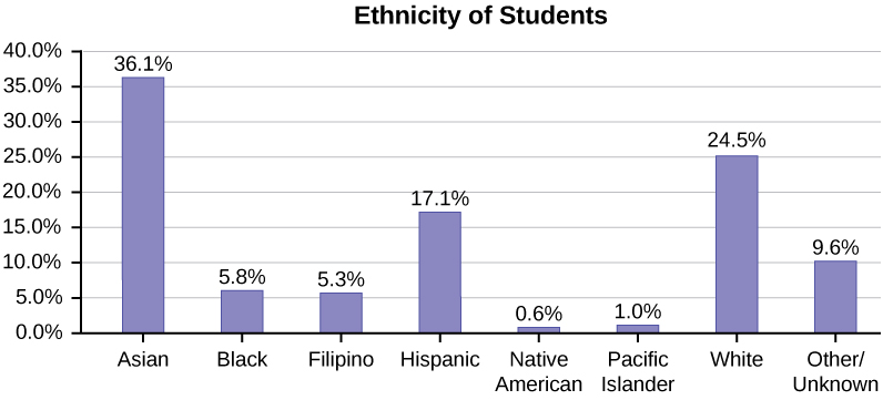
The table displays Ethnicity of Students but is missing the "Other/Unknown" category. This category contains people who did not feel they fit into any of the ethnicity categories or declined to respond. Notice that the frequencies do not add up to the total number of students. In this situation, create a bar graph and not a pie chart.
| Frequency | Percent | |
|---|---|---|
| Asian | 8,794 | 36.1% |
| Black | 1,412 | 5.8% |
| Filipino | 1,298 | 5.3% |
| Hispanic | 4,180 | 17.1% |
| Native American | 146 | 0.6% |
| Pacific Islander | 236 | 1.0% |
| White | 5,978 | 24.5% |
| TOTAL | 22,044 out of 24,382 | 90.4% out of 100% |
The following graph is the same as the previous graph, but the “Other/Unknown” percent (9.6%) has been included. The “Other/Unknown” category is large compared to some of the other categories (Native American, 0.6%, Pacific Islander 1.0%). This is important to know when we think about what the data are telling us.
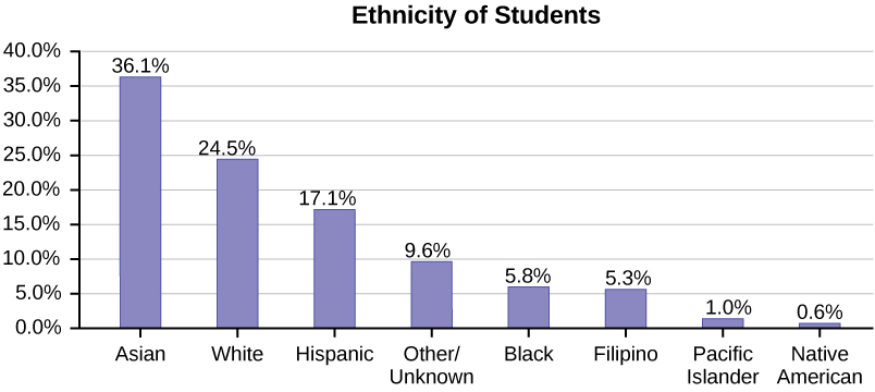
This particular bar graph in Figure \(\PageIndex{4}\) can be difficult to understand visually. The graph in Figure \(\PageIndex{5}\) is a Pareto chart. The Pareto chart has the bars sorted from largest to smallest and is easier to read and interpret.