
2.1: Visual Summaries of Qualitative Data
- Page ID
- 105813
\( \newcommand{\vecs}[1]{\overset { \scriptstyle \rightharpoonup} {\mathbf{#1}} } \)
\( \newcommand{\vecd}[1]{\overset{-\!-\!\rightharpoonup}{\vphantom{a}\smash {#1}}} \)
\( \newcommand{\id}{\mathrm{id}}\) \( \newcommand{\Span}{\mathrm{span}}\)
( \newcommand{\kernel}{\mathrm{null}\,}\) \( \newcommand{\range}{\mathrm{range}\,}\)
\( \newcommand{\RealPart}{\mathrm{Re}}\) \( \newcommand{\ImaginaryPart}{\mathrm{Im}}\)
\( \newcommand{\Argument}{\mathrm{Arg}}\) \( \newcommand{\norm}[1]{\| #1 \|}\)
\( \newcommand{\inner}[2]{\langle #1, #2 \rangle}\)
\( \newcommand{\Span}{\mathrm{span}}\)
\( \newcommand{\id}{\mathrm{id}}\)
\( \newcommand{\Span}{\mathrm{span}}\)
\( \newcommand{\kernel}{\mathrm{null}\,}\)
\( \newcommand{\range}{\mathrm{range}\,}\)
\( \newcommand{\RealPart}{\mathrm{Re}}\)
\( \newcommand{\ImaginaryPart}{\mathrm{Im}}\)
\( \newcommand{\Argument}{\mathrm{Arg}}\)
\( \newcommand{\norm}[1]{\| #1 \|}\)
\( \newcommand{\inner}[2]{\langle #1, #2 \rangle}\)
\( \newcommand{\Span}{\mathrm{span}}\) \( \newcommand{\AA}{\unicode[.8,0]{x212B}}\)
\( \newcommand{\vectorA}[1]{\vec{#1}} % arrow\)
\( \newcommand{\vectorAt}[1]{\vec{\text{#1}}} % arrow\)
\( \newcommand{\vectorB}[1]{\overset { \scriptstyle \rightharpoonup} {\mathbf{#1}} } \)
\( \newcommand{\vectorC}[1]{\textbf{#1}} \)
\( \newcommand{\vectorD}[1]{\overrightarrow{#1}} \)
\( \newcommand{\vectorDt}[1]{\overrightarrow{\text{#1}}} \)
\( \newcommand{\vectE}[1]{\overset{-\!-\!\rightharpoonup}{\vphantom{a}\smash{\mathbf {#1}}}} \)
\( \newcommand{\vecs}[1]{\overset { \scriptstyle \rightharpoonup} {\mathbf{#1}} } \)
\( \newcommand{\vecd}[1]{\overset{-\!-\!\rightharpoonup}{\vphantom{a}\smash {#1}}} \)
\(\newcommand{\avec}{\mathbf a}\) \(\newcommand{\bvec}{\mathbf b}\) \(\newcommand{\cvec}{\mathbf c}\) \(\newcommand{\dvec}{\mathbf d}\) \(\newcommand{\dtil}{\widetilde{\mathbf d}}\) \(\newcommand{\evec}{\mathbf e}\) \(\newcommand{\fvec}{\mathbf f}\) \(\newcommand{\nvec}{\mathbf n}\) \(\newcommand{\pvec}{\mathbf p}\) \(\newcommand{\qvec}{\mathbf q}\) \(\newcommand{\svec}{\mathbf s}\) \(\newcommand{\tvec}{\mathbf t}\) \(\newcommand{\uvec}{\mathbf u}\) \(\newcommand{\vvec}{\mathbf v}\) \(\newcommand{\wvec}{\mathbf w}\) \(\newcommand{\xvec}{\mathbf x}\) \(\newcommand{\yvec}{\mathbf y}\) \(\newcommand{\zvec}{\mathbf z}\) \(\newcommand{\rvec}{\mathbf r}\) \(\newcommand{\mvec}{\mathbf m}\) \(\newcommand{\zerovec}{\mathbf 0}\) \(\newcommand{\onevec}{\mathbf 1}\) \(\newcommand{\real}{\mathbb R}\) \(\newcommand{\twovec}[2]{\left[\begin{array}{r}#1 \\ #2 \end{array}\right]}\) \(\newcommand{\ctwovec}[2]{\left[\begin{array}{c}#1 \\ #2 \end{array}\right]}\) \(\newcommand{\threevec}[3]{\left[\begin{array}{r}#1 \\ #2 \\ #3 \end{array}\right]}\) \(\newcommand{\cthreevec}[3]{\left[\begin{array}{c}#1 \\ #2 \\ #3 \end{array}\right]}\) \(\newcommand{\fourvec}[4]{\left[\begin{array}{r}#1 \\ #2 \\ #3 \\ #4 \end{array}\right]}\) \(\newcommand{\cfourvec}[4]{\left[\begin{array}{c}#1 \\ #2 \\ #3 \\ #4 \end{array}\right]}\) \(\newcommand{\fivevec}[5]{\left[\begin{array}{r}#1 \\ #2 \\ #3 \\ #4 \\ #5 \\ \end{array}\right]}\) \(\newcommand{\cfivevec}[5]{\left[\begin{array}{c}#1 \\ #2 \\ #3 \\ #4 \\ #5 \\ \end{array}\right]}\) \(\newcommand{\mattwo}[4]{\left[\begin{array}{rr}#1 \amp #2 \\ #3 \amp #4 \\ \end{array}\right]}\) \(\newcommand{\laspan}[1]{\text{Span}\{#1\}}\) \(\newcommand{\bcal}{\cal B}\) \(\newcommand{\ccal}{\cal C}\) \(\newcommand{\scal}{\cal S}\) \(\newcommand{\wcal}{\cal W}\) \(\newcommand{\ecal}{\cal E}\) \(\newcommand{\coords}[2]{\left\{#1\right\}_{#2}}\) \(\newcommand{\gray}[1]{\color{gray}{#1}}\) \(\newcommand{\lgray}[1]{\color{lightgray}{#1}}\) \(\newcommand{\rank}{\operatorname{rank}}\) \(\newcommand{\row}{\text{Row}}\) \(\newcommand{\col}{\text{Col}}\) \(\renewcommand{\row}{\text{Row}}\) \(\newcommand{\nul}{\text{Nul}}\) \(\newcommand{\var}{\text{Var}}\) \(\newcommand{\corr}{\text{corr}}\) \(\newcommand{\len}[1]{\left|#1\right|}\) \(\newcommand{\bbar}{\overline{\bvec}}\) \(\newcommand{\bhat}{\widehat{\bvec}}\) \(\newcommand{\bperp}{\bvec^\perp}\) \(\newcommand{\xhat}{\widehat{\xvec}}\) \(\newcommand{\vhat}{\widehat{\vvec}}\) \(\newcommand{\uhat}{\widehat{\uvec}}\) \(\newcommand{\what}{\widehat{\wvec}}\) \(\newcommand{\Sighat}{\widehat{\Sigma}}\) \(\newcommand{\lt}{<}\) \(\newcommand{\gt}{>}\) \(\newcommand{\amp}{&}\) \(\definecolor{fillinmathshade}{gray}{0.9}\)Section 1: Categorical Data
Next, we will discuss how to visually summarize data. We will start with learning how to organize categorical data because it is the simplest type of data thus everything that we can do with categorical data can be applied to all other types of data.
Consider the following data set obtained from asking 40 students their political party affiliation:
|
D |
D |
R |
R |
R |
R |
R |
R |
|
D |
R |
D |
D |
O |
D |
R |
D |
|
D |
R |
D |
D |
R |
R |
D |
R |
|
D |
R |
D |
D |
D |
R |
O |
D |
|
O |
D |
D |
D |
R |
R |
R |
D |
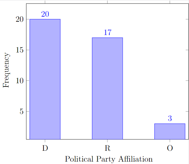
One way of organizing categorical data is to construct a table that contains the list of all possible values. For each value we can find its frequency - the number of times that the value occurs in the data set. To obtain the frequencies we are going to go through the data and use tally:
|
Political party affiliation |
Tally |
Frequency |
|---|---|---|
|
D |
||||| ||||| ||||| ||||| |
20 |
|
O |
||| |
3 |
|
R |
||||| ||||| ||||| || |
17 |
|
Total: |
20+3+17=40 |
A table that lists the distinct values along with their frequencies is called the frequency distribution table. One way to validate the table is to find the total, that is, add the entries in the frequency column and check whether the sum is equal to the sample size. Using tally can save a lot of time when constructing a frequency table because when using the tally method one would only have to browse through the data set once.
In summary, to construct a frequency distribution table for categorical data:
- List the distinct values of the observations in the data set in the first column of a table.
- For each observation, place a tally mark in the second column of the table in the row of the appropriate distinct value.
- Count the tallies for each distinct value and record the totals in the third column of the table.
Let’s compare the results from the same survey of a different class:
|
Political party affiliation |
Frequency |
|---|---|
|
D |
40 |
|
O |
|
|
R |
|
|
Total: |
We see that the number of people that support democrats in the other class is 40. Can we conclude the democrat supporters prevail in the other class twice as much? Well, not if you see the entire frequency table!
|
Political party affiliation |
Frequency |
|---|---|
|
D |
40 |
|
O |
5 |
|
R |
55 |
|
Total: |
100 |
Turns out that a frequency table does not show the whole picture! We can compare apples to apples if we compare the corresponding relative frequencies. To compute a relative frequency, we divide the frequency of an observation by the total.
|
Class 1 |
Class 2 |
||||||||||||||||||||||||||||||
|
|
Relative frequencies can be expressed as fractions, decimals, or percentages. The total of a relative frequency column must add up to 1 or 100%. A listing of the distinct values and their relative frequencies is called relative-frequency distribution table. Now, we can compare apples with apples and see that the democrats are actually a minority in the second class!
In summary, to construct a relative-frequency distribution table for categorical data:
- Obtain a frequency distribution of the data.
- Divide each frequency by the total number of observations to obtain a relative frequency.
One way to visualize a frequency table is to draw a two-dimensional coordinate plane with the categories on the horizontal axis and frequencies on the vertical axis. For each category, we draw a bar above the corresponding label with the height equal the frequency.
Such a display of frequencies is called a frequency bar chart. The frequency of each distinct value is represented by a vertical bar whose height is equal to the frequency of that value. The bars should be positioned so that they do not touch each other.

In the same way we may visualize the relative frequency table.

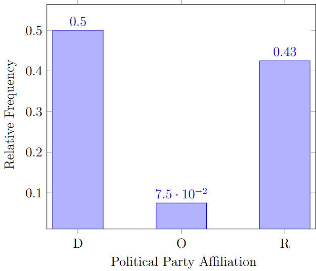
Such a summary is called the relative frequency bar chart. Note that the only difference between the frequency and the relative frequency bar charts is the scale and the units on the vertical axis, everything else is identical.
In summary, to construct a frequency or a relative frequency bar chart:
- Obtain a frequency or relative-frequency distribution of the data.
- Draw a horizontal axis on which to place the bars and a vertical axis on which to display the relative frequencies.
- For each distinct value, construct a vertical bar whose height equals the relative frequency of that value.
- Label the bars with distinct values, the horizontal axis with the name of the variable, and the vertical axis with “Relative frequency.”
Frequency tables and bar charts are considered the most basic ways of organizing the data! However, scientists kept inventing the new ways of organizing data throughout times. Another way to visualize the categorical data is via pie-chart. A pie chart is a disk divided into wedge-shaped pieces proportional to the relative frequencies of the qualitative data. In other words, the area that corresponds to D is 50% of the total area, the area that corresponds to O is 7.5% of the total area, and the area that corresponds to R is 42.5% of the total area.
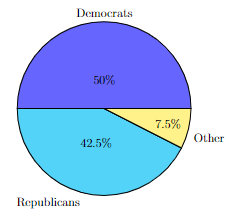
To construct this by hand one would have to use a protractor and a calculator to compute the exact values of the central angles for each sector! Luckily, every statistical software can create a pie chart with just a press of a button! For us, it is more important to be able to read the chart than to construct it because nowadays creating such chart and especially printing it out is considered a waste of ink!
In summary, to construct a pie chart:
- Obtain a relative-frequency distribution of the data.
- Divide a disk into wedge-shaped pieces proportional to the relative frequencies.
- Label the slices with distinct values and their relative frequencies.
Note that due to the absence of the natural order, the categories in categorical data can be re-arranged for different purposes. For example, in a Pareto chart, the bars are arranged in decreasing order by the category size (from the largest to the smallest):
We discussed the ways to visualize the categorical data, the two most basic ones are frequency tables and bar charts.
Section 2: Ordinal Data
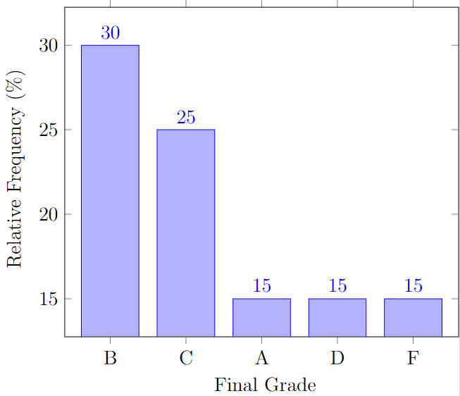
Next, we will discuss how to visually summarize ordinal data. What will change when we consider the ordinal type of data? Consider the following data set obtained by recording the final grades of twenty students:
B, A, C, C, D, C, A, B, D, F, B, A, B, C, C, D, B, F, B, F
Can we treat this data set the same way we treated the categorical data? The answer is yes. We can list all possible values, do the tally, find the frequencies, and the total and then compute the relative frequencies.
|
Final grade |
Tally |
Frequency |
Relative Frequency |
|---|---|---|---|
|
A |
||| |
3 |
3/20=0.15=15% |
|
B |
||||| | |
6 |
6/20=0.3=30% |
|
C |
||||| |
5 |
5/20=0.25=25% |
|
D |
||| |
3 |
3/20=0.15=15% |
|
F |
||| |
3 |
3/20=0.15=15% |
|
Total: |
20 |
20/20=1=100% |
So we can construct a relative frequency distribution table for ordinal data the same way we do it for categorical data! Can we construct the bar chart for the ordinal data the same way we did it earlier for categorical data? The answer is yes!

The same applies for the relative frequency bar chart!

The only difference between the ways we treat ordinal and categorical data is that the ordinal data has the natural order which we would like to preserve and maintain across all visual summaries. So, while the following pie chart and Pareto chart below still make sense, we wouldn't normally use them unless we really have to.

We discussed the most basic visual summaries of the most basic type of data.