
4.4: Measures of Spread and Position
- Page ID
- 92989

\( \newcommand{\vecs}[1]{\overset { \scriptstyle \rightharpoonup} {\mathbf{#1}} } \)
\( \newcommand{\vecd}[1]{\overset{-\!-\!\rightharpoonup}{\vphantom{a}\smash {#1}}} \)
\( \newcommand{\dsum}{\displaystyle\sum\limits} \)
\( \newcommand{\dint}{\displaystyle\int\limits} \)
\( \newcommand{\dlim}{\displaystyle\lim\limits} \)
\( \newcommand{\id}{\mathrm{id}}\) \( \newcommand{\Span}{\mathrm{span}}\)
( \newcommand{\kernel}{\mathrm{null}\,}\) \( \newcommand{\range}{\mathrm{range}\,}\)
\( \newcommand{\RealPart}{\mathrm{Re}}\) \( \newcommand{\ImaginaryPart}{\mathrm{Im}}\)
\( \newcommand{\Argument}{\mathrm{Arg}}\) \( \newcommand{\norm}[1]{\| #1 \|}\)
\( \newcommand{\inner}[2]{\langle #1, #2 \rangle}\)
\( \newcommand{\Span}{\mathrm{span}}\)
\( \newcommand{\id}{\mathrm{id}}\)
\( \newcommand{\Span}{\mathrm{span}}\)
\( \newcommand{\kernel}{\mathrm{null}\,}\)
\( \newcommand{\range}{\mathrm{range}\,}\)
\( \newcommand{\RealPart}{\mathrm{Re}}\)
\( \newcommand{\ImaginaryPart}{\mathrm{Im}}\)
\( \newcommand{\Argument}{\mathrm{Arg}}\)
\( \newcommand{\norm}[1]{\| #1 \|}\)
\( \newcommand{\inner}[2]{\langle #1, #2 \rangle}\)
\( \newcommand{\Span}{\mathrm{span}}\) \( \newcommand{\AA}{\unicode[.8,0]{x212B}}\)
\( \newcommand{\vectorA}[1]{\vec{#1}} % arrow\)
\( \newcommand{\vectorAt}[1]{\vec{\text{#1}}} % arrow\)
\( \newcommand{\vectorB}[1]{\overset { \scriptstyle \rightharpoonup} {\mathbf{#1}} } \)
\( \newcommand{\vectorC}[1]{\textbf{#1}} \)
\( \newcommand{\vectorD}[1]{\overrightarrow{#1}} \)
\( \newcommand{\vectorDt}[1]{\overrightarrow{\text{#1}}} \)
\( \newcommand{\vectE}[1]{\overset{-\!-\!\rightharpoonup}{\vphantom{a}\smash{\mathbf {#1}}}} \)
\( \newcommand{\vecs}[1]{\overset { \scriptstyle \rightharpoonup} {\mathbf{#1}} } \)
\(\newcommand{\longvect}{\overrightarrow}\)
\( \newcommand{\vecd}[1]{\overset{-\!-\!\rightharpoonup}{\vphantom{a}\smash {#1}}} \)
\(\newcommand{\avec}{\mathbf a}\) \(\newcommand{\bvec}{\mathbf b}\) \(\newcommand{\cvec}{\mathbf c}\) \(\newcommand{\dvec}{\mathbf d}\) \(\newcommand{\dtil}{\widetilde{\mathbf d}}\) \(\newcommand{\evec}{\mathbf e}\) \(\newcommand{\fvec}{\mathbf f}\) \(\newcommand{\nvec}{\mathbf n}\) \(\newcommand{\pvec}{\mathbf p}\) \(\newcommand{\qvec}{\mathbf q}\) \(\newcommand{\svec}{\mathbf s}\) \(\newcommand{\tvec}{\mathbf t}\) \(\newcommand{\uvec}{\mathbf u}\) \(\newcommand{\vvec}{\mathbf v}\) \(\newcommand{\wvec}{\mathbf w}\) \(\newcommand{\xvec}{\mathbf x}\) \(\newcommand{\yvec}{\mathbf y}\) \(\newcommand{\zvec}{\mathbf z}\) \(\newcommand{\rvec}{\mathbf r}\) \(\newcommand{\mvec}{\mathbf m}\) \(\newcommand{\zerovec}{\mathbf 0}\) \(\newcommand{\onevec}{\mathbf 1}\) \(\newcommand{\real}{\mathbb R}\) \(\newcommand{\twovec}[2]{\left[\begin{array}{r}#1 \\ #2 \end{array}\right]}\) \(\newcommand{\ctwovec}[2]{\left[\begin{array}{c}#1 \\ #2 \end{array}\right]}\) \(\newcommand{\threevec}[3]{\left[\begin{array}{r}#1 \\ #2 \\ #3 \end{array}\right]}\) \(\newcommand{\cthreevec}[3]{\left[\begin{array}{c}#1 \\ #2 \\ #3 \end{array}\right]}\) \(\newcommand{\fourvec}[4]{\left[\begin{array}{r}#1 \\ #2 \\ #3 \\ #4 \end{array}\right]}\) \(\newcommand{\cfourvec}[4]{\left[\begin{array}{c}#1 \\ #2 \\ #3 \\ #4 \end{array}\right]}\) \(\newcommand{\fivevec}[5]{\left[\begin{array}{r}#1 \\ #2 \\ #3 \\ #4 \\ #5 \\ \end{array}\right]}\) \(\newcommand{\cfivevec}[5]{\left[\begin{array}{c}#1 \\ #2 \\ #3 \\ #4 \\ #5 \\ \end{array}\right]}\) \(\newcommand{\mattwo}[4]{\left[\begin{array}{rr}#1 \amp #2 \\ #3 \amp #4 \\ \end{array}\right]}\) \(\newcommand{\laspan}[1]{\text{Span}\{#1\}}\) \(\newcommand{\bcal}{\cal B}\) \(\newcommand{\ccal}{\cal C}\) \(\newcommand{\scal}{\cal S}\) \(\newcommand{\wcal}{\cal W}\) \(\newcommand{\ecal}{\cal E}\) \(\newcommand{\coords}[2]{\left\{#1\right\}_{#2}}\) \(\newcommand{\gray}[1]{\color{gray}{#1}}\) \(\newcommand{\lgray}[1]{\color{lightgray}{#1}}\) \(\newcommand{\rank}{\operatorname{rank}}\) \(\newcommand{\row}{\text{Row}}\) \(\newcommand{\col}{\text{Col}}\) \(\renewcommand{\row}{\text{Row}}\) \(\newcommand{\nul}{\text{Nul}}\) \(\newcommand{\var}{\text{Var}}\) \(\newcommand{\corr}{\text{corr}}\) \(\newcommand{\len}[1]{\left|#1\right|}\) \(\newcommand{\bbar}{\overline{\bvec}}\) \(\newcommand{\bhat}{\widehat{\bvec}}\) \(\newcommand{\bperp}{\bvec^\perp}\) \(\newcommand{\xhat}{\widehat{\xvec}}\) \(\newcommand{\vhat}{\widehat{\vvec}}\) \(\newcommand{\uhat}{\widehat{\uvec}}\) \(\newcommand{\what}{\widehat{\wvec}}\) \(\newcommand{\Sighat}{\widehat{\Sigma}}\) \(\newcommand{\lt}{<}\) \(\newcommand{\gt}{>}\) \(\newcommand{\amp}{&}\) \(\definecolor{fillinmathshade}{gray}{0.9}\)Consider these three sets of student quiz scores on a 10-point quiz:
- Class A: 5, 5, 5, 5, 5, 5, 5, 5, 5, 5
- Class B: 0, 0, 0, 0, 0, 10, 10, 10, 10, 10
- Class C: 4, 4, 4, 5, 5, 5, 5, 6, 6, 6
All these data sets have mean \(\overline{x} = 5\) and median of 5, yet the three sets of scores are clearly quite different.
In Class A, everyone had the same score. In Class B, half the class got no points and the other half got a perfect score of 10 points. Scores in Class C were not as consistent as those in Class A but also not as widely varied as those in Class B.
This scenario shows that, in addition to the mean and median which measure the "typical" value of a data set, we also need a way to measure how "spread out" or varied each data set is. There are several ways to measure the variation and locate positions in a data distribution. In this section we explore range, standard deviation, percentiles, quartiles, and the interquartile range (IQR). We also examine a graphical representation of spread using a box plot.
Range
The first and simplest way to measure spread is the range. Calculation of the range uses only two values from the data set - the largest value and the smallest value. The range is the distance between these two values.
The range is the difference between the maximum value and the minimum value of the data set.
Refer to the three sets of student quiz scores from the introduction to this section.
- For Class A, the range is 0 since both the maximum and minimum are the same: \(5 – 5 = 0\).
- For Class B, the range is 10 since \(10 – 0 = 10\).
- For Class C, the range is 2 since \(6 – 4 = 2\).
In this example, the range seems to be revealing how spread out the data is. However, suppose we add a fourth set of quiz scores:
Class D: 0, 5, 5, 5, 5, 5, 5, 5, 5, 10.
Quiz scores from this class also have a mean and median of 5. The range is 10 like Class B, yet this data set is quite different than Class B. To more accurately measure the difference in spreads between these two sets of data, we’ll have to turn to more sophisticated measures of variation.
Find the range for each data set.
Set A: 10, 20, 30, 40, 50 Set B: 10, 35, 36, 37, 50
Solution
For both sets of data, the range is \(50 - 10 = 40\). However, most of the data in Set B is closer together, except for the extremes. There seems to be less variability in the data in Set B than in the data in Set A. The range focuses only only the two extreme values yet ignores all the data between the extremes. So, we need a better way to quantify the spread.
Standard Deviation
We saw that the range focuses on the difference between the maximum and minimum values. What if we focused on the differences between each of the data values and and the center? The center we will use is the mean. The difference between a data value \(x\) and the mean of the distribution \(\overline{x}\) is called a deviation.
The difference between a data value \(x\) and the mean of the data distribution is called the deviation from the mean.
\(\text{deviation from the mean } = x - \overline{x} \)
To see how deviations work, let’s return to the temperature data set from the previous section.
| 71 | 59 | 69 | 68 | 63 | 57 |
| 57 | 57 | 57 | 65 | 67 |
We computed the mean earlier and it was \(\overline{x} =62.7^oF\). We will create a table showing each of the 11 data values in the first column and the deviation from the mean for each data value in the second column.
\(\begin{array}{|c|l|}
\hline x & x - \overline{x} \\
\hline 71 & 71-62.7=8.3 \\
\hline 59 & 59-62.7=-3.7 \\
\hline 69 & 69-62.7=6.3 \\
\hline 68 & 68-62.7=5.3\\
\hline 63 & 63-62.7=0.3\\
\hline 57 & 57-62.7=-5.7 \\
\hline 57 & 57-62.7=-5.7 \\
\hline 57 & 57-62.7=-5.7 \\
\hline 57 & 57-62.7=-5.7 \\
\hline 65 & 65-62.7=2.3 \\ \hline 67 & 67-62.7=4.3 \\ \hline \text{sum} & 0.3 \\
\hline
\end{array}\)
Notice that some of the deviations and positive and some of them are negative. The sum of the deviations is around zero. If there had been no rounding of the mean, then the sum of the deviations would have been exactly 0.
So what does that tell us? Does this imply that on average the data values are a distance of zero units from the mean? No. It just means that some of the data values are above the mean and some are below the mean. The negative deviations are for data values that are below the mean and the positive deviations are for data values that are above the mean. The positive and negative deviations from the mean cancel each other out.
We need to eliminate the signs of the deviations so we can measure the distance from the mean. How do we get rid of a negative sign? Squaring a number is a widely accepted way to make all of the numbers positive. We continue building the table by adding a third column that contains the squares of the deviations from the mean.
\(\begin{array}{|c|l|l|}
\hline x & x - \overline{x} & (x-\overline{x})^2 \\
\hline 71 & 71-62.7=8.3 & (8.3)^2 =68.89 \\
\hline 59 & 59-62.7=-3.7 & (-3.7)^2= 13.69 \\
\hline 69 & 69-62.7=6.3 & (6.3)^2=39.69\\
\hline 68 & 68-62.7=5.3 & (5.3)^2=28.09\\
\hline 63 & 63-62.7=0.3 & (0.3)^2=0.09\\
\hline 57 & 57-62.7=-5.7 & (-5.7)^2= 32.49\\
\hline 57 & 57-62.7=-5.7 & (-5.7)^2=32.49\\
\hline 57 & 57-62.7=-5.7 & (-5.7)^2= 32.49\\
\hline 57 & 57-62.7=-5.7 & (-5.7)^2=32.49\\
\hline 65 & 65-62.7=2.3 & (2.3)^2=5.29\\ \hline 67 & 67-62.7=4.3 & (4.3)^2 = 18.49\\ \hline \text{sum} & 0.3 & 304.19\\
\hline
\end{array}\)
Now that we have the sum of the squared deviations, we should find the mean of these values. However, since this is a sample, the normal way to find the mean (summing and dividing by \(n\)) does not estimate the true population spread correctly. It would underestimate the true value. So, to calculate a better estimate, we will divide by a slightly smaller number, \(n-1\). This strange average is known as the sample variance. The sample variance is the sum of the squared deviations from the mean divided by \(n-1\). The symbol for sample variance is \(s^2\) and the formula for the sample variance is
\(s^2 = \dfrac{\sum (x - \overline{x})^2 }{n-1}\).
For this data set, the sample variance is
\(s^2 = \dfrac{304.19}{11-1} = \dfrac{304.19}{10} = 30.419\).
The variance measures the average squared distance from the mean. Since we want to know the average distance from the mean, we will need to take the square root at this point and the result will be the sample standard deviation. The sample standard deviation is the square root of the variance and measures the average distance the data values are from the mean. The symbol for sample standard deviation is \(s\) and the formula for the sample standard deviation is
\(s = \sqrt{s^2} = \sqrt{\dfrac{\sum (x - \overline{x})^2 }{n-1}}\).
Thus, for this data set, the sample standard deviation is
\(s = \sqrt{30.419} \approx 5.52 ^{\circ}F\).
Note: The units are the same as the original data.
The standard deviation is a measure of spread based on how far each data value deviates from the mean.
\(s = \sqrt{\dfrac{\sum (x - \overline{x})^2 }{n-1}}\)
To compute the sample standard deviation by hand,
- Find the deviation of each data value from the mean. In other words, subtract the mean from the data value.
- Square each deviation.
- Add the squared deviations.
- Divide by one fewer than the number of data values, \(n-1\). This value is the variance.
- Take the square root of the result.
A random sample of unemployment rates for 10 counties in the EU for March 2013 is given below.
| 11.0% | 7.2% | 13.1% | 26.7% | 5.7% | 9.9% | 11.5% | 8.1% | 4.7% | 14.5% |
(Eurostat, n.d.)
Find the range, variance, and standard deviation.
Solution
The maximum is 26.7% and the minimum is 4.7% so the range is \(26.7\% - 4.7\% = 22.0\%\).
To find the variance and the standard deviation, it is easier to use a table than the formula. The table helps us find all the calculations needed in the formula.
The mean is \(\overline{x} =11.24\%\).
\(\begin{array}{|l|l|l|}
\hline x & x - \overline{x} & (x-\overline{x})^2 \\
\hline 11.0 & 11.0-11.24=-0.24 & (-0.24)^2 =0.0576 \\
\hline 7.2 & 7.2-11.24=-4.04 & (-4.04)^2= 16.3216 \\
\hline 13.1 & 13.1-11.24=1.86 & (1.86)^2=3.4596\\
\hline 26.7 & 26.7-11.24=15.46 & (15.46)^2=239.0116\\
\hline 5.7 & 5.7-11.24=-5.54 & (-5.54)^2=30.6916\\
\hline 9.9 & 9.9-11.24=-1.34 & (-1.34)^2= 1.7956\\
\hline 11.5 & 11.5-11.24=0.26 & (0.26)^2=0.0676\\
\hline 8.1 & 8.1-11.24=-3.14 & (-3.14)^2= 9.8596\\
\hline 4.7 & 4.7-11.24=-6.54 & (-6.54)^2=42.7716\\
\hline 14.5 & 14.5-11.24=3.26 & (3.26)^2=10.6276\\ \hline \text{sum} & 0 & 354.664\\
\hline
\end{array}\)
Apply the formula for the sample variance:
\(s^2 = \dfrac{354.664}{10-1} = \dfrac{354.664}{9} \approx 39.40711111\)
Take the square root of the sample variance to find the sample standard deviation:
\(s = \sqrt{39.4071111} \approx 6.28 \%\)
So, the typical unemployment rate for countries in the EU is approximately 11.24% with an average spread of about 6.28%. Since the sample standard deviation is fairly high compared to the mean, then there is a great deal of variability in unemployment rates for countries in the EU. This implies that some countries in the EU have rates that are much lower than the mean and some that have rates much higher than the mean.
There are a few important characteristics of the standard deviation that we should note. Standard deviation is always zero or positive. Standard deviation will be zero if all the data values are equal and the standard deviation will get larger as the data spreads out. Standard deviation, like the mean, can be highly influenced by outliers.
According to the U.S. Department of Agriculture, ten to twenty earthworms per cubic foot is a sign of healthy soil. Mr. Green checked the soil in his garden by digging 7 one-cubic-foot holes and counting the earthworms. Here is the number of earthworms he found in each hole. What are the mean and standard deviation?
| 4 | 24 | 15 | 10 | 8 | 12 | 18 |
- Answer
-
\(\overline{x}= 13\) worms; \(s \approx 6.66\) worms
The computation of the sample variance and standard deviation is not complicated, but it is tedious and time consuming. Later in this section there are instructions for using a TI calculator to find various measures of variation and position.
Percentiles
There are other calculations that we can do to look at spread and position of data within a data set. One of those is called a percentile. The percentile is a value in the data set which has a certain percent of the data less than or equal to its value.
The \(k\)th percentile is a value of the data set where \(k\%\) of the data set is less than or equal to that data value.
For example, if a data value is at the 80th percentile, then 80% of the data values fall at or below this value (and 20% of the data values fall above this value.)
We see percentiles in many places in our lives. If you take any standardized test, your score is usually given as a percentile. If you take your child to the doctor, their height and weight are given as percentiles so they can be compared to other children their age. If your child is tested for gifted or behavior problems, the score is given as a percentile. If your child has a score on a gifted test that is at the 92nd percentile, then that means 92% of all of the children who took the same gifted test scored the same or lower than your child. Of course, that also means that 8% scored higher than your child. This may mean that your child is gifted.
A percentile is a measure that helps you determine where a data value is located relative to the other data values. For example, a test grade reported as a percentile does not tell you whether you did well or poorly. It does not tell you whether you passed or failed. It only tells you how well you did relative to the rest of the students who took the same test. For this reason, we often refer to a percentile as a measure of position.
Suppose you took your biology final exam and received your score as a percentile.
- What does a score at the 90th percentile mean?
90% of the scores were at or below your score. You did the same as or better than 90% of the test takers. Only 10% scored higher than you.
- What does a score at the 30th percentile mean?
30% of the scores were at or below your score. You did the same or better than 30% of the test takers, and 70% scored higher than you.
- If the test was out of 200 points and you scored at the 80th percentile, what was your score on the test?
You do not know! All you know is that you scored the same or better than 80% of the students who took the test. If all the scores were really low, you could have still failed the test. On the other hand, if many of the scores were high you could have gotten a very good score on the test.
- If your score was at the 95th percentile, does that mean you passed the test?
No, it just means you did the same or better than 95% of the other students who took the test. You could have failed the test, but still did the same as or better than 95% of the rest of the people. It just means there were many others who also failed.
Five Number Summary
Three very common percentiles are the first, second, and third quartiles. Quartiles are locations in the data set that split the data distribution into quarters, or sections that each contain 25% of the data values.
Quartiles are values that divide the data in quarters.
- The first quartile (\(Q_1\)) is the value so that 25% of the data values are at or below this value. This is also known as the 25th percentile.
- The second quartile (\(Q_2\)) is the value so that 50% of the data values are at or below this value. This is also known as the 50th percentile, but more commonly called the median.
- The third quartile (\(Q_3\)) is the value so that 75% of the data values are at or below this value. This is also known as the 75th percentile.
To find the quartiles,
- Order the data from smallest to largest.
- Find the median. This is the second quartile, Q2.
- Find the median of the lower half of the data values (all values to the left of the median's location.) This is the first quartile, Q1.
- Find the median of the upper half of the data values (all values to the right of the median's location.) This is the third quartile, Q3.
Like the standard deviation, the quartiles are used to measure how spread out the data are, but unlike the standard deviation the quartiles are not a single-number summary of spread. The three quartiles, together with the maximum and minimum values, create a measure of spread called the five-number summary.
The five number summary takes the form: Minimum, \(Q_1\), Median, \(Q_3\), Maximum.
These five values divide the data into quarters: 25% of the data is between the minimum and \(Q_1\), 25% is between \(Q_1\) and the median, 25% is between the median and \(Q_3\), and 25% is between \(Q_3\) and the maximum value.
Moreover, 50% of the data lies between \(Q_1\) and \(Q_3\). The distance between \(Q_1\) and \(Q_3\) is called the interquartile range.
The interquartile range (IQR) measures the spread in the middle 50% of the data. Subtract \(Q_1\) from \(Q_3\) to find its value.
\(IQR = Q_3 - Q_1\)
Examples should help make this clearer.
The first 11 days of May 2013 in Flagstaff, AZ, had the following high temperatures (in °F) shown below. Find the five-number summary and IQR.
| 71 | 59 | 69 | 68 | 63 | 57 |
| 57 | 57 | 57 | 65 | 67 |
(Weather Underground, n.d.)
Solution
To find the five-number summary, you must first order the data from smallest to largest:
57 57 57 57 59 63 65 67 68 69 71
Then find the median. There are \(n=11\) data values so the median will be a single value in the middle. Here, 63oF is located at the middle of the data set. To find \(Q_1\) and \(Q_3\), look at the numbers in each half on each side of the median. Since 63 is the median, it is not included in either half.
\[\underbrace{\text{57 57 57 57 59 }}_{\text{numbers below median}} \: \: \: \underbrace{\text{ 63 }}_{\text{median}} \: \: \: \underbrace{\text{ 65 67 68 69 71}}_{\text{numbers above median}} \nonumber\]
- There are 5 numbers below the median: {57 57 57 57 59}. The median of these numbers is 57. So, \(Q_1 = 57°F\).
- There are 5 numbers above the median: {65 67 68 69 71}. The median of these numbers is 68. So, \(Q_3 = 68°F\).
- The minimum is 57°F and the maximum is 71°F.
Thus, the five-number summary is Min = 57°F, Q1 = 57°F, Med = 63°F, Q3 = 68°F, Max = 71°F. The \(IQR = Q_3 – Q_1 = 68 – 57 = 11°F\).
The scores for a women's golf team in tournament play are listed below. Find the five-number summary and the IQR.
89 90 87 95 86 81 111 108 83 88 91 79
Solution
First, order the \(n=12\) data values from smallest to largest. The median will be the mean of the two middle values since there are an even number of data values.
\[\underbrace{\text{79 81 83 86 87 88}}_{\text{numbers below median}} \: \: \: \underbrace{\text{ }}_{\text{median}} \: \: \: \underbrace{\text{89 90 91 95 108 111}}_{\text{numbers above median}} \nonumber\]
- The median is \(\frac{88+89}{2}=88.5\).
- There are 6 numbers below the median: {79 81 83 86 87 88}. The median of these six numbers is \(\frac{83+86}{2}=84.5\).
- There are 6 numbers above the median: {89 90 91 95 108 111}. The median of these six numbers is \(\frac{91+95}{2}=93\).
- The minimum is 79 and the maximum is 111.
Thus, the five-number summary is Min = 79, Q1 = 84.5, Med = 88.5, Q3 = 93, Max = 111. The \(IQR = Q_3 – Q_1 = 93 – 84.5= 8.5\).
Firman’s Fitness Factory is a new gym that offers reasonably priced family packages. The following shows the number of family packages sold during the opening month. Find the five-number summary and the IQR. (The data have been ordered for your convenience.)
20 21 22 22 23 24 24 24 26 27
27 27 27 28 28 28 28 29 30 30
31 32 32 32 32 32 32 34 34 35
- Answer
-
Minimum = 20, Q1 = 24, Median = 28, Q3 = 32, Maximum = 35, IQR = 8.
Finding Descriptive Statistics Using the TI Calculator
We have already used the TI calculator to find the mean and the median in the previous section. Now, we expand the previous explanation to measures of spread and position. The procedures for finding the descriptive statistics for the Flagstaff, AZ temperature data used in examples throughout this section are shown below.
First, enter the data into the calculator. To do this, press STAT. The STAT button is in the third row of buttons, next to the arrow keys. Once you press STAT, you will see the following screen:
Choose 1:Edit… and you will see the following screen. If there is already data in List 1 (L1), then you should move the cursor up to L1 by using the arrow keys. Then, press CLEAR and ENTER. This should clear all data from List 1 (L1).
Now type all of the data into List 1 (L1). Be sure to press ENTER after each value. You can only see the last six data values entered on the screen, but all the data has been entered.
Next, press STAT again and move over to CALC using the right arrow button. You will see the following screen:
Choose 1:1-Var Stats. This will put 1-Var Stats on your home screen. Type the name of the list containing the data L1 (2nd 1), and the calculator will show the following:
At this point press ENTER, and you will see the results. You will need to use the down arrow button to see all of the results.
Therefore, the mean is \(\overline{x} \approx 62.7^{\circ}F\), the standard deviation is \(s \approx 5.515^{\circ}F\), and the five-number summary is Min = 57°F, Q1 = 57°F, Med = Q2 = 63°F, Q3 = 68°F, Max = 71°F.
You can find the range by subtracting the max and min. You can find IQR by subtracting Q3 and Q1, and you can find the variance by squaring the standard deviation. You cannot find the mode from the calculator.
The calculator also gives the population standard deviation \(\sigma \approx 5.259^{\circ}F\). Notice it is different than the value for \(s\), since they are calculated differently. The value the calculator gives you for the population standard deviation is not the actual true value. The calculator gives you both values because it does not know if you typed in data from a sample or a population. You can ignore the population standard deviation \(\sigma\) in almost all cases.
Box-and-Whiskers Plots
There are times when we want to look at the five-number summary as a graphical representation. This is known as a box-and-whiskers plot, or merely just a box plot.
A box plot is a graphical representation of the five-number summary.
A box plot is created by first setting a scale (number line) as a guideline for the box plot. Then, draw a rectangle that spans from \(Q_1\) to \(Q_3\) above the number line. Mark the median with a vertical line through the rectangle. Next, draw symbols (dots, small vertical lines, etc.) for the minimum and maximum points to the sides of the rectangle. Finally, draw horizontal lines from the sides of the rectangle out to the symbols. These horizontal lines are known as "whiskers."
Using the results of the golf scores tournament from Example 6, the box plot has been constructed below:

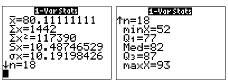
A chain restaurant advertises that a typical number of French fries in a large order is 82. Roberta is a bit curious about this claim, so she bought a large order of fries each day for 18 days and counted the number of fries in the orders. Her data are shown below.
80 72 77 80 90 85 93 52 84 87 80 86 92 88 67 86 66 77
Use a TI calculator to find the mean, median, \(Q_1\), \(Q_3\), IQR, standard deviation, minimum, and maximum for the data in her sample. Then, sketch a box plot.
- Answer
-


The mean is 80.1, the median is 82, Q1 is 77, Q3 is 87, IQR is 10, standard deviation is about 10.5, minimum is 52, and maximum is 93.

The box plot represents the heights of a group of several females.

- What is the median height for the females in this group?
The median is located at the vertical line inside the box of the box plot. Here, the median is 66 inches.
- What is the interquartile range of the heights for the females in this group?
\(IQR = Q_3 - Q_1 = 69 - 62 = 7\) inches.
- What percent of the females in this group are 62 inches or shorter?
62 inches corresponds to \(Q_1\). This value is also the 25th percentile, so 25% of the females are 62 inches or shorter.
- How tall are the tallest 25% of females in this group?
The tallest 25% of females would be taller than the value of \(Q_3\) = 69 inches.
The box plot shows the total cost of textbooks for the fall semester for a sample of PGCC students.

- What is the most any student spent on textbooks for the semester?
- What percent of students spent between $255 and $347.50 on textbooks for the semester?
- What percent of students spent $347.50 or less on textbooks for the semester?
- Answer
-
- $460
- 50%
- 75%
Box plots are particularly useful for comparing data from two samples.
The box plot of service times for two fast-food restaurants is shown below.
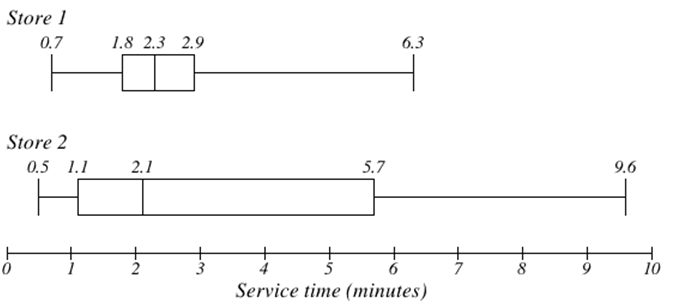
While Store 2 had a slightly shorter median service time (2.1 minutes vs. 2.3 minutes), Store 2 is less consistent in the amount of time needed to provide service. That is, Store 2 has a wider spread in the data.
At Store 1, 75% of customers were served within 2.9 minutes, while at Store 2, 75% of customers were served within 5.7 minutes.
Which store should you go to in a hurry? That depends upon your opinions about luck and probability – 25% of customers at Store 2 had to wait between 5.7 and 9.6 minutes, while all of the customers at Store 1 had been served within 6.3 minutes.