
2.3: Linear Regression
- Page ID
- 139264
\( \newcommand{\vecs}[1]{\overset { \scriptstyle \rightharpoonup} {\mathbf{#1}} } \)
\( \newcommand{\vecd}[1]{\overset{-\!-\!\rightharpoonup}{\vphantom{a}\smash {#1}}} \)
\( \newcommand{\id}{\mathrm{id}}\) \( \newcommand{\Span}{\mathrm{span}}\)
( \newcommand{\kernel}{\mathrm{null}\,}\) \( \newcommand{\range}{\mathrm{range}\,}\)
\( \newcommand{\RealPart}{\mathrm{Re}}\) \( \newcommand{\ImaginaryPart}{\mathrm{Im}}\)
\( \newcommand{\Argument}{\mathrm{Arg}}\) \( \newcommand{\norm}[1]{\| #1 \|}\)
\( \newcommand{\inner}[2]{\langle #1, #2 \rangle}\)
\( \newcommand{\Span}{\mathrm{span}}\)
\( \newcommand{\id}{\mathrm{id}}\)
\( \newcommand{\Span}{\mathrm{span}}\)
\( \newcommand{\kernel}{\mathrm{null}\,}\)
\( \newcommand{\range}{\mathrm{range}\,}\)
\( \newcommand{\RealPart}{\mathrm{Re}}\)
\( \newcommand{\ImaginaryPart}{\mathrm{Im}}\)
\( \newcommand{\Argument}{\mathrm{Arg}}\)
\( \newcommand{\norm}[1]{\| #1 \|}\)
\( \newcommand{\inner}[2]{\langle #1, #2 \rangle}\)
\( \newcommand{\Span}{\mathrm{span}}\) \( \newcommand{\AA}{\unicode[.8,0]{x212B}}\)
\( \newcommand{\vectorA}[1]{\vec{#1}} % arrow\)
\( \newcommand{\vectorAt}[1]{\vec{\text{#1}}} % arrow\)
\( \newcommand{\vectorB}[1]{\overset { \scriptstyle \rightharpoonup} {\mathbf{#1}} } \)
\( \newcommand{\vectorC}[1]{\textbf{#1}} \)
\( \newcommand{\vectorD}[1]{\overrightarrow{#1}} \)
\( \newcommand{\vectorDt}[1]{\overrightarrow{\text{#1}}} \)
\( \newcommand{\vectE}[1]{\overset{-\!-\!\rightharpoonup}{\vphantom{a}\smash{\mathbf {#1}}}} \)
\( \newcommand{\vecs}[1]{\overset { \scriptstyle \rightharpoonup} {\mathbf{#1}} } \)
\( \newcommand{\vecd}[1]{\overset{-\!-\!\rightharpoonup}{\vphantom{a}\smash {#1}}} \)
In the last section we explored linear functions. Recall that linear functions have a constant rate of change, and can be written in the form f(x) = b + mx, or f(x) = mx + b. When graphed, a linear function is a straight line, where all points that satisfy the linear equation fall exactly on the graph of the line. This can be seen in the graph below:
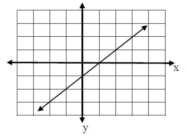
This is the graph of f(x)= -1 + x. Some of the points on this line are: (-2, -3), (0, -1), (1, 0), and (3, 2). There are infinitely many other points on this
line too.
Now consider the following graph that represents the relationship between the age of a vehicle (in years) and its value (in $1000s) for 10 different vehicles.
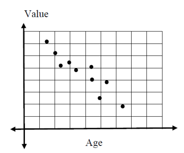
Can we write the equation of a linear function that represents this set of points? No, not exactly.
There is no straight line that will go through ALL of these points, but there does appear to be a linear relationship between the two variables.
The graph that you see above is called a scatterplot. A scatterplot is used to show the relationship between two numerical variables. The independent (predictor) variable is plotted on the horizontal axis, and the dependent (response) variable is plotted on the vertical axis.
The data below show a person’s body weight during a diet program.
|
Time, t |
0 |
1 |
2 |
3 |
4 |
5 |
|
Weight, W, in pounds |
196 |
192 |
193 |
190 |
190 |
186 |
Draw a scatterplot of the data. Does the data appear linear?
Solution
Step 1: Enter the data into your calculator
Press STAT (Second Row of Keys)
Press ENTER to access 1:Edit under EDIT menu
Note: Be sure all data columns are cleared. To do so, use your arrows to scroll up to L1 or L2 then click CLEAR then scroll down. (DO NOT CLICK DELETE!)
Once your data columns are clear, enter the input data into L1 (press ENTER after each data value to get to the next row) then right arrow to L2 and enter the output data into L2. Your result should look like this when you are finished (for L1 and L2):

Step 2: Turn on your Stat Plot 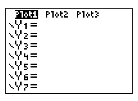
- Press Y=
- Use your arrow keys to scroll up to Plot1
- Press ENTER
- Scroll down and Plot1 should be highlighted as at left
- Clear out all entries below
Step 3: Graph the Data in an Appropriate Viewing Window
- Click the ZOOM key, and scroll down to Option 9: “ZoomStat”
- Once your cursor is on “ZoomStat”, press the GRAPH key. A graph of your data should appear in an appropriate window so that all data points are clearly visible.

The scatterplot above shows that the data points seem to have a linear relationship.
From the previous scatterplot, it looks like there is a negative linear relationship between the time in weeks and the weight in pounds. We can see this linear relationship because the points are scattered around an imaginary straight line. More specifically, as the time increases, the weight seems to decrease by a fairly consistent amount.
Consider the data set:
|
|
3 |
5 |
8 |
9 |
11 |
12 |
15 |
|
|
1.1 |
3.2 |
7.0 |
6.8 |
9.5 |
9.8 |
13.0 |
a. Draw a scatterplot for the data set.
b. Does the data set appear to be increasing or decreasing?
c. Does the data set appear to have a linear relationship?
Solution
a. 
b. Increasing
c. Yes, there appears to be a linear trend
Just because data are not EXACTLY linear does not mean we cannot write an approximate linear model for the given data set. In fact, most data in the real world are NOT exactly linear and all we can do is write models that are close to the given values.
Once we have determined using a scatterplot that our two variables appear to have a roughly linear relationship, we can use a process called linear regression to find the equation of the line that best fits the data points. If you take a statistics class, you will learn a lot more about this process. In this class, you will be introduced to the basics. This process is also called “FINDING THE LINE OF BEST FIT”. This process is lengthy and calculation intensive by hand, but can be done quickly using our graphing calulator.
Our calculator will give us the best linear equation possible by taking into account ALL the given data points.
NOTE: Unless your data are exactly linear, the regression equation will not match all data points exactly. It is a model used to predict outcomes not provided in the data set.
Consider the data set from the previous problem:
|
Time, t |
0 |
1 |
2 |
3 |
4 |
5 |
|
Weight, W, in pounds |
196 |
192 |
193 |
190 |
190 |
186 |
Use your graphing calculator to find the regression equation.
Solution
Step 1: Enter the Data into your Graphing Calculator
Step 1: Enter the Data into your Graphing Calculator
Press STAT then select option 1:Edit under EDIT menu. Clear lists, then enter the values.

**NOTE If you ever accidentally DELETE a column, then go to STAT, Option 5: SetUpEditor>ENTER. When you go back to STAT, your column should be restored.
Step 2: Turn on your Stat Plot and Graph the Data in an Appropriate Viewing Window
(Refer to previous example for help)

Note: Since we already graphed the scatterplot for this data set (and know the data looks linear), you could skip this step. Graphing the scatterplot is not required in order to calculate the regression equation, but you should always verify using a scatterplot that your data looks linear BEFORE doing a linear regression!
Step 3: Access the Linear Regression section of your calculator
- Press STAT
- Scroll to the right one place to CALC
- Scroll down to 4:LinReg(ax+b)
- Your screen should look as the one at left
Step 4: Determine the linear regression equation 
- Press ENTER twice in a row to view the screen at right
- The calculator computes values for slope (a) and y-intercept (b) in what is called the equation of best-fit for your data.
- Identify these values and round to the appropriate places. Let’s say 2 decimals in this case. So, a = -1.69 and b = 195.38
- Now, replace the a and b in y = ax + b with the rounded values to write the actual equation: y = -1.69x + 195.38
- To write the equation in terms of initial variables, we would write W = -1.69t + 195.38
- In function notation, W(t) = -1.69t + 195.38
GRAPHING THE REGRESSION EQUATION ON TOP OF THE STAT PLOT
- Enter the Regression Equation with rounded values into Y=
- Press GRAPH
- You can see from the graph that the “best fit” line does not hit very many of the given data points. But, it will be the most accurate linear model for the overall data set.

IMPORTANT NOTE: When you are finished graphing your data, TURN OFF YOUR PLOT1. Otherwise, you will encounter an INVALID DIMENSION error when trying to graph other functions. To do this:
- Press Y=
- Use your arrow keys to scroll up to Plot1
- Press ENTER
- Scroll down and Plot1 should be UNhighlighted
Consider the data set:
|
n |
0 |
2 |
4 |
6 |
8 |
10 |
12 |
|
f(n) |
23.76 |
24.78 |
25.93 |
26.24 |
26.93 |
27.04 |
27.93 |
Use your graphing calculator to find the linear regression equation for this data set.
Solution
y = 0.32x + 24.16
Once you have a linear regression equation, you can then use that equation to provide you with information about how your two variables change together, and to make predictions about other values of your variables of interest.
Consider again the data set from the previous problem
|
Time, t |
0 |
1 |
2 |
3 |
4 |
5 |
|
Weight, W, in pounds |
196 |
192 |
193 |
190 |
190 |
186 |
a) Interpret the meaning of the vertical intercept.
b) Interpret the meaning of the slope.
c) Use your regression equation to predict the weight in pounds after 2.5 weeks.
d) Use your regression equation to predict the weight in pounds after 6 weeks.
Solution
Recall, the regression equation for this data set was
y = -1.69x + 195.38
To write the equation in terms of initial variables, we would write W = -1.69t + 195.38
a) The vertical intercept is the value of W when t = 0. Based on the regression equation, we know that when t = 0, W = 195.38. This tells us that when first starting the weight loss program, the individual weighed approximately 195.38 pounds.
Note: In this particular case, we had a data point for time 0 weeks of 196 pounds. In general, the regression equation gives an estimate (or predicted value) of the response variable. Output from the regression equation will rarely equal the exact data values themselves.
b) The slope of the regression equation is -1.69 . Recall that the slope measures \(\frac{\text { change in } y}{\text { change in } x}\),or in our problem, \(\frac{\text { change in weight }(W)}{\text { change in time }(t)}\). We can write the slope for this equation of -1.69 as a fraction by writing it over 1 :
\[
\frac{\text { change in weight }(W)}{\text { change in time }(t)}=\frac{-1.69}{1}
\]
To interpret the meaning of the slope, we would say that for each additional week, the weight decreases by approximately 1.69 pounds.
c) To predict the weight in pounds after 2.5 weeks, plug in \(t=2.5\) to the regression equation, and solve for \(\mathrm{W}\).
\[
\begin{array}{l}
\mathrm{W}=-1.69(2.5)+195.38 \\
\mathrm{~W}=191 \text { pounds }
\end{array}
\]
d) To predict the weight in pounds after 6 weeks, plug in \(t=6\) to the regression equation, and solve for \(\mathrm{W}\).
\[
\begin{array}{l}
\mathrm{W}=-1.69(6)+195.38 \\
\mathrm{~W}=185 \text { pounds }
\end{array}
\]
In the previous problem, we used our regression equation to tell us how our two variables change together, and to make predictions about other values. You may have noticed that we made predictions about the values of our dependent variable only for values of our independent variable that were close to the actual values in our data set. In other words, our original data set included values of time from 0-5 weeks. Based on that information, we created our model. It would not be appropriate to try to make predictions for values of time that are far outside our original range of time values (from 0 – 5 weeks). This is called extrapolation and can result in very poor predictions. Consider the following example.
Consider again the data set from the previous problem:
|
Time, t |
0 |
1 |
2 |
3 |
4 |
5 |
|
Weight, W, in pounds |
196 |
192 |
193 |
190 |
190 |
186 |
Would it be reasonable to use your regression equation to predict the weight in pounds after 100 weeks? Why or why not?
Solution
Recall, the regression equation for this data set was
\[
W=-1.69 t+195.38
\]
Our model was created based off of data from 0 to 5 weeks into a weight loss program. Is it reasonable to assume that the same pattern of weight loss that held in weeks \(0-5\) would be present in week 100? It certainly doesn't seem so. This is an example of extrapolation. Let's see what would happen if we tried to use the model to predict the weight in pounds after 100 weeks. We plug in \(\mathrm{t}=100\) to the regression equation, and solve for \(\mathrm{W}\).
\[
\begin{array}{l}
\mathrm{W}=-1.69(100)+195.38 \\
\mathrm{~W}=26 \text { pounds }
\end{array}
\]
If this pattern of weight loss continued, the individual would weigh only 26 pounds
The following table gives the total number of live Christmas trees sold, in millions, in the United States from 2004 to 2011. (Source: Statista.com).
|
Year |
2004 |
2006 |
2008 |
2010 |
2011 |
|
C(tr) = Total number of |
27.10 |
28.60 |
28.20 |
27 |
30.80 |
a) Use your calculator to determine the equation of the regression line, \(C(t)\) where \(t\) represents the number of years since 2004
Start by entering new \(t\) values for the table below based upon the number of years since 2004. The first few are done for you:
|
t= Number of years since 2004 |
0 |
2 |
|||
|
C(tr) = Total number of |
27.10 |
28.60 |
28.20 |
27 |
30.80 |
b) Identify the slope of the regression equation and explain its meaning in the context of this problem.
c) Use the regression equation to predict the number of Christmas trees that will be sold in the year 2013. Write your answer as a complete sentence.
d) Should you use your regression equation to predict the number of Christmas trees that will be sold in the year 2030 ? Why or why not?
Solution
a. C(t) = 0.279t + 27.28
b. For each additional year since 2004, the number of Christmas trees sold in the U.S. will increase by approximately 279,000 trees.
c. 29.79 million Christmas trees
d. No. The original data is for years 2004 through 2011. The year 2030 is too far from the original data set.