
2.4: Correlation
- Page ID
- 139265
\( \newcommand{\vecs}[1]{\overset { \scriptstyle \rightharpoonup} {\mathbf{#1}} } \)
\( \newcommand{\vecd}[1]{\overset{-\!-\!\rightharpoonup}{\vphantom{a}\smash {#1}}} \)
\( \newcommand{\dsum}{\displaystyle\sum\limits} \)
\( \newcommand{\dint}{\displaystyle\int\limits} \)
\( \newcommand{\dlim}{\displaystyle\lim\limits} \)
\( \newcommand{\id}{\mathrm{id}}\) \( \newcommand{\Span}{\mathrm{span}}\)
( \newcommand{\kernel}{\mathrm{null}\,}\) \( \newcommand{\range}{\mathrm{range}\,}\)
\( \newcommand{\RealPart}{\mathrm{Re}}\) \( \newcommand{\ImaginaryPart}{\mathrm{Im}}\)
\( \newcommand{\Argument}{\mathrm{Arg}}\) \( \newcommand{\norm}[1]{\| #1 \|}\)
\( \newcommand{\inner}[2]{\langle #1, #2 \rangle}\)
\( \newcommand{\Span}{\mathrm{span}}\)
\( \newcommand{\id}{\mathrm{id}}\)
\( \newcommand{\Span}{\mathrm{span}}\)
\( \newcommand{\kernel}{\mathrm{null}\,}\)
\( \newcommand{\range}{\mathrm{range}\,}\)
\( \newcommand{\RealPart}{\mathrm{Re}}\)
\( \newcommand{\ImaginaryPart}{\mathrm{Im}}\)
\( \newcommand{\Argument}{\mathrm{Arg}}\)
\( \newcommand{\norm}[1]{\| #1 \|}\)
\( \newcommand{\inner}[2]{\langle #1, #2 \rangle}\)
\( \newcommand{\Span}{\mathrm{span}}\) \( \newcommand{\AA}{\unicode[.8,0]{x212B}}\)
\( \newcommand{\vectorA}[1]{\vec{#1}} % arrow\)
\( \newcommand{\vectorAt}[1]{\vec{\text{#1}}} % arrow\)
\( \newcommand{\vectorB}[1]{\overset { \scriptstyle \rightharpoonup} {\mathbf{#1}} } \)
\( \newcommand{\vectorC}[1]{\textbf{#1}} \)
\( \newcommand{\vectorD}[1]{\overrightarrow{#1}} \)
\( \newcommand{\vectorDt}[1]{\overrightarrow{\text{#1}}} \)
\( \newcommand{\vectE}[1]{\overset{-\!-\!\rightharpoonup}{\vphantom{a}\smash{\mathbf {#1}}}} \)
\( \newcommand{\vecs}[1]{\overset { \scriptstyle \rightharpoonup} {\mathbf{#1}} } \)
\(\newcommand{\longvect}{\overrightarrow}\)
\( \newcommand{\vecd}[1]{\overset{-\!-\!\rightharpoonup}{\vphantom{a}\smash {#1}}} \)
\(\newcommand{\avec}{\mathbf a}\) \(\newcommand{\bvec}{\mathbf b}\) \(\newcommand{\cvec}{\mathbf c}\) \(\newcommand{\dvec}{\mathbf d}\) \(\newcommand{\dtil}{\widetilde{\mathbf d}}\) \(\newcommand{\evec}{\mathbf e}\) \(\newcommand{\fvec}{\mathbf f}\) \(\newcommand{\nvec}{\mathbf n}\) \(\newcommand{\pvec}{\mathbf p}\) \(\newcommand{\qvec}{\mathbf q}\) \(\newcommand{\svec}{\mathbf s}\) \(\newcommand{\tvec}{\mathbf t}\) \(\newcommand{\uvec}{\mathbf u}\) \(\newcommand{\vvec}{\mathbf v}\) \(\newcommand{\wvec}{\mathbf w}\) \(\newcommand{\xvec}{\mathbf x}\) \(\newcommand{\yvec}{\mathbf y}\) \(\newcommand{\zvec}{\mathbf z}\) \(\newcommand{\rvec}{\mathbf r}\) \(\newcommand{\mvec}{\mathbf m}\) \(\newcommand{\zerovec}{\mathbf 0}\) \(\newcommand{\onevec}{\mathbf 1}\) \(\newcommand{\real}{\mathbb R}\) \(\newcommand{\twovec}[2]{\left[\begin{array}{r}#1 \\ #2 \end{array}\right]}\) \(\newcommand{\ctwovec}[2]{\left[\begin{array}{c}#1 \\ #2 \end{array}\right]}\) \(\newcommand{\threevec}[3]{\left[\begin{array}{r}#1 \\ #2 \\ #3 \end{array}\right]}\) \(\newcommand{\cthreevec}[3]{\left[\begin{array}{c}#1 \\ #2 \\ #3 \end{array}\right]}\) \(\newcommand{\fourvec}[4]{\left[\begin{array}{r}#1 \\ #2 \\ #3 \\ #4 \end{array}\right]}\) \(\newcommand{\cfourvec}[4]{\left[\begin{array}{c}#1 \\ #2 \\ #3 \\ #4 \end{array}\right]}\) \(\newcommand{\fivevec}[5]{\left[\begin{array}{r}#1 \\ #2 \\ #3 \\ #4 \\ #5 \\ \end{array}\right]}\) \(\newcommand{\cfivevec}[5]{\left[\begin{array}{c}#1 \\ #2 \\ #3 \\ #4 \\ #5 \\ \end{array}\right]}\) \(\newcommand{\mattwo}[4]{\left[\begin{array}{rr}#1 \amp #2 \\ #3 \amp #4 \\ \end{array}\right]}\) \(\newcommand{\laspan}[1]{\text{Span}\{#1\}}\) \(\newcommand{\bcal}{\cal B}\) \(\newcommand{\ccal}{\cal C}\) \(\newcommand{\scal}{\cal S}\) \(\newcommand{\wcal}{\cal W}\) \(\newcommand{\ecal}{\cal E}\) \(\newcommand{\coords}[2]{\left\{#1\right\}_{#2}}\) \(\newcommand{\gray}[1]{\color{gray}{#1}}\) \(\newcommand{\lgray}[1]{\color{lightgray}{#1}}\) \(\newcommand{\rank}{\operatorname{rank}}\) \(\newcommand{\row}{\text{Row}}\) \(\newcommand{\col}{\text{Col}}\) \(\renewcommand{\row}{\text{Row}}\) \(\newcommand{\nul}{\text{Nul}}\) \(\newcommand{\var}{\text{Var}}\) \(\newcommand{\corr}{\text{corr}}\) \(\newcommand{\len}[1]{\left|#1\right|}\) \(\newcommand{\bbar}{\overline{\bvec}}\) \(\newcommand{\bhat}{\widehat{\bvec}}\) \(\newcommand{\bperp}{\bvec^\perp}\) \(\newcommand{\xhat}{\widehat{\xvec}}\) \(\newcommand{\vhat}{\widehat{\vvec}}\) \(\newcommand{\uhat}{\widehat{\uvec}}\) \(\newcommand{\what}{\widehat{\wvec}}\) \(\newcommand{\Sighat}{\widehat{\Sigma}}\) \(\newcommand{\lt}{<}\) \(\newcommand{\gt}{>}\) \(\newcommand{\amp}{&}\) \(\definecolor{fillinmathshade}{gray}{0.9}\)In the last section we learned about relationships between two variables that appeared to be linear. In some cases, the scatterplot shows very clearly that the two variables are linearly related, but it many cases it can be a bit challenging to tell exactly how strong the linear relationship is between the two variables of interest. The linear correlation (r), also called the correlation coefficient, is a way to numerically measure the strength and the direction of the linear relationship between two variables.
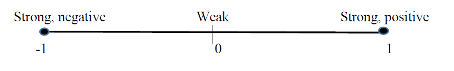
Properties of Correlation:
- We use " \(r\) " to represent the correlation
- \(-1 \leq r \leq 1\)
- The sign of \(r\) indicates the direction of the linear relationship between the 2 variables
- If \(\mathrm{r}<0\), there is a negative linear relationship between the 2 variables (slope of the regression equation is negative).
- If \(r>0\), there is a positive linear relationship between the 2 variables (slope of the regression equation is positive).
- The magnitude of \(r\) indicates the strength of the linear relationship between the 2 variables
- If \(\mathrm{r} \approx 0\), then there is no linear relationship between the 2 variables
- If \(|r| \approx 1\), then there is a very strong linear relationship between the 2 variables
- If \(\mathrm{r}=1\) or -1 , then there is an exact linear relationship between the 2 variables (every data point falls exactly on the regression line)
These properties of correlation can be summarized in the graphic below:
Consider the following scatterplots, and their corresponding correlation values.

Classify the strength and direction of the linear relationship between the 2 variables in each scatterplot
Solution
a. Here r = 0.94, which is close to positive 1. We would say these 2 variables have a strong, positive linear relationship.
b. Here r = -0.15, which is negative and close to 0. We could say these 2 variables have a very weak, negative linear relationship.
c. Here r = -0.88, which is close to negative 1. We would say these 2 variables have a strong, negative linear relationship.
d. Here r = 0.58, which is positive, but not particularly close to 0 or 1. We would say these 2 variables have a moderate, positive linear relationship.
Note: There is no “cutoff” value for which values of r are considered “strong” and which are considered “weak”. The interpretation of r can be fairly subjective. What you should know is that the farther the value of r is from 0, the stronger the linear relationship between the 2 variables is considered to be.
Now that we have a basic understanding of interpreting the correlation, we can discuss how to find it. As with linear regression, the calculations for finding correlation by hand are rather time consuming. We will again rely on the graphing calculator to find the correlation for us.
Consider again the data set from the weight loss problem:
|
Time, t |
0 |
1 |
2 |
3 |
4 |
5 |
|
Weight, W, in pounds |
196 |
192 |
193 |
190 |
190 |
186 |
a. Use your graphing calculator to find the correlation between time and weight.
b. Interpret the meaning of the correlation you found in part a.
Solution
To find the correlation on the graphing calculator, press the " 2 nd" \(k e y\) and then "Catalog". "Catalog" is a \(2^{\text {nd }}\) function on the zero key. Use the arrow keys to scroll down to "DiagnosticOn". Hit ENTER. On the main screen, your calculator should display DiagnosticOn followed by a blinking cursor. Hit ENTER. The calculator should display "Done". Once you have turned on the DiagnosticON, you do not have to do it again. Also, it will not interfere with any other calculator functions, so you can just leave it on.
Once you have turned on "DiagnosticOn" you can follow the instructions for finding the linear regression equation from section 3.3. When the calculator displays the linear regression equation, it will also display the correlation value, \(r\).
- Enter your data into L1 and L2, then press STAT, scroll over to CALC, and select option 4: \(\operatorname{LinReg}(a x+b)\). Your output should consist of the values of a and \(b\) (just like we did in section 3.3) AND two new values: \(r^2\) and \(r\). The value of \(r=-0.94\). (NOTE: The quantity \(r^2\) is the coefficient of determination, which we do not cover in this course).
- The value of \(r=-0.94\). This means that time and weight have a strong, negative linear relationship. This means that as time increases, weight tends to decrease. This can be confirmed by a scatterplot of the data which showed a negative slope to the data points.
Recall, the following table gives the total number of live Christmas trees sold, in millions, in the United States from 2004 to 2011. (Source: Statista.com).
|
t= number of years since |
0 |
2 |
4 |
6 |
7 |
|
C(t) - Total number of |
27.10 |
28.60 |
28.20 |
27 |
30.80 |
a) Use your graphing calculator to find the numerical value of the correlation.
b) Interpret the meaning of the correlation from part a).
- Answer
-
a. r = 0.52 b. There is a moderate, positive linear relationship between the time in years since 2004 and the number of Christmas trees sold in the U.S.