
3.3: Linear Modeling with Data
- Page ID
- 130958
Linear functions have many uses in other areas of mathematics. For instance, the subject of calculus is based on using linear functions to approximate more complicated functions, and linear functions in multiple dimensions are used to describe physics and chemistry applications. In this section, we will see how linear functions are used in an important statistics context: linear regression.
- Recognize, interpret, and make a two-variable scatter plot using given data
- Find the average of a set of numbers
- Perform a linear regression based on a set of two-variable data
- Find and interpret the coefficient of correlation based on a set of two-variable data
Scatter Plots and Definitions
Much like the last section, we'll start with an example to make sense of the concepts we'll see in this section.
3.14 a la mode, a fictitious ice cream parlor in Seattle, wishes to better predict its monthly sales numbers. It recorded the average monthly high temperature each month, along with the monthly sales in thousands of dollars, for a year, and compared them using the table below.
| Month | Avg. High Temp (Deg. Fahrenheit) | Sales in \(\$1000\)s |
| January | 47 | 18 |
| February | 50 | 30 |
| March | 54 | 32 |
| April | 58 | 65 |
| May | 65 | 54 |
| June | 70 | 61 |
| July | 78 | 66 |
| August | 76 | 77 |
| September | 71 | 75 |
| October | 60 | 45 |
| November | 51 | 39 |
| December | 48 | 18 |
Analyze the data above in the following ways:
- Find the average monthly temperature, in degrees Fahrenheit, throughout the year.
- Find the average monthly ice cream sales, in thousands of dollars, throughout the year.
Then, from this table, plot the numerical values on each row as \((x,y)\) coordinates, and describe trends that you see in the graph. Can you explain these trends?
Solution
- We haven't seen averages yet in this book, but you may be familiar with the concept from previous mathematical experiences. An average, or mean, of a list of numbers is found by adding up all the numbers, and then dividing by how many numbers were in the list. The average is known as a "measure of center" of a set of data, which can sometimes help to summarize a key fact about the data. However, it doesn't tell us about the invdividual data points themselves, or how spread out they are. Nevertheless, let's find the average of the monthly temperatures. We first add up the numbers: \[47 + 50 + 54 + 58 + 65 + 70 + 78 + 76 + 71 + 60 + 51 + 48 = 728 \] Then, we'll divide by how many numbers were in the list; in this case, there are \(12\) numbers (corresponding to the \(12\) months of the year): \[728 \div 12 = 60.667\] We see that the decimal continues, but we choose to round to the thousandths place. What does this number tell us? It tells us that the average monthly temperature in Seattle for the year above was \(60.667\) degrees Fahrenheit.
- We'll use a similar approach to find the average ice cream sales. First, we'll add up the numbers in that column:\[18+ 30+ 32 + 65 + 54 + 61 + 66 + 77 +75 +45 + 39+ 18 = 580\] Then, as before, we'll divide by \(12\): \[580 \div 12 = 48.333\] Once again, we see that the decimal continues, so we will choose to round to the thousandths place. This tells use that the average monthly ice cream sales, in thousands of dollars, are \(48.333\) thousand dollars per month. A clearer way to say this would be that average monthly ice cream sales are \(\$48,333\) dollars per month.
Next, we'll plot the numerical values of each row as \((x,y)\) coordinates. This means we'll take the numbers in a given row and simply think of them as an ordered pair. For example, in the first row, the numbers are \(47\) and \(18\). In that case the ordered pair would be \((47,18)\). If you'd like to think of \(47\) as the "input" and \(18\) as the "output" you may, though beware of that intuition later on, because it won't always hold up. The first column of the table, which lists the months, will actually not be a part of our scatter plot. The months are here simply to organize the data into related pairs. We will not eventually care about months -- we are simply interested in the relationship between temperature and sales.
In any case, we generate our list of ordered pairs: \((47, 18)\), \((50, 30)\), \((54, 32)\), and so on. Then we will plot these points on a graph. I'll show how to do this using a computer in the screen cast for this section, or you can do it by hand.
In any case, when we plot these points, it will look like the following graph:
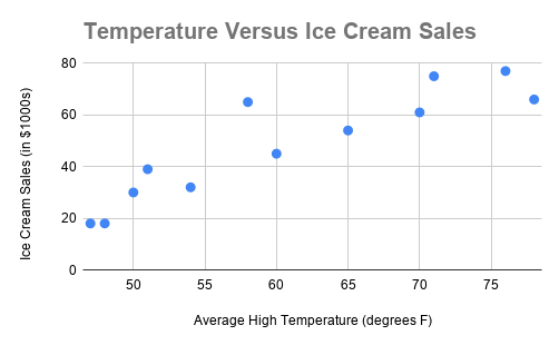
It's not necessary to label any of the points, but we should make sure that, in general, the graph looks correct before moving on. Indeed, we see two dots in the lower left next to each other. We see that these correspond to the points \(47,18)\) and \((48, 18)\), which correspond to January and December. You can go through all of the other points and verify that they appear. One thing you will notice when you verify this is that the horizontal axis does not start in a regular way -- it skips from \(0\) to \(50\), and then increases in increments of \(5\). This is a perfectly fine thing to do when making a chart, provided the axes are clearly labeled. The reason we do this is to center our data in the ranges that matter, and in fact most good graphing programs will do this automatically.
There are many possible ways we could describe the trends in the graph. It looks like, as the temperature increases, the ice cream sales also increase. Though, it could also be described as somewhat random. For example, compare the two points in the middle of the graph that appears to go "down" — these points are \((58, 65)\) and \((60,45)\). This means that when the average high temperate was \(58\) degrees, there were \(\$65,000\) in sales, but when the temperature rose to \(60\) degrees, the sales went down to \(\$45,000\). So it's not a perfectly stable relationship.
Also, take note that the average sales and average temperature occur in approximately the "middle" of the graph. This makes sense, as these numbers told us something about the central tendency of our data. However, as we can see from the the graph, there is a lot of variability from the average, and that's perfectly normal. This demonstrates that the average can be a useful estimation, but actual numbers will vary in context.
Can we explain these trends? Well, given the data at hand, we can't make any certain conclusions about the relationship between ice cream sales and temperature. However, these data do indicate some shared relationship between temperature and ice cream sales, because both quantities appear to rise together. Thinking about the context of the situation, this makes sense. Using common sense, we can say that people will probably buy more ice cream when it's hotter. The graph of the points gives us a visual way to confirm that supposed relationship
The graph in the question above is called a scatter plot, and the question illustrates how a scatter plot can visually suggest a relationship between two set of data. However, scatter plots alone have two problems:
- They do not give us the ability to clearly state how strongly related two sets of data are — we can only describe relationships in qualitative terms.
- They do not give us the ability to make a conclusion involving causality. That is, we cannot say that one variable necessarily influences or affects the other.
Of course, in a given context, we may have very good reasons to believe that there is a causal relationship between the variables. For instance, in the previous example, it seems quite likely that an increase in temperature would cause ice cream sales to rise. As we will see, we cannot usually make such claims, and sometimes variables that appear very strongly related from a graphical standpoint actually have nothing to do with one another.
Before we work on the second bullet point above, let's try to remedy the first one. We need a way to clearly state how strongly related two sets of data are. This brings us to the following two definitions.
The line of best fit or trendline is a linear function that approximates a scatter plot by minimizing the distance between the line and each of the points in the scatter plot. The process of finding the line of best fit is linear regression.
The coefficient of correlation, commonly referred to as \(R\), is a numerical measure of the amount of correlation between two variables. That is, it measures how closely related the two variables are.
These two definitions will help us more clearly describe our scatter plot. We can find the line of best fit using linear regression, and then compute the value of R to get specific information about how closely related the data are.
To learn how to perform a linear regression, watch this video. In doing so, you will find the equation for the line of best fit, and a value called \(R^2\).
To find \(R\) from \(R^2\), follow these steps:
- Take the square root of \(R^2\)
- Assign either a positive or negative sign to the result. Assign a positive sign if the trendline slope is positive, and a negative sign if the slope is negative.
Once you find \(R\), consult the following chart to determine the type of correlation that data exhibits.
| Range of \(R\) value | Interpretation |
| \(-1 \leq R < -.8\) | strong negative correlation |
| \(-.8 \leq R < -.5\) | moderate negative correlation |
| \(-.5 \leq R < 0\) | weak negative correlation |
| \(R = 0 \) | no correlation |
| \(0 < R < .5\) | weak positive correlation |
| \(.5 \leq R < .8\) | moderate positive correlation |
| \(.8 \leq R \leq 1\) | strong positive correlation |
In other words, if R is close to 1 or -1, that means that the data are very closely correlated; they move together in lockstep. However, if R is closer to 0, the data are not correlated at all. The table above shows the gradation as R changes values.
However, as usual, we need to use caution when we are interpreting data.
Caveat: The ranges for weak, moderate, and strong correlation will vary based on context. The ranges above are what we will use for this class but should not be interpreted as universally applicable.
To expand a bit: different disciplines have different correlation needs and conventions. For example, in a psychology experiment, a value of \(R = .4\) might be considered moderate positive correlation. And in biology, a value of \(R = -.78\) could be considered weak negative correlation. You will learn the convention of your discipline in relevant discipline-based classes. However, the ranges indicated above are good enough for many situations, and represent a happy medium between many different disciplines.
Regression and Correlation Examples
Let's see an example of regression and correlation in context.
For the ice cream sales data above, perform a linear regression. Find the value of \(R\) and state the type of correlation exhibited. Then, use the line of best fit to predict ice cream sales if the temperature is \(67\) degrees.
Solution
You just saw how to do this in the example video! If you didn't watch it before, watch it now.
Once we have the linear regression, including the value of \(R^2\), we produce the following graph:
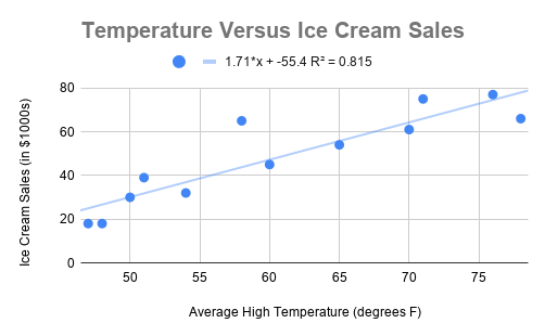
From the top of the graph, we can see that the line of best fit is \(S(x) = 1.71x - 55.4\). We are choosing to name our function \(S(x)\) since the output of the linear function represents sales. We also see that \(R^2 = .815\).
To find the value of \(R\), we will first take the square root of \(R^2\): \[\sqrt{R^2} = \sqrt{.815} = .9028\]
Now, we ask whether the correlation is positive or negative. Since the slope of the line of best fit is positive (in this case, it's \(1.71\), the correlation is also positive. Therefore, we have \(R =.9028\). Looking at the chart for \(R\) values, we see that this data exhibits strong positive correlation. This confirms our suspicion from before!
Finally, we will use the line of best fit to make a prediction. The input to this line, \(x\), stands for the temperature. Therefore, to predict sales when the temperature is \(67\) degrees, we will substitute \(67\) in for \(x\) in the equation for \(S(x)\). That is, we have: \[S(67) = 1.71(67) - 55.4 = 59.17\]
Remember that the units on sales were thousands of dollars. So, we predict the sales will be \($59,170\) if the temperature is \(67\) degrees. Looking at the graph, this seems reasonable, since the line of best fit appears to be at about \(60\) on the vertical axis when the horizontal axis value is \(67\).
This shows how finding the line of best fit can help us make predictions, and how finding \(R\) gives us a more specific and quantitative way to describe the relationship between two sets of data. Unfortunately, it did not tell us anything more about causality. As we will see in the next example, R does not have anything to do with causation.
Below are the data that compare the number of engineering Ph.D.s awarded in a given year to per-person mozzarella cheese consumption in the US. Make a scatter plot of these data, and find the \(R\) value. What kind of correlation does this data exhibit?
| Year | Engineering Ph.D.s Awarded | Cheese eaten (in pounds) |
| 2000 | 480 | 9.3 |
| 2001 | 501 | 9.7 |
| 2002 | 540 | 9.7 |
| 2003 | 552 | 9.7 |
| 2004 | 547 | 9.9 |
| 2005 | 622 | 10.2 |
| 2006 | 655 | 10.5 |
| 2007 | 701 | 11 |
| 2008 | 712 | 10.6 |
| 2009 | 708 | 10.6 |
Solution
If this question does not seem strange to you, go back and read it again.
Why are we comparing engineering Ph.D.s and per-person mozzarella cheese consumption? These two variables have no obvious reason to be related, and it seems virtually impossible that a change in one variable would cause a change in the other. In other words, awarding more engineering Ph.D.s should not cause cheese consumption to increase (or decrease). Likewise, even if the average person eats more cheese, that should not affect whether more or fewer people receive engineering Ph.Ds.
(Some have suggested that perhaps hungry and cash-strapped graduate students are driving pizza consumption up — while there is some truth to this, the proportion of engineering graduate students to the entire US population is so minuscule that it would not make that large of a difference.)
In any case, we really shouldn't expect to see any relationship between these two variables, and therefore we may also not expect to see any correlation. Let's make the scatterplot and see:
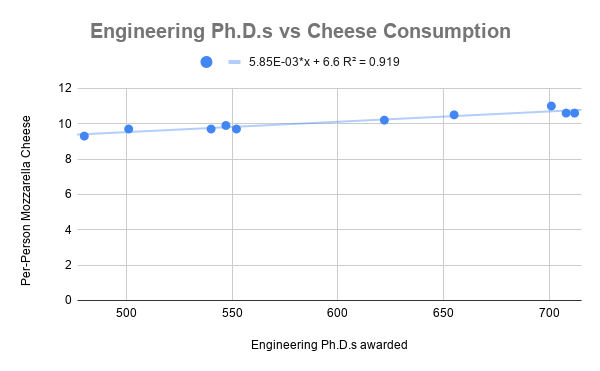
Amazingly, these data look very related. Look how close all of the points are to the line of best fit! That means that they must be closely correlated. Let's find \(R\) to be sure. We calculate: \[R = \sqrt{R^2} = \sqrt{.919} = .9586\]
Since the slope of the trendline is positive (in other words, both the variables are increasing together), we have \(R = .9586\). That means that these two sets of data — engineering Ph.D.s and per-person cheese consumption — are strongly positively correlated. Indeed, this \(R\) value is above \(.95\), and thus very close to \(1\), which stands for perfect correlation (all points on the line of best fit). One might even say these are very strongly positively correlated!
The example above is from a website called Spurious Correlations. The main goal of this website is to illustrate an extremely important concept in statistics:
Correlation does not imply causation.
In other words, even if two variables are strongly correlated, there may not be a causal relationship between them. That is, the variables may not influence one another at all, despite being mathematically linked.
The reason to emphasize this point is immense. It is very, very easy to forget this point when we read the news or make decisions about how we spend our time, money, and effort. For example, suppose you read the headline: "Higher rates of free/reduced lunch in schools linked to low test scores." In the article, you see that the authors found a strong negative correlation between school district poverty and test scores. From this, it is very easy to assume that receiving free/reduced-price lunch causes lower test scores. But be careful. The way in which one pays for lunch should not, on the face of it, impact a given test score. There are multiple possible ways in which this could be explained, of course. There are likely third factors (called lurking variables) that would influence both free/reduced lunch rates and test scores. Or there could be some other factor -- for example, the presence or lack of a particular test prep program in a school -- that would explain the changes in test scores. Such a discussion requires significantly more careful thought, analysis, and knowledge. The headline does not provide this, and instead suggests a causal link that is likely not there.
Exercises
- The following fictitious table lists the number of hours per week a high school student uses their cell phone, and compares that with the student's high school GPA.
Phone Use (Hours Per Week) High School GPA 2.5 3.8 3 3.9 4 3.5 4 3.5 7 3.6 7.5 3.1 8 2.9 8.5 2.9 10 2.5 11 2.3 14 2.1 14 1.9 14 3.9 - Find the average phone use hours per week for this set of data.
- Find the average GPA for this set of data.
- Perform a linear regression on this data, and make a graph that includes the scatter plot, line of best fit, and value of \(R^2\).
- Find the value of \(R\) (be careful with signs here!) and state which type of correlation this data exhibits.
- Write a 3-4 sentence answer to the following prompt: Do you believe that there is a causal relationship here? If so, in what direction? If not, what are other explanations for this correlation?
- Find an example of a news headline from the last 6 months in which a correlation between two quantities is implied. Read the article and determine whether or not a causal relationship existed in this case. Write a 4-5 sentence summary of your findings, and include the title and author of the article, as well as the source (just a URL is fine).