1.6.6.4: Is there an association? Analysis of tables
( \newcommand{\kernel}{\mathrm{null}\,}\)
Contingency tables
How do you compare samples of categorical data? These frequently are text only, there are have no numbers, like in classic “Fisher’s tea drinker” example[1]. A British woman claimed to be able to distinguish whether milk or tea was added to the cup first. To test, she was given 8 cups of tea, in four of which milk was added first:
Code 1.6.6.4.1 (R):
The only way is to convert it to numbers, and the best way to convert is to count cases, make contingency table:
Code 1.6.6.4.2 (R):
Contingency table is not a matrix or data frame, it is the special type of R object called “table”.
In R formula language, contingency tables are described with simple formula
~ factor(s)
To use this formula approach, run xtabs() command:
Code 1.6.6.4.3 (R):
(More than one factors have to be connected with + sign.)
If there are more than two factors, R can build a multidimensional table and print it as a series of two-dimensional tables. Please call the embedded Titanic data to see how 3-dimensional contingency table looks. A “flat” contingency table can be built if all the factors except one are combined into one multidimensional factor. To do this, use the command ftable():
Code 1.6.6.4.4 (R):
The function table can be used simply for calculation of frequencies (including missing data, if needed):
Code 1.6.6.4.5 (R):
The function mosaicplot() creates a graphical representation of a contingency table (Figure 1.6.6.4.1):
Code 1.6.6.4.6 (R):
(We used mosaicplot() command because apply() outputted a matrix. If the data is a “table” with more than one dimension, object, plot() command will output mosaic plot by default.)
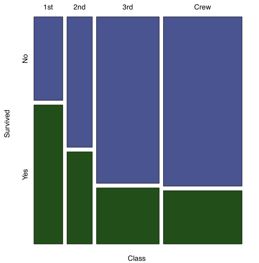 Figure 1.6.6.4.1 Survived on the “Titanic”
Contingency tables are easy enough to make even from numerical data. Suppose that we need to look on association between month and comfortable temperatures in New York. If the temperatures from 64 to 86°F (from 18 to 30°C) are comfort temperatures, then:
Code 1.6.6.4.7 (R):
Now we have two categorical variables, comfort and airquality$Month and can proceed to the table:
Code 1.6.6.4.8 (R):
Spine plot (Figure 1.6.6.4.2) is good for this kind of table, it looks like a visually advanced “hybrid” between histogram, barplot and mosaic plot:
Code 1.6.6.4.9 (R):
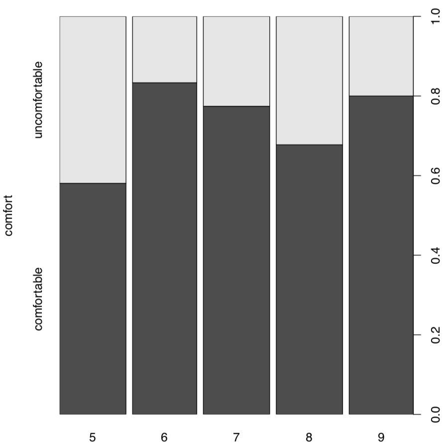 Figure 1.6.6.4.1 Spine plot: when is better to visit New York City.
(Another variant to plot these two-dimensional tables is the dotchart(), please try it yourself. Dotchart is good also for 1-dimensional tables, but sometimes you might need to use the replacement Dotchart1() from asmisc.r—it keeps space for y axis label.)
Table tests
To find if there is an association in a table, one should compare two frequencies in each cell: predicted (theoretical) and observed. The serious difference is the sign of association. Null and alternative hypotheses pairs are typically:
- Null: independent distribution of factors ≈ no pattern present ≈ no association present
- Alternative: concerted distribution of factors ≈ pattern present ≈ there is an association
In terms of p-values:
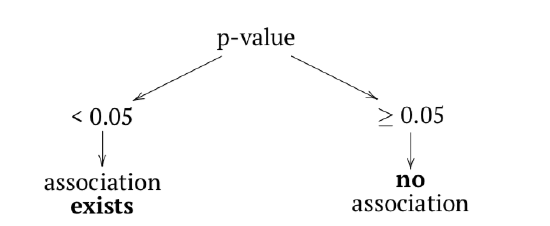
Function chisq.test() runs a chi-squared test, one of two most frequently used tests for contingency tables. Two-sample chi-squared (or χ2) test requires either contingency table or two factors of the same length (to calculate table from them first).
Now, what about the table of temperature comfort? assocplot(comf.month) shows some “suspicious” deviations. To check if these are statistically significant:
Code 1.6.6.4.10 (R):
No, they are not associated. As before, there is nothing mysterious in these numbers. Everything is based on differences between expected and observed values:
Code 1.6.6.4.11 (R):
(Note how expected values calculated and how they look: expected (null) are equal proportions between both rows and columns. June and September have 30 days each, hence slight differences in values—but not in expected proportions.)
Let us see now whether hair color and eye color from the 3-dimensional embedded HairEyeColor data are associated. First, we can examine associations graphically with assocplot() (Figure 1.6.6.4.3):
Code 1.6.6.4.12 (R):
(Instead of apply() used in the previous example, we employed margin.table() which essentially did the same job.)
Association plot shows several things: the height of bars reflects the contribution of each cell into the total chi-squared, this allows, for example, to detect outliers. Square of rectangle corresponds with difference between observed and expected value, thus big tall rectangles indicate more association (to understand this better, compare this current plot with assocplot(comf.month)). Color and position of rectangle show the sign of the difference.
Overall, it is likely that there is an association. Now we need to check this hypothesis with a test:
Code 1.6.6.4.13 (R):
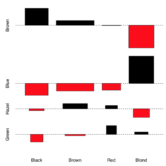 Figure 1.6.6.4.3 Association between hair color and eye color.
The chi-squared test takes as null hypothesis “no pattern”, “no association”. Therefore, in our example, since we reject the null hypothesis, we find that the factors are associated.
And what about survival on the “Titanic”?
Code 1.6.6.4.14 (R):
Yes (as reader might remember from the famous movie), survival was associated with being in the particular class.
General chi-squared test shows only if asymmetry presents anywhere in the table. This means that if it is significant, then at least one group of passengers has the difference in survival. Like ANOVA, test does not show which one. Post hoc, or pairwise table test is able do show this:
Code 1.6.6.4.15 (R):
From the table of p-values, it is apparent that 3rd class and crew members were not different by survival rates. Note that post hoc tests apply p-value adjustment for multiple comparisons; practically, it means that because 7 tests were performed simultaneously, p-values were magnified with some method (here, Benjamini & Hochberg method is default).
The file seedlings.txt contains results of an experiment examining germination of seeds infected with different types of fungi. In all, three fungi were tested, 20 seeds were tested for each fungus, and therefore with the controls 80 seeds were tested. Do the germination rates of the infected seeds differ?
Let us examine now the more complicated example. A large group of epidemiologists gathered for a party. The next morning, many woke up with symptoms of food poisoning. Because they were epidemiologists, they decided to remember what each of them ate at the banquet, and thus determine what was the cause of the illness. The gathered data take the following format:
Code 1.6.6.4.16 (R):
(We used head() here because the table is really long.)
The first variable (ILL) tells whether the participant got sick or not (1 or 2 respectively); the remaining variables correspond to different foods.
A simple glance at the data will not reveal anything, as the banquet had 45 participants and 13 different foods. Therefore, statistical methods must be used. Since the data are nominal, we will use contingency tables:
Code 1.6.6.4.17 (R):
(First, we ran ILL variable against every column and made a list of small contingency tables. Second, we converted list into 3-dimensional array, just like the Titanic data is, and also made sensible names of dimensions.)
Now our data consists of small contingency tables which are elements of array:
Code 1.6.6.4.18 (R):
(Note two commas which needed to tell R that we want the third dimension of the array.)
Now we need a kind of stratified (with every type of food) table analysis. Since every element in the tox.2 is 2×2 table, fourfold plot will visualize this data well (Figure 1.6.6.4.4):
Code 1.6.6.4.19 (R):
(In fourfold plots, association corresponds with the difference between two pairs of diagonal sectors. Since we test multiple times, confidence rings are suppressed.)
There are some apparent differences, especially for CAESAR, BREAD and TOMATO. To check their significance, we will at first apply chi-squared test multiple times and check out p-values:
Code 1.6.6.4.20 (R):
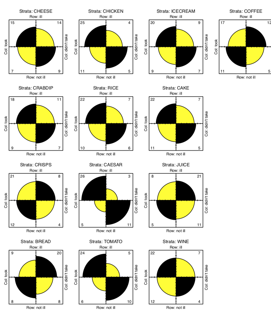 Figure 1.6.6.4.4 Association between food taken and illness.
(An apply() allows us not to write the code for the test 13 times. You may omit cbind() since it used only to make output prettier. There were multiple warnings, and we will return to them soon.)
The result is that two foods exhibit significant associations with illness—Caesar salad and tomatoes. The culprit is identified! Almost. After all, it is unlikely that both dishes were contaminated. Now we must try to determine what was the main cause of the food poisoning. We will return to this subject later.
Let us discuss one more detail. Above, we applied chi-squared test simultaneously several times. To account for multiple comparisons, we must adjust p-values, magnify them in accordance with the particular rule, for example, with widely known Bonferroni correction rule, or with (more reliable) Benjamini and Hochberg correction rule like in the following example:
Code 1.6.6.4.21 (R):
Now you know how to apply p-value corrections for multiple comparisons. Try to do this for our toxicity data. Maybe, it will help to identify the culprit?
The special case of chi-squared test is the goodness-of-fit test, or G-test. We will apply it to the famous data, results of Gregor Mendel first experiment. In this experiment, he crossed pea plants which grew out of round and angled seeds. When he counted seeds from the first generation of hybrids, he found that among 7,324 seeds, 5,474 were round and 1850 were angled. Mendel guessed that true ratio in this and six other experiments is 3:1[2]:
Code 1.6.6.4.22 (R):
Goodness-of-fit test uses the null that frequencies in the first argument (interpreted as one-dimensional contingency table) are not different from probabilities in the second argument. Therefore, 3:1 ratio is statistically supported. As you might note, it is not radically different from the proportion test explained in the previous chapter.
Without p parameter, G-test simply checks if probabilities are equal. Let us check, for example, if numbers of species in supergroups of living organisms on Earth are equal:
Code 1.6.6.4.23 (R):
Naturally, numbers of species are not equal between supergroups. Some of them like bacteria (supergroup Monera) have surprisingly low number of species, others like insects (supergroup Ecdysozoa)—really large number (Figure 1.6.6.4.5).
Chi-squared test works well when the number of cases per cell is more then 5. If there are less cases, R gives at least three workarounds.
First, instead of p-value estimated from the theoretical distribution, there is a way to calculate it directly, with Fisher exact test. Tea drinker table contains less then 5 cases per cell so it is a good example:
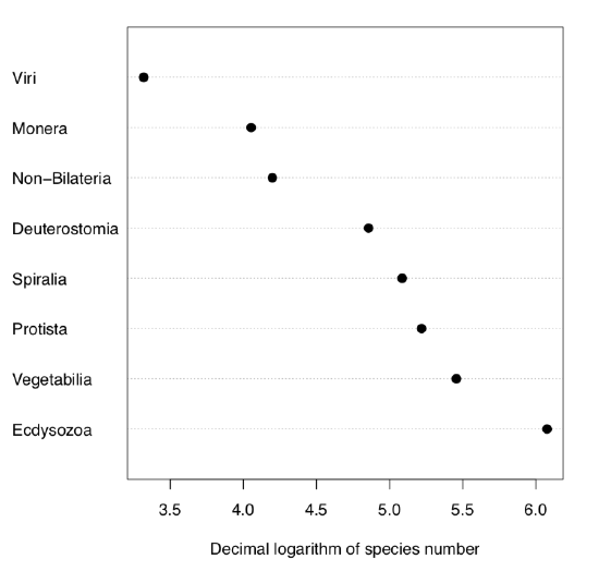 Figure 1.6.6.4.5 Numbers of species in supergroups of living organisms.
Code 1.6.6.4.24 (R):
Fisher test checks the null if odds ratio is just one. Although in this case, calculation gives odds ratio (3:1)/(1:3)=9, there are only 8 observations, and confidence interval still includes one. Therefore, contrary to the first impression, the test does not support the idea that aforementioned woman is a good guesser.
Fourfold plot (please check it yourself) gives the similar result:
Code 1.6.6.4.25 (R):
While there is apparent difference between diagonals, confidence rings significantly intersect.
Fisher test is computationally intensive so it is not recommended to use it for large number of cases.
The second workaround is the Yates continuity correction which in R is default for chi-squared test on 22 tables. We use now data from the original Yates (1934)[3] publication, data is taken from study of the influence of breast and artificial feeding on teeth formation:
Code 1.6.6.4.26 (R):
(Note the warning in the end.)
Yates correction is not a default for the summary.table() function:
Code 1.6.6.4.27 (R):
(Note different p-value: this is an effect of no correction. For all other kind of tables (e.g., non 2×2), results of chisq.test() and summary.table() should be similar.)
The third way is to simulate chi-squared test p-value with replication:
Code 1.6.6.4.28 (R):
(Note that since this algorithm is based on random procedure, p-values might differ.)
How to calculate an effect size for the association of categorical variables? One of them is odds ratio from the Fisher test (see above). There are also several different effect size measures changing from 0 (no association) to (theoretically) 1 (which is an extremely strong association). If you do not want to use external packages, one of them, ϕ coefficient is easy to calculate from the χ-squared statistic.
Code 1.6.6.4.29 (R):
Φ coefficient works only for two binary variables. If variables are not binary, there are Tschuprow’s T and Cramer’s V coefficients. Now it is better to use the external code from the asmisc.r distributing with this book:
Code 1.6.6.4.30 (R):
R package vcd has function assocstats() which calculates odds ratio, ϕ, Cramer’s V and several other effect measures.
In the open repository, file cochlearia.txt contains measurements of morphological characters in several populations (locations) of scurvy-grass, Cochlearia. One of characters, binary IS.CREEPING reflects the plant life form: creeping or upright stem. Please check if numbers of creeping plants are different between locations, provide effect sizes and p-values.
There are many table tests. For example, test of proportions from the previous chapter could be easily extended for two samples and therefore could be used as a table test. There is also mcnemar.test() which is used to compare proportions when they belong to same objects (paired proportions). You might want to check the help (and especially examples) in order to understand how they work.
In the betula (see above) data, there are two binary characters: LOBES (position of lobes on the flower bract) and WINGS (the relative size of fruit wings). Please find if proportions of plants with 0 and 1 values of LOBES are different between location 1 and location 2.
Are proportions of LOBES and WING values different in the whole dataset?
The typical sequence of procedures related with analysis of tables is listed below:
- Check the phenomenon of association: table(), xtabs()
- Plot it first: mosaicplot(), spineplot(), assocplot()
- Decide is association is statistically significant: chisq.test(), fisher.test()
- Measure how strong is an association: VTCoeffs()
- Optionally, if there are more then two groups per case involved, run post hoc pairise tests with the appropriate correction: pairwise.Table2.test()
To conclude this “differences” chapter, here is the Table 1.6.6.4.1 which will guide the reader through most frequently used types of analysis. Please note also the much more detailed Table 6.1.1 in the appendix.
| Normal | Non-normal | ||
|---|---|---|---|
| measurement or ranked | nominal | ||
| =2 samples | Student’s test | Wilcoxon test | Chi-squared test (+ post-hoc test) |
| >2 samples |
ANOVA or one-way + some post hoc test |
Kruskall-Wallis + some post hoc test |
|
Table 1.6.6.4.1: Methods, most frequently used to analyze differences and patterns. This is the simplified variant of Table 6.1.1.
References
1. Fisher R.A. 1971. The design of experiments. 9th ed. P. 11.
2. Mendel G. 1866. Versuche über Pflanzen-Hybriden. Verhandlungen des naturforschenden Vereines in Brünn. Bd. 4, Abhandlungen: 12. http://biodiversitylibrary.org/page/40164750
3. Yates F. 1934. Contingency tables involving small numbers and the x2 test. Journal of the Royal Statistical Society. 1(2): 217–235.


