1.6.7.2: Analysis of regression
- Page ID
- 32648
\( \newcommand{\vecs}[1]{\overset { \scriptstyle \rightharpoonup} {\mathbf{#1}} } \)
\( \newcommand{\vecd}[1]{\overset{-\!-\!\rightharpoonup}{\vphantom{a}\smash {#1}}} \)
\( \newcommand{\dsum}{\displaystyle\sum\limits} \)
\( \newcommand{\dint}{\displaystyle\int\limits} \)
\( \newcommand{\dlim}{\displaystyle\lim\limits} \)
\( \newcommand{\id}{\mathrm{id}}\) \( \newcommand{\Span}{\mathrm{span}}\)
( \newcommand{\kernel}{\mathrm{null}\,}\) \( \newcommand{\range}{\mathrm{range}\,}\)
\( \newcommand{\RealPart}{\mathrm{Re}}\) \( \newcommand{\ImaginaryPart}{\mathrm{Im}}\)
\( \newcommand{\Argument}{\mathrm{Arg}}\) \( \newcommand{\norm}[1]{\| #1 \|}\)
\( \newcommand{\inner}[2]{\langle #1, #2 \rangle}\)
\( \newcommand{\Span}{\mathrm{span}}\)
\( \newcommand{\id}{\mathrm{id}}\)
\( \newcommand{\Span}{\mathrm{span}}\)
\( \newcommand{\kernel}{\mathrm{null}\,}\)
\( \newcommand{\range}{\mathrm{range}\,}\)
\( \newcommand{\RealPart}{\mathrm{Re}}\)
\( \newcommand{\ImaginaryPart}{\mathrm{Im}}\)
\( \newcommand{\Argument}{\mathrm{Arg}}\)
\( \newcommand{\norm}[1]{\| #1 \|}\)
\( \newcommand{\inner}[2]{\langle #1, #2 \rangle}\)
\( \newcommand{\Span}{\mathrm{span}}\) \( \newcommand{\AA}{\unicode[.8,0]{x212B}}\)
\( \newcommand{\vectorA}[1]{\vec{#1}} % arrow\)
\( \newcommand{\vectorAt}[1]{\vec{\text{#1}}} % arrow\)
\( \newcommand{\vectorB}[1]{\overset { \scriptstyle \rightharpoonup} {\mathbf{#1}} } \)
\( \newcommand{\vectorC}[1]{\textbf{#1}} \)
\( \newcommand{\vectorD}[1]{\overrightarrow{#1}} \)
\( \newcommand{\vectorDt}[1]{\overrightarrow{\text{#1}}} \)
\( \newcommand{\vectE}[1]{\overset{-\!-\!\rightharpoonup}{\vphantom{a}\smash{\mathbf {#1}}}} \)
\( \newcommand{\vecs}[1]{\overset { \scriptstyle \rightharpoonup} {\mathbf{#1}} } \)
\(\newcommand{\longvect}{\overrightarrow}\)
\( \newcommand{\vecd}[1]{\overset{-\!-\!\rightharpoonup}{\vphantom{a}\smash {#1}}} \)
\(\newcommand{\avec}{\mathbf a}\) \(\newcommand{\bvec}{\mathbf b}\) \(\newcommand{\cvec}{\mathbf c}\) \(\newcommand{\dvec}{\mathbf d}\) \(\newcommand{\dtil}{\widetilde{\mathbf d}}\) \(\newcommand{\evec}{\mathbf e}\) \(\newcommand{\fvec}{\mathbf f}\) \(\newcommand{\nvec}{\mathbf n}\) \(\newcommand{\pvec}{\mathbf p}\) \(\newcommand{\qvec}{\mathbf q}\) \(\newcommand{\svec}{\mathbf s}\) \(\newcommand{\tvec}{\mathbf t}\) \(\newcommand{\uvec}{\mathbf u}\) \(\newcommand{\vvec}{\mathbf v}\) \(\newcommand{\wvec}{\mathbf w}\) \(\newcommand{\xvec}{\mathbf x}\) \(\newcommand{\yvec}{\mathbf y}\) \(\newcommand{\zvec}{\mathbf z}\) \(\newcommand{\rvec}{\mathbf r}\) \(\newcommand{\mvec}{\mathbf m}\) \(\newcommand{\zerovec}{\mathbf 0}\) \(\newcommand{\onevec}{\mathbf 1}\) \(\newcommand{\real}{\mathbb R}\) \(\newcommand{\twovec}[2]{\left[\begin{array}{r}#1 \\ #2 \end{array}\right]}\) \(\newcommand{\ctwovec}[2]{\left[\begin{array}{c}#1 \\ #2 \end{array}\right]}\) \(\newcommand{\threevec}[3]{\left[\begin{array}{r}#1 \\ #2 \\ #3 \end{array}\right]}\) \(\newcommand{\cthreevec}[3]{\left[\begin{array}{c}#1 \\ #2 \\ #3 \end{array}\right]}\) \(\newcommand{\fourvec}[4]{\left[\begin{array}{r}#1 \\ #2 \\ #3 \\ #4 \end{array}\right]}\) \(\newcommand{\cfourvec}[4]{\left[\begin{array}{c}#1 \\ #2 \\ #3 \\ #4 \end{array}\right]}\) \(\newcommand{\fivevec}[5]{\left[\begin{array}{r}#1 \\ #2 \\ #3 \\ #4 \\ #5 \\ \end{array}\right]}\) \(\newcommand{\cfivevec}[5]{\left[\begin{array}{c}#1 \\ #2 \\ #3 \\ #4 \\ #5 \\ \end{array}\right]}\) \(\newcommand{\mattwo}[4]{\left[\begin{array}{rr}#1 \amp #2 \\ #3 \amp #4 \\ \end{array}\right]}\) \(\newcommand{\laspan}[1]{\text{Span}\{#1\}}\) \(\newcommand{\bcal}{\cal B}\) \(\newcommand{\ccal}{\cal C}\) \(\newcommand{\scal}{\cal S}\) \(\newcommand{\wcal}{\cal W}\) \(\newcommand{\ecal}{\cal E}\) \(\newcommand{\coords}[2]{\left\{#1\right\}_{#2}}\) \(\newcommand{\gray}[1]{\color{gray}{#1}}\) \(\newcommand{\lgray}[1]{\color{lightgray}{#1}}\) \(\newcommand{\rank}{\operatorname{rank}}\) \(\newcommand{\row}{\text{Row}}\) \(\newcommand{\col}{\text{Col}}\) \(\renewcommand{\row}{\text{Row}}\) \(\newcommand{\nul}{\text{Nul}}\) \(\newcommand{\var}{\text{Var}}\) \(\newcommand{\corr}{\text{corr}}\) \(\newcommand{\len}[1]{\left|#1\right|}\) \(\newcommand{\bbar}{\overline{\bvec}}\) \(\newcommand{\bhat}{\widehat{\bvec}}\) \(\newcommand{\bperp}{\bvec^\perp}\) \(\newcommand{\xhat}{\widehat{\xvec}}\) \(\newcommand{\vhat}{\widehat{\vvec}}\) \(\newcommand{\uhat}{\widehat{\uvec}}\) \(\newcommand{\what}{\widehat{\wvec}}\) \(\newcommand{\Sighat}{\widehat{\Sigma}}\) \(\newcommand{\lt}{<}\) \(\newcommand{\gt}{>}\) \(\newcommand{\amp}{&}\) \(\definecolor{fillinmathshade}{gray}{0.9}\)Single line
Analysis of correlation allows to determine if variables are dependent and calculate the strength and sign of the dependence. However, if the goal is to understand the other features of dependence (like direction), and, even more important, predict (extrapolate) results (Figure \(\PageIndex{1}\)) we need another kind of analysis, the analysis of regression.
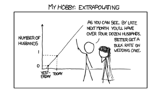 Figure \(\PageIndex{1}\) Extrapolation (taken from XKCD, http://xkcd.com/605/).
It gives much more information on the relationship, but requires us to assign variables beforehand to one of two categories: influence (predictor) or response. This approach is rooted in the nature of the data: for example, we may use air temperature to predict ice cream sales, but hardly the other way around.
The most well-known example is a simple linear regression:
\(\mbox{response} = \mbox{intercept} + \mbox{slope}\times\mbox{influence}\)
or, in R formula language, even simpler:
response ~ influence
That model estimates the average value of response if the value of influence is known (note that both effect and influence are measurement variables). The differences between observed and predicted values are model errors (or, better, residuals). The goal is to minimize residuals (Figure \(\PageIndex{3}\)); since residuals could be both positive and negative, it is typically done via squared values, this method is called least squares.
Ideally, residuals should have the normal distribution with zero mean and constant variance which is not dependent on effect and influence. In that case, residuals are homogeneous. In other cases, residuals could show heterogeneity. And if there is the dependence between residuals and influence, then most likely the overall model should be non-linear and therefore requires the other kind of analysis.
Linear regression model is based on the several assumptions:
- Linearity of the relationship. It means that for a unit change in influence, there should always be a corresponding change in effect. Units of change in response variable should retain the same size and sign throughout the range of influence.
- Normality of residuals. Please note that normality of data is not an assumption! However, if you want to get rid of most other assumptions, you might want to use other regression methods like LOESS.
- Homoscedasticity of residuals. Variability within residuals should remain constant across the whole range of influence, or else we could not predict the effect reliably.
The null hypothesis states that nothing in the variability of response is explained by the model. Numerically, R-squared coefficient is the the degree to which the variability of response is explained by the model, therefore null hypothesis is that R-squared equals zero, this approach uses F-statistics (Fisher’s statistics), like in ANOVA. There are also checks of additional null hypotheses that both intercept and slope are zeros. If all three p-values are smaller than the level of significance (0.05), the whole model is statistically significant.
Here is an example. The embedded women data contains observations on the height and weight of 15 women. We will try to understand the dependence between weight and height, graphically at first (Figure \(\PageIndex{2}\)):
Code \(\PageIndex{1}\) (R):
(Here we used function Cladd() which adds confidence bands to the plot\(^{[1]}\).)
Let us visualize residuals better (Figure \(\PageIndex{3}\)):
Code \(\PageIndex{2}\) (R):
To look on the results of model analysis, we can employ summary():
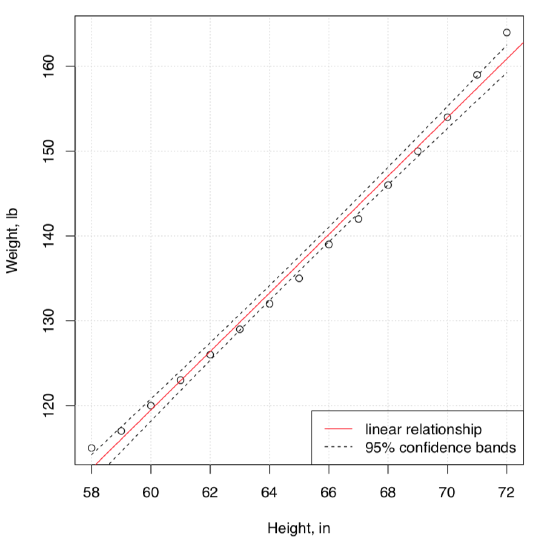 Figure \(\PageIndex{2}\) The relation between height and weight.
Code \(\PageIndex{3}\) (R):
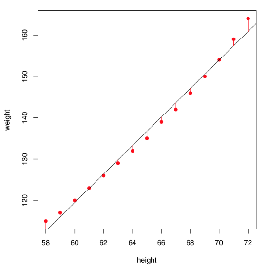 Figure \(\PageIndex{3}\) Residuals of the women weight vs. height linear model.
This long output is better to read from bottom to the top. We can say that:
- The significance of relation (reflected with R-squared) is high from the statistical point of view: F-statistics is \(1433\) with overall p-value: 1.091e-14.
- The R-squared (use Adjusted R-squared because this is better suited for the model) is really big, \(R^2 = 0.9903\). This means that almost all variation in response variable (weight) is explained by predictor (height).
R-squared is related with the coefficient of correlation and might be used as the measure of effect size. Since it is squared, high values start from 0.25:
Code \(\PageIndex{4}\) (R):
- Both coefficients are statistically different from zero, this might be seen via “stars” (like ***), and also via actual p-values Pr(>|t|): 1.71e-09 for intercept, and 1.09e-14 for height, which represents the slope.
To calculate slope in degrees, one might run:
Code \(\PageIndex{5}\) (R):
- Overall, our model is:
Weight (estimated) = -87.51667 + 3.45 * Height,
so if the height grows by 4 inches, the weight will grow on approximately 14 pounds.
- The maximal positive residual is \(3.1167\) lb, maximal negative is \(-1.7333\) lb.
- Half of residuals are quite close to the median (within approximately \(\pm1\) interval).
On the first glance, the model summary looks fine. However, before making any conclusions, we must also check assumptions of the model. The command plot(women.lm) returns four consecutive plots:
- First plot, residuals vs. fitted values, is most important. Ideally, it should show no structure (uniform variation and no trend); this satisfies both linearity and homoscedascicity assumptions.
- Unfortunately, women.lm model has an obvious trend which indicates non-linearity. Residuals are positive when fitted values are small, negative for fitted values in the mid-range, and positive again for large fitted values. Clearly, the first assumption of the linear regression analysis is violated.
Code \(\PageIndex{6}\) (R):
- To understand residuals vs. fitted plots better, please run the following code yourself and look on the resulted plots:
- On the the next plot, standardized residuals do not follow the normal line perfectly (see the explanation of the QQ plot in the previous chapter), but they are “good enough”. To review different variants of these plots, run the following code yourself:
Code \(\PageIndex{7}\) (R):
- Test for the normality should also work:
Code \(\PageIndex{8}\) (R):
- The third, Scale-Location plot, is similar to the residuals vs. fitted, but instead of “raw” residuals it uses the square roots of their standardized values. It is also used to reveal trends in the magnitudes of residuals. In a good model, these values should be more or less randomly distributed.
- Finally, the last plot demonstrates which values exert most influence over the final shape of the model. Here the two values with most leverage are the first and the last measurements, those, in fact, that stay furtherest away from linearity.
(If you need to know more about summary and plotting of linear models, check help pages with commands ?summary.lm and ?plot.lm. By the way, as ANOVA has many similarities to the linear model analysis, in R you can run same diagnostic plots for any ANOVA model.)
Now it is clear that our first linear model does not work well for our data which is likely non-linear. While there are many non-linear regression methods, let us modify it first in a more simple way to introduce non-linearity. One of simple ways is to add the cubed term, because weight relates with volume, and volume is a cube of linear sizes:
Code \(\PageIndex{9}\) (R):
(Function I() was used to tell R that height^3 is arithmetical operation and not the part of model formula.)
The quick look on the residuals vs. fitted plot (Figure \(\PageIndex{4}\)) shows that this second model fits much better! Confidence bands and predicted line are also look more appropriate :
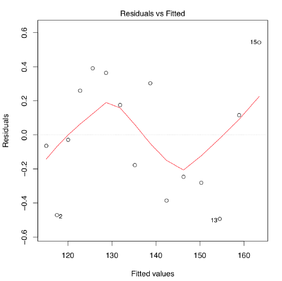 Figure \(\PageIndex{4}\) Residuals vs. fitted plot for the women height/weight model with the cubed term.
You may want also to see the confidence intervals for linear model parameters. For that purpose, use confint(women.lm).
Another example is from egg data studied graphically in the second chapter (Figure 2.9.1). Does the length of the egg linearly relate with with of the egg?
Code \(\PageIndex{10}\) (R):
We can analyze the assumptions first:
Code \(\PageIndex{11}\) (R):
The most important, residuals vs. fitted is not perfect but could be considered as “good enough” (please check it yourself): there is no obvious trend, and residuals seem to be more or less equally spread (homoscedasticity is fulfilled). Distribution of residuals is close to normal. Now we can interpret the model summary:
Code \(\PageIndex{12}\) (R):
Significance of the slope means that the line is definitely slanted (this is actually what is called “relation” in common language). However, intercept is not significantly different from zero:
Code \(\PageIndex{13}\) (R):
(Confidence interval for intercept includes zero.)
To check the magnitude of effect size, one can use:
Code \(\PageIndex{14}\) (R):
This is a really large effect.
Third example is based on a simple idea to check if the success in multiple choice test depends on time spent with it. Data presents in exams.txt file which contains results of two multiple choice tests in a large class:
Code \(\PageIndex{15}\) (R):
First variable is the number of test, two others are order of finishing the work, and resulted number of points (out of 50). We assume here that the order reflects the time spent on test. Select one of two exams:
Code \(\PageIndex{16}\) (R):
... and plot it first (please check this plot yourself):
Code \(\PageIndex{17}\) (R):
Well, no visible relation occurs. Now we approach it inferentially:
Code \(\PageIndex{18}\) (R):
As usual, this output is read from bottom to the top. First, statistical significance of the relation is absent, and relation (adjusted R-squared) itself is almost zero. Even if intercept is significant, slope is not and therefore could easily be zero. There is no relation between time spent and result of the test.
To double check if the linear model approach was at all applicable in this case, run diagnostic plots yourself:
Code \(\PageIndex{19}\) (R):
And as the final touch, try the regression line and confidence bands:
Code \(\PageIndex{20}\) (R):
Almost horizontal—no relation. It is also interesting to check if the other exam went the same way. Please find out yourself.
). Please find which morphological measurement characters are most correlated, and check the linear model of their relationships.
) plant. Please find which pair of morphological characters is most correlated and analyze the linear model which includes these characters. Also, check if length of leaf is different between the three biggest populations of sundew.
As the linear models and ANOVA have many in common, there is no problem in the analysis of multiple groups with the default linear regression methods. Consider our ANOVA data:
Code \(\PageIndex{21}\) (R):
This example shows few additional “tricks”. First, this is how to analyze several response variables at once. This is applicable also to aov()—try it yourself.
Next, it shows how to re-level factor putting one of proximal levels first. That helps to compare coefficients. In our case, it shows that blonds do not differ from browns by weight. Note that “intercepts” here have no clear relation with plotting linear relationships.
It is also easy to calculate the effect size because R-squared is the effect size.
Last but not least, please check assumptions of the linear model with plot(lm(...)). At the moment in R, this works only for singular response.
Is there the linear relation between the weight and height in our ANOVA hwc data?
Many lines
Sometimes, there is a need to analyze not just linear relationships between variables, but to answer second order question: compare several regression lines.
In formula language, this is described as
response ~ influence * factor
where factor is a categorical variable responsible for the distinction between regression lines, and star (*) indicates that we are simultaneously checking (1) response from influence (predictor), (2) response from factor and (3) response from interaction between influence and factor.
This kind of analysis is frequently called ANCOVA, “ANalysis of COVAriation”. The ANCOVA will check if there is any difference between intercept and slope of the first regression line and intercepts and slopes of all other regression lines where each line corresponds with one factor level.
Let us start from the example borrowed from M.J. Crawley’s “R Book”. 40 plants were treated in two groups: grazed (in first two weeks of the cultivation) and not grazed. Rootstock diameter was also measured. At the end of season, dry fruit production was measured from both groups. First, we analyze the data graphically:
Code \(\PageIndex{22}\) (R):
As it is seen on the plot (Figure \(\PageIndex{5}\)), regression lines for grazed and non-grazed plants are likely different. Now to the ANCOVA model:
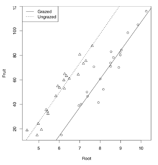 Figure \(\PageIndex{5}\) Grazed vs. non-grazed plants: linear models.
Code \(\PageIndex{23}\) (R):
Model output is similar to the linear model but one more term is present. This term indicated interaction which labeled with colon. Since Grazing factor has two level arranged alphabetically, first level (Grazed) used as default and therefore (Intercept) belongs to grazed plants group. The intercept of non-grazed group is labeled as GrazingUngrazed. In fact, this is not even an intercept but difference between intercept of non-grazed group and intercept of grazed group. Analogously, slope for grazed is labeled as Root, and difference between slopes of non-grazed and grazed labeled as Root:GrazingUngrazed. This difference is interaction, or how grazing affects the shape of relation between rootstock size and fruit weight. To convert this output into regression formulas, some calculation will be needed:
Fruit = -125.174 + 23.24 * Root (grazed) Fruit = (-125.174 + 30.806) + (23.24 + 0.756) * Root (non-grazed)
Note that difference between slopes is not significant. Therefore, interaction could be ignored. Let us check if this is true:
Code \(\PageIndex{24}\) (R):
First, we updated our first model by removing the interaction term. This is the additive model. Then summary() told us that all coefficients are now significant (check its output yourself). This is definitely better. Finally, we employed AIC (Akaike’s Information Criterion). AIC came from the theory of information and typically reflects the entropy, in other words, adequacy of the model. The smaller is AIC, the better is a model. Then the second model is the unmistakable winner.
By the way, we could specify the same additive model using plus sign instead of star in the model formula.
What will the AIC tell about our previous example, women data models?
Code \(\PageIndex{25}\) (R):
Again, the second model (with the cubed term) is better.
It is well known that in the analysis of voting results, dependence between attendance and the number of people voted for the particular candidate, plays a great role. It is possible, for example, to elucidate if elections were falsified. Here we will use the elections.txt data file containing voting results for three different Russian parties in more than 100 districts:
Code \(\PageIndex{26}\) (R):
To simplify typing, we will attach() the data frame (if you do the same, do not forget to detach() it at the end) and calculate proportions of voters and the overall attendance:
Code \(\PageIndex{27}\) (R):
Now we will look on the dependence between attendance and voting graphically (Figure \(\PageIndex{6}\)):
Code \(\PageIndex{28}\) (R):
So the third party had a voting process which was suspiciously different from voting processes for two other parties. It was clear even from the graphical analysis but we might want to test it inferentially, using ANCOVA:
Code \(\PageIndex{29}\) (R):
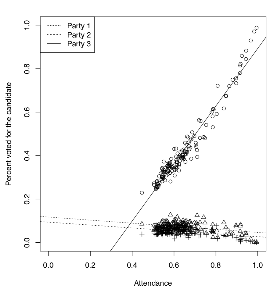 Figure \(\PageIndex{6}\) Voting results vs. attendance for every party.
(Here we created and checked the new data frame. In elections2, all variables are now stack()’ed in two columns, and the third column contains the party code.)
Code \(\PageIndex{30}\) (R):
Here (Intercept) belongs specifically to the model for first party. Its p-value indicates if it differs significantly from zero. Second coefficient, atten, belongs to the continuous predictor, attendance. It is not an intercept but slope of a regression. It is also compared to zero.
Next four rows represent differences from the first party, two for intercepts and two for slopes (this is the traditional way to structure output in R). Last two items represent interactions. We were most interested if there is an interaction between attendance and voting for the third party, this interaction is common in case of falsifications and our results support this idea.
(Figure \(\PageIndex{7}\), phenomenon when in each population there are mostly two types of plants: with flowers bearing long stamens and short style, and with flowers bearing long style and short stamens. It was proved that heterostyly helps in pollination. Please check if the linear dependencies between lengths of style and stamens are different in these two species. Find also which model is better, full (multiplicative, with interactions) or reduced (additive, without interactions).
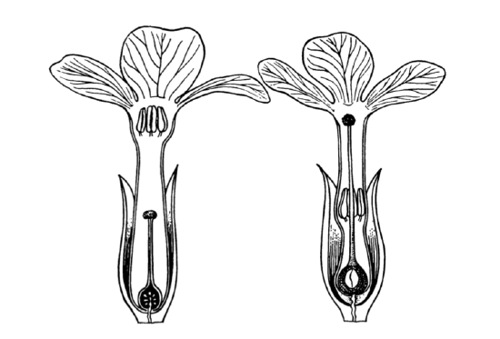
Figure \(\PageIndex{7}\) Heterostyly in primroses: flowers from the different plants of one population.
More then one way, again
Armed with the knowledge about AIC, multiplicative and additive models, we can return now to the ANOVA two-way layouts, briefly mentioned before. Consider the following example:
Code \(\PageIndex{31}\) (R):
(To start, we converted dose into factor. Otherwise, our model will be ANCOVA instead of ANOVA.)
Assumptions met, now the core analysis:
Code \(\PageIndex{32}\) (R):
Now we see what was already visible on the interaction plot (Figure 5.3.4: model with interactions is better, and significant are all three terms: dose, supplement, and interaction between them.
Effect size is really high:
Code \(\PageIndex{33}\) (R):
Post hoc tests are typically more dangerous in two-way analysis, simply because there are much more comparisons. However, it is possible to run TukeyHSD():
Code \(\PageIndex{34}\) (R):
The rest of comparisons is here omitted, but TukeyHSD() has plotting method allowing to plot the single or last element (Figure 6.3.1):
Code \(\PageIndex{35}\) (R):
References
1. Function Cladd() is applicable only to simple linear models. If you want confidence bands in more complex cases, check the Cladd() code to see what it does exactly.


