1.6.7.1: Analysis of Correlation
( \newcommand{\kernel}{\mathrm{null}\,}\)
To start with relationships, one need first to find a correlation, e.g., to measure the extent and sign of relation, and to prove if this is statistically reliable.
Note that correlation does not reflect the nature of relationship (Figure 1.6.7.1.1). If we find a significant correlation between variables, this could mean that A depends on B, B depends on A, A and B depend on each other, or A and B depend on a third variable C but have no relation to each other. A famous example is the correlation between ice cream sales and home fires. It would be strange to suggest that eating ice cream causes people to start fires, or that experiencing fires causes people to buy ice cream. In fact, both of these parameters depend on air temperature[1].
 Figure 1.6.7.1.1 Correlation and causation (taken from XKCD, http://xkcd.com/552/).
Numbers alone could be misleading, so there is a simple rule: plot it first.
Plot it first
The most striking example of relationships where numbers alone do to provide a reliable answer, is the Anscombe’s quartet, four sets of two variables which have almost identical means and standard deviations:
Code 1.6.7.1.1 (R):
(Data anscombe is embedded into R. To compact input and output, several tricks were used. Please find them yourself.)
Linear model coefficients (see below) are also quite similar but if we plot these data, the picture (Figure 1.6.7.1.2) is radically different from what is reflected in numbers:
Code 1.6.7.1.2 (R):
(For aesthetic purposes, we put all four plots on the same figure. Note the for operator which produces cycle repeating one sequence of commands four times. To know more, check ?"for".)
To the credit of nonparametric and/or robust numerical methods, they are not so easy to deceive:
Code 1.6.7.1.3 (R):
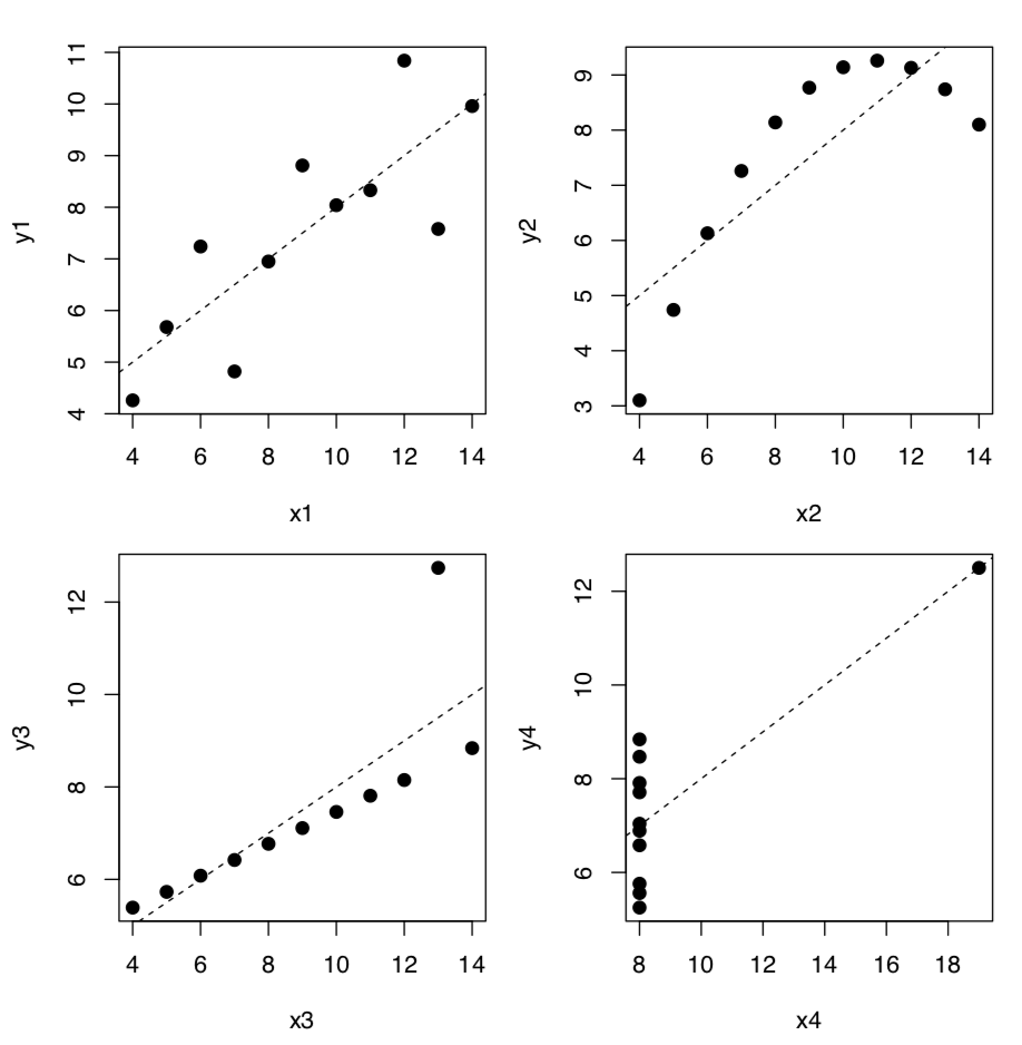 Figure 1.6.7.1.2 Anscombe’s quartet, plotted together with lines from linear models.
This is correct to guess that boxplots should also show the difference. Please try to plot them yourself.
Correlation
To measure the extent and sign of linear relationship, we need to calculate correlation coefficient. The absolute value of the correlation coefficient varies from 0 to 1. Zero means that the values of one variable are unconnected with the values of the other variable. A correlation coefficient of 1 or −1 is an evidence of a linear relationship between two variables. A positive value of means the correlation is positive (the higher the value of one variable, the higher the value of the other), while negative values mean the correlation is negative (the higher the value of one, the lower of the other).
It is easy to calculate correlation coefficient in R:
Code 1.6.7.1.4 (R):
(By default, R calculates the parametric Pearson correlation coefficient r.)
In the simplest case, it is given two arguments (vectors of equal length). It can also be called with one argument if using a matrix or data frame. In this case, the function cor() calculates a correlation matrix, composed of correlation coefficients between all pairs of data columns.
Code 1.6.7.1.5 (R):
As correlation is in fact the effect size of covariance, joint variation of two variables, to calculate it manually, one needs to know individual variances and variance of the difference between variables:
Code 1.6.7.1.6 (R):
Another way is to use cov() function which calculates covariance directly:
Code 1.6.7.1.7 (R):
To interpret correlation coefficient values, we can use either symnum() or Topm() functions (see below), or Mag() together with apply():
Code 1.6.7.1.8 (R):
If the numbers of observations in the columns are unequal (some columns have missing data), the parameter use becomes important. Default is everything which returns NA whenever there are any missing values in a dataset. If the parameter use is set to complete.obs, observations with missing data are automatically excluded. Sometimes, missing data values are so dispersed that complete.obs will not leave much of it. In that last case, use pairwise.complete.obs which removes missing values pair by pair.
Pearson’s parametric correlation coefficients characteristically fail with the Anscombe’s data:
Code 1.6.7.1.9 (R):
To overcome the problem, one can use Spearman’s ρ (“rho”, or rank correlation coefficient) which is most frequently used nonparametric correlation coefficient:
Code 1.6.7.1.10 (R):
(Spearman’s correlation is definitely more robust!)
The third kind of correlation coefficient in R is nonparametric Kendall’s τ (“tau”):
Code 1.6.7.1.11 (R):
It is often used to measure association between two ranked or binary variables, i.e. as an alternative to effect sizes of the association in contingency tables.
How to check if correlation is statistically significant? As a null hypothesis, we could accept that correlation coefficient is equal to zero (no correlation). If the null is rejected, then correlation is significant:
Code 1.6.7.1.12 (R):
The logic of cor.test() is the same as in tests before (Table 5.1.1, Figure 5.1.1). In terms of p-value:
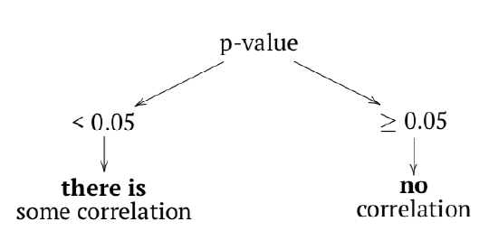
The probability of obtaining the test statistic (correlation coefficient), given the initial assumption of zero correlation between the data is very low—about 0.3%. We would reject H0 and therefore accept an alternative hypothesis that correlation between variables is present. Please note the confidence interval, it indicates here that the true value of the coefficient lies between 0.2 and 0.7. with 95% probability.
It is not always easy to read the big correlation table, like in the following example of longley macroeconomic data. Fortunately, there are several workarounds, for example, the symnum() function which replaces numbers with letters or symbols in accordance to their value:
Code 1.6.7.1.13 (R):
The second way is to represent the correlation matrix with a plot. For example, we may use the heatmap: split everything from −1 to +1 into equal intervals, assign the color for each interval and show these colors (Figure 1.6.7.1.3):
Code 1.6.7.1.14 (R):
(We shortened here long names with the abbreviate() command.)
The other interesting way of representing correlations are correlation ellipses (from ellipse package). In that case, correlation coefficients are shown as variously compressed ellipses; when coefficient is close to −1 or +1, ellipse is more narrow (Figure 1.6.7.1.4). The slope of ellipse represents the sign of correlation (negative or positive):
Code 1.6.7.1.15 (R):
Several useful ways to visualize and analyze correlations present in the asmisc.r file supplied with this book:
Code 1.6.7.1.16 (R):
We calculated here Kendall’s correlation coefficient for the binary toxicity data to make the picture used on the title page. Pleiad() not only showed (Figure 1.6.7.1.5) that illness is associated with tomato and Caesar salad, but also found two other correlation pleiads: coffee/rice and crab dip/crisps. (By the way, pleiads show one more application of R: analysis of networks.)
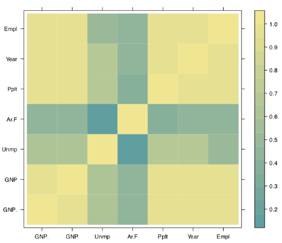 Figure 1.6.7.1.3 Heatmap: graphical representation of the correlation matrix.
Function Cor() outputs correlation matrix together with asterisks for the significant correlation tests:
Code 1.6.7.1.17 (R):
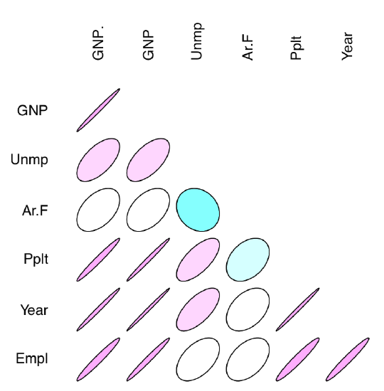 Figure 1.6.7.1.4 Correlation coefficients as ellipses.
Finally, function Topm() shows largest correlations by rows:
Code 1.6.7.1.18 (R):
Data file traits.txt contains results of the survey where most genetically apparent human phenotype characters were recorded from many individuals. Explanation of these characters are in trait_c.txt file. Please analyze this data with correlation methods.
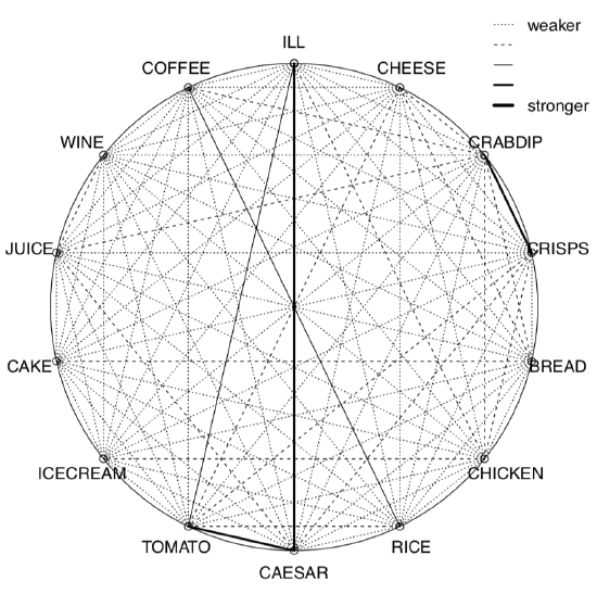 Figure 1.6.7.1.5 Correlation pleiads for the toxicity data.
References
1. There are, however, advanced techniques with the goal to understand the difference between causation and correlation: for example, those implemented in bnlearn package.

