
2.3: Other Charts

( \newcommand{\kernel}{\mathrm{null}\,}\)
Frequency and relative frequency distribution tables along with (relative) frequency bar plots and histograms are considered the basic visual summaries of data as they can be constructed for any type of data and essentially provide all the information one may need to know about the given data. However, statisticians continue to invent ways to display data. Next, we will discuss some other less common ways used to visually summarize the data.
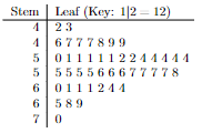
One method, developed in the 1960s by the late Professor John Tukey of Princeton University, is called a stem-and-leaf diagram, or stemplot. Let’s consider again the ages of the presidents at the time of their inauguration. We are going to construct the stem-and-leaf diagram by first constructing a stem - the list the first digits of all possible ages and then drawing the leaves one for each president’s age.

Once the diagram is complete, we can sort the values in each branch in increasing order:

When the branches are too long, we can split the branches by assigning a portion of the branch in this case values from 0-4 to one half and the values from 5-9 to the other half:
To construct a stem-and-leaf diagram:
- Think of each observation as a stem—consisting of all but the rightmost digit—and a leaf, the rightmost digit.
- Write the stems from smallest to largest in a vertical column to the left of a vertical rule.
- Write each leaf to the right of the vertical rule in the row that contains the appropriate stem.
- (Optional) Arrange the leaves in each row in ascending order.
- (Optional) Split the stems.
This ingenious diagram is often easier to construct than either a frequency distribution or a histogram and generally displays more information.
Here are a few tips to consider before making a stem-and-leaf diagram also known as a stemplot:
- Stemplots do not work well for large data sets, where each stem must hold a large number of leaves.
- There is no magic number of stems to use, but five is a good minimum. Too few or too many stems will make it difficult to see the distribution’s shape.
- If you split stems, be sure that each stem is assigned an equal number of possible leaf digits (two stems, each with five possible leaves; or five stems, each with two possible leaves).
- You can get more flexibility by rounding the data so that the final digit after rounding is suitable as a leaf. Do this when the data has too many digits. For example, in reporting teachers’ salaries, using all five digits (for example, $42,549) would be unreasonable. It would be better to round to the nearest thousand and use 4 as a stem and 3 as a leaf.
Alternatively, we can use another type of graphical display for quantitative data called the dot plot.

To Construct a Dot Plot:
- Draw a horizontal axis that displays the possible values of the quantitative data.
- Record each observation by placing a dot over the appropriate value on the horizontal axis.
- Label the horizontal axis with the name of the variable.
Dot plots are particularly useful for showing the relative positions of the data in a data set or for comparing two or more data sets.
Why bother with learning different ways to summarize data?
- The advantage of dot plots and stem-and-leaf plots is that both of them can be constructed as the data being collected, that is we do not need to have access to the entire data set to start visualizing it.
- To compare two populations side-by-side we can use a back-to-back stem-and-leaf plot by drawing a stem and adding leaves for one population on one side and for the other population on the other side. We can also use the dot plot in the same way by drawing the dots for one population above the x-axis and for the other population below the x-axis.
As an alternative to drawing the vertical bars in histograms we can mark the frequencies with a point and then connect the points with lines.

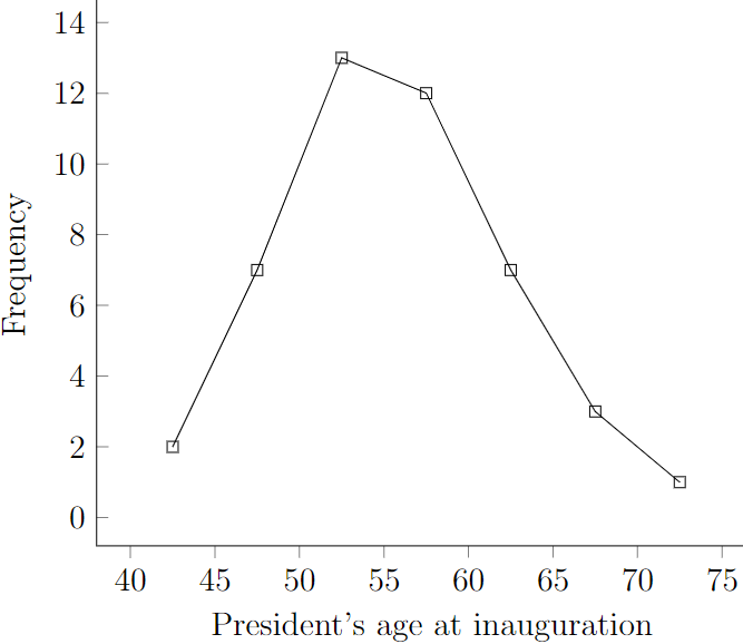
Such a summary is called a frequency polygon. As an alternative it can be used to save ink in your printer!
Another common way to organize the data is to use a cumulative frequency. A cumulative frequency of a class is obtained by summing the frequencies of all classes representing values less than the upper limit of the given class. The last entry in the cumulative frequency column must be equal to the total number of observations.
|
Classes |
Midpoint |
Frequency |
Cumulative Frequency |
|---|---|---|---|
|
40 to 45 |
42.5 |
2 |
2 |
|
45 to 50 |
47.5 |
7 |
2+7=9 |
|
50 to 55 |
52.5 |
13 |
2+7+13=22 |
|
55 to 60 |
57.5 |
12 |
2+7+13+12=34 |
|
60 to 65 |
62.5 |
7 |
2+7+13+12+7=41 |
|
65 to 70 |
67.5 |
3 |
2+7+13+12+7+3=44 |
|
70 to 75 |
72.5 |
1 |
2+7+13+12+7+3+1=45 |
|
Total: |
45 |
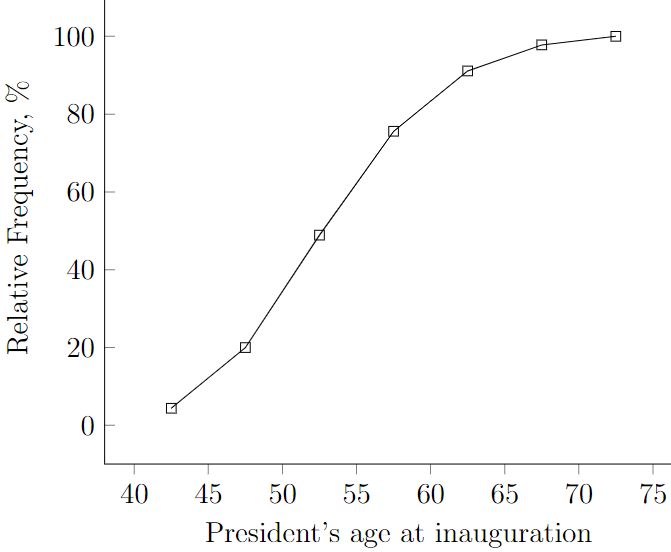
A cumulative frequency polygon that is constructed using the midpoints on the horizontal axis and the cumulative frequency on the vertical axis is called ogive.
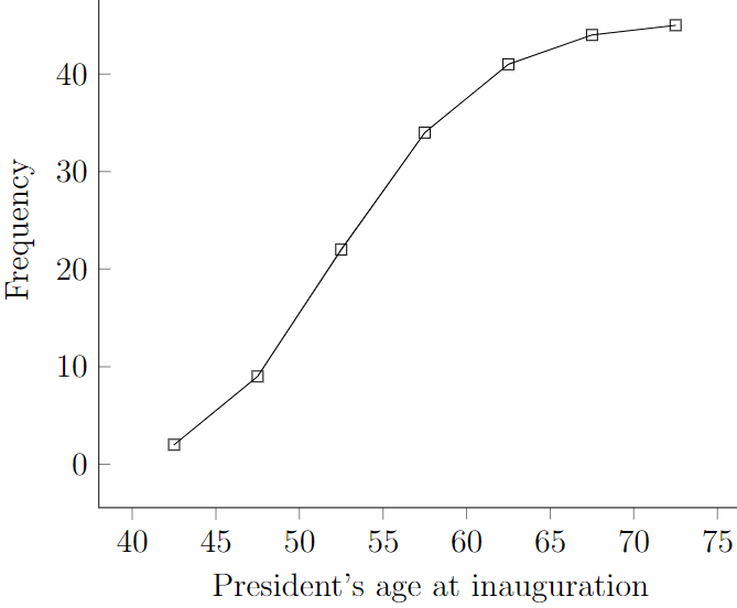
We can easily do the same with relative cumulative frequencies. First construct the cumulative relative frequency table:
|
Classes |
Midpoint |
Cumulative Frequency |
Relative Cumulative Frequency |
|---|---|---|---|
|
40 to 45 |
42.5 |
2 |
2/45=0.044 |
|
45 to 50 |
47.5 |
9 |
9/45=0.200 |
|
50 to 55 |
52.5 |
22 |
22/45=0.489 |
|
55 to 60 |
57.5 |
34 |
34/45=0.756 |
|
60 to 65 |
62.5 |
41 |
41/45=0.911 |
|
65 to 70 |
67.5 |
44 |
44/45=0.978 |
|
70 to 75 |
72.5 |
45 |
45/45=1.000 |
Then construct the cumulative relative frequency polygon, also known as ogive:
We discussed a variety of alternatives to the most basic visual summaries – frequency tables and histograms.