
1.8: R graphics

- Last updated
- Jun 24, 2019
- Save as PDF
( \newcommand{\kernel}{\mathrm{null}\,}\)
Graphical systems
One of the most valuable part of every statistical software is the ability to make diverse plots. R sets here almost a record. In the base, default installation, several dozens of plot types are already present, more are from recommended lattice package, and much more are in the external packages from CRAN where more than a half of them (several thousands!) is able to produce at least one unique type of plot. Therefore, there are several thousands plot types in R. But this is not all. All these plots could be enhanced by user! Here we will try to describe fundamental principles of R graphics.
Let us look on this example (Figure 1.8.1):
Code 1.8.1 (R)
(Curious reader will find here many things to experiment with. What, for example, is pch? Change its number in the second row and find out. What if you supply 20:1 instead of 1:20? Please discover and explain.)
Command plot() draws the basic plot whereas the legend() adds some details to the already drawn output. These commands represent two basic types of R plotting commands:
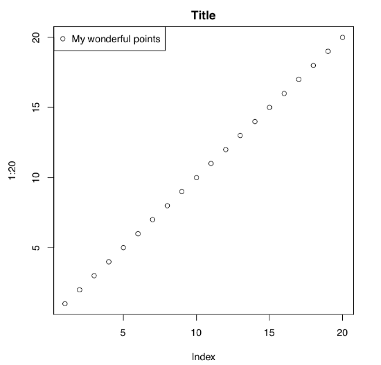 Figure 1.8.1 Example of the plot with title and legend.
- high-level commands which create new plot, and
- low-level commands which add features to the existing plot.
Consider the following example:
Code 1.8.2 (R)
(These commands make almost the same plot as above! Why? Please find out. And what is different?)
Note also that type argument of the plot() command has many values, and some produce interesting and potentially useful output. To know more, try p, l, c, s, h and b types; check also what example(plot) shows.
Naturally, the most important plotting command is the plot(). This is a “smart” command[1]. It means that plot() “understands” the type of the supplied object, and draws accordingly. For example, 1:20 is a sequence of numbers (numeric vector, see below for more explanation), and plot() “knows” that it requires dots with coordinates corresponding to their indices (x axis) and actual values (y axis). If you supply to the plot() something else, the result most likely would be different. Here is an example (Figure 1.8.2):
Code 1.8.3 (R)
Here commands of both types are here again, but they were issued in a slightly different way. cars is an embedded dataset (you may want to call ?cars which give you more information). This data is not a vector but data frame (sort of table) with two columns, speed and distance (actually, stopping distance). Function plot() chooses the scatterplot as a best way to represent this kind of data. On that scatterplot, x axis corresponds with the first column, and y axis—with the second.
We recommend to check what will happen if you supply the data frame with three columns (e.g., embedded trees data) or contingency table (like embedded Titanic or HairEyeColor data) to the plot().
There are innumerable ways to alter the plot. For example, this is a bit more fancy “twenty points”:
Code 1.8.4 (R)
(Please run this example yourself. What are col and pch? What will happen if you set pch=0? If you set col=0? Why?)
Sometimes, default R plots are considered to be “too laconic”. This is simply wrong. Plotting system in R is inherited from S where it was thoroughly developed on the base of systematic research made by W.S. Cleveland and others in Bell Labs. There were many experiments[2]. For example, in order to understand which plot types are easier to catch, they presented different plots and then asked to reproduce data numerically. The research resulted in recommendations of how to make graphic
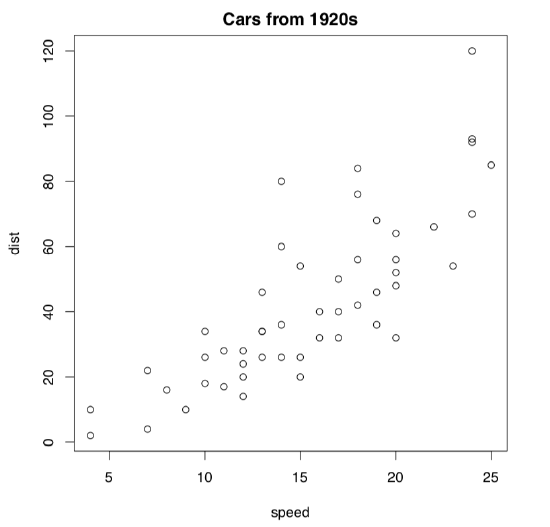 Figure 1.8.2 Example of plot showing cars data.
output more understandable and easy to read (please note that it is not always “more attractive”!)
In particular, they ended up with the conclusion that elementary graphical perception tasks should be arranged from easiest to hardest like: position along a scale → length → angle and slope → area → volume → color hue, color saturation and density. So it is easy to lie with statistics, if your plot employs perception tasks mostly from the right site of this sequence. (Do you see now why pie charts are particularly bad?)
They applied this paradigm to S and consequently, in R almost everything (point shapes, colors, axes labels, plotting size) in default plots is based on the idea of intelligible graphics. Moreover, even the order of point and color types represents the sequence from the most easily perceived to less easily perceived features.
Look on the plot from Figure 1.8.3. Guess how was it done, which commands were used?
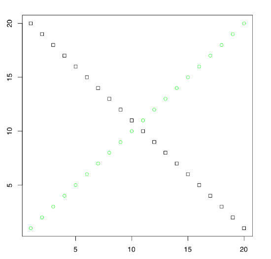 Figure 1.8.3 Exercise: which commands were used to make this plot?
Many packages extend the graphical capacities of R. Second well-known R graphical subsystem comes from the lattice package (Figure 1.8.4):
Code 1.8.5 (R)
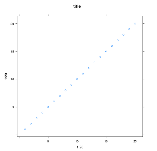 Figure 1.8.4 Example of plot with a title made with xyplot() command from lattice package.
(We repeated 1:20 twice and added tilde because xyplot() works slightly differently from the plot(). By default, lattice should be already installed in your system.[3])
Package lattice is by default already installed on your system. To know which packages are already installed, type library().
Next, below is what will happen with the same 1:20 data if we apply function qplot() from the third popular R graphic subsystem, ggplot2[4] package (Figure 1.8.5):
Code 1.8.6 (R)
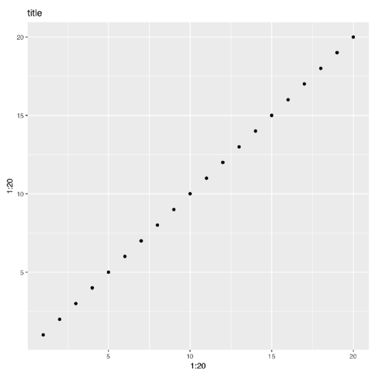 Figure 1.8.5 Example of plot with a title made with qplot() command from ggplot2 package.
We already mentioned above that library() command loads the package. But what if this package is absent in your installation? ggplot2 is not installed by default.
In that case, you will need to download it from Internet R archive (CRAN) and install. This could be done with install.packages("ggplot2") command (note plural in the command name and quotes in argument). During installation, you will be asked first about preferable Internet mirror (it is usually good idea to choose the first).
Then, you may be asked about local or system-wide installation (local one works in most cases).
Finally, R for Windows or macOS will simply unpack the downloaded archive whereas R on Linux will compile the package from source. This takes a bit more time and also could require some additional software to be installed. Actually, some packages want additional software regardless to the system.
Maximal length and maximal width of birds’ eggs are likely related. Please make a plot from eggs.txt data and confirm (or deny) this hypothesis. Explanations of characters are in companion eggs_c.txt file.
Graphical devices
This is the second important concept of R graphics. When you enter plot(), R opens screen graphical device and starts to draw there. If the next command is of the same type, R will erase the content of the device and start the new plot. If the next command is the “adding” one, like text(), R will add something to the existing plot. Finally, if the next command is dev.off(), R will close the device.
Most of times, you do not need to call screen devices explicitly. They will open automatically when you type any of main plotting commands (like plot()). However, sometimes you need more than one graphical window. In that case, open additional device with dev.new() command.
Apart from the screen device, there are many other graphical devices in R, and you will need to remember the most useful. They work as follows:
Code 1.8.7 (R)
png() command opens the graphical device with the same name, and you may apply some options specific to PNG, e.g., transparency (useful when you want to put the image on the Web page with some background). Then you type all your plotting commands without seeing the result because it is now redirected to PNG file connection. When you finally enter dev.off(), connection and device will close, and file with a name 01_20.png will appear in the working directory on disk. Note that R does it silently so if there was the file with the same name, it will be overwritten!
So saving plots in R is as simple as to put elephant into the fridge in three steps (Remember? Open fridge – put elephant – close fridge.) This “triple approach” (open device – plot – close device) is the most universal way to save graphics from R. It works on all systems and (what is really important), from the R scripts.
For the beginner, however, difficult is that R is here tacit and does not output anything until the very end. Therefore, it is recommended first to enter plotting commands in a common way, and check what is going on the screen graphic device. Then enter name of file graphic device (like png()), and using arrow up, repeat commands in proper sequence. Finally, enter dev.off().
png() is good for, saying, Web pages but outputs only raster images which do not scale well. It is frequently recommended to use vector images like PDF:
Code 1.8.8 (R)
(Traditionally, PDF width is measured in inches. Since default is 7 inches, the command above makes a bit wider PDF.)
(Above, we used “quaternary approach” because after high-level command, we added some low-level ones. This is also not difficult to remember, and as simple as putting hippo into the fridge in four steps: open fridge – take elephant – put hippo – close fridge.)
R also can produce files of SVG (scalable vector graphics) format[5].
Important is to always close the device! If you did not, there could be strange consequences: for example, new plots do not appear or some files on disk become inaccessible. If you suspect that it is the case, repeat dev.off() several times until you receive an error like:
Code 1.8.9 (R)
(This is not a dangerous error.)
It usually helps.
Please create the R script which will make PDF plot by itself.
Graphical options
We already said that R graphics could be tuned in the almost infinite number of ways. One way of the customization is the modification of graphical options which are preset in R. This is how you, for example, can draw two plots, one under another, in the one window. To do it, change graphical options first (Figure 1.8.6):
Code 1.8.10 (R)
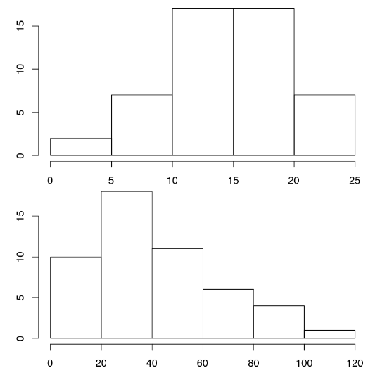 Figure 1.8.6 Two histograms on the one plot.
(hist() command creates histogram plots, which break data into bins and then count number of data points in each bin. See more detailed explanations at the end of “one-dimensional” data chapter.)
The key command here is par(). First, we changed one of its parameters, namely mfrow which regulates number and position of plots within the plotting region. By default mfrow is c(1, 1) which means “one plot vertically and one horizontally”. To protect the older value of par(), we saved them in the object old.par. At the end, we changed par() again to initial values.
The separate task is to overlay plots. That may be done in several ways, and one of them is to change the default par(new=...) value from FALSE to TRUE. Then next high-level plotting command will not erase the content of window but draw over the existed content. Here you should be careful and avoid intersecting axes:
Code 1.8.11 (R)
(Try this plot yourself.)
Interactive graphics
Interactive graphics enhances the data analysis. Interactive tools trace particular points on the plot to their origins in a data, add objects to the arbitrary spots, follow one particular data point across different plots (“brushing”), enhance visualization of multidimensional data, and much more.
The core of R graphical system is not very interactive. Only two interactive commands, identify() and locator() come with the default installation.
With identify(), R displays information about the data point on the plot. In this mode, the click on the default (left on Windows and Linux) mouse button near the dot reveals its row number in the dataset. This continues until you right-click the mouse (or Command-Click on macOS).
Code 1.8.12 (R)
Identifying points in 1:20 is practically useless. Consider the following:
Code 1.8.13 (R)
By default, plot() does not name states, only print dots. Yes, this is possible to print all state names but this will flood plot window with names. Command identify() will help if you want to see just outliers.
Command locator() returns coordinates of clicked points. With locator() you can add text, points or lines to the plot with the mouse[6]. By default, output goes to the console, but with the little trick you can direct it to the plot:
Code 1.8.14 (R)
(Again, left click (Linux & Windows) or click (macOS) will mark places; when you stop this with the right click (Linux & Windows) or Command+Click (macOS), the text will appear in previously marked place(s).)
How to save the plot which was modified interactively? The “triple approach” explained above will not work because it does not allow interaction. When your plot is ready on the screen, use the following:
Code 1.8.15 (R)
This pair of commands (concatenated with command delimiter, semicolon, for the compactness) copy existing plot into the specified file.
Plenty of interactive graphics is now available in R through the external packages like iplot, loon, manipulate, playwith, rggobi, rpanel, TeachingDemos and many others.
References
1. The better term is generic command.
2. Cleveland W. S., McGill R. 1985. Graphical perception and graphical methods for analyzing scientific data. Science. 229(4716): 828–833.
3. lattice came out of later ideas of W.S. Cleveland, trellis (conditional) plots (see below for more examples).
4. ggplot2 is now most fashionable R graphic system. Note, however, that it is based on the different “ideology” which related more with SYSTAT visual statistic software and therefore is alien to R.
5. By the way, both PDF and SVG could be opened and edited with the freely available vector editorInkscape.
6. Collection gmoon.r has game-like command Miney(), based on locator(); it partly imitates the famous “minesweeper” game.