
1.5: Graphs
- Page ID
- 22307

\( \newcommand{\vecs}[1]{\overset { \scriptstyle \rightharpoonup} {\mathbf{#1}} } \)
\( \newcommand{\vecd}[1]{\overset{-\!-\!\rightharpoonup}{\vphantom{a}\smash {#1}}} \)
\( \newcommand{\id}{\mathrm{id}}\) \( \newcommand{\Span}{\mathrm{span}}\)
( \newcommand{\kernel}{\mathrm{null}\,}\) \( \newcommand{\range}{\mathrm{range}\,}\)
\( \newcommand{\RealPart}{\mathrm{Re}}\) \( \newcommand{\ImaginaryPart}{\mathrm{Im}}\)
\( \newcommand{\Argument}{\mathrm{Arg}}\) \( \newcommand{\norm}[1]{\| #1 \|}\)
\( \newcommand{\inner}[2]{\langle #1, #2 \rangle}\)
\( \newcommand{\Span}{\mathrm{span}}\)
\( \newcommand{\id}{\mathrm{id}}\)
\( \newcommand{\Span}{\mathrm{span}}\)
\( \newcommand{\kernel}{\mathrm{null}\,}\)
\( \newcommand{\range}{\mathrm{range}\,}\)
\( \newcommand{\RealPart}{\mathrm{Re}}\)
\( \newcommand{\ImaginaryPart}{\mathrm{Im}}\)
\( \newcommand{\Argument}{\mathrm{Arg}}\)
\( \newcommand{\norm}[1]{\| #1 \|}\)
\( \newcommand{\inner}[2]{\langle #1, #2 \rangle}\)
\( \newcommand{\Span}{\mathrm{span}}\) \( \newcommand{\AA}{\unicode[.8,0]{x212B}}\)
\( \newcommand{\vectorA}[1]{\vec{#1}} % arrow\)
\( \newcommand{\vectorAt}[1]{\vec{\text{#1}}} % arrow\)
\( \newcommand{\vectorB}[1]{\overset { \scriptstyle \rightharpoonup} {\mathbf{#1}} } \)
\( \newcommand{\vectorC}[1]{\textbf{#1}} \)
\( \newcommand{\vectorD}[1]{\overrightarrow{#1}} \)
\( \newcommand{\vectorDt}[1]{\overrightarrow{\text{#1}}} \)
\( \newcommand{\vectE}[1]{\overset{-\!-\!\rightharpoonup}{\vphantom{a}\smash{\mathbf {#1}}}} \)
\( \newcommand{\vecs}[1]{\overset { \scriptstyle \rightharpoonup} {\mathbf{#1}} } \)
\( \newcommand{\vecd}[1]{\overset{-\!-\!\rightharpoonup}{\vphantom{a}\smash {#1}}} \)
\(\newcommand{\avec}{\mathbf a}\) \(\newcommand{\bvec}{\mathbf b}\) \(\newcommand{\cvec}{\mathbf c}\) \(\newcommand{\dvec}{\mathbf d}\) \(\newcommand{\dtil}{\widetilde{\mathbf d}}\) \(\newcommand{\evec}{\mathbf e}\) \(\newcommand{\fvec}{\mathbf f}\) \(\newcommand{\nvec}{\mathbf n}\) \(\newcommand{\pvec}{\mathbf p}\) \(\newcommand{\qvec}{\mathbf q}\) \(\newcommand{\svec}{\mathbf s}\) \(\newcommand{\tvec}{\mathbf t}\) \(\newcommand{\uvec}{\mathbf u}\) \(\newcommand{\vvec}{\mathbf v}\) \(\newcommand{\wvec}{\mathbf w}\) \(\newcommand{\xvec}{\mathbf x}\) \(\newcommand{\yvec}{\mathbf y}\) \(\newcommand{\zvec}{\mathbf z}\) \(\newcommand{\rvec}{\mathbf r}\) \(\newcommand{\mvec}{\mathbf m}\) \(\newcommand{\zerovec}{\mathbf 0}\) \(\newcommand{\onevec}{\mathbf 1}\) \(\newcommand{\real}{\mathbb R}\) \(\newcommand{\twovec}[2]{\left[\begin{array}{r}#1 \\ #2 \end{array}\right]}\) \(\newcommand{\ctwovec}[2]{\left[\begin{array}{c}#1 \\ #2 \end{array}\right]}\) \(\newcommand{\threevec}[3]{\left[\begin{array}{r}#1 \\ #2 \\ #3 \end{array}\right]}\) \(\newcommand{\cthreevec}[3]{\left[\begin{array}{c}#1 \\ #2 \\ #3 \end{array}\right]}\) \(\newcommand{\fourvec}[4]{\left[\begin{array}{r}#1 \\ #2 \\ #3 \\ #4 \end{array}\right]}\) \(\newcommand{\cfourvec}[4]{\left[\begin{array}{c}#1 \\ #2 \\ #3 \\ #4 \end{array}\right]}\) \(\newcommand{\fivevec}[5]{\left[\begin{array}{r}#1 \\ #2 \\ #3 \\ #4 \\ #5 \\ \end{array}\right]}\) \(\newcommand{\cfivevec}[5]{\left[\begin{array}{c}#1 \\ #2 \\ #3 \\ #4 \\ #5 \\ \end{array}\right]}\) \(\newcommand{\mattwo}[4]{\left[\begin{array}{rr}#1 \amp #2 \\ #3 \amp #4 \\ \end{array}\right]}\) \(\newcommand{\laspan}[1]{\text{Span}\{#1\}}\) \(\newcommand{\bcal}{\cal B}\) \(\newcommand{\ccal}{\cal C}\) \(\newcommand{\scal}{\cal S}\) \(\newcommand{\wcal}{\cal W}\) \(\newcommand{\ecal}{\cal E}\) \(\newcommand{\coords}[2]{\left\{#1\right\}_{#2}}\) \(\newcommand{\gray}[1]{\color{gray}{#1}}\) \(\newcommand{\lgray}[1]{\color{lightgray}{#1}}\) \(\newcommand{\rank}{\operatorname{rank}}\) \(\newcommand{\row}{\text{Row}}\) \(\newcommand{\col}{\text{Col}}\) \(\renewcommand{\row}{\text{Row}}\) \(\newcommand{\nul}{\text{Nul}}\) \(\newcommand{\var}{\text{Var}}\) \(\newcommand{\corr}{\text{corr}}\) \(\newcommand{\len}[1]{\left|#1\right|}\) \(\newcommand{\bbar}{\overline{\bvec}}\) \(\newcommand{\bhat}{\widehat{\bvec}}\) \(\newcommand{\bperp}{\bvec^\perp}\) \(\newcommand{\xhat}{\widehat{\xvec}}\) \(\newcommand{\vhat}{\widehat{\vvec}}\) \(\newcommand{\uhat}{\widehat{\uvec}}\) \(\newcommand{\what}{\widehat{\wvec}}\) \(\newcommand{\Sighat}{\widehat{\Sigma}}\) \(\newcommand{\lt}{<}\) \(\newcommand{\gt}{>}\) \(\newcommand{\amp}{&}\) \(\definecolor{fillinmathshade}{gray}{0.9}\)Once we have collected data, then we need to start analyzing the data. One way to analyze the data is using graphical techniques. The type of graph to use depends on the type of data you have. Qualitative data use graphs like bar graphs, pie graphs, and pictograms. Quantitative data use graphs such as histograms. In order to create any graphs, you must first create a summary of the data in the form of a frequency distribution. A frequency distribution is created by listing all of the data values (or grouping of data values) and how often the data value occurs.
Frequency: Number of times a data value occurs in a data set.
Frequency Distribution: A listing of each data value or grouping of data values (called classes) with their frequencies.
Relative Frequency: The frequency divided by n, the size of the sample. This gives the percent of the total for each data value or class of data values.
Relative Frequency Distribution: A listing of each data value or class of data values with their relative frequencies.
How to create a frequency distribution depends on whether you have qualitative or quantitative variable. We will now look at how to create each type of frequency distribution according to the type of variable, and the graphs that go with them.
Qualitative Variable:
First let’s look at the types of graphs that are commonly created for qualitative variables. Remember, qualitative variables are words, and not numbers.
Bar graph: A graph where rectangles represent the frequency of each data value or class of data values. The bars can be drawn vertically or horizontally. Note: The bars do not touch and they are the same width.
Pie Chart: A graph where the "pie" represents the entire sample and the "slices" represent the categories or classes. To find the angle that each “slice” takes up, multiple the relative frequency of that slice by 360°. Note: The percentages in each slice of a pie chart must all add up to 100%.
Pictograms: A bar graph where the bars are made up of icons instead of rectangles.
Pictograms are overused in the media and they are the same as a regular bar graph except more eye-catching. To be more professional, bar graphs or pie charts are better.
Example \(\PageIndex{1}\): Qualitative Variable Frequency Distribution and Graphs
Suppose a class was asked what their favorite soft drink is and the following is the results:
| Coke | Pepsi | Mt. Dew | Coke | Pepsi | Dr. Pepper | Sprite | Coke | Mt. Dew |
| Pepsi | Pepsi | Dr. Pepper | Coke | Sprite | Mt. Dew | Pepsi | Dr. Pepper | Coke |
| Pepsi | Mt. Dew | Coke | Pepsi | Pepsi | Dr. Pepper | Sprite | Pepsi | Coke |
| Dr. Pepper | Mt. Dew | Sprite | Coke | Coke | Pepsi |
- Create a frequency distribution for the data.
To do this, just list each drink type, and then count how often each drink comes up in the list. Notice Coke comes up nine times in the data set. Pepsi comes up 10 times. And so forth.
| Drink | Coke | Pepsi | Mt Dew | Dr. Pepper | Sprite |
| Frequency | 9 | 10 | 5 | 5 | 4 |
- Create a relative frequency distribution for the data.
To do this, just divide each frequency by 33, which is the total number of data values. Round to three decimal places.
| Drink | Coke | Pepsi | Mt Dew | Dr. Pepper | Sprite |
| Frequency | 9 | 10 | 5 | 5 | 4 |
| Relative Frequency |
9/33 =0.273 =27.3% |
10/33 =0.303 =30.3% |
5/33 =0.152 =15.2% |
5/33 =0.152 =15.2% |
4/33 =0.121 =12.1% |
- Draw a bar graph of the frequency distribution.
Along the horizontal axis you place the drink. Space these equally apart, and allow space to draw a rectangle above it. The vertical axis contains the frequencies. Make sure you create a scale along that axis in which all of the frequencies will fit. Notice that the highest frequency is 10, so you want to make sure the vertical axis goes to at least 10, and you may want to count by two for every tick mark. Using Excel, this is what your graph will look like.
Graph 1.5.4: Bar Graph of Favorite Soft Drink

- Draw a bar graph of the relative frequency distribution.
This is similar to the bar graph for the frequency distribution, except that you use the relative frequencies instead. Notice that the graph does not actually change except the numbers on the vertical scale.
Graph 1.5.5: Relative Frequency Bar Graph of Favorite Soft Drink

- Draw a pie chart of the data.
To draw a pie chart, multiply the relative frequencies by 360°. Then use a protractor to draw the corresponding angle. Or, it is easier to use Excel, or some other spreadsheet program to draw the graph.
| Drink | Coke | Pepsi | Mt Dew | Dr. Pepper | Sprite |
|---|---|---|---|---|---|
| Frequency | 9 | 10 | 5 | 5 | 4 |
| Relative Frequency | 0.273 | 0.303 | 0.152 | 0.152 | 0.121 |
| Angles |
(9/33)*360 =98.2° |
(10/33)*360 =109.1° |
(5/33)*360 =54.5° |
(5/33)*360 =54.5° |
(4/33)*360 =43.6° |
Graph 1.5.7: Pie Chart for Favorite Soft Drink

- Draw a pictograph for the favorite soft drink data.
Here you can get creative. One thing to draw would be glasses. Now you would not want to draw 10 glasses. So what you can do is let each glass be worth a certain number of data values, let’s say one glass = frequency of two. So this means that you will need to draw half of a glass for some of the frequencies. So for the first drink, with a frequency of nine, you need to draw four and a half glasses. For the second drink, with a frequency of 10, you need to draw five glasses. And so on.
Graph 1.5.8: Pictograph for Favorite Soft Drink
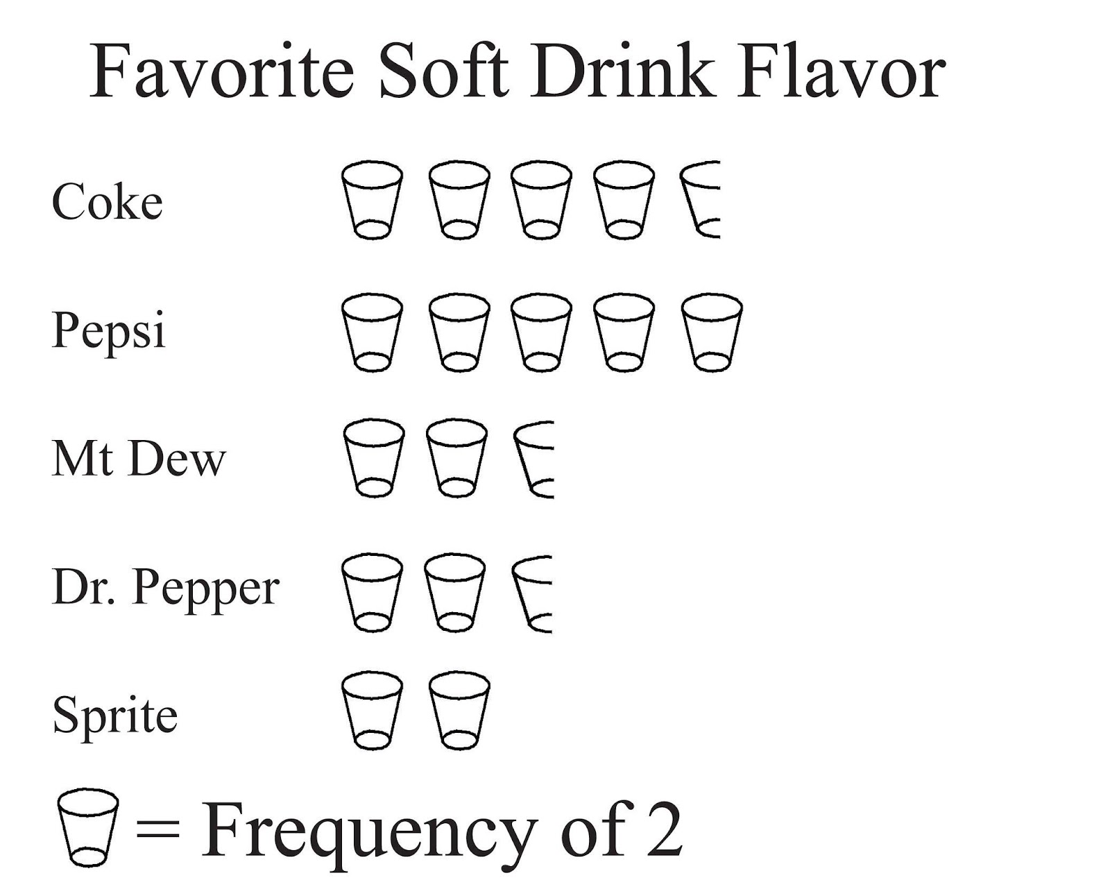
Pictographs are not really useful graphs. The makers of these graphs are trying to use graphics to catch a person’s eye, but most of these graphs are missing labels, scaling, and titles. Additionally, it can sometimes be unclear what ½ or ¼ of an icon represents. It is better to just do a bar graph, and use color to catch a person’s eye.
Quantitative Variable
Quantitative variables are numbers, so the graph you create is different from the ones for qualitative data. First, the frequency distribution is created by dividing the interval containing the data values into equally spaced subintervals. Then you count how many data values fall into each subinterval. Since the subintervals do not overlap, but do touch, then the graph you create has the bars touching.
Histogram: A graph of a quantitative variable where rectangles are used for each subinterval, the height of the rectangle represents the frequency of the data values in the subinterval, and there are no gaps in between the rectangles. Sometimes the midpoint of each subinterval is graphed instead of the endpoints of the subinterval.
Example \(\PageIndex{2}\): Quantitative Variable Frequency Distribution and Graphs
The energy used (in kg of oil equivalent per capita) in 2010 of 137 countries around the world is summarized in the following frequency distribution. Use this distribution draw a histogram. (World Bank, 2010).
This frequency distribution was created by dividing the range of the data into 12 equally spaced subintervals, sometimes called classes.
| Lower limit | Upper limit | Midpoint | Frequency |
|---|---|---|---|
| 142 | 1537 | 839.5 | 71 |
| 1538 | 2933 | 2235.5 | 27 |
| 2934 | 4329 | 3631.5 | 16 |
| 4330 | 5725 | 5027.5 | 7 |
| 5726 | 7121 | 6423.5 | 4 |
| 7122 | 8517 | 7819.5 | 7 |
| 8518 | 9913 | 9215.5 | 0 |
| 9914 | 11309 | 10611.5 | 0 |
| 11310 | 12705 | 12007.5 | 1 |
| 12706 | 14101 | 13403.5 | 2 |
| 14102 | 15497 | 14799.5 | 0 |
| 15498 | 16893 | 16195.5 | 2 |
Graph 1.5.10: Histogram for Energy Used in 2010 for 137 Countries in the World

Notice that the vertical axes starts at 0, there is a title on the graph, the axes have labels, and the tick marks are labeled. This is a correct way to draw a graph, and allows people to know what the data represents.
Interpreting graphs
It is important to be able to interpret graphs. If you look at the graphs in Example \(\PageIndex{1}\), you can see that Pepsi is more popular than any of the other drinks. You can also see that Sprite is the least popular, and that Mt. Dew and Dr. Pepper are equally liked. If you look at the graph in Example \(\PageIndex{2}\), you can see that most countries use around 839.5 kg of energy per capita. You can also see that the graph is heavily weighted to the lower amounts of energy use, and that there is a gap between the bulk of the amounts and the higher ends. So there are very few countries that use over 9215.5 kg of energy per capita. Since the data is quantitative, we can talk about the shape of the distribution. This graph would be called skewed right, since the data on the right side of the graph is the unusual data, and if it was not there, then the graph may look more symmetric. Some basic shapes of histograms are shown below.
Graph 1.5.11: Example of Symmetric Histogram

Graph 1.5.12: Example of Skewed Right Histogram

Graph 1.5.13: Example of Skewed Left Histogram
