Mathematics LibreTexts

15.7: Chapter 8

  • Page ID
    129937
  • \( \newcommand{\vecs}[1]{\overset { \scriptstyle \rightharpoonup} {\mathbf{#1}} } \)

    \( \newcommand{\vecd}[1]{\overset{-\!-\!\rightharpoonup}{\vphantom{a}\smash {#1}}} \)

    \( \newcommand{\id}{\mathrm{id}}\) \( \newcommand{\Span}{\mathrm{span}}\)

    ( \newcommand{\kernel}{\mathrm{null}\,}\) \( \newcommand{\range}{\mathrm{range}\,}\)

    \( \newcommand{\RealPart}{\mathrm{Re}}\) \( \newcommand{\ImaginaryPart}{\mathrm{Im}}\)

    \( \newcommand{\Argument}{\mathrm{Arg}}\) \( \newcommand{\norm}[1]{\| #1 \|}\)

    \( \newcommand{\inner}[2]{\langle #1, #2 \rangle}\)

    \( \newcommand{\Span}{\mathrm{span}}\)

    \( \newcommand{\id}{\mathrm{id}}\)

    \( \newcommand{\Span}{\mathrm{span}}\)

    \( \newcommand{\kernel}{\mathrm{null}\,}\)

    \( \newcommand{\range}{\mathrm{range}\,}\)

    \( \newcommand{\RealPart}{\mathrm{Re}}\)

    \( \newcommand{\ImaginaryPart}{\mathrm{Im}}\)

    \( \newcommand{\Argument}{\mathrm{Arg}}\)

    \( \newcommand{\norm}[1]{\| #1 \|}\)

    \( \newcommand{\inner}[2]{\langle #1, #2 \rangle}\)

    \( \newcommand{\Span}{\mathrm{span}}\) \( \newcommand{\AA}{\unicode[.8,0]{x212B}}\)

    \( \newcommand{\vectorA}[1]{\vec{#1}}      % arrow\)

    \( \newcommand{\vectorAt}[1]{\vec{\text{#1}}}      % arrow\)

    \( \newcommand{\vectorB}[1]{\overset { \scriptstyle \rightharpoonup} {\mathbf{#1}} } \)

    \( \newcommand{\vectorC}[1]{\textbf{#1}} \)

    \( \newcommand{\vectorD}[1]{\overrightarrow{#1}} \)

    \( \newcommand{\vectorDt}[1]{\overrightarrow{\text{#1}}} \)

    \( \newcommand{\vectE}[1]{\overset{-\!-\!\rightharpoonup}{\vphantom{a}\smash{\mathbf {#1}}}} \)

    \( \newcommand{\vecs}[1]{\overset { \scriptstyle \rightharpoonup} {\mathbf{#1}} } \)

    \( \newcommand{\vecd}[1]{\overset{-\!-\!\rightharpoonup}{\vphantom{a}\smash {#1}}} \)

    \(\newcommand{\avec}{\mathbf a}\) \(\newcommand{\bvec}{\mathbf b}\) \(\newcommand{\cvec}{\mathbf c}\) \(\newcommand{\dvec}{\mathbf d}\) \(\newcommand{\dtil}{\widetilde{\mathbf d}}\) \(\newcommand{\evec}{\mathbf e}\) \(\newcommand{\fvec}{\mathbf f}\) \(\newcommand{\nvec}{\mathbf n}\) \(\newcommand{\pvec}{\mathbf p}\) \(\newcommand{\qvec}{\mathbf q}\) \(\newcommand{\svec}{\mathbf s}\) \(\newcommand{\tvec}{\mathbf t}\) \(\newcommand{\uvec}{\mathbf u}\) \(\newcommand{\vvec}{\mathbf v}\) \(\newcommand{\wvec}{\mathbf w}\) \(\newcommand{\xvec}{\mathbf x}\) \(\newcommand{\yvec}{\mathbf y}\) \(\newcommand{\zvec}{\mathbf z}\) \(\newcommand{\rvec}{\mathbf r}\) \(\newcommand{\mvec}{\mathbf m}\) \(\newcommand{\zerovec}{\mathbf 0}\) \(\newcommand{\onevec}{\mathbf 1}\) \(\newcommand{\real}{\mathbb R}\) \(\newcommand{\twovec}[2]{\left[\begin{array}{r}#1 \\ #2 \end{array}\right]}\) \(\newcommand{\ctwovec}[2]{\left[\begin{array}{c}#1 \\ #2 \end{array}\right]}\) \(\newcommand{\threevec}[3]{\left[\begin{array}{r}#1 \\ #2 \\ #3 \end{array}\right]}\) \(\newcommand{\cthreevec}[3]{\left[\begin{array}{c}#1 \\ #2 \\ #3 \end{array}\right]}\) \(\newcommand{\fourvec}[4]{\left[\begin{array}{r}#1 \\ #2 \\ #3 \\ #4 \end{array}\right]}\) \(\newcommand{\cfourvec}[4]{\left[\begin{array}{c}#1 \\ #2 \\ #3 \\ #4 \end{array}\right]}\) \(\newcommand{\fivevec}[5]{\left[\begin{array}{r}#1 \\ #2 \\ #3 \\ #4 \\ #5 \\ \end{array}\right]}\) \(\newcommand{\cfivevec}[5]{\left[\begin{array}{c}#1 \\ #2 \\ #3 \\ #4 \\ #5 \\ \end{array}\right]}\) \(\newcommand{\mattwo}[4]{\left[\begin{array}{rr}#1 \amp #2 \\ #3 \amp #4 \\ \end{array}\right]}\) \(\newcommand{\laspan}[1]{\text{Span}\{#1\}}\) \(\newcommand{\bcal}{\cal B}\) \(\newcommand{\ccal}{\cal C}\) \(\newcommand{\scal}{\cal S}\) \(\newcommand{\wcal}{\cal W}\) \(\newcommand{\ecal}{\cal E}\) \(\newcommand{\coords}[2]{\left\{#1\right\}_{#2}}\) \(\newcommand{\gray}[1]{\color{gray}{#1}}\) \(\newcommand{\lgray}[1]{\color{lightgray}{#1}}\) \(\newcommand{\rank}{\operatorname{rank}}\) \(\newcommand{\row}{\text{Row}}\) \(\newcommand{\col}{\text{Col}}\) \(\renewcommand{\row}{\text{Row}}\) \(\newcommand{\nul}{\text{Nul}}\) \(\newcommand{\var}{\text{Var}}\) \(\newcommand{\corr}{\text{corr}}\) \(\newcommand{\len}[1]{\left|#1\right|}\) \(\newcommand{\bbar}{\overline{\bvec}}\) \(\newcommand{\bhat}{\widehat{\bvec}}\) \(\newcommand{\bperp}{\bvec^\perp}\) \(\newcommand{\xhat}{\widehat{\xvec}}\) \(\newcommand{\vhat}{\widehat{\vvec}}\) \(\newcommand{\uhat}{\widehat{\uvec}}\) \(\newcommand{\what}{\widehat{\wvec}}\) \(\newcommand{\Sighat}{\widehat{\Sigma}}\) \(\newcommand{\lt}{<}\) \(\newcommand{\gt}{>}\) \(\newcommand{\amp}{&}\) \(\definecolor{fillinmathshade}{gray}{0.9}\)

    Your Turn

    8.1
    1. None of the above (there’s no sample being selected here; the entire population is being surveyed)
    2. Stratified random sample (the strata are the different majors)
    3. Simple random sample
    8.2
    1.
    Major Frequency
    Biology 6
    Education 1
    Political Science 3
    Sociology 2
    Undecided 4
    8.3
    1.
    Number of people in the residence Frequency
    1 12
    2 13
    3 8
    4 6
    5 1
    8.4
    1.
    Age range Frequency
    25-29 2
    30-34 6
    35-39 2
    40-44 4
    45-49 1
    50-54 2
    55-59 2
    60-64 0
    65-70 1

    (Answers may vary depending on bin boundary decisions)

    8.5
    1.
    Major Frequency Proportion
    Biology 6 37.5%
    Education 1 6.3%
    Political Science 3 18.8%
    Sociology 2 12.5%
    Undecided 4 25%
    Note that these percentages add up to 100.1%, due to the rounding.
    8.6
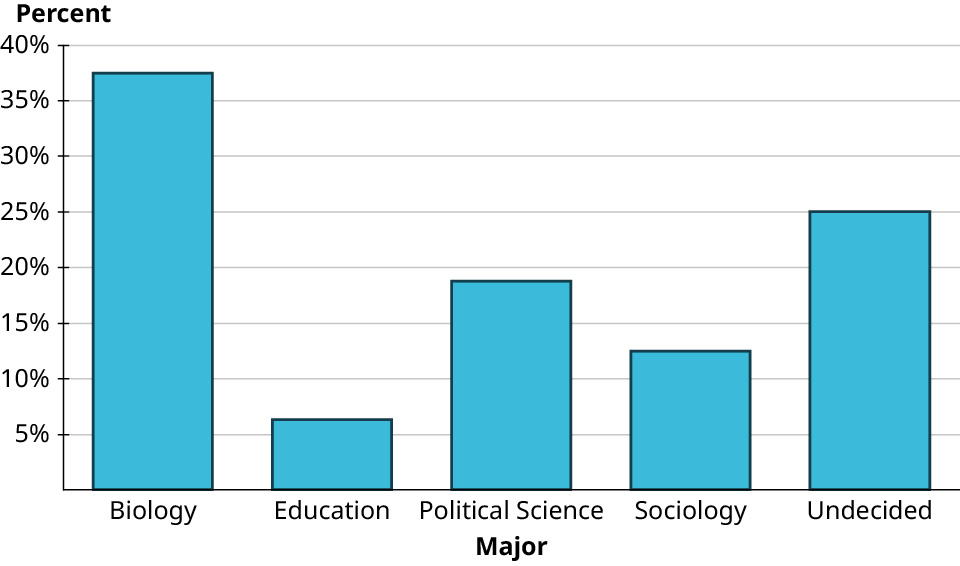
    1. A bar graph plots percentages of different majors. The horizontal axis represents majors. The vertical axis representing percent ranges from 0 percent to 40 percent, in increments of 5 percent. The graph infers the following data. Biology: 37.5 percent. Education: 6.3 percent. Political Science: 18.8 percent. Sociology: 12.5 percent. Undecided: 25 percent.
    8.7
    1. Southeast
    2. Just over 10%
    3. Outlying Areas and Rocky Mtns.
    8.8
    1. A pie chart represents the majors of students in the class. The pie chart infers the following data. Biology: 37.5 percent. Undecided: 25 percent. Political Science: 18.8 percent. Sociology: 12.5 percent. Education: 6.3 percent.
    8.9
    1. Twenty-four
    2. The longest commutes are 60, 50, and 36 miles; the shortest are 4, 6, and 7 miles.
    3. 4, 6, 7, 10, 10, 10, 12, 12, 12, 14, 15, 18, 18, 20, 25, 25, 25, 30, 30, 35, 35, 36, 50, 60
    8.10
    1.
    4 7
    5 9 7 4
    6 9 8 7
    7 8 7 5 2 2 1 0
    8 9 6 5 4 4 1
    9 7 7 6 3 3 1
    10 7 6 3 1
    8.11
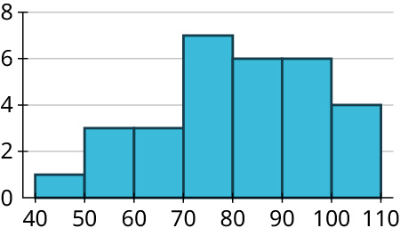
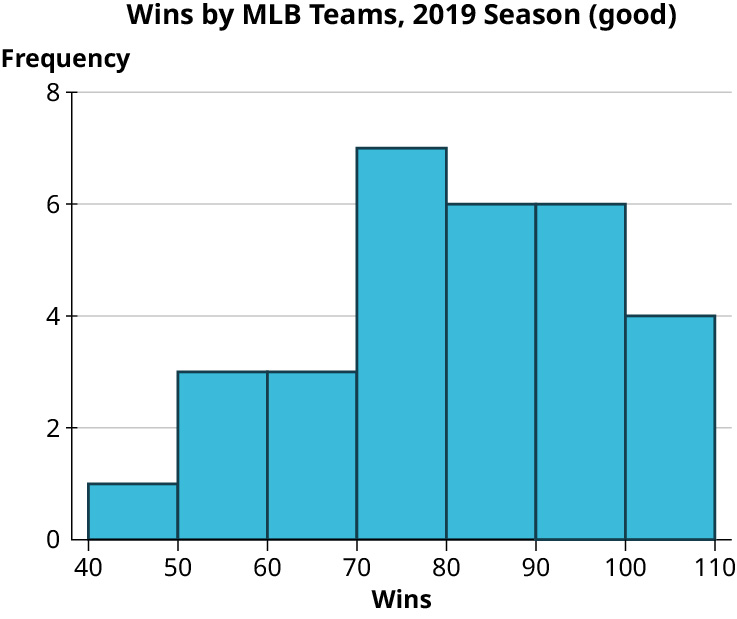
    1. A histogram represents wins by MLB teams, 2019 season (good). The horizontal axis representing wins ranges from 40 to 110, in increments of 10. The vertical axis representing frequency ranges from 0 to 8, in increments of 2. The histogram infers the following data. 40 to 50: 1. 50 to 60: 3. 60 to 70: 3. 70 to 80: 7. 80 to 90: 6. 90 to 100: 6. 100 to 110: 4.
    8.12
    1.

    Answers may vary based on bin choices. Here’s the result for bins of width 2,500:

    A histogram of in-state tuition costs at US institutions. The horizontal axis representing tuition ranges from 2500 to 75000, in increments of 2500. The vertical axis representing frequency ranges from 0 to 800, in increments of 200. The histogram infers the following data: 2500, 230. 5000, 680. 7500, 480. 10000, 390.  12500, 300. 15000, 390. 17500, 270. 20000, 175. 22500, 150. 25000, 100. 27500, 120. 30000, 150. 32500, 160. 35000, 120. 37500, 100. 40000, 90. 42500, 80. 45000, 70. 47500, 60. 50000, 50. 52500, 50. 55000, 70. 57500, 50. 60000, 10. 75000, 10. Note: all values are approximate.

    The data are strongly right-skewed.

    8.13
    1. A bar graph represents world records for women’s swimming events, 100 meters. The horizontal axis represents the event. The vertical axis representing time in seconds ranges from 0 to 70, in increments of 10. The bar graph infers the following data. Freestyle: 52. Backstroke: 57. Breaststroke: 64. Butterfly: 56. Note: all values are approximate.
    8.14
    1.

    Top ten teams by wins:

    A bar graph represents the top ten MLB teams by wins, 2019 (good). The horizontal axis represents the team. The vertical axis representing wins ranges from 0 to 120, in increments of 20. The bar graph infers the following data. HOU: 107; LAD: 106; NYY: 103; MIN: 101; ATL: 97; OAK: 97; TBR: 96; CLE: 93; WSN: 93; STL: 91. Note: all values are approximate.

    A bar graph represents the top ten MLB teams by wins, 2019 (bad). The horizontal axis represents the team. The vertical axis representing wins ranges from 90 to 108, in increments of 2. The bar graph infers the following data. HOU: 107; LAD: 106; NYY: 103; MIN: 101; ATL: 97; OAK: 97; TBR: 96; CLE: 93; WSN: 93; STL: 91. Note: all values are approximate.

    A histogram represents wins by MLB teams, 2019 season (good). The horizontal axis representing wins ranges from 40 to 110, in increments of 10. The vertical axis representing frequency ranges from 0 to 8, in increments of 2. The histogram infers the following data. 40 to 50: 1. 50 to 60: 3. 60 to 70: 3. 70 to 80: 7. 80 to 90: 6. 90 to 100: 6. 100 to 110: 4.

    A histogram represents wins by MLB teams, 2019 season (bad). The horizontal axis representing wins ranges from under 70 to 110, in increments of 10. The vertical axis representing frequency ranges from 0 to 8, in increments of 1. The histogram infers the following data. Under 70: 7. 70 to 80: 7. 80 to 90: 6. 90 to 100: 6. 100 to 110: 4.

    8.15
    1. There are two modes: 89 and 104, each of which appears three times.
    8.16
    1.

    2

    8.17
    1. 136
    8.18
    1. 82.5
    8.19
    1. 2
    8.20
    1. 12.556
    8.21
    1. \(\frac6233 = 1.879\)
    8.22
    1. Modes: 72, 84, 93, 97
    Median: 82.5
    Mean: 80.967 (rounded to three decimal places)
    8.23
    1. Mode or median
    2. Median or mean
    3. Median or mean
    8.24
    1. 67
    8.25
    1. \(\$ 74,514 - \$ 480 = \$ 74,034\)
    8.26
    1.

    \(s = \sqrt {752.5} \approx 27.432\)

    8.27
    1. $13,333.77.
    8.28
    1. 15
    2. 70th percentile
    8.29
    1. 1026
    2. 1318
    3. 82.7th
    4. 99.2nd
    8.30
    1. $3,120
    2. $26,465.20
    3. 32.3rd
    4. 98.5th
    8.31
    1.

    The red (leftmost) distribution has mean 11, the blue (middle) has mean 13, and the yellow (rightmost) has mean 14.

    8.32
    1. 6
    8.33
    1. Mean: 150; standard deviation: 20
    8.34
    1. 99.7%
    2. 95%
    3. 68%
    8.35
    1.

    65 and 75

    2.

    26 and 54

    3.

    110 and 290

    8.36
    1.

    47.5%

    2.

    15.85%

    3.

    81.5%

    8.37
    1.
    \(−1.8\)
    \(1.6\)
    \(−0.6\)
    8.38
    1. –44
    30
    6
    8.39
    1.

    80th

    9th

    97th

    8.40
    1.

    3.9

    6.3

    2.9

    8.41
    1. 1.29
    2. 94.5th
    3. An LSAT score of 161 is better
    8.42
    1. 72
    2. 6
    3. 93rd
    8.43
    1.

    Using NORM.INV: 1092.8

    Using PERCENTILE: 1085
    8.44
    1. Income
    2. Either; neither one seems to directly influence the other (they’re both influenced by the student’s academic ability)
    3. GPA
    8.45
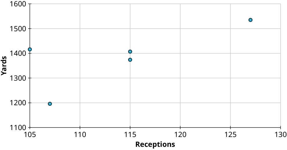
    1. A scatter plot shows five points. The horizontal axis representing receptions ranges from 105 to 130, in increments of 5. The vertical axis representing yards ranges from 1100 to 1600, in increments of 100. The points are at the following coordinates: (105, 1420), (107, 1200), (115, 1380), (115, 1410), and (127, 1540). Note: all values are approximate.
    8.46
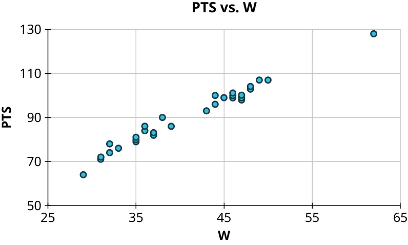
    1. A scatter plot represents PTS versus W. The horizontal axis representing W ranges from 25 to 65, in increments of 5. The vertical axis representing PTS ranges from 50 to 130, in increments of 20. The points are arranged in increasing order. Some of the points are as follows: (32, 70), (35, 80), (40, 88), (45, 100), and (50, 108). Note: all values are approximate.
    8.47
    1. \(\,\)
    1. No curved pattern
    2. Strong negative relationship, \(r \approx - 0.9\)
    2. \(\,\)
    1. Curved pattern
    3. \(\,\)
    1. No curved pattern
    2. No apparent relationship, \(r \approx 0\)
    4. \(\,\)
    1. No curved pattern
    2. Weak positive relationship, \(r \approx 0.6\)
    8.48
    1.
    1. \(r = - 0.91\)
    2. Not appropriate
    3. \(r = - 0.01\)
    4. \(r = 0.62\)
    8.49
    1. \(y = 0.75\left( \frac{20}{5} \right)(x - 100) + 200 = 3x - 100\)
    8.50
    1.

    \(y = 1.8x + 16.9\)

    8.51
    1.

    \(y = 0.174x + 14.5\)

    2.

    26.68

    3.

    Predicted: 28; actual: 18. The Phillies were caught around 10 fewer times than expected.

    4.

    Every 10 additional steal attempts will result in getting caught about 1.7 times on average.

    8.52
    1. \(y = 0.5481x + 0.1055\), where x is the proportion of made field goals and y is the proportion of made three-point field goals
    2. 0.347
    3. Predicted: 0.340; actual: 0.368. The Aces made about 2.8% more of their three-point shots than expected.
    4. An increase of 1% in made field goal attempts will result in an expected increase of 0.55% in made three-point field goal attempts.

    Check Your Understanding

    1. Randomization is being used; cluster random sample.
    2. No randomization is being used.
    3. Randomization is being used; stratified random sample.
    4.
    Genre Frequency
    Cooking 1
    Non-fiction 3
    Romance 4
    Thriller 3
    True Crime 3
    Young Adult 6
    5.
    Number of classes Frequency
    1 1
    2 3
    3 16
    4 8
    5 4
    6.
    Range of Cell Phone Subscriptions Per Hundred People Frequency
    0.0 – 24.9 1
    25.0 – 49.9 3
    50.0 – 74.9 1
    75.0 – 99.9 6
    100.0 – 124.9 7
    125.0 – 149.9 3
    150.0 – 174.9 3
    175.0 – 199.9 1

    (Note: Answers may vary based on choices made about bins.)
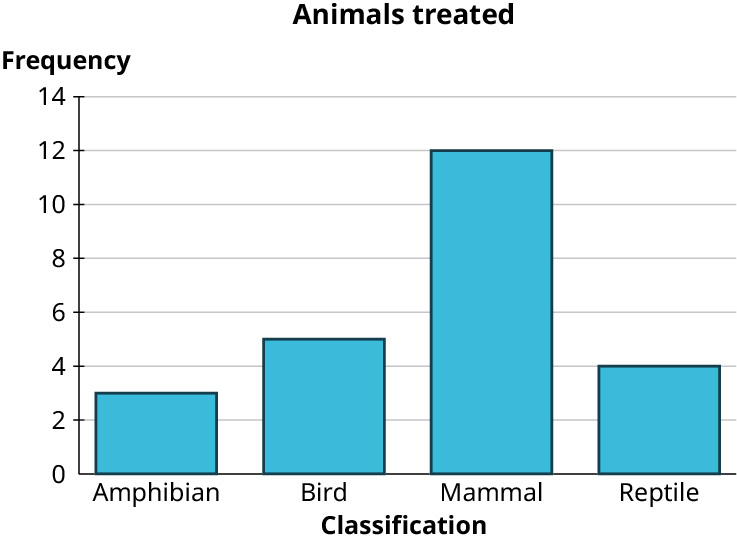
    7. A bar graph titled, animals treated. The horizontal axis represents classification. The vertical axis representing frequency ranges from 0 to 14, in increments of 2. The bar graph infers the following data. Amphibian: 3. Bird: 5. Mammal: 12. Reptile: 4.
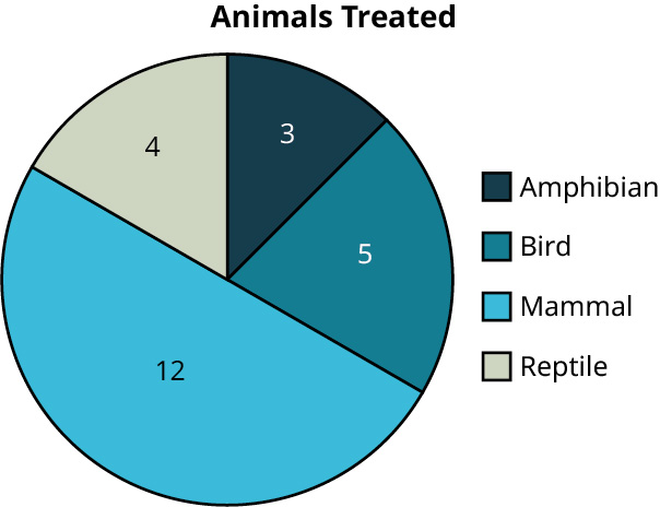
    8. A pie chart titled, animals treated. The pie chart is divided into four unequal parts. The pie chart infers the following data. Amphibian: 3. Bird: 5. Mammal: 12. Reptile: 4.
    9.
    12 7
    13 0 2 3 6 6 7 8 9 9
    14 1 2 3 3 6 8 8
    15 3 3 5 6 6 6 7 7 8 8
    16 4 7 8
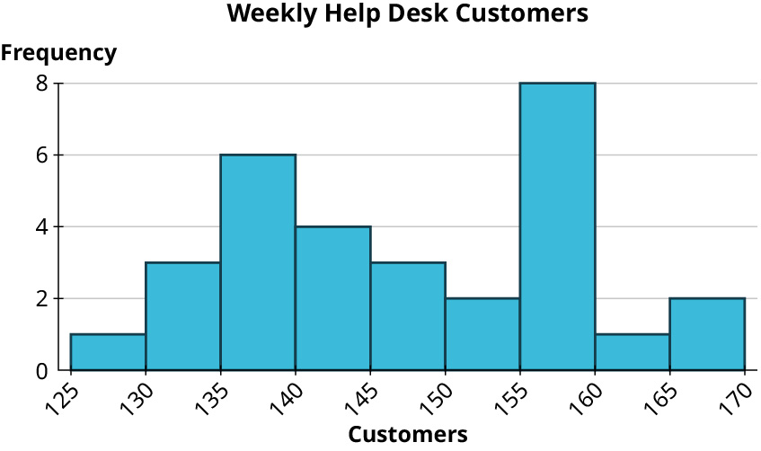
    10. A histogram titled, weekly help desk customers. The horizontal axis representing customers ranges from 125 to 170, in increments of 5. The vertical axis representing frequency ranges from 0 to 8, in increments of 2. The histogram infers the following data. 125 to 130: 1. 130 to 135: 3. 135 to 140: 6. 140 to 145: 4. 145 to 150: 3. 150 to 155: 2. 155 to 160: 8. 160 to 165: 1. 165 to 170: 2.
    11.
    A bar graph titled, admission rate at different campuses in the University of California System. The horizontal axis represents campus. The vertical axis representing the admission rate ranges from 0 to 0.7, in increments of 0.1. The bar graph infers the following data. Berkeley: 0.14. Davis: 0.41. Irvine: 0.28. Los Angeles: 0.14. Merced: 0.66. Riverside: 0.5. San: Diego: 0.3. Santa Barbara: 0.32. Santa Cruz: 0.48. Note: all values are approximate.
    (data source:https://data.ed.gov/)
    12.
    A bar graph titled, out-of-state costs at University of California campuses, unbiased. The horizontal axis represents campus. The vertical axis represents cost ranges from 0 to 45000, in increments of 5000. The bar graph infers the following data. Berkeley: 43,176. Davis: 43,394. Irvine: 42,692. Los Angeles: 42,218. Merced: 42,530. Riverside: 42,819. San Diego: 43,159. Santa Barbara: 43,383. Santa Cruz: 42,952. Note: all values are approximate.
    (data source: https://data.ed.gov/)
    A bar graph titled, out-of-state costs at University of California campuses, biased. The horizontal axis represents campus. The vertical axis represents cost ranges from 41600 to 43600, in increments of 200. The bar graph infers the following data. Berkeley: 43,176. Davis: 43,394. Irvine: 42,692. Los Angeles: 42,218. Merced: 42,530. Riverside: 42,819. San Diego: 43,159. Santa Barbara: 43,383. Santa Cruz: 42,952. Note: all values are approximate.
    (data source: https://data.ed.gov/)
    13.

    Mode: 112

    Median: 113

    Mean: 112.64

    14. 3
    15. 3
    16. \(\frac{107}{32} \approx 3.344\)
    17.

    156

    18.

    147

    19.

    147.2

    20.

    Mode: not useful; every value appears only once

    Median: 0.322

    Mean: 0.3612

    21.

    Mode: not useful; every value appears only once

    Median: $42,952

    Mean: $42924.78

    22. Mode: $13,380
    Median: $11,207
    Mean: $15,476.79
    23. Since the data are right skewed, the mean will be bigger than the mean. Thus, the workers would rather use the median, while the management will prefer the mean.
    24. 9
    25. \(\sqrt {10.5} \approx 3.240\)
    26. \(168 - 127 = 41\)
    27. 11.306
    28. Range: \(0.6617 - 0.1404 = 0.5213\)
    29. Standard deviation: 0.170
    30. Range: \(\$ 43,394 - 42,218 = \$ 1,176\)
    31. Standard deviation: $398.37
    32. 18
    33. 14
    34. 80th
    35. 60th
    36. 71.7
    37. 101.2
    38. 70.25
    39. 51.7th
    40. 79.3rd
    41. 13.8th
    42. 95%
    43. 34%
    44. 84th
    45. 0.583
    46. 71.2
    47. 72nd
    48. 115.38
    49. 27th
    50.

    23.2

    51.

    1300 on the SAT

    52. \(\mu = 60\); \(\sigma = \frac{1}{2}\sqrt {120} \approx 5.477\)
    53. 96.6th
    54. 57
    55.

    PERCENTILE gives 20.86; NORM.INV gives 21.11.

    56.

    PERCENTILE gives 11.82; NORM.INV gives 11.68.

    57.

    PERCENTRANK gives 92.6th; NORM.DIST gives 91.9th.

    58.

    PERCENTRANK gives 77th; NORM.DIST gives 79.2nd.
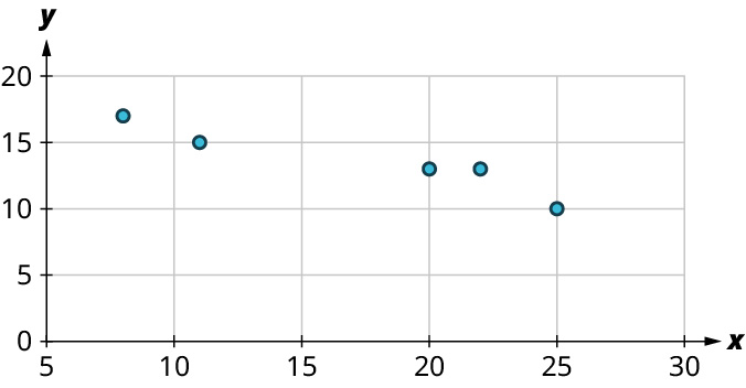
    59. A scatter plot shows five points. The x-axis ranges from 5 to 30, in increments of 5. The y-axis ranges from 0 to 20, in increments of 5. The points are as follows: (8, 17), (11, 15), (20, 13), (22, 13), and (25, 10). Note: all values are approximate.
    60.
    1. Yes
    61.
    1. No
    2. Weak positive relationship; \(r \approx 0.5\)
    62.

    0.96

    63. \(y = 2900 x\, –\, 478\)
    64.

    $7,475

    65.

    Less than expected by $1,495.68

    66.

    For every $1,000 increase in out-of-state tuition, we expect average monthly salary to increase by $161.


    This page titled 15.7: Chapter 8 is shared under a CC BY 4.0 license and was authored, remixed, and/or curated by OpenStax via source content that was edited to the style and standards of the LibreTexts platform.

    • Was this article helpful?