9.1: Presenting Categorical Data Graphically
- Page ID
- 59976

Categorical, or qualitative, data are pieces of information that allow us to classify the objects under investigation into various categories. We usually begin working with categorical data by summarizing the data into a frequency table.
A frequency table is a table with two columns. One column lists the categories, and another for the frequencies with which the items in the categories occur (how many items fit into each category).
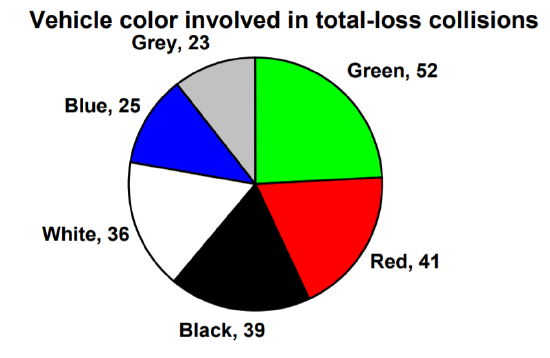
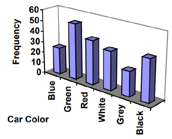
An insurance company determines vehicle insurance premiums based on known risk factors. If a person is considered a higher risk, their premiums will be higher. One potential factor is the color of your car. The insurance company believes that people with some color cars are more likely to get in accidents. To research this, they examine police reports for recent total-loss collisions. The data is summarized in the frequency table below.
| Color | Frequency |
| Blue | 25 |
| Green | 52 |
| Red | 41 |
| White | 36 |
| Black | 39 |
| Grey | 23 |
Sometimes we need an even more intuitive way of displaying data. This is where charts and graphs come in. There are many, many ways of displaying data graphically, but we will concentrate on one very useful type of graph called a bar graph. In this section, we will work with bar graphs that display categorical data; the next section will be devoted to graphs that display quantitative data.
A bar graph is a graph that displays a bar for each category with the length of each bar indicating the frequency of that category.
Note, a bar graph is only used to display categorical data.
To construct a bar graph, we need to draw a vertical axis and a horizontal axis. The vertical direction will have a scale and measure the frequency of each category; the horizontal axis has no scale in this instance, but only the names of each category. The construction of a bar chart is most easily described by use of an example.
Using our car data from above, note the highest frequency is 52, so our vertical axis needs to go from 0 to 52, but we might as well use 0 to 55, so that we can put a hash mark every 5 units:
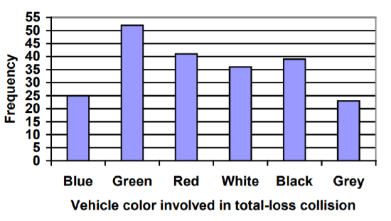
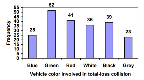
Notice that the height of each bar is determined by the frequency of the corresponding color. The horizontal gridlines are a nice touch, but not necessary. In practice, you will find it useful to draw bar graphs using graph paper, so the gridlines will already be in place, or using technology. Instead of gridlines, we might also list the frequencies at the top of each bar, like this:
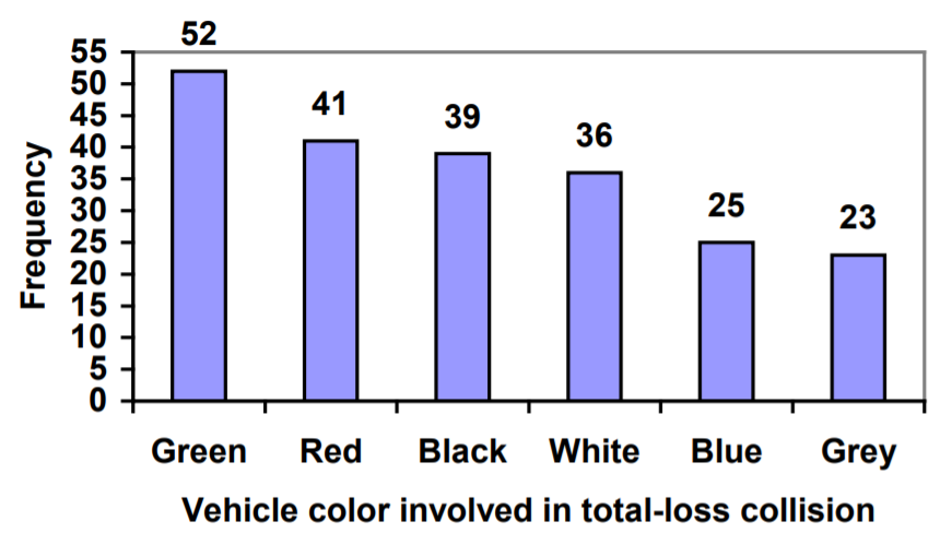
In this case, our chart might benefit from being reordered from largest to smallest frequency values. This arrangement can make it easier to compare similar values in the chart, even without gridlines. When we arrange the categories in decreasing frequency order like this, it is called a Pareto chart.
A Pareto chart is a bar graph ordered from highest to lowest frequency.
Transforming our bar graph from earlier into a Pareto chart, we get:
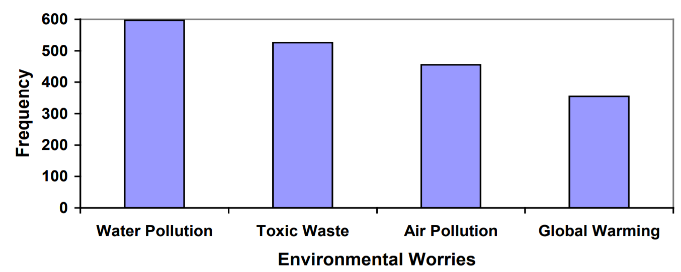
In a survey [1], adults were asked whether they personally worried about a variety of environmental concerns. The numbers (out of 1012 surveyed) who indicated that they worried “a great deal” about some selected concerns are summarized below.
| Environmental Issue | Frequency |
| Pollution of drinking water | 597 |
| Contamination of soil and water by toxic waste | 526 |
| Air pollution | 455 |
| Global warming | 354 |
This data could be shown graphically in a bar graph:
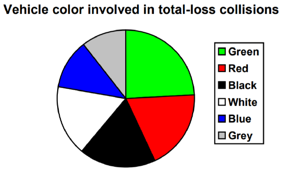
To show relative sizes, it is common to use a pie chart.
A pie chart is a circle with wedges cut of varying sizes marked out like slices of pie or pizza. The relative sizes of the wedges correspond to the relative frequencies of the categories.
For our vehicle color data, a pie chart might look like this:
Pie charts can often benefit from including frequencies or relative frequencies (percents) in the chart next to the pie slices. Often, having the category names next to the pie slices also makes the chart clearer.
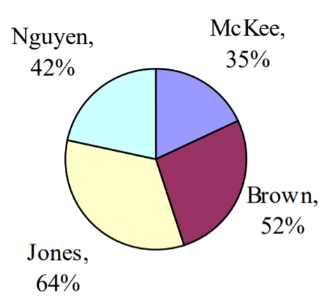
The pie chart to the right shows the percentage of voters supporting each candidate running for a local senate seat.
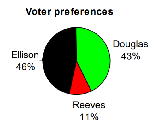
If there are 20,000 voters in the district, the pie chart shows that about 11% of those, about 2,200 voters, support Reeves.
Pie charts look nice but are harder to draw by hand than bar charts since to draw them accurately we would need to compute the angle each wedge cuts out of the circle, then measure the angle with a protractor. Computers are much better suited to drawing pie charts. Common software programs like Microsoft Word or Excel, OpenOffice.org Write or Calc, or Google Docs are able to create bar graphs, pie charts, and other graph types. There are also numerous online tools that can create graphs [2].
Create a bar graph and a pie chart to illustrate the grades on a history exam below.
A: 12 students,
B: 19 students,
C: 14 students,
D: 4 students,
F: 5 students
Don’t get fancy with graphs! People sometimes add features to graphs that don’t help to convey their information. For example, 3-dimensional bar charts like the one shown below are usually not as effective as their two-dimensional counterparts.
Here is another way that fanciness can lead to trouble. Instead of plain bars, it is tempting to substitute meaningful images. This type of graph is called a pictogram.
A pictogram is a statistical graphic in which the size of the picture is intended to represent the frequencies or size of the values being represented.
A labor union might produce the graph to the right to show the difference between the average manager salary and the average worker salary.

Looking at the picture, it would be reasonable to guess that the manager salaries is 4 times as large as the worker salaries – the area of the bag looks about 4 times as large. However, the manager salaries are in fact only twice as large as worker salaries, which were reflected in the picture by making the manager bag twice as tall.
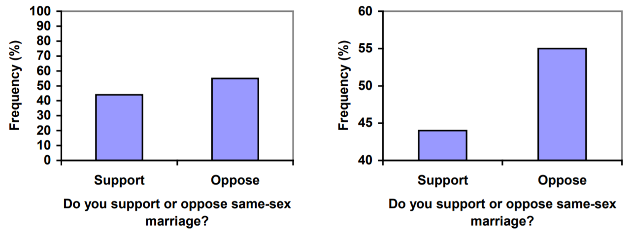
Another distortion in bar charts results from setting the baseline to a value other than zero. The baseline is the bottom of the vertical axis, representing the least number of cases that could have occurred in a category. Normally, this number should be zero.
Compare the two graphs below showing support for same-sex marriage rights from a poll taken in December 2008 [3]. The difference in the vertical scale on the first graph suggests a different story than the true differences in percentages; the second graph makes it look like twice as many people oppose marriage rights as support it.
A poll was taken asking people if they agreed with the positions of the 4 candidates for a county office. Does the pie chart present a good representation of this data? Explain.